本篇文档主要是利用echarts实现可拖动节点的折现图,在echarts中找到了一个demo,传送门:https://echarts.baidu.com/examples/editor.html?c=line-draggable,但是不是用vue写的,并且在改写为vue组件的过程中遇到了很多问题,在百度过程中发现并没有相关的文档,所以决定自己开发,并在demo的基础上开发了一些实用的功能,所以把这个过程记录下来。文档中还有很多不够完善的地方,欢迎讨论哈!
需求:制作一个折线图用于显示当前24小时的数据,并且可以通过拖动折现图设置数据
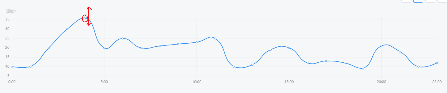
效果图如下:初步看和一般的折线图没什么区别,但是实际如图示,节点是可以上下拖动的
代码如下:
<template>
  <div ref="dom" class="charts chart-bar"></div>
</template>

<script>
import echarts from 'echarts'
import tdTheme from '_c/charts/theme.json'  // 这是我自己写的主题文件,可以不用管
import { on, off } from '@/libs/tools' // 这是其他一些方法函数,可以不管
echarts.registerTheme('tdTheme', tdTheme)
export default {
  name: 'ChartLine',
  props: {
    text: String,
    subtext: String,
    yName: String
  },
  data () {
    return {
      dom: null,
      symbolSize: 5,
    // 通过拖动是可以实时改变这里的值的
      data: [[0, 10], [1, 10], [2, 20], [3, 30], [4, 36], [5, 20], [6, 25], [7, 20], [8, 21], [9, 22],
      [10, 23], [11, 25], [12, 10], [13, 11], [14, 19], [15, 20], [16, 12], [17, 13], [18, 12], [19, 9],
      [20, 21], [21, 18], [22, 10], [23, 12]]
    }
  },
  methods: {
    resize () {
      this.dom.resize()
    }
  },
  mounted () {
    this.dom = echarts.init(this.$refs.dom, 'tdTheme')
    this.dom.setOption({
      title: {
        text: this.text,
        subtext: this.subtext,
        x: 'center'
      },
      grid: {
        left: 50,
        top: 40
      },
      tooltip: {
        trigger: 'axis'
      },
      xAxis: {
        min: 0,
        max: 23,
        type: 'value',
        axisLabel: {
          formatter (value) {
            return value + ':00' // 格式时间显示方式
          }
        },
        axisLine: { onZero: false }
      },
      yAxis: {
        min: 4,
        max: 36,
        type: 'value',
        name: this.yName,
        axisLine: { onZero: false }
      },
      series: [
        {
          id: 'a',
          type: 'line',
          smooth: true,
          symbolSize: this.symbolSize, // 为了方便拖拽,把 symbolSize 尺寸设大了。
          data: this.data
        }
      ]
    })
    this.dom.setOption({
      graphic: echarts.util.map(this.data, (dataItem, dataIndex) => {
        const that = this // 因为ondrag函数必须在回调内使用this.position获取实时坐标,此处必须用that替换this
        return {
          // 'circle' 表示这个 graphic element 的类型是圆点。
          type: 'circle',
          shape: {
            // 圆点的半径。
            r: this.symbolSize / 2
          },
          // 用 transform 的方式对圆点进行定位。position: [x, y] 表示将圆点平移到 [x, y] 位置。
          // 这里使用了 convertToPixel 这个 API 来得到每个圆点的位置
          position: this.dom.convertToPixel('grid', dataItem),
          // 这个属性让圆点不可见(但是不影响他响应鼠标事件)。
          invisible: true,
          // 这个属性让圆点可以被拖拽。
          draggable: true,
          // 把 z 值设得比较大,表示这个圆点在最上方,能覆盖住已有的折线图的圆点。
          z: 100,
          ondrag: echarts.util.curry(function (dataIndex) { // 此处必须用匿名函数,不能用箭头函数,否则拿不到拖动的坐标
            let origin = that.dom.convertToPixel('grid', that.data[dataIndex]) // 得到每个圆点原始位置
            // let maxY = that.dom.convertToPixel('grid', [40, 36]) // 最高温度为36摄氏度,暂未做封装
            // 超过最高温度36将不能拖动,写死的最低点高度为240,最高点为40
            if (this.position[1] > 240) {
              this.position[1] = 240
            } else if (this.position[1] < 40) {
              this.position[1] = 40
            }
            this.position[0] = origin[0] // 控制每个点位只能在y轴方向移动
            // this.position[1] = origin[1] // 控制每个点位只能在x轴方向移动
            // 实时获取拖动的点位信息并根据此信息重新画图
            that.data[dataIndex] = that.dom.convertFromPixel('grid', this.position)
            that.dom.setOption({
              series: [{
                id: 'a',
                data: that.data
              }]
            })
          }, dataIndex)
        }
      })
    })
    on(window, 'resize', this.dom.setOption({
      graphic: echarts.util.map(this.data, (item, dataIndex) => {
        return {
          position: this.dom.convertToPixel('grid', item)
        }
      })
    }))
  },
  beforeDestroy () {
    off(window, 'resize', this.resize)
  }
}
</script>