给随机的速度和定位~
html
<template>
  <div class="container">
    <!-- <img class="img1" src="../assets/bg_0.png" alt> -->
    <!-- <img src="../assets/cover_txt1.png" alt class="img2 animated shake infinite">
    <img src="../assets/cover_txt1_bottom.png" alt class="img3"> -->
    <div class="top">
      <div v-for="i in 160" :key="i" class="rain"></div>
    </div>

    <transition-group tag="div" mode="out-in" class="bottom" appear name="slide">
      <div class="circle" v-for="i in 160" :key="i"></div>
    </transition-group>
  </div>
</template>
css
<style scoped>
.container {
  width: 100%;
  height: 100%;
  background: url("../assets/bg.png");
  position: relative;
  overflow: hidden;
}

.top {
  width: 100%;
  height: 260px;
  position: relative;
  overflow: hidden;
  margin-left: -2px;
}
.rain {
  width: 30px;
  height: 2px;
  background: turquoise;
  transform: rotate(90deg);
  position: absolute;
  animation: down linear infinite;
}
@keyframes down {
  /* 0%  {top: -30px} */
  0% {
  }
  100% {
    top: 260px;
  }
}

.circle {
  width: 10px;
  height: 10px;
  border-radius: 50%;
  background: lightskyblue;
  opacity: 0.4;
  position: absolute;
  animation: up linear infinite;
}

@keyframes up {
  0% {
    transform: scale(1);
  }
  5% {
    transform: scale(2);
  }
  20% {
    transform: scale(0.5);
  }
  35% {
    transform: scale(2);
  }
  40% {
    transform: scale(0.5);
  }
  55% {
    transform: scale(2);
  }
  60% {
    transform: scale(0.5);
  }
  75% {
    transform: scale(2);
  }
  80% {
    transform: scale(0.5);
  }
  95% {
    transform: scale(2);
  }
  100% {
    transform: scale(0.5);
    top: -30px;
  }
}
</style>
js:
这地方真是不知道怎么用纯原生vue写
<script>
export default {
  methods: {},
  mounted() {
    var list = document.querySelectorAll(".rain");
    for (let i = 0; i < 160; i++) {
      list[i].style.left = Math.random() * 380 + "px";
      list[i].style.top = -(Math.random() * 400 + 260) + "px";
      list[i].style.animationDuration = Math.random() * 10 + 4 + "s";
      // list[i].style.animationIterationCount = "infinite";
    }
    var lists = document.querySelectorAll(".circle");
    for (let i = 0; i < 160; i++) {
      lists[i].style.left = Math.random() * 380 + "px";
      lists[i].style.top = Math.random() * 600 +800 + "px";
      // lists[i].style.animationIterationCount = "infinite";
      lists[i].style.animationDuration = Math.random() * 10+6 + "s";
    }
  }
};
</script>
效果:样式自己整吧~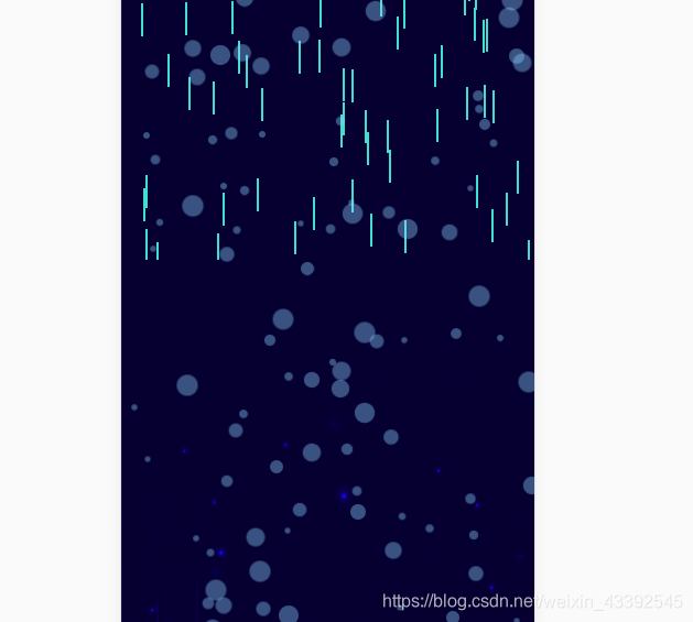
遇见问题,留作参考。