前言
用过Matlab的plot函数的小伙伴都知道,使用plot作二维数学图形,极其方便好用,再加上Matlab GUI强大的图形编辑功能,对于科研绘图而言,是一种无法取代的高效工具。而在产品研发领域,QCustomPlot开源库提供了同样给力的性能,使Qt/C++的开发同样能做出类似效果的二维图表。
本文是基于Visual Studio 2017+Qt5.9开发环境的QCustomPlot入门配置教程。
QCustomPlot
QCustomPlot采用GPL开源协议,是基于Qt/C++开发的第三方开源库,主要功能是绘制各种酷炫的二维图表,除了能够在程序中显示之外,还可以生成类似于PDF、PNG这种高清文件,功能可谓十分齐全。
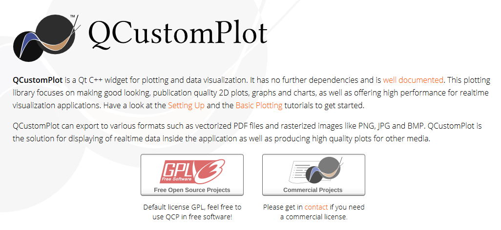 QCustomPlot官网:https://www.qcustomplot.com/。
我们需要在官网上下载一个开源包:
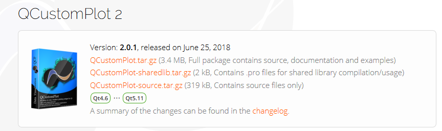
其中,第一个文件是最完整的包,包括源文件、文档和演示样例;第二个包只有演示样例,第三个包只有源文件。推荐下载第一个包,里面的离线文档十分好用,方便日后的查询:
项目配置
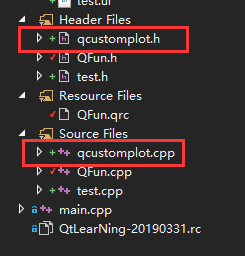
下载完之后,将qcustomplot.h和qcustomplot.cpp两个文件加入到项目中:
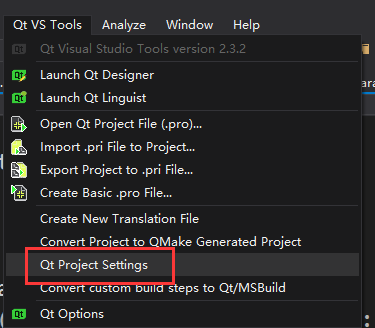
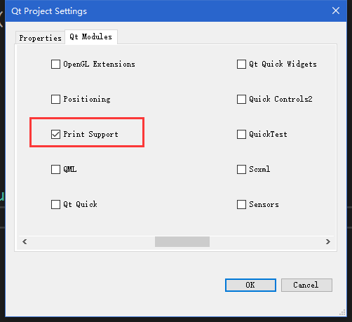
如果之前没有勾选过Qt Print Support组件的话,需要在Qt插件中勾选,步骤如下:
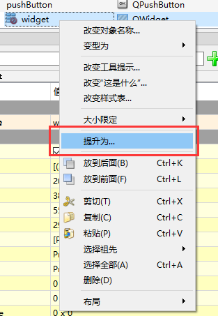
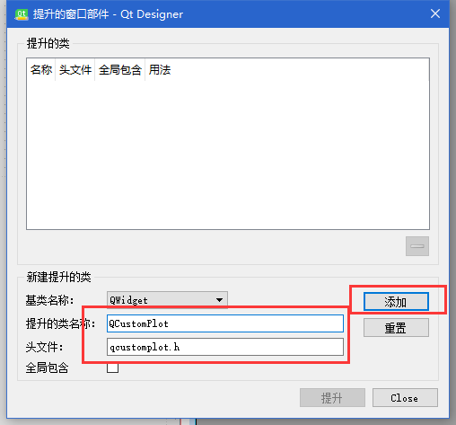
配置好之后,打开Qt Designer,在自己的ui文件中,添加一个Widget,然后右键菜单中点击提升:
输入QCustomPlot,提升后保存:
相应的,提升之后的Widget,发生了一些变化,打开ui_Qfun.h文件,发现两行代码发生了改变
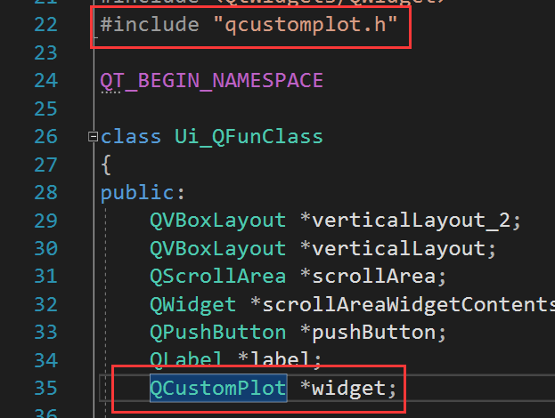
其中,QCustomPlot类是QWidget的子类。然后我们就可以通过QCustomPlot类来绘制我们的二维图表了,关于QCustomPlot的具体使用方法,example文件夹中给出了很多可以直接参考的Demo,非常详细,这里我们引用一例:
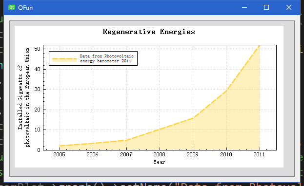
void QFun::setupScatterStyleGraph(QCustomPlot * customPlot)
{
	//customPlot->axisRect()->setBackground(QPixmap("./solarpanels.jpg"));
	customPlot->addGraph();
	customPlot->graph()->setLineStyle(QCPGraph::lsLine);
	QPen pen;
	pen.setColor(QColor(255, 200, 20, 200));
	pen.setStyle(Qt::DashLine);
	pen.setWidthF(2.5);
	customPlot->graph()->setPen(pen);
	customPlot->graph()->setBrush(QBrush(QColor(255, 200, 20, 70)));
	//customPlot->graph()->setScatterStyle(QCPScatterStyle(QPixmap("./sun.png")));
	// set graph name, will show up in legend next to icon:
	customPlot->graph()->setName("Data from Photovoltaic\nenergy barometer 2011");
	// set data:
	QVector<double> year, value;
	year << 2005 << 2006 << 2007 << 2008 << 2009 << 2010 << 2011;
	value << 2.17 << 3.42 << 4.94 << 10.38 << 15.86 << 29.33 << 52.1;
	customPlot->graph()->setData(year, value);

	// set title of plot:
	customPlot->plotLayout()->insertRow(0);
	customPlot->plotLayout()->addElement(0, 0, new QCPTextElement(customPlot, "Regenerative Energies", QFont("sans", 12, QFont::Bold)));
	// axis configurations:
	customPlot->xAxis->setLabel("Year");
	customPlot->yAxis->setLabel("Installed Gigawatts of\nphotovoltaic in the European Union");
	customPlot->xAxis2->setVisible(true);
	customPlot->yAxis2->setVisible(true);
	customPlot->xAxis2->setTickLabels(false);
	customPlot->yAxis2->setTickLabels(false);
	customPlot->xAxis2->setTicks(false);
	customPlot->yAxis2->setTicks(false);
	customPlot->xAxis2->setSubTicks(false);
	customPlot->yAxis2->setSubTicks(false);
	customPlot->xAxis->setRange(2004.5, 2011.5);
	customPlot->yAxis->setRange(0, 52);
	// setup legend:
	customPlot->legend->setFont(QFont(font().family(), 7));
	customPlot->legend->setIconSize(50, 20);
	customPlot->legend->setVisible(true);
	customPlot->axisRect()->insetLayout()->setInsetAlignment(0, Qt::AlignLeft | Qt::AlignTop);
}
最终效果: