ProgressBar
提供两种进度显示模式:精确模式,模糊模式,效果见当前文件夹下
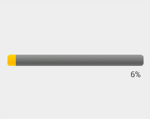
精确模式:可看到精确的进度(右)
模糊模式:相当于动画,用户看到到进度信息(左)

XML属性
style属性值
Widget.ProgressBar.Horizontal 横向进度条,模式由 indeterminate 属性决定
?android:attr/progressBarStyleHorizontal
Widget.ProgressBar 中号的圆形进度条(模糊模式)
?android:attr/progressBarStyle
Widget.ProgressBar.Small 小号的圆形进度条(模糊模式)
android:attr/progressBarStyleSmall
Widget.ProgressBar.Large 大号的圆形进度条(模糊模式)
?android:attr/progressBarStyleLarge
Widget.ProgressBar.Inverse 中号的圆形进度条(模糊模式), 适用于亮色背景,如白色
?android:attr/progressBarStyleInverse
Widget.ProgressBar.Small.Inverse 小号的圆形进度条(模糊模式),适用于亮色背景,如白色
?android:attr/progressBarStyleSmallInverse
Widget.ProgressBar.Large.Inverse 大号的圆形进度条(模糊模式),适用于亮色背景,如白色
?android:attr/progressBarStyleLargeInverse
?android:attr/progressBarStyleSmallTitle
?android:attr/progressBarStyle
由上可知:默认为中号圆形。Horizontal:水平,Small:小,Large:大,Inverse:适用于亮色背景
其他属性
animationResolution 必须为整形,模糊模式下动画每帧间隔的时间,无效设置
indeterminate true:模糊模式,默认false。用于水平进度条,圆形进度条只有模糊模式
indeterminateBehavior repeat:从头开始重复播放,cycle 结束一次循环后,倒序播放
indeterminateDrawable 模糊模式下的Drawable资源。可以是图片或者旋转动画
indeterminateDuration 必须为整形,模糊模式下动画周期持续时间
indeterminateOnly true:只能使用模糊模式,默认false
max 精确模式下最大值
progress 0~max之间的默认进度值
maxHeight 可选属性,设置ProgressBar视图(Drawable)的最大高度
maxWidth 可选属性,设置ProgressBar视图(Drawable)的最大宽度
minHeight 可选属性,设置ProgressBar视图(Drawable)的最小高度
minWidth 可选属性,设置ProgressBar视图(Drawable)的最小宽度
progressDrawable 精确模式下ProgressBar第一个进度条的Drawable资源
secondaryProgress 精确模式下ProgressBar第二个进度条的Drawable资源
mirrorForRtl 设置ProgressBar是否从右往左显示,适配阿拉伯等国家习惯,需在清单文件application标 签中设置android:supportsRtl=“true”,此属性才会生效
interpolator 默认动画的插值器
自定义ProgressBar
步骤
- 确定ProgressBar的模式
- 定义ProgressBar的Drawable资源(核心)
- 定义动画持续时间、动画重复方式以及动画的变化率(适用于模糊模式)
解析系统自带水平进度条
<style name="Widget.ProgressBar.Horizontal">
    <item name="indeterminateOnly">false</item>
    <item name="progressDrawable">@drawable/progress_horizontal</item>
    <item name="indeterminateDrawable">@drawable/progress_indeterminate_horizontal</item>
    <item name="minHeight">20dip</item>
    <item name="maxHeight">20dip</item>
    <item name="mirrorForRtl">true</item>
</style>
<!-- progress_horizontal -->
<?xml version="1.0" encoding="utf-8"?>
<layer-list xmlns:android="http://schemas.android.com/apk/res/android">

    <!-- 定义ProgressBar的背景 -->
    <item android:id="@android:id/background">
        <shape>
            <corners android:radius="5dip" />
            <gradient
                    android:startColor="#ff9d9e9d"
                    android:centerColor="#ff5a5d5a"
                    android:centerY="0.75"
                    android:endColor="#ff747674"
                    android:angle="270"/>
        </shape>
    </item>

    <!-- 定义ProgressBar第二进度条的资源 -->
    <item android:id="@android:id/secondaryProgress">
        <!-- 将ShapeDrawable转换成ClipDrawable -->
        <clip>
            <shape>
                <corners android:radius="5dip" />
                <gradient
                        android:startColor="#80ffd300"
                        android:centerColor="#80ffb600"
                        android:centerY="0.75"
                        android:endColor="#a0ffcb00"
                        android:angle="270"/>
            </shape>
        </clip>
    </item>

    <!-- 定义ProgressBar第一进度条的资源 -->
    <item android:id="@android:id/progress">
        <!-- 将ShapeDrawable转换成ClipDrawable -->
        <clip>
            <shape>
                <corners android:radius="5dip" />
                <gradient
                        android:startColor="#ffffd300"
                        android:centerColor="#ffffb600"
                        android:centerY="0.75"
                        android:endColor="#ffffcb00"
                        android:angle="270"/>
            </shape>
        </clip>
    </item>

</layer-list>
自定义progressDrawable
横向渐变进度条
<?xml version="1.0" encoding="utf-8"?>
<layer-list xmlns:android="http://schemas.android.com/apk/res/android">

    <item android:id="@android:id/background">
        <shape>
            <corners android:radius="5dip" />
            <gradient
                android:angle="270"
                android:centerColor="#ff5a5d5a"
                android:centerY="0.75"
                android:endColor="#ff747674"
                android:startColor="#ff9d9e9d" />
        </shape>
    </item>

    <item android:id="@android:id/secondaryProgress">
        <clip>
            <shape>
                <corners android:radius="5dip" />
                <gradient
                    android:angle="0"
                    android:endColor="#a0ffcb00"
                    android:startColor="#80ffd300" />
            </shape>
        </clip>
    </item>

    <item android:id="@android:id/progress">
        <clip>
            <shape>
                <corners android:radius="5dip" />
                <gradient
                    android:angle="0"
                    android:endColor="#ffff4b00"
                    android:startColor="#ffffd300" />
            </shape>
        </clip>
    </item>

</layer-list>
垂直渐变进度条
<?xml version="1.0" encoding="utf-8"?>
<layer-list xmlns:android="http://schemas.android.com/apk/res/android">

    <item android:id="@android:id/background">
        <shape>
            <corners android:radius="5dip" />
            <gradient
                android:angle="270"
                android:centerColor="#ff5a5d5a"
                android:centerY="0.75"
                android:endColor="#ff747674"
                android:startColor="#ff9d9e9d" />
        </shape>
    </item>

    <item android:id="@android:id/secondaryProgress">
        <clip
            android:clipOrientation="vertical"
            android:gravity="bottom">
            <shape>
                <corners android:radius="5dip" />
                <gradient
                    android:angle="90"
                    android:endColor="#a0ffcb00"
                    android:startColor="#80ffd300" />
            </shape>
        </clip>
    </item>

    <item android:id="@android:id/progress">
        <!-- 定义ClipDrawable的剪裁方向为垂直 -->
        <clip
            android:clipOrientation="vertical"
            android:gravity="bottom">
            <shape>
                <corners android:radius="5dip" />
                <gradient
                    android:angle="90"
                    android:endColor="#ffff4b00"
                    android:startColor="#ffffd300" />
            </shape>
        </clip>
    </item>

</layer-list>
旋转的齿轮
<!-- progress_indeterminate_rotate_gear -->
<?xml version="1.0" encoding="utf-8"?>
<rotate xmlns:android="http://schemas.android.com/apk/res/android"
    android:fromDegrees="0"
    android:toDegrees="360"
    android:pivotX="50%"
    android:pivotY="50%"
    android:drawable="@drawable/progress_indeterminate_gear1"/>
xml中ProgressBar标签
<ProgressBar
    android:layout_margin="20dp"
 android:indeterminateDrawable="@drawable/progress_indeterminate_rotate_gear"
    android:indeterminate="true"
    android:indeterminateDuration="3000"
    android:indeterminateBehavior="repeat"
    android:layout_width="200dp"
    android:layout_height="200dp" />
小结
style属性设置系统属性。如果是模糊模式,通过indeterminateDrawable属性指向自定义Drawable属性;如果是精确模式,通过progressDrawable属性指向自定义Drawable属性。
总结
-
AlphaAnimation的巧妙用法
对于动画的实现,ProgressBar巧妙地利用了AlphaAnimation不断变化的Alpha值来改变Drawable的Level属性,从而实现不同Drawable具有不同动画效果的功能,这一点应该说是ProgressBar的精华所在,动画不仅仅可以用来播放,也可以用来动态改变属性,这让我看到了PropertyAnimation的影子。我们可以利用AlphaAnimation的Alpha属性来模拟属性动画中的ValueAnimator,从而在3.0以下实现类似属性动画的效果,这个技巧在实现兼容低版本的View动画的时候很有用。
-
面向Drawable,而不是Canvas
从Progressbar的实现方式上,我们可以发现它一直是利用Drawable来实现视图的,而不是使用Canvas来绘制图形,这样让ProgressBar的具有十分强的通用性和可扩展性,我们在自定义View的时候也应该多考虑使用Drawable资源,而不是一味地自己绘图。
-
SynchronizedPool对象池的使用
ProgressBar在频繁更新进度值的时候使用了对象池来回收资源,这样避免创建过多的对象,最大限度上减少了资源的消耗。
源码解析
待更新