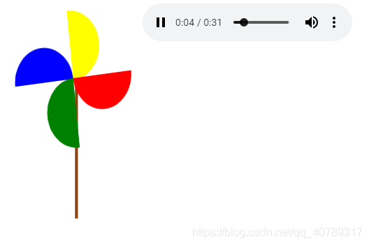
大风车转呀转
<!DOCTYPE html>
<html lang="en">
<head>
<meta charset="UTF-8">
<title>Title</title>
<style>
body{
display: flex;
}
.a{
width:100px;
height:50px;
background-color:yellow;
border-radius:50px 50px 0 0;
display: inline-block;
top: 50px;
left:10px;
position: absolute;
}
.b{
display: inline-block;
width: 50px;
height: 100px;
background-color: blue;
border-radius: 50px 0 0 50px;
position: absolute;
top: 100px;
left: 58px;
}
.c{
display: inline-block;
width:100px;
height:50px;
background-color:green;
border-radius:0 0 50px 50px;
position: absolute;
top: 100px;
left: 107px;
}
.d{
display: inline-block;
width: 50px;
height: 100px;
background-color: red;
border-radius: 0 50px 50px 0;
position: absolute;
top: 0px;
left: 107px;
}
.e{
width: 200px;
height: 200px;
display: block;
}
@keyframes move {
0% {
transform:rotate(360deg);
}
25%{
transform: rotate(270deg);
}
50%{
transform: rotate(180deg);
}
75%{
transform: rotate(90deg);
}
100%{
transform: rotate(0deg);
}
}
.e{
animation: move 2s linear;
animation-iteration-count: infinite;
}
.f{
background-color: saddlebrown;
width: 5px;
height: 200px;
position: absolute;
top: 108px;
left: 104px;
display: block;
z-index: -1;
}
@keyframes move1 {
0%{
left: 0px;
}
25%{
left: 341px;
transform: rotateY(90deg);
}
50%{
left: 683px;
transform: rotateY(180deg);
}
75%{
left: 1023px;
transform: rotateY(270deg);
}
100%{
left: 1366px;
transform: rotateY(360deg);
}
}
.g{
animation: move1 5s linear;
animation-iteration-count: infinite;
display: block;
}
.h{
justify-content: space-between;
flex: 0 0 auto;
}
</style>
</head>
<body>
<div class="g">
<div class="e">
<div class="a"></div>
<div class="b"></div>
<div class="c"></div>
<div class="d"></div>
</div>
<div class="f">
</div>
</div>
<audio src="1.mp3" controls autoplay class="h" loop>
</audio>
</body>
</html>