版权声明:本文纯属原创,未经同意请勿转载。 https://blog.csdn.net/beiluo77/article/details/88076787
CSS3学习笔记之3d菜单
在网页上要实现3d动画效果一般都要用到js代码,今天,我学习了用纯CSS3代码实现这个效果(学习了这个动效,感觉自己以前好像没学过CSS一样~)。
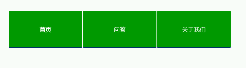
先上效果:
鼠标划过时的效果
上面用到的知识主要是:
perspective
transform-style: preserve-3d;
以下是代码:
<!DOCTYPE html>
<html>
<head>
<meta charset="UTF-8">
<title></title>
<style type="text/css">
.nav{
width: 980px;
margin: 50px auto;
}
.nav:after{
clear: both;
display: block;
overflow: hidden;
content: "";
}
.nav .item{
width: 200px;
height: 100px;
margin-right: 5px;
float: left;
perspective: 4000px;
}
.nav .item a{
display: block;
height: 100px;
text-decoration: none;
transition: all .5s;
transform-style: preserve-3d;
}
.nav .item a p{
height: 100px;
margin: 0;
line-height: 100px;
color: #fff;
text-align: center;
font-family: "microsoft yahei";
border-radius: 2px;
transition: all .5s;
}
.nav .item a p:first-child{
background-color: #090;
transform: translateZ(50px);
}
.nav .item a p:last-child{
background-color: #009;
transform: translateZ(50px) rotateX(-90deg);
margin-top: -50px;
}
.nav .item a:hover{
transform: rotateX(90deg);
}
.nav .item a:hover p:last-child{
margin-top: 0;
transform: translateZ(0) rotateX(-90deg);
}
</style>
</head>
<body>
<header class="nav">
<div class="item">
<a href="#">
<p>首页 </p>
<p>Home</p>
</a>
</div>
<div class="item">
<a href="#">
<p>问答</p>
<p>Q & A</p>
</a>
</div>
<div class="item">
<a href="#">
<p>关于我们</p>
<p>About us</p>
</a>
</div>
</header>
</body>
</html>
代码很简单,但是效果很炫!
另外还可以加入box-shadow,添加阴影,或者改变颜色…