补充:
一、伪元素选择器
a 什么是伪元素选择器?
伪元素选择器作用就是给指定标签的内容前面添加一个子元素或者给指定标签的内容后面添加一个子元素。
b 格式
标签名称::before{
属性名称:值;
}
标签名称::after{
属性名称:值;
}
例子:
<!DOCTYPE html>
<html>
<head lang="en">
<meta charset="UTF-8">
<title>伪元素选择器</title>
<style type="text/css">
*{
margin: 0;
padding: 0;
}
div{
width: 200px;
height: 200px;
background: red;
}
p{
width: 50px;
height: 50px;
background: pink;
}
</style>
</head>
<body>
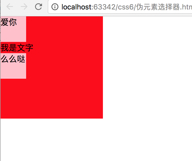
<div>
<p>爱你</p>
我是文字
<p>么么哒</p>
</div>
</body>
</html>
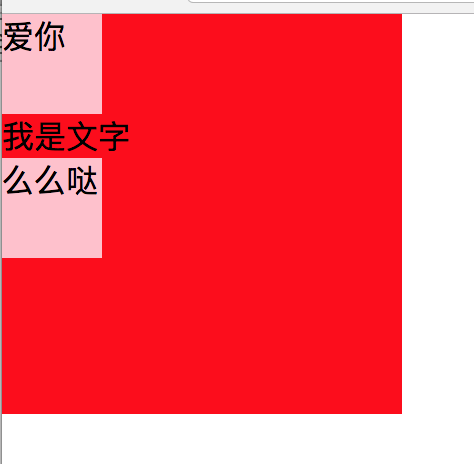
如何用伪元素选择器实现同样的效果呢?
<!DOCTYPE html>
<html>
<head lang="en">
    <meta charset="UTF-8">
    <title>伪元素选择器</title>
    <style type="text/css">
        *{
            margin: 0;
            padding: 0;
        }
        div{
            width: 200px;
            height: 200px;
            background: red;

        }
        div::before{
            /*指定添加的子元素中存储的内容*/
            content: "爱你";
            /*指定添加的子元素的宽度和高度*/
            width: 50px;
            height: 50px;
            /**/
            background: pink;
            /*指定添加的子元素的显示模式*/
            display: block;

        }

        div::after{
            content: "么么哒";
            width: 50px;
            height: 50px;
            background: pink;
            display: block;
            /*隐藏添加的子元素*/
            /*visibility: hidden;*/
        }

        /*p{*/
            /*width: 50px;*/
            /*height: 50px;*/
            /*background: pink;*/
        /*}*/

    </style>
</head>
<body>
    <div>
        <!--<p>爱你</p>-->
        我是文字
        <!--<p>么么哒</p>-->
    </div>
</body>
</html>
二、overflow:hidden;
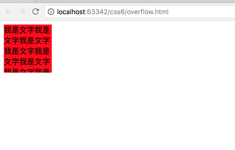
作用1:超出元素的内容部分隐藏
<!DOCTYPE html>
<html>
<head lang="en">
    <meta charset="UTF-8">
    <title>overflow:hidden</title>
    <style type="text/css">
        div{
            height: 100px;
            width: 100px;
            background: red;
            /*超出元素的部分隐藏*/
            overflow: hidden;
        }
    </style>

</head>
<body>
    <div>我是文字我是文字我是文字我是文字我是文字我是文字我是文字我是文字我是文
        字我是文字我是文字我是文字我是文字我是文字我是文字我是文字我是文字我是文字我是文字我是文字</div>
</body>
</html>
overflow:visible |
默认值。内容不会被修剪,会呈现在元素框之外。 |
overflow:hidden |
内容会被修剪,并且其余内容是不可见的。 |
overflow:scroll |
内容会被修剪,但是浏览器会显示滚动条以便查看其余的内容。 |
overflow:auto |
如果内容被修剪,则浏览器会显示滚动条以便查看其余的内容。 |
作用2:
嵌套关系下,解决外边距塌陷情况。(可以给外面盒子添加边框。或者给外面盒子使用overflow:hidden)
三 css初始化
腾讯:
body,ol,ul,h1,h2,h3,h4,h5,h6,p,th,td,dl,dd,form,fieldset,legend,input,textarea,select{margin:0;padding:0}
body{font:12px"宋体","Arial Narrow",HELVETICA;background:#fff;-webkit-text-size-adjust:100%;}
a{color:#2d374b;text-decoration:none}
a:hover{color:#cd0200;text-decoration:underline}
em{font-style:normal}
li{list-style:none}
img{border:0;vertical-align:middle}
table{border-collapse:collapse;border-spacing:0}
p{word-wrap:break-word}
新浪:
body,ul,ol,li,p,h1,h2,h3,h4,h5,h6,form,fieldset,table,td,img,div{margin:0;padding:0;border:0;}
body{background:#fff;color:#333;font-size:12px; margin-top:5px;font-family:"SimSun","宋体","Arial Narrow";}
ul,ol{list-style-type:none;}
select,input,img,select{vertical-align:middle;}
a{text-decoration:none;}
a:link{color:#009;}
a:visited{color:#800080;}
a:hover,a:active,a:focus{color:#c00;text-decoration:underline;}
淘宝:
body, h1, h2, h3, h4, h5, h6, hr, p, blockquote, dl, dt, dd, ul, ol, li, pre, form, fieldset, legend, button, input, textarea, th, td { margin:0; padding:0; }
body, button, input, select, textarea { font:12px/1.5tahoma, arial, \5b8b\4f53; }
h1, h2, h3, h4, h5, h6{ font-size:100%; }
address, cite, dfn, em, var { font-style:normal; }
code, kbd, pre, samp { font-family:couriernew, courier, monospace; }
small{ font-size:12px; }
ul, ol { list-style:none; }
a { text-decoration:none; }
a:hover { text-decoration:underline; }
sup { vertical-align:text-top; }
sub{ vertical-align:text-bottom; }
legend { color:#000; }
fieldset, img { border:0; }
button, input, select, textarea { font-size:100%; }
table { border-collapse:collapse; border-spacing:0; }
1. 网页布局方式
网页的布局方式其实就是浏览器是如何对网页中的元素进行排版的。
1.1 标准流(文档流/普通流)排版方式
☆ 浏览器的默认的排版方式就是标准流的排版方式
☆ 在css中将元素分为三类,分别是块级元素、行内元素、行内块级元素。
☆ 在标准流中有两种排版方式,一种是垂直排版,一种是水平排版。
垂直排版,如果元素是块级元素,那么就会垂直排版
水平排版,如果元素是行内元素、行内块级元素,那么就会水平排版。
1.2 浮动流排版方式
☆ 浮动流是一种“半脱离标准流”的排版方式
☆ 浮动流只有一种排版方式,就是水平排版,它只能设置某个元素左对齐或者右对齐
注意点:1 浮动流中没有居中对齐,也就是没有center这个取值。
2 在浮动流中是不可以使用 margin : 0 auto;
特点:
☆ 在浮动流中是不区分块级元素、行内元素、行内块级元素的。无论是什么元素都可以水平排版
☆ 在浮动流中无论什么元素都可以设置设置宽高。
1.3 定位流排版方式
2. 浮动布局
2.1 浮动的作用
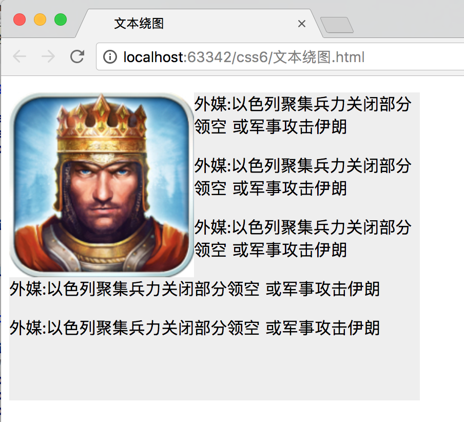
☆ 文本绕图
☆ 制作导航
☆ 网页布局
<!DOCTYPE html>
<html>
<head lang="en">
    <meta charset="UTF-8">
    <title>文本绕图</title>
    <style type="text/css">
        .box{
            width: 400px;
            height: 300px;
            background: #eeeeee;
        }
        .box img{
            float: left;
        }
    </style>
</head>
<body>
    <div class="box">

        <img src="image/1.jpg" alt=""/>
        <!--注意看效果:文本不存在重叠-->
        <p>外媒:以色列聚集兵力关闭部分领空 或军事攻击伊朗</p>
        <p>外媒:以色列聚集兵力关闭部分领空 或军事攻击伊朗</p>
        <p>外媒:以色列聚集兵力关闭部分领空 或军事攻击伊朗</p>
        <p>外媒:以色列聚集兵力关闭部分领空 或军事攻击伊朗</p>
        <p>外媒:以色列聚集兵力关闭部分领空 或军事攻击伊朗</p>

    </div>
</body>
</html>
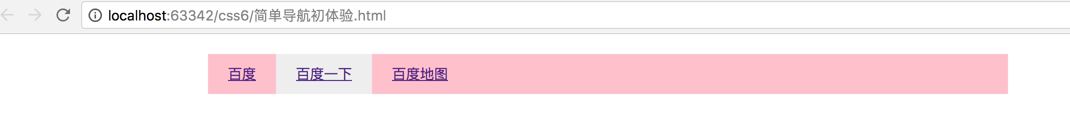
<!DOCTYPE html>
<html>
<head lang="en">
    <meta charset="UTF-8">
    <title>简单导航</title>
    <style type="text/css">
        body, div, dl, dt, dd, ul, ol, li, h1, h2, h3, h4, h5, h6, pre, code, form, textarea,
        select, optgroup, option, fieldset, legend, p, blockquote, th, td {
            margin: 0;
            padding: 0
        }
        ul li{
            list-style: none;
        }
        .nav{
            width: 800px;
            height: 40px;
            background: pink;
            margin: 20px auto;

        }
        .nav ul li{
            float: left;
        }

        .nav ul li a{
            display: inline-block;
            height: 40px;
            font: 14px/40px "微软雅黑";
            padding: 0px 20px;


        }
        .nav ul li a:hover{
            background: #eee;
        }
    </style>
</head>
<body>
    <div class="nav">
        <!--思路:将li左浮动。给a设置高度(要转成行内块)垂直居中-->
        <ul>
            <li><a href="#">百度</a></li>
            <li><a href="#">百度一下</a></li>
            <li><a href="#">百度地图</a></li>
        </ul>
    </div>

</body>
</html>
<!DOCTYPE html>
<html>
<head lang="en">
    <meta charset="UTF-8">
    <title>浮动练习</title>
    <style type="text/css">
        body, div, dl, dt, dd, ul, ol, li, h1, h2, h3, h4, h5, h6, pre, code, form, textarea,
        select, optgroup, option, fieldset, legend, p, blockquote, th, td {
            margin: 0;
            padding: 0
        }
        .header{
            height: 100px;
            width: 980px;
            /*background: red;*/
            margin: 0 auto;
        }
        .header .logo{
            width: 250px;
            height: 100px;
            background: pink;
            float: left;
        }
        /*注意language的位置,(要在父元素中展示全。贴靠现象)*/
        .header .language{
            width: 150px;
            height: 50px;
            background: skyblue;
            float: right;
        }
        .header .nav{
            width: 650px;
            height: 50px;
            background: purple;
            float: right;
        }
        .content{
            width: 980px;
            height: 400px;
            margin: 0 auto;
            /*background: green;*/
            margin-top: 10px;
        }
        .content .aside{
            width: 320px;
            height: 400px;
            background: yellow;
            float: left;
        }
        .content .article{
            width: 650px;
            height: 400px;
            /*background: pink;*/
            float: right;
        }
        .content .article .articleTop{
            width: 650px;
            height: 350px;
            /*background: blue;*/
        }
        .content .article .articleTop .articleTopLeft{
            width: 400px;
            height: 350px;
            /*background: red;*/
            float: left;
        }

        .content .article .articleTop .articleTopLeft .new1{
            width: 400px;
            height: 200px;
            background: deepskyblue;
        }

        .content .article .articleTop .articleTopLeft .new2{
            width: 400px;
            height:140px;
            background: tomato;
            margin-top: 10px;
        }

        .content .article .articleTop .articleTopRight{
            width: 240px;
            height: 350px;
            background: green;
            float: right;
        }


        .content .article .articleBottom{
            width: 650px;
            height: 40px;
            background: darkgoldenrod;
            margin-top: 10px;
        }

        .footer{
            width: 980px;
            height: 40px;
            background: tomato;
            margin:  0 auto;
            margin-top: 10px;
        }


    </style>
</head>
<body>

    <!--竖直方向标准流布局,水平方向浮动布局-->
    <div class="header">
        <div class="logo"></div>
        <div class="language"></div>
        <div class="nav"></div>
    </div>
    <div class="content">
       <div class="aside"></div>
        <div class="article">
            <div class="articleTop">
                <div class="articleTopLeft">
                    <div class="new1"></div>
                    <div class="new2"></div>
                </div>
                <div class="articleTopRight"></div>
            </div>
            <div class="articleBottom"></div>
        </div>
    </div>
    <div class="footer"></div>
</body>
</html>

浮动元素排序规则
1 相同方向上的浮动元素,先浮动的元素会显示在前面,后浮动的元素会显示在后面
2 不同方向上的浮动元素,左浮动会找左浮动,右浮动会找右浮动
3 浮动元素浮动之后的位置,由浮动元素浮动之前在标准流中的位置决定。
2.2 清除浮动方式
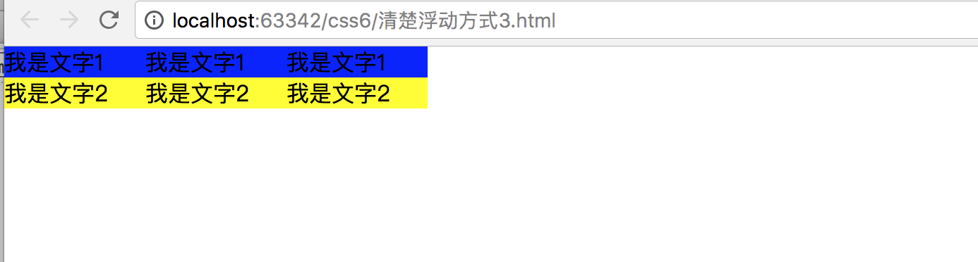
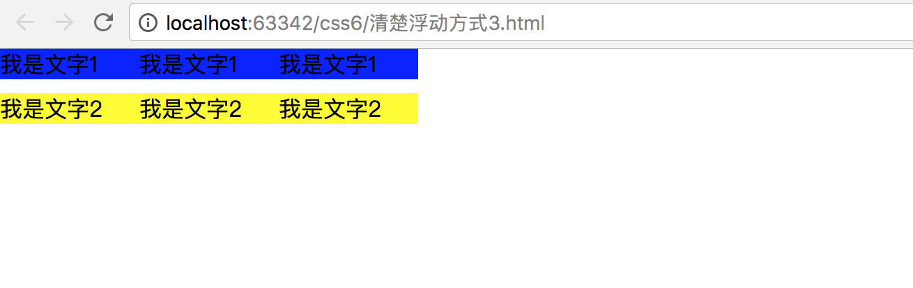
当父盒子没有定义高度,嵌套的盒子浮动之后,下边的元素发生位置错误。
清除浮动不是不用浮动,清除浮动产生的不利影响。
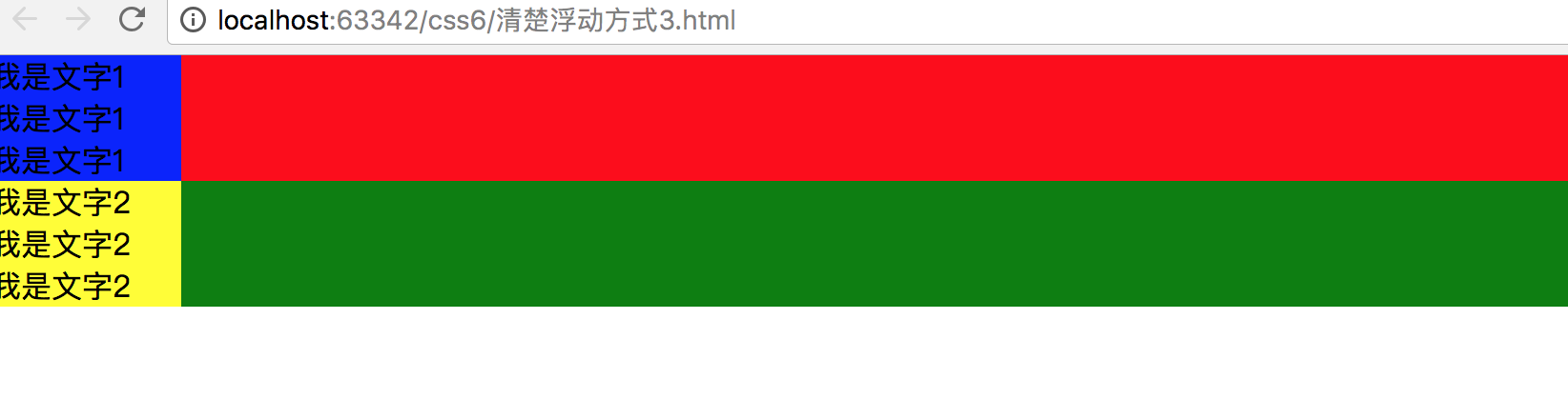
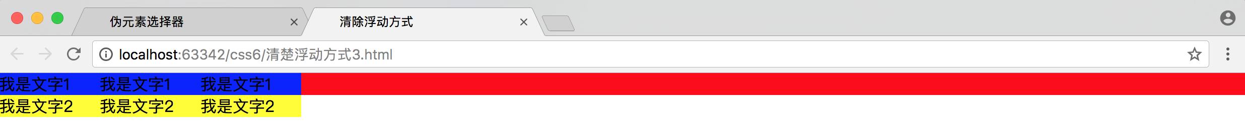
先来看一下例子不添加浮动的时候效果。
<!DOCTYPE html>
<html>
<head lang="en">
    <meta charset="UTF-8">
    <title>清除浮动方式</title>
    <style type="text/css">
        *{
            margin: 0;
            padding: 0;
        }
        .box1{
            background: red;
        }

        .box2{
            background: green;

        }
        .box1 p{
            width: 100px;
            background: blue;
        }

        .box2 p{
            width: 100px;
            background: yellow;
        }


    </style>
</head>
<body>

    <div class="box1">
        <p>我是文字1</p>
        <p>我是文字1</p>
        <p>我是文字1</p>

    </div>


    <div class="box2">

        <p>我是文字2</p>
        <p>我是文字2</p>
        <p>我是文字2</p>

    </div>
</body>
</html>
(1) 给后面的盒子添加clear属性
clear属性取值:none : 默认取值。按照浮动元素的排序规则来排序(左浮动找左浮动,右浮动找右浮动)
left:不要找前面的左浮动元素
right:不要找前面的右浮动元素
both: 不要找前面的左浮动元素和右浮动元素
注意点:当我们给某个元素添加clear属性之后,这个元素的margin属性就失效。
<!DOCTYPE html>
<html>
<head lang="en">
    <meta charset="UTF-8">
    <title>清除浮动方式</title>
    <style type="text/css">
        *{
            margin: 0;
            padding: 0;
        }
        .box1{
            background: red;
        }
        .box2{
            background: green;
            clear: both;
            /*margin-top: 10px;*/

        }
        .box1 p{
            width: 100px;
            background: blue;
        }

        .box2 p{
            width: 100px;
            background: yellow;
        }
        p{
            float: left;
        }

    </style>
</head>
<body>
<!--
1、清除浮动的第二种方式

给后面的盒子添加clear属性

clear属性取值:
none : 默认取值。按照浮动元素的排序规则来排序(左浮动找左浮动,右浮动找右浮动)
left:不要找前面的左浮动元素
right:不要找前面的右浮动元素
both: 不要找前面的左浮动元素和右浮动元素


-->
    <div class="box1">
        <p>我是文字1</p>
        <p>我是文字1</p>
        <p>我是文字1</p>

    </div>

    <div class="box2">
        <p>我是文字2</p>
        <p>我是文字2</p>
        <p>我是文字2</p>
    </div>
</body>
</html>

(2)隔墙法
在企业开发中不常用隔墙法来清除浮动。
a. 外墙法:在两个盒子中间添加一个额外的块级元素。给这个额外的块级元素设置clear:both; 属性
注意点:外墙法它可以让第二个盒子使用margin-top属性。但是不可以让第一个盒子使用margin-bottom属性
<!DOCTYPE html>
<html>
<head lang="en">
    <meta charset="UTF-8">
    <title>清除浮动方式</title>
    <style type="text/css">
        *{
            margin: 0;
            padding: 0;
        }
        .box1{
            background: red;
        }
        .wall{
            clear: both;
        }
        .box2{
            background: green;

        }
        .box1 p{
            width: 100px;
            background: blue;
        }

        .box2 p{
            width: 100px;
            background: yellow;
        }

        p{
            float: left;
        }

    </style>
</head>
<body>

    <div class="box1">
        <p>我是文字1</p>
        <p>我是文字1</p>
        <p>我是文字1</p>

    </div>

    <div class="wall"></div>

    <div class="box2">
        <p>我是文字2</p>
        <p>我是文字2</p>
        <p>我是文字2</p>
    </div>
</body>
</html>
效果图:
接下来如何让box1 和box 2 之间有10px间距。
方式一:设置box2的margin-top。但是由于注意点中提到不能设置第一个元素的margin-bottom,所以推荐下面的方式。
<!DOCTYPE html>
<html>
<head lang="en">
    <meta charset="UTF-8">
    <title>清除浮动方式</title>
    <style type="text/css">
        *{
            margin: 0;
            padding: 0;
        }
        .box1{
            background: red;
        }
        .wall{
            clear: both;
        }
        .box2{
            background: green;
            margin-top: 10px;

        }
        .box1 p{
            width: 100px;
            background: blue;
        }

        .box2 p{
            width: 100px;
            background: yellow;
        }

        p{
            float: left;
        }

    </style>
</head>
<body>

    <div class="box1">
        <p>我是文字1</p>
        <p>我是文字1</p>
        <p>我是文字1</p>

    </div>

    <div class="wall"></div>

    <div class="box2">
        <p>我是文字2</p>
        <p>我是文字2</p>
        <p>我是文字2</p>
    </div>
</body>
</html>
方式二 设置额外元素的height
<!DOCTYPE html>
<html>
<head lang="en">
    <meta charset="UTF-8">
    <title>清除浮动方式</title>
    <style type="text/css">
        *{
            margin: 0;
            padding: 0;
        }
        .box1{
            background: red;
        }
        .wall{
            clear: both;
        }
        .h10{
            height: 10px;
        }
        .box2{
            background: green;

        }
        .box1 p{
            width: 100px;
            background: blue;
        }

        .box2 p{
            width: 100px;
            background: yellow;
        }

        p{
            float: left;
        }

    </style>
</head>
<body>

    <div class="box1">
        <p>我是文字1</p>
        <p>我是文字1</p>
        <p>我是文字1</p>

    </div>

    <div class="wall h10"></div>

    <div class="box2">
        <p>我是文字2</p>
        <p>我是文字2</p>
        <p>我是文字2</p>
    </div>
</body>
</html>

b. 内墙法
<!DOCTYPE html>
<html>
<head lang="en">
    <meta charset="UTF-8">
    <title>清除浮动方式</title>
    <style type="text/css">
        *{
            margin: 0;
            padding: 0;
        }
        .box1{
            background: red;
        }
        .wall{
            clear: both;
        }
        .h10{
           height: 10px;
           background:deepskyblue ;
        }
        .box2{
            background: green;

        }
        .box1 p{
            width: 100px;
            background: blue;
        }

        .box2 p{
            width: 100px;
            background: yellow;
        }
        p{
            float: left;
        }


    </style>
</head>
<body>

    <div class="box1">
        <p>我是文字1</p>
        <p>我是文字1</p>
        <p>我是文字1</p>
        <div class="wall h10"></div>
    </div>


    <div class="box2">

        <p>我是文字2</p>
        <p>我是文字2</p>
        <p>我是文字2</p>

    </div>
</body>
</html>

box1红色背景颜色可以看出,内墙法会撑起盒子的高度。外墙法不会。
(3)利用伪元素选择器
主要要兼容IE6
<!DOCTYPE html>
<html>
<head lang="en">
    <meta charset="UTF-8">
    <title>清除浮动方式</title>
    <style type="text/css">
        *{
            margin: 0;
            padding: 0;
        }
        .box1{
            background: red;
        }
        .box2{
            background: green;

        }
        .box1 p{
            width: 100px;
            background: blue;
        }

        .box2 p{
            width: 100px;
            background: yellow;
        }
        p{
            float: left;
        }
        .box1::after{
            /*设置添加的子元素的内容为空*/
            content: "";
            /*设置添加的子元素为块级元素*/
            display: block;
            /*设置添加的子元素的高度为0*/
            height: 0px;
            /*给添加的子元素设置clear:both*/
            clear: both;
            /*设置添加的子元素看不见*/
            visibility: hidden;

        }
        .box1{
            /*兼容IE6*/
            *zoom: 1;
        }

    </style>
</head>
<body>

    <div class="box1">
        <p>我是文字1</p>
        <p>我是文字1</p>
        <p>我是文字1</p>


    </div>


    <div class="box2">

        <p>我是文字2</p>
        <p>我是文字2</p>
        <p>我是文字2</p>

    </div>
</body>
</html>
(4)overflow:hidden
<!DOCTYPE html>
<html>
<head lang="en">
    <meta charset="UTF-8">
    <title>清除浮动方式</title>
    <style type="text/css">
        *{
            margin: 0;
            padding: 0;
        }
        .box1{
            background: red;
            overflow: hidden;
        }
        .box2{
            background: green;

        }
        .box1 p{
            width: 100px;
            background: blue;

        }

        .box2 p{
            width: 100px;
            background: yellow;
        }
        p{
            float: left;
        }


    </style>
</head>
<body>

<div class="box1">
    <p>我是文字1</p>
    <p>我是文字1</p>
    <p>我是文字1</p>


</div>


<div class="box2">

    <p>我是文字2</p>
    <p>我是文字2</p>
    <p>我是文字2</p>

</div>
</body>
</html>
可以用margin属性来设置间距。box1的bottom,box2的top。