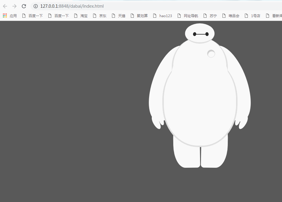
HTML部分:
<body>

        <div id="baymax">

        <!-- 定义头部,包括两个眼睛、嘴 -->
        <div id="head">
            <div id="eye"></div>
            <div id="eye2"></div>
            <div id="mouth"></div>
        </div>

        <!-- 定义躯干,包括心脏 -->
        <div id="torso">
            <div id="heart"></div>
        </div>

        <!-- 定义肚子腹部,包括 cover(和躯干的连接处) -->
        <div id="belly">
            <div id="cover"></div>
        </div>

        <!-- 定义左臂,包括一大一小两个手指 -->
        <div id="left-arm">
            <div id="l-bigfinger"></div>
            <div id="l-smallfinger"></div>
        </div>

        <!-- 定义右臂,同样包括一大一小两个手指 -->
        <div id="right-arm">
            <div id="r-bigfinger"></div>
            <div id="r-smallfinger"></div>
        </div>

        <!-- 定义左腿 -->
        <div id="left-leg"></div>

        <!-- 定义右腿 -->
        <div id="right-leg"></div>

    </div>


    </body>
css样式:
  1     <style>
  2 body {
  3     background: #595959;
  4 }
  5
  6 #baymax {
  7
  8     /*设置为 居中*/
  9     margin: 0 auto;
 10
 11     /*高度*/
 12     height: 600px;
 13
 14     /*隐藏溢出*/
 15     overflow: hidden;
 16 }
 17
 18 #head {
 19     height: 64px;
 20     width: 100px;
 21
 22     /*以百分比定义圆角的形状*/
 23     border-radius: 50%;
 24
 25     /*背景*/
 26     background: #fff;
 27     margin: 0 auto;
 28     margin-bottom: -20px;
 29
 30     /*设置下边框的样式*/
 31     border-bottom: 5px solid #e0e0e0;
 32
 33     /*属性设置元素的堆叠顺序;
 34     拥有更高堆叠顺序的元素总是会处于堆叠顺序较低的元素的前面*/
 35     z-index: 100;
 36
 37     /*生成相对定位的元素*/
 38     position: relative;
 39 }
 40
 41 #eye,
 42 #eye2 {
 43     width: 11px;
 44     height: 13px;
 45     background: #282828;
 46     border-radius: 50%;
 47     position: relative;
 48     top: 30px;
 49     left: 27px;
 50
 51     /*旋转该元素*/
 52     transform: rotate(8deg);
 53 /*眼睛的动画*/
 54     animation:myfirst 5s;
 55     -moz-animation:myfirst 5s; /* Firefox */
 56     -webkit-animation:myfirst 5s; /* Safari and Chrome */
 57      -o-animation:myfirst 5s; /* Opera */
 58       animation-iteration-count:infinite;/*动画无限的循环*/
 59
 60 }
 61
 62 #eye2 {
 63
 64     /*使其旋转对称*/
 65     transform: rotate(-8deg);
 66     left: 69px;
 67     top: 17px;
 68
 69     animation:myfirst 5s;
 70    -moz-animation:myfirst 5s; /* Firefox */
 71    -webkit-animation:myfirst 5s; /* Safari and Chrome */
 72     -o-animation:myfirst 5s; /* Opera */
 73     animation-iteration-count:infinite;
 74
 75 }
 76 @keyframes myfirst
 77 {
 78 from {background:black;}
 79 to {background:white;}
 80 }
 81
 82 @-moz-keyframes myfirst /* Firefox */
 83 {
 84 from {background:black;}
 85 to {background:white;}
 86 }
 87
 88 @-webkit-keyframes myfirst /* Safari and Chrome */
 89 {
 90 from {background:black;}
 91 to {background:white;}
 92 }
 93
 94 @-o-keyframes myfirst /* Opera */
 95 {
 96 from {background:black;}
 97 to {background:white;}
 98 }
 99
100 #mouth {
101     width: 38px;
102     height: 1.5px;
103     background: #282828;
104     position: relative;
105     left: 34px;
106     top: 10px;
107 }
108
109 #torso,
110 #belly {
111     margin: 0 auto;
112     height: 200px;
113     width: 180px;
114     background: #fff;
115     border-radius: 47%;
116
117     /*设置边框*/
118     border: 5px solid #e0e0e0;
119     border-top: none;
120     z-index: 1;
121 }
122
123 #belly {
124     height: 300px;
125     width: 245px;
126     margin-top: -140px;
127     z-index: 5;
128 }
129
130 #cover {
131     width: 190px;
132     background: #fff;
133     height: 150px;
134     margin: 0 auto;
135     position: relative;
136     top: -20px;
137     border-radius: 50%;
138 }
139
140 #heart{
141   width:25px;
142   height:25px;
143   border-radius:50%;
144   position:relative;
145
146   /*向边框四周添加阴影效果*/
147   box-shadow:2px 5px 2px #ccc inset;
148
149   right:-115px;
150   top:40px;
151   z-index:111;
152   border:1px solid #ccc;
153 }
154
155 #left-arm,
156 #right-arm {
157     height: 270px;
158     width: 120px;
159     border-radius: 50%;
160     background: #fff;
161     margin: 0 auto;
162     position: relative;
163     top: -350px;
164     left: -100px;
165     transform: rotate(20deg);
166     z-index: -1;
167 }
168
169 #right-arm {
170     transform: rotate(-20deg);
171     left: 100px;
172     top: -620px;
173 }
174
175
176 #l-bigfinger,
177 #r-bigfinger {
178     height: 50px;
179     width: 20px;
180     border-radius: 50%;
181     background: #fff;
182     position: relative;
183     top: 250px;
184     left: 50px;
185     transform: rotate(-50deg);
186 }
187
188 #r-bigfinger {
189     left: 50px;
190     transform: rotate(50deg);
191 }
192
193 #l-smallfinger,
194 #r-smallfinger {
195     height: 35px;
196     width: 15px;
197     border-radius: 50%;
198     background: #fff;
199     position: relative;
200     top: 195px;
201     left: 66px;
202     transform: rotate(-40deg);
203 }
204
205 #r-smallfinger {
206     background: #fff;
207     transform: rotate(40deg);
208     top: 195px;
209     left: 37px;
210 }
211
212 #left-leg,
213 #right-leg {
214     height: 170px;
215     width: 90px;
216     border-radius: 40% 30% 10px 45%;
217     background: #fff;
218     position: relative;
219     top: -640px;
220     left: -45px;
221     transform: rotate(-1deg);
222     z-index: -2;
223     margin: 0 auto;
224 }
225
226 #right-leg {
227     background: #fff;
228     border-radius:30% 40% 45% 10px;
229     margin: 0 auto;
230     top: -810px;
231     left: 50px;
232     transform: rotate(1deg);
233 }
234
235 </style>