版权声明:本文为博主原创文章,未经博主允许不得转载。 https://blog.csdn.net/qq_43679030/article/details/86481986
matplotlib是python中的一个数据可视化库,可以做出很多数据统计图,下面来说一说matplotlib的一些基本使用。
1.首先引入和数据分析有关的库。
import pandas as pd
import matplotlib.pyplot as plt
import numpy as np
2.然后使用pandas读入数据。
3.fig = plt.figure(figsize=(m,n)):规定一个长为m,宽为n的画图区域。
4.plt.xlabel(""):规定横轴名称。
5.plt.ylabel(""):规定纵轴名称。
6.plt.title(""):规定图像名称。
7.plt.xticks(rotation=k):将x轴的各标签旋转k度。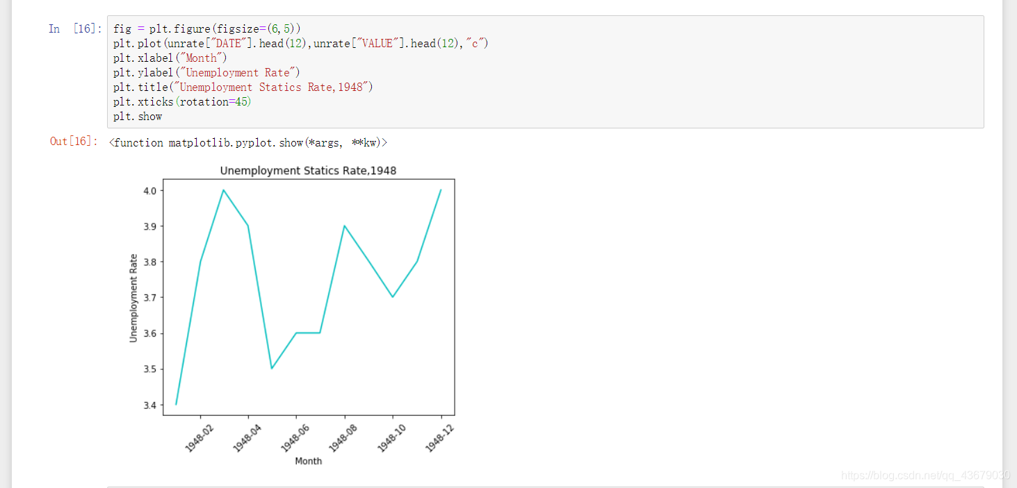
8.plt.legend(loc="best):添加图例,loc为图例的位置,传入best系统会自动寻找最佳的图例位置。下图为绘制五条折线。
fig = plt.figure(figsize=(10,7))	#规定绘图区域大小
color = ["green","cyan","yellow","red","black"]	#指定五条折线的颜色
plt.xlabel("Month")
plt.ylabel("Unemployment Rate")
plt.title("Unemployment Statics Trend,1948")
for i in range(5):
    x = i*12
    y = (i+1)*12
    subset = unrate[x:y]
    label = str(1948+i)
    plt.plot(subset["MONTH"],subset["VALUE"],c=color[i],label=label)
plt.legend(loc="best")	#添加图例到最佳显示位置
plt.show()

9.fig.add_subplot():添加子图绘制区域。
fig = plt.figure(figsize=(10,8))
ax1 = fig.add_subplot(2,2,1)	#指定子图位置
ax2 = fig.add_subplot(2,2,2)
ax3 = fig.add_subplot(2,2,3)
ax4 = fig.add_subplot(2,2,4)
plt.show()

10.ax.set_xticks():指定x轴绘图坐标。
11.ax.set_xticklabels():指定x轴每个标签的名字。
12.ax.set_xlabel()、ax.set_ylabel()、ax.set_title():分别指定x轴,y轴,图像名称。
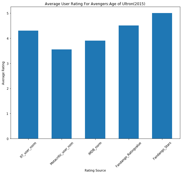
num_cols = ['RT_user_norm', 'Metacritic_user_nom', 'IMDB_norm', 'Fandango_Ratingvalue', 'Fandango_Stars']
bar_heights = norm_reviews.loc[0,num_cols].values
print(bar_heights)
bar_positions = np.arange(5)
print(bar_positions)
tick_positions = range(0,5)
fig,ax = plt.subplots(figsize=(10,8))	#用ax画图,fig控制区域
plt.bar(bar_positions,bar_heights,0.6)	#0.6表示所画条形图每个图形的宽度
ax.set_xticks(tick_positions)
ax.set_xticklabels(num_cols,rotation=45)
ax.set_xlabel("Rating Source")
ax.set_ylabel("Average Rating")
ax.set_title("Average User Rating For Avengers:Age of Ultron(2015)")
plt.show()
13.如果要让条形图横着画,只需将绘制条形图的命令plt.bar()改为plt.barh(),如果有需要再重新指定一下自己所需的横纵坐标即可。
14.plt.scatter():绘制散点图。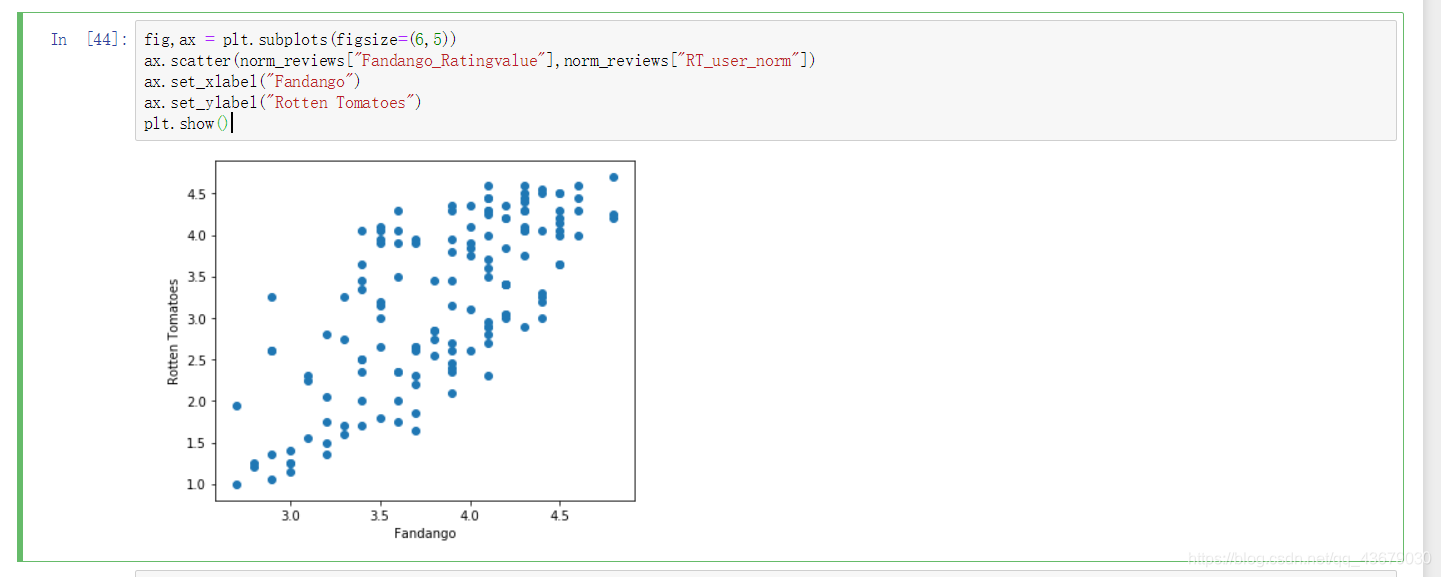
15.plt.hist(x,bins=k,range=(m,n)):绘制直方图,bins指定绘制出数据的条数,range()指定直方图横坐标的取值范围。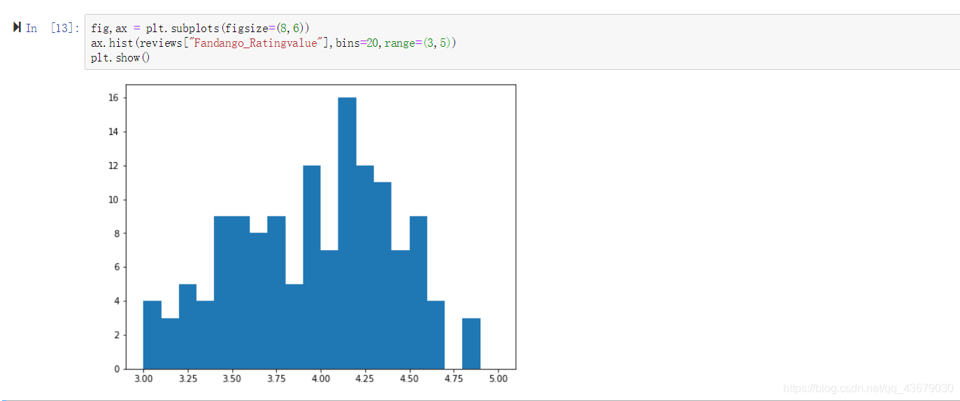
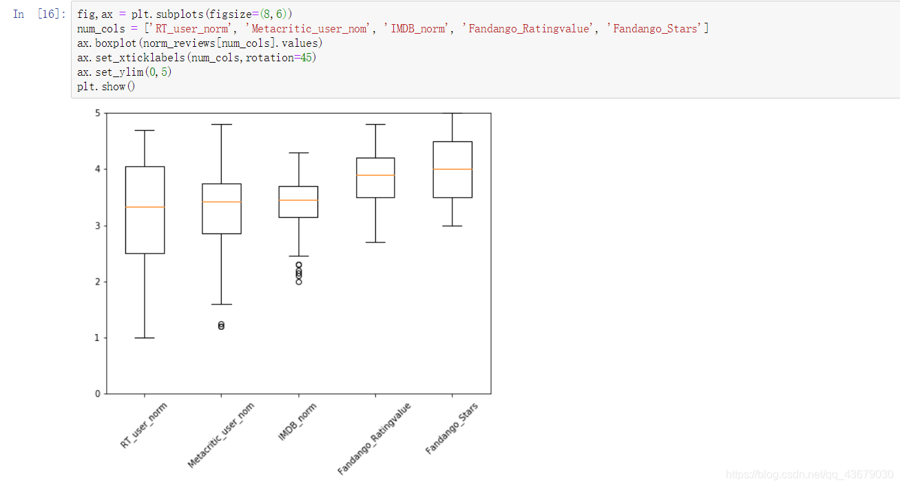
16.ax.boxplot():绘制盒形图,盒形图可以直观的观察出数据的离群点,也就是不符合规范的数据,具体到seaborn库时会讲。