本文将介绍 Python 的绘图库 Matplotlib, 它可与 NumPy 一起使用,提供了一种有效的 MatLab 开源替代方案。
目录
1.1 使用matplotlib.pyplot中的title()函数设置图像标题
1.2 使用matplotlib.pyplot中的annotate()函数标注文字
1.3 使用matplotlib.pyplot中的text()函数设置文字说明
1.4 使用matplotlib.pyplot中的legend()函数和plot中的label参数一起作用添加图例
1.5 使用matplotlib.pyplot中的axis()函数指定坐标范围
1.6 使用matplotlib.pyplot中的grid()函数添加网格
1.7 使用matplotlib.pyplot中的spines()函数移动脊柱

7.1 用matplotlib.pyplot.subplot()函数绘制多个子图
7.2 用matplotlib.pyplot.subplot2grid函数绘制多个子图
7.3 用matplotlib.gridspec函数绘制多个子图
7.4 用matplotlib.pyplot.subplots()函数绘制多个子图
1 matplotlib——文本说明
1.1 使用matplotlib.pyplot中的title()函数设置图像标题
import matplotlib.pyplot as plt

x = [1, 2, 3, 4, 5]
y = [3, 6, 7, 9, 2]

fig, ax = plt.subplots(1, 1)
ax.plot(x, y, label='trend')
ax.set_title('title test', fontsize=12, color='r', bbox={'facecolor': 'red', 'alpha': 0.5, 'pad': 10})
plt.show()

1.2 使用matplotlib.pyplot中的annotate()函数标注文字
import matplotlib.pyplot as plt
import numpy as np
x = np.arange(0, 6)
y = x * x
plt.plot(x, y, marker='o')
for xy in zip(x, y):
    plt.annotate("(%s,%s)" % xy, xy=xy, xytext=(-20, 10), textcoords='offset points')
plt.show() 
1.3 使用matplotlib.pyplot中的text()函数设置文字说明
import matplotlib.pyplot as plt
fig = plt.figure()
plt.axis([0, 10, 0, 10])  #设置x,y轴坐标范围都为0到10
t = "This is a really long string that I'd rather have wrapped so that it doesn't go outside of the figure, but if it's long enough it will go off the top or bottom!"
plt.text(4, 1, t, ha='left', rotation=15, wrap=True)  #ha为水平对齐方式,rotation为逆时针旋转角度,wrap:是否在图中显示文字说明
plt.text(6, 5, t, ha='left', rotation=15, wrap=True)
plt.text(5, 5, t, ha='right', rotation=-15, wrap=True)
plt.text(5, 10, t, fontsize=18, style='oblique', ha='center',va='top',wrap=True)
plt.text(3, 4, t, family='serif', style='italic', ha='right', wrap=True)
plt.text(-1, 0, t, ha='left', rotation=-15, wrap=True)
plt.show()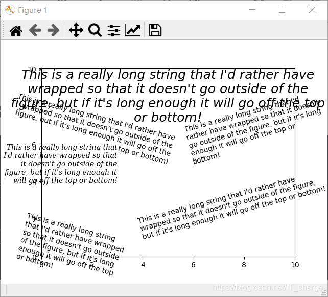
1.4 使用matplotlib.pyplot中的legend()函数和plot中的label参数一起作用添加图例
import matplotlib.pyplot as plt
plt.plot([1,2,3], [1,2,3], 'go-', label='line 1', linewidth=2)
plt.plot([1,2,3], [1,4,9], 'rs',  label='line 2')
plt.legend(loc='best')
plt.show()
1.5 使用matplotlib.pyplot中的axis()函数指定坐标范围
import matplotlib.pyplot as plt
plt.plot([1,2,3], [1,2,3], 'go-', label='line 1', linewidth=2)
plt.plot([1,2,3], [1,4,9], 'rs',  label='line 2')
plt.axis([0, 4, 0, 10])
plt.legend()
plt.show() 
使用 xlabel() 和 ylabel() 函数为图添加 x,y 坐标轴说明。
import matplotlib.pyplot as plt
plt.plot([1,2,3], [1,2,3], 'go-', label='line 1', linewidth=2)
plt.plot([1,2,3], [1,4,9], 'rs',  label='line 2')
plt.axis([0, 4, 0, 10])
plt.xlabel('data x')
plt.ylabel('target y')
plt.title('test plot')
plt.legend()
plt.show() 
1.6 使用matplotlib.pyplot中的grid()函数添加网格
import matplotlib.pyplot as plt
plt.grid()
plt.legend(['3','4','5'], loc='upper right')
plt.show() 
1.7 使用matplotlib.pyplot中的spines()函数移动脊柱
import matplotlib.pyplot as plt

fig = plt.figure()
ax1 = fig.gca()
ax1.spines['right'].set_color('none')
ax1.spines['top'].set_color('none')
ax1.xaxis.set_ticks_position('bottom')
ax1.spines['bottom'].set_position(('data', 0))
ax1.yaxis.set_ticks_position('left')
ax1.spines['left'].set_position(('data', 0))

ax1.set_xlim([-3, 3])
ax1.set_ylim([-3, 3])
plt.show()
1.8 绘制综合图
import matplotlib.pyplot as plt
fig=plt.figure() #创建一张图
fig.suptitle('bold figure suptitle',fontsize=14,fontweight='bold') #为总图设置标题

ax=fig.add_subplot(111) #创建一个子图
fig.subplots_adjust(top=0.85) #调整图高度
ax.set_title('axes title') #设置子图标题

ax.set_xlabel('xlabel') #设置子图x轴标签
ax.set_ylabel('ylabel') #设置子图y轴标签

ax.text(3,8,'boxed italics text in data coords',style='italic',
        bbox={'facecolor':'red','alpha':0.5,'pad':10}) #设置子图文字标注
ax.text(2,6,r'an equation: $E=mc^2$',fontsize=15)
ax.text(0.95,0.01,'colored text in baxes coords',verticalalignment='bottom',
        horizontalalignment='right',transform=ax.transAxes,color='green',fontsize=15)

ax.plot([2],[1],'o') #为子图画(2,1)这个点的图,图形状为点状
ax.annotate('annotate',xy=(2,1),xytext=(3,4),arrowprops=dict(facecolor='yellow',shrink=0.05)) #为(2,1)点添加注释
ax.axis([0,10,0,10]) #为x,y轴设置坐标范围
plt.show() 
1.9 绘制正弦余弦函数曲线
import numpy as np
import matplotlib.pyplot as plt

# 使用np中的linspace函数,创建一个值在负π到π之间,大小为256的一维数组x,并使用np的sin和cos函数对x取正弦余弦值并分别赋给C,S
x=np.linspace(-np.pi,np.pi,256,endpoint=True)
C,S=np.sin(x),np.cos(x)

# 使用plt.plot()函数分别传入参数x,C绘制正弦图,传入参数x,S绘制正余弦图,使用plt.show()函数显示图像
plt.plot(x,C)
plt.plot(x,S)
plt.show()
1.9.1 设置在线上标记的特殊符号
通过调整 plt.plot() 的默认参数 color、linewidth、linestyle、marker 对线条的颜色,宽度,样式、在线上标记的特殊符号进行设置。
import numpy as np
import matplotlib.pyplot as plt
x=np.linspace(-np.pi,np.pi,256,endpoint=True)
C,S=np.sin(x),np.cos(x)
plt.plot(x,C,color='red',linewidth=2.5,linestyle='-',marker='.')
plt.plot(x,S,color='blue',linewidth=2.5,linestyle='-',marker='x')
plt.show() 
1.9.2 设置x,y轴刻度标签
使用 plt.axis() 调整坐标范围,使用 plt.xlim() 和 plt.ylim() 调整 x,y 轴范围,使用 plt.xticks,plt.yticks 设置 x,y 轴刻度标签。
import numpy as np
import matplotlib.pyplot as plt
x=np.linspace(-np.pi,np.pi,256,endpoint=True)
C,S=np.sin(x),np.cos(x)
plt.plot(x,C,color='red',linewidth=2.5,linestyle='-')
plt.plot(x,S,color='blue',linewidth=2.5,linestyle='-')
plt.axis([-4,4,-1.3,1.3])
plt.xlim(x.min()*1.1,x.max()*1.1)
plt.ylim(C.min()*1.1,C.max()*1.1)
plt.xticks([-np.pi,-np.pi/2,0,np.pi/2,np.pi],[r'$-\pi$',r'$-\pi/2$',r'$0$',r'$+\pi/2$',r'$+\pi$'])
plt.yticks([-1,0,1],[r'$-1$',r'$0$',r'$+1$'])
plt.show()
1.9.3 设置标签的位置和字体
通过在 plt.plot() 函数中设置 label 标签,为绘制的正弦余弦图分别添加 sin(t)、cos(t) 图例,并使用 plt.legend() 函数设置标签的位置和字体。
import numpy as np
import matplotlib.pyplot as plt
x=np.linspace(-np.pi,np.pi,256,endpoint=True)
C,S=np.sin(x),np.cos(x)
plt.plot(x,C,color='red',linewidth=2.5,linestyle='-',label=r'$sin(t)$')
plt.plot(x,S,color='blue',linewidth=2.5,linestyle='-',label=r'$cos(t)$')
plt.legend(loc='upper left',frameon=False)
plt.axis([-4,4,-1.3,1.3])
plt.xlim(x.min()*1.1,x.max()*1.1)
plt.ylim(C.min()*1.1,C.max()*1.1)
plt.xticks([-np.pi,-np.pi/2,0,np.pi/2,np.pi],[r'$-\pi$',r'$-\pi/2$',r'$0$',r'$+\pi/2$',r'$+\pi$'])
plt.yticks([-1,0,1],[r'$-1$',r'$0$',r'$+1$'])
plt.show()
1.9.4 为X轴或Y轴分别添加“X”、“Y”标签
通过 plt.xlabe l函数和 plt.ylabel 函数为 X 轴或 Y 轴分别添加 “X”、“Y” 标签。
import numpy as np
import matplotlib.pyplot as plt
x=np.linspace(-np.pi,np.pi,256,endpoint=True)
C,S=np.sin(x),np.cos(x)
plt.plot(x,C,color='red',linewidth=2.5,linestyle='-',label=r'$sin(t)$')
plt.plot(x,S,color='blue',linewidth=2.5,linestyle='-',label=r'$cos(t)$')
plt.legend(loc='upper left',frameon=False)
plt.axis([-4,4,-1.3,1.3])
plt.xlim(x.min()*1.1,x.max()*1.1)
plt.ylim(C.min()*1.1,C.max()*1.1)
plt.xticks([-np.pi,-np.pi/2,0,np.pi/2,np.pi],[r'$-\pi$',r'$-\pi/2$',r'$0$',r'$+\pi/2$',r'$+\pi$'])
plt.yticks([-1,0,1],[r'$-1$',r'$0$',r'$+1$'])
plt.xlabel("X")
plt.ylabel("Y")
plt.show()
1.9.5 为图添加标题
通过 plt.title() 函数为正弦余弦图添加 “ The sine and cosine on the same graph” 标题。
import numpy as np
import matplotlib.pyplot as plt
x=np.linspace(-np.pi,np.pi,256,endpoint=True)
C,S=np.sin(x),np.cos(x)
plt.plot(x,C,color='red',linewidth=2.5,linestyle='-',label=r'$sin(t)$')
plt.plot(x,S,color='blue',linewidth=2.5,linestyle='-',label=r'$cos(t)$')
plt.legend(loc='upper left',frameon=False)
plt.axis([-4,4,-1.3,1.3])
plt.xlim(x.min()*1.1,x.max()*1.1)
plt.ylim(C.min()*1.1,C.max()*1.1)
plt.xticks([-np.pi,-np.pi/2,0,np.pi/2,np.pi],[r'$-\pi$',r'$-\pi/2$',r'$0$',r'$+\pi/2$',r'$+\pi$'])
plt.yticks([-1,0,1],[r'$-1$',r'$0$',r'$+1$'])
plt.xlabel("X")
plt.ylabel("Y")
plt.title("The sine and cosine on the same gragh.")
plt.show()
1.9.6 Spines为图移动坐标轴位置
使用 plt.gca() 函数获取当前轴 ax,然后使用 ax 的 spines 中 set_color 设置颜色(无)使得右上两边的轴线为透明色。 进而我们移动下面和左边的线到坐标 0。
import numpy as np
import matplotlib.pyplot as plt

x = np.linspace(-np.pi, np.pi, 256, endpoint=True)
C, S = np.sin(x), np.cos(x)

ax = plt.gca()
ax.spines['right'].set_color('none')  # set_color设置右边轴线为透明色
ax.spines['top'].set_color('none')  # set_color设置上边轴线为透明色
ax.xaxis.set_ticks_position('bottom')  # 移动下边边框线,相当于移动x轴
ax.spines['bottom'].set_position(
    ('data', 0))  # set_position设置轴位置:'center' -> ('axes',0.5);'zero' -> ('data', 0.0;('data',anyvalue)
ax.yaxis.set_ticks_position('left')  # 移动左边边框线,相当于移动y轴
ax.spines['left'].set_position(('data', 0))
plt.plot(x, C, color='red', linewidth=2.5, linestyle='-', label=r'$sin(t)$')
plt.plot(x, S, color='blue', linewidth=2.5, linestyle='-', label=r'$cos(t)$')
plt.legend(loc='upper left', frameon=False)
plt.axis([-4, 4, -1.3, 1.3])
plt.xlim(x.min() * 1.1, x.max() * 1.1)
plt.ylim(C.min() * 1.1, C.max() * 1.1)
plt.xticks([-np.pi, -np.pi / 2, 0, np.pi / 2, np.pi], [r'$-\pi$', r'$-\pi/2$', r'$0$', r'$+\pi/2$', r'$+\pi$'])
plt.yticks([-1, 0, 1], [r'$-1$', r'$0$', r'$+1$'])
plt.xlabel("X")
plt.ylabel("Y")
plt.title("The sine and cosine on the same gragh.")
plt.show() 
1.9.7 Spines为图移动坐标轴位置
使用 plt.annotate 函数为 2*π/3 对应的正弦余弦表示出来,并使用 savefig() 方法保存图片。
import numpy as np
import matplotlib.pyplot as plt
x=np.linspace(-np.pi,np.pi,256,endpoint=True)
C,S=np.sin(x),np.cos(x)
ax=plt.gca()
ax.spines['right'].set_color('none')   #set_color设置右边轴线为透明色
ax.spines['top'].set_color('none')     #set_color设置上边轴线为透明色
ax.xaxis.set_ticks_position('bottom')  #移动下边边框线,相当于移动x轴
ax.spines['bottom'].set_position(('data',0)) #set_position设置轴位置:'center' -> ('axes',0.5);'zero' -> ('data', 0.0;('data',anyvalue)
ax.yaxis.set_ticks_position('left')      #移动左边边框线,相当于移动y轴
ax.spines['left'].set_position(('data',0))
plt.plot(x,C,color='red',linewidth=2.5,linestyle='-',label=r'$sin(t)$')
plt.plot(x,S,color='blue',linewidth=2.5,linestyle='-',label=r'$cos(t)$')
plt.legend(loc='upper left',frameon=False)
plt.axis([-4,4,-1.3,1.3])
plt.xlim(x.min()*1.1,x.max()*1.1)
plt.ylim(C.min()*1.1,C.max()*1.1)
plt.xticks([-np.pi,-np.pi/2,0,np.pi/2,np.pi],[r'$-\pi$',r'$-\pi/2$',r'$0$',r'$+\pi/2$',r'$+\pi$'])
plt.yticks([-1,0,1],[r'$-1$',r'$0$',r'$+1$'])
plt.title("The sine and cosine on the same gragh.")
t=2*np.pi/3
plt.plot([t,t],[0,np.sin(t)],linewidth=1.5,linestyle='--',color='red')
plt.scatter([t,],[np.sin(t),],50,color='red')
plt.annotate(r'$\sin(\frac{2\pi}{3})=\frac{\sqrt{3}}{2}$',xy=(t,np.sin(t)),xycoords='data',xytext=(+20,+20),textcoords='offset points',fontsize=16,arrowprops=dict(arrowstyle='->',connectionstyle='arc3,rad=.2'))
plt.plot([t,t],[0,np.cos(t)],color='blue',linewidth=1.5,linestyle='--')
plt.scatter([t,],[np.cos(t),],50,color='blue')
plt.annotate(r'$\cos(\frac{2\pi}{3})=-\frac{1}{2}$',xy=[t,np.cos(t)],xycoords='data',xytext=[-90,-50],textcoords='offset points',fontsize=16,arrowprops=dict(arrowstyle='->',connectionstyle='arc3,rad=.2'))
plt.savefig('test',dpi=600)#plt.savefig()将输出图形存储为文件,默认为png格式,可以通过dpi修改像素
plt.show() 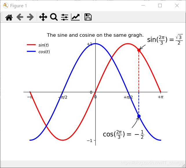
1.9.8 显示被曲线挡住的部分
添加一个白色的半透明底色,把坐标轴上的记号标签被曲线挡住的部分显示出来。
import numpy as np
import matplotlib.pyplot as plt

x = np.linspace(-np.pi, np.pi, 256, endpoint=True)
C, S = np.sin(x), np.cos(x)
ax = plt.gca()
ax.spines['right'].set_color('none')  # set_color设置右边轴线为透明色
ax.spines['top'].set_color('none')  # set_color设置上边轴线为透明色
ax.xaxis.set_ticks_position('bottom')  # 移动下边边框线,相当于移动x轴
ax.spines['bottom'].set_position(
    ('data', 0))  # set_position设置轴位置:'center' -> ('axes',0.5);'zero' -> ('data', 0.0;('data',anyvalue)
ax.yaxis.set_ticks_position('left')  # 移动左边边框线,相当于移动y轴
ax.spines['left'].set_position(('data', 0))
plt.plot(x, C, color='red', linewidth=2.5, linestyle='-', label=r'$sin(t)$')
plt.plot(x, S, color='blue', linewidth=2.5, linestyle='-', label=r'$cos(t)$')
plt.legend(loc='upper left', frameon=False)
plt.axis([-4, 4, -1.3, 1.3])
plt.xlim(x.min() * 1.1, x.max() * 1.1)
plt.ylim(C.min() * 1.1, C.max() * 1.1)
plt.xticks([-np.pi, -np.pi / 2, 0, np.pi / 2, np.pi], [r'$-\pi$', r'$-\pi/2$', r'$0$', r'$+\pi/2$', r'$+\pi$'])
plt.yticks([-1, 0, 1], [r'$-1$', r'$0$', r'$+1$'])
plt.title("The sine and cosine on the same gragh.")
t = 2 * np.pi / 3
plt.plot([t, t], [0, np.sin(t)], linewidth=1.5, linestyle='--', color='red')
plt.scatter([t, ], [np.sin(t), ], 50, color='red')
plt.annotate(r'$\sin(\frac{2\pi}{3})=\frac{\sqrt{3}}{2}$', xy=(t, np.sin(t)), xycoords='data', xytext=(+20, +20),
             textcoords='offset points', fontsize=16, arrowprops=dict(arrowstyle='->', connectionstyle='arc3,rad=.2'))
plt.plot([t, t], [0, np.cos(t)], color='blue', linewidth=1.5, linestyle='--')
plt.scatter([t, ], [np.cos(t), ], 50, color='blue')
plt.annotate(r'$\cos(\frac{2\pi}{3})=-\frac{1}{2}$', xy=[t, np.cos(t)], xycoords='data', xytext=[-90, -50],
             textcoords='offset points', fontsize=16, arrowprops=dict(arrowstyle='->', connectionstyle='arc3,rad=.2'))

for label in ax.get_xticklabels() + ax.get_yticklabels():
    label.set_fontsize(16)
    label.set_bbox(dict(facecolor='white', edgecolor='None', alpha=0.06))

plt.savefig('test', dpi=600)  # plt.savefig()将输出图形存储为文件,默认为png格式,可以通过dpi修改像素
plt.show() 
2 matplotlib——条形图
使用 matplotlib.pyplot 中的 bar 或 barh 函数绘制条形图。
2.1 绘制bar类型的条形图
import numpy as np
import matplotlib.pyplot as plt

# 创建一张图
fig = plt.figure(1)
# 创建一个子图
ax1 = plt.subplot(111)
# 使用numpy包中的array函数绘制绘图所需的数据
data = np.array([15, 20, 18, 25])
# 准备绘制条形图的参数,绘制的条形宽度width=0.5,绘制的条形位置(中心)x_bar=np.arange(4),条形图的高度(height=data)
width = 0.5
x_bar = np.arange(4)
# 通过plt.bar函数来绘制条形的主体,并传入宽度width,位置x_bar,高度data,颜色color="lightblue"等参数
rect = ax1.bar(x=x_bar, height=data, width=width, color='lightblue')
# 向条形图添加数据标签
for rec in rect:
    x = rec.get_x()
    height = rec.get_height()
    ax1.text(x + 0.1, 1.02 * height, str(height))
# 绘制x,y坐标轴刻度及标签,以及图形标题
ax1.set_xticks(x_bar)  # x轴刻度
ax1.set_xticklabels(('first', 'second', 'third', 'fourth'))  # x轴刻度标签
ax1.set_ylabel('Y Axis')  # y轴标签
ax1.set_title("The Bar Graph")  # 子图的标题
ax1.grid(True)  # 绘制网格
ax1.set_ylim(0, 28)  # 绘制y轴的刻度范围
plt.show()
2.2 绘制barh条形图
import numpy as np
import matplotlib.pyplot as plt

# 创建一张图
fig=plt.figure(1)
# 创建一个子图
ax1=fig.add_subplot(111)
# 使用numpy包中的array函数绘制绘图所需的数据
data=np.array([30,40,35,50])
# 准备绘制条形图的参数,绘制的条形高度height=0.35,绘制的条形位置(中心)bottom=np.arange(4)
height=0.35
bottom=np.arange(4)
# 通过plt.barh函数来绘制条形的主体,并传入宽度data,位置bottom,高度height,颜色color="lightbgreen"等参数
rect=ax1.barh(y=bottom,width=data,height=height,color='lightgreen',align='center')
# 向条形图添上数据标签
for rec in rect:
    y=rec.get_y()
    width=rec.get_width()
    ax1.text(1.02*width,y+0.15,str(width))
# 绘制x,y坐标轴刻度及标签,以及图形标题
ax1.set_yticks(bottom)   #y轴刻度
ax1.set_yticklabels(('first','second','third','fourth')) #y轴刻度标签
ax1.set_ylabel('category')  #y轴标签
ax1.set_xlabel('number')
ax1.set_title("The Barh Graph")  #子图的标题
ax1.set_xlim(0,53)  #绘制x轴的刻度范围
plt.show()
3 matplotlib——直方图
使用matplotlib.pyplot中的bar或barh函数绘制条形图。
import numpy as np
import matplotlib.pyplot as plt

# 创建一张图
fig=plt.figure(1)
# 创建一个子图
ax1=fig.add_subplot(111)
# 使用numpy包中的array函数绘制绘图所需的数据
np.random.seed(19680801)
mu, sigma = 100, 15
x = mu + sigma * np.random.randn(10000)
# 通过hist函数来绘制直方图的主体,并传入对数据进行正则化normed=1,条数bins=50,颜色facecolor='g',透明度alpha=0.75等参数
n,bins,patches=ax1.hist(x,bins=50,normed=1,facecolor='g',alpha=0.75)
# 添加一条最完美的mu=100,sigma=15正态曲线
y = ((1 / (np.sqrt(2 * np.pi) * sigma)) *
     np.exp(-0.5 * (1 / sigma * (bins - mu))**2))
ax1.plot(bins, y, '--')
# 绘制x,y坐标轴标签、直方图内容标签,以及图形标题
ax1.set_xlabel('Smarts')
ax1.set_ylabel('Probability')
ax1.set_title('Histogram of IQ')
plt.text(60,0.025,r'$\mu=100,\ \sigma=15$')
# 使用axis函数调整坐标范围,使用grid函数添加网格
ax1.axis([40,160,0,0.03])
ax1.grid(True)
plt.show()
4 matplotlib——饼状图
使用matplotlib.pyplot中的pie函数绘制饼状图
import numpy as np
import matplotlib.pyplot as plt

# 创建一张图
fig = plt.figure(1)
# 创建一个子图
ax1 = plt.subplot(111)

# 使用numpy包中的array函数创建绘图所需的数据
slices = np.array([7, 2, 2, 13])
# 准备绘制条形图的参数,绘制的每块饼的标签activities,绘制的每块饼的颜色colors,指定某块饼与其它饼隔开explode。
activities = ['sleep', 'eating', 'working', 'playing']
colors = ['lightpink', 'm', 'lightgreen', 'r']
explode = (0, 0.1, 0, 0.1)

# 通过pie函数来绘制饼状图的主体,并传入标签labels=activities,颜色colors=colors,起始角度startangle=90,是否加阴影shadow=False,每一块饼中心与圆心的位移explode=explode,饼上的文本格式autopct='%1.1f%%'等参数。
ax1.pie(slices, labels=activities, colors=colors, startangle=90, shadow=False, explode=explode, autopct='%1.1f%%')
# 绘制饼图的标题
ax1.set_title('Pie chart of the proportion of time in daily life', bbox={'facecolor': '0.8', 'pad': 5})
# 显示图像
plt.show()
5 matplotlib——散点图
使用matplotlib.pyplot中的scatter函数绘制散点图。
# 使用numpy包的random函数随机生成1000组数据,然后通过scatter函数绘制散点图,参数都用默认值
import numpy as np
import matplotlib.pyplot as plt

N = 1000
x = np.random.randn(N)
y = np.random.randn(N)
plt.scatter(x, y)
plt.show()
# 使用numpy包的random函数随机生成1000组数据,然后通过scatter函数绘制了散点图,设置点的大小参数s=x*20
import numpy as np
import matplotlib.pyplot as plt

N = 1000
x = np.random.randn(N)
y = np.random.randn(N)
plt.scatter(x, y,s=x*20)
plt.show()
# 使用numpy包的random函数随机生成1000组数据,然后通过scatter函数绘制散点图,设置颜色参数,形状参数marker=‘>'
import numpy as np
import matplotlib.pyplot as plt

N = 1024
x = np.random.randn(N)
y = np.random.randn(N)
colors=np.random.rand(N)
plt.scatter(x, y,c=colors,marker='>')
plt.show()
# 使用numpy包的random函数随机生成1000组数据,然后通过scatter函数绘制散点图,设置透明度参数alpha=0.5
import numpy as np
import matplotlib.pyplot as plt

N = 1000
x = np.random.randn(N)
y = np.random.randn(N)
plt.scatter(x, y, alpha=0.5)
plt.show()
# 使用numpy包的random函数随机生成1000组数据,然后通过scatter函数绘制了散点图,设置颜色参数c为浮点数组x,即c=x时,再设置颜色渐变参数cmap=plt.cm.get_cmap('RdYlBu'),可以使点的颜色逐渐由红变蓝,最后使用colorbar函数为图像增加颜色条
import numpy as np
import matplotlib.pyplot as plt

N = 1000
x = np.random.randn(N)
y = np.random.randn(N)
cm=plt.cm.get_cmap('RdYlBu')
sc=plt.scatter(x, y,c=x,cmap=cm)
plt.colorbar(sc)
plt.show()
# 使用numpy包的random函数随机生成1000组数据,然后通过scatter函数绘制了散点图,设置透明度参数linewidth=[1]*1000,设置边缘颜色edgecolors='r'
import numpy as np
import matplotlib.pyplot as plt

N = 1000
x = np.random.randn(N)
y = np.random.randn(N)
plt.scatter(x, y,linewidth=[1]*1000,edgecolors=['r','y','g','pink'])
plt.show()
6 matplotlib——3D图
6.1 绘制三维散点图
import numpy as np
# 载入 2D, 3D 绘图模块
from mpl_toolkits.mplot3d import Axes3D
import matplotlib.pyplot as plt

# x, y, z 均为 0 到 1 之间的 100 个随机数
x = np.random.normal(0, 1, 100)
y = np.random.normal(0, 1, 100)
z = np.random.normal(0, 1, 100)
# 使用 Axes3D() 创建 3D 图形对象
fig = plt.figure()
ax = Axes3D(fig)
# 调用散点图绘制方法绘图并显示出来。
ax.scatter(x, y, z)
plt.show() 
6.2 三维线型图
# 导入包matplotlib的pyplot模块,用别名plt表示,导入包numpy,并用别名np表示,载入3D 绘图模块mpl_toolkits.mplot3d中的Axes3D
from mpl_toolkits.mplot3d import Axes3D
import matplotlib.pyplot as plt
import numpy as np

# 使用numpy中的linspace()函数,生成1000个范围在-6π至6π之间的等间距数组x,将数组x映射到np中的sin、cos函数,分别生成数组y,z
x = np.linspace(-6 * np.pi, 6 * np.pi, 1000)
y = np.sin(x)
z = np.cos(x)

# 创建一个图对象fig,然后使用Axes3D函数将图对象封装成一个3D图对象ax
fig = plt.figure()
ax = Axes3D(fig)
# 调用线型图绘制方法绘图并显示出来
ax.plot(x, y, z)
plt.show() 
6.3 三维柱状图
# 导入包matplotlib的pyplot模块,用别名plt表示,导入包numpy,并用别名np表示,载入3D 绘图模块mpl_toolkits.mplot3d中的Axes3D
from mpl_toolkits.mplot3d import Axes3D
import matplotlib as mpl
import matplotlib.pyplot as plt
import numpy as np

# 创建一个图对象fig,然后创建一个3D子图对象ax
fig = plt.figure()
ax = fig.add_subplot(111, projection='3d')

# 接下来需要传入 x, y, z 三个坐标的数值,并创建颜色集合color,使用range生成一个1到12的数字序列x,使用numpy.random中的rand()函数,生成12个范围在0至1000之间的浮点数组y,z坐标为列表 [2011, 2012, 2013, 2014],使用plt.cm.Set2函数,传入用random.choice函数随机选取序列range(plt.cm.Set2.N)中的值作为参数,创建颜色集合color
x = range(1,13)
y = 1000 * np.random.rand(12)
color = plt.cm.Set2(np.random.choice(range(plt.cm.Set2.N)))

# 绘制三维柱状图,设置决定z轴维度的参数zdir='y',设置颜色参数color=color,透明度参数alpha=0.8,从颜色映射集合中随机选择一种颜色,然后把它和每一个Z轴集合的<x,y>对关联起来。最后,用<x,y>对渲染出柱状条序列
for z in [2011, 2012, 2013, 2014]:
    ax.bar(x, y, zs=z, zdir='y', color=color, alpha=0.8)

# 为坐标轴打标签并显示图片
ax.xaxis.set_major_locator(mpl.ticker.FixedLocator(x))
ax.yaxis.set_major_locator(mpl.ticker.FixedLocator(y))
ax.set_xlabel('X')
ax.set_ylabel('Y')
ax.set_zlabel('Z')
plt.show()
6.4 三维图曲面图
# 导入包matplotlib的pyplot模块,用别名plt表示,导入包numpy,并用别名np表示,载入3D 绘图模块mpl_toolkits.mplot3d中的Axes3D
from mpl_toolkits.mplot3d import Axes3D
import matplotlib.pyplot as plt
import numpy as np

# 创建一个图对象fig,然后创建一个3D子图对象ax
fig = plt.figure()
ax = fig.add_subplot(111, projection='3d')

# 需要传入 x, y, z 三个坐标的数值,使用numpy中的arange()函数,生成40个范围在-2至2之间的等间距数组x,y,将数组x**2+y**2映射到np中的sqrt函数,生成数组z
X = np.arange(-2, 2, 0.1)
Y = np.arange(-2, 2, 0.1)
X, Y = np.meshgrid(X, Y)
Z = np.sqrt(X ** 2 + Y ** 2)

# 绘制曲面图,使用 cmap 着色(cmap=plt.cm.winter 表示采用了 winter 配色方案),并显示图
ax.plot_surface(X, Y, Z, cmap=plt.cm.winter)
plt.show() 
6.5 画一朵花
from mpl_toolkits.mplot3d import Axes3D
from matplotlib import cm
from matplotlib.ticker import LinearLocator
import matplotlib.pyplot as plt
import numpy as np

fig = plt.figure()
ax = fig.gca(projection='3d')

[x, t] = np.meshgrid(np.array(range(25)) / 24.0, np.arange(0, 575.5, 0.5) / 575 * 17 * np.pi - 2 * np.pi)
p = (np.pi / 2) * np.exp(-t / (8 * np.pi))
u = 1 - (1 - np.mod(3.6 * t, 2 * np.pi) / np.pi) ** 4 / 2
y = 2 * (x ** 2 - x) ** 2 * np.sin(p)
r = u * (x * np.sin(p) + y * np.cos(p))
surf = ax.plot_surface(r * np.cos(t), r * np.sin(t), u * (x * np.cos(p) - y * np.sin(p)), rstride=1, cstride=1,
                       cmap=cm.gist_rainbow_r, linewidth=0, antialiased=True)
plt.show()
7 matplotlib——绘制多个子图
7.1 用matplotlib.pyplot.subplot()函数绘制多个子图
7.1.1 绘制多个子图
import numpy as np
import matplotlib.pyplot as plt

# 自定义一个函数f,输入参数t,返回一个指数e-t*cos(2π*t)表达式
def f(t):
    return np.exp(-t) * np.cos(2 * np.pi * t)

# 使用numpy包中的arange函数绘制绘图所需的数据t1,t2
t1 = np.arange(0.0, 5.0, 0.1)
t2 = np.arange(0.0, 5.0, 0.02)
# 创建一张图figure
plt.figure(1)
# 创建绘制图表样式为 2X1 的图片区域,并选中第一个子图,然后使用plot函数传入数据t1,t2分别绘制走势为函数f(t),颜色为蓝色形状为点状的图与颜色为黑色形状为默认线条的图
plt.subplot(211)
plt.plot(t1, f(t1), 'bo', t2, f(t2), 'k')
# 创建绘制图表样式为 2X1 的图片区域,并选中第二个子图,然后使用plot函数传入数据t2,绘制走势为cos(2π*t2),颜色为红色形状为默认虚线条的图
plt.subplot(212)
plt.plot(t2, np.cos(2 * np.pi * t2), 'r--')
# 显示图片
plt.show()
7.1.2 绘制序号为1,2的两张图
如果不指定 figure() 的轴,figure(1) 命令默认会被建立,同样如果你不指定 subplot(numrows, numcols, fignum) 的轴,subplot(111) 也会自动建立。
import matplotlib.pyplot as plt

plt.figure(1)                        # 创建第一个画板(figure)
plt.subplot(211)                     # 第一个画板的第一个子图
plt.plot([1, 2, 3])
plt.subplot(212)                     # 第一个画板的第二个子图
plt.plot([4, 5, 6])
plt.figure(2)                        #创建第二个画板
plt.plot([4, 5, 6])                  # 默认子图命令是subplot(111)
plt.figure(1)                        # 调取画板1; subplot(212)仍然被调用中
plt.subplot(211)                     #调用subplot(211)
plt.title('First Axis on Figure 1')  # 做出211的标题
plt.show()
7.1.3 绘制内嵌图
import matplotlib.pyplot as plt
import numpy as np

# 创建数据(使用numpy中的arange、random.randn、convolve创建数据)
dt = 0.001
t = np.arange(0.0, 10.0, dt)
r = np.exp(-t[:1000]/0.05) # impulse response
x = np.random.randn(len(t))
s = np.convolve(x, r)[:len(x)]*dt # colored noise

# 默认主轴图axes是subplot(111) (使用plt.axis画出绘图区域,然后使用plt.plot函数绘制高斯有色噪声图,使用xlabel、ylabel和title来对x轴、y轴和标题命名,默认主轴图axes是subplot(111))
plt.plot(t, s)
plt.axis([0, 1, 1.1*np.amin(s), 2*np.amax(s)])
plt.xlabel('time (s)')
plt.ylabel('current (nA)')
plt.title('Gaussian colored noise')

# 内嵌图(使用plt.axis画出绘图区域,并标记该区域的颜色为红色,用于内嵌一个图,然后在该内嵌图中使用plt.hist()绘制一个直方图,用plt.title函数设置标题)
a = plt.axes([.65, .6, .2, .2], facecolor='y')
n, bins, patches = plt.hist(s, 400, normed=1)
plt.title('Probability')
plt.xticks([])
plt.yticks([])

# 另外一个内嵌图(使用plt.axis画出绘图区域,并标记该区域的颜色为红色,用于内嵌另外一个图,然后在该内嵌图中使用plt.plot()绘制一个曲线图,用plt.title函数设置标题,plt.xlim函数设置x轴刻度范围)
a = plt.axes([0.2, 0.6, .2, .2], facecolor='y')
plt.plot(t[:len(r)], r)
plt.title('Impulse response')
plt.xlim(0, 0.2)
plt.xticks([])
plt.yticks([])
plt.show()
7.2 用matplotlib.pyplot.subplot2grid函数绘制多个子图
import matplotlib.pyplot as plt

# 创建一个图像窗口
plt.figure()
# 创建第1个小图, (4,3)表示将整个图像窗口分成4行3列, (0,0)表示从第0行第0列开始作图,colspan=3表示列的跨度为3, rowspan=1表示行的跨度为1. colspan和rowspan缺省, 默认跨度为1
ax1 = plt.subplot2grid((4,3), (0,0), colspan=3)
# # 创建一个散点图, 使用ax1.set_xlabel和ax1.set_ylabel来对x轴和y轴命名
ax1.scatter([1, 2, 3, 4], [1, 2, 3, 4])
ax1.set_xlabel('ax1_x')
ax1.set_ylabel('ax1_y')
ax1.set_title('ax1_title')
# 创建第2个小图, (3,3)表示将整个图像窗口分成3行3列, (1,0)表示从第1行第0列开始作图,colspan=2表示列的跨度为2. 同上画出 ax3, (1,2)表示从第1行第2列开始作图,rowspan=2表示行的跨度为2.再画一个 ax4 和 ax5, 使用默认 colspan, rowspan
ax2 = plt.subplot2grid((3,3), (1,0), colspan=2)
ax3 = plt.subplot2grid((3,3), (1, 2), rowspan=2)
ax4 = plt.subplot2grid((3,3), (2, 0))
ax5 = plt.subplot2grid((3,3), (2, 1))
# 显示图像
plt.show() 
7.3 用matplotlib.gridspec函数绘制多个子图
import matplotlib.pyplot as plt
import matplotlib.gridspec as gridspec

# 用plt.figure()创建一个图像窗口, 使用gridspec.GridSpec将整个图像窗口分成3行3列
plt.figure()
gs = gridspec.GridSpec(3, 3)

# 使用plt.subplot来作图, gs[0, :]表示这个图占第0行和所有列, gs[1, :-1]表示这个图占第1行和倒数第1列前的所有列, gs[1:, -1]表示这个图占第1行后的所有行和倒数第1列, gs[-1, 0]表示这个图占倒数第1行和第0列, gs[-1, -2]表示这个图占倒数第1行和倒数第2列
ax1 = plt.subplot(gs[0, :])
ax2 = plt.subplot(gs[1,:-1])
ax3 = plt.subplot(gs[1:, -1])
ax4 = plt.subplot(gs[-1,0])
ax5 = plt.subplot(gs[-1,-2])
plt.show() 
7.4 用matplotlib.pyplot.subplots()函数绘制多个子图
import matplotlib.pyplot as plt

# 使用plt.subplots建立一个2行2列的图像窗口,sharex=True表示共享x轴坐标, sharey=True表示共享y轴坐标. ((ax11, ax12), (ax13, ax14))表示第1行从左至右依次放ax11和ax12, 第2行从左至右依次放ax13和ax14
f, ((ax11, ax12), (ax13, ax14)) = plt.subplots(2, 2, sharex=True, sharey=True)
# plt.tight_layout()表示紧凑显示图像
plt.tight_layout()
# 显示图像
plt.show() 
欢迎留言,一起学习交流~
感谢阅读