相关知识点:
1 混淆矩阵 confusion_matrix : 混淆矩阵类似于
混淆矩阵也称误差矩阵,是表示精度评价的一种标准格式,用n行n列的矩阵形式来表示。混淆矩阵的每一列代表了预测类别 ,每一列的总数表示预测为该类别的数据的数目;每一行代表了数据的真实归属类别,每一行的数据总数表示该类别的数据实例的数目。
如有150个样本数据,预测为1,2,3类各为50个。分类结束后得到的混淆矩阵为:
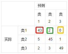
红色框数据表示:样本实际类别为1并且预测类别也为1的样本数目为43
绿色框数据表示:样本实际类别为1并且预测类别也为2的样本数目为2
黄色框数据表示:样本实际类别为1并且预测类别也为3的样本数目为0
以此类推。。。
所以混淆矩阵可以很直观的看出分类器classifier的性能
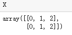
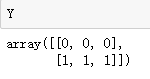
2 生成网格点坐标矩阵 numpy.meshgrid(x, y) :
如何生成(0,0),(1,0),(2,0),(0,1),(1,1),(2,1)这六个点?
import numpy as np
import matplotlib.pyplot as plt

x = np.array([0, 1, 2]) # x: 横坐标的所有取值
y = np.array([0, 1]) # y: 纵坐标的所有取值
X, Y = np.meshgrid(x, y)
# X: 按照纵坐标的取值数目,将x重复若干倍,得6个点的横坐标
# Y: 按照横坐标的取值数目,将y重复若干倍,得6个点的纵坐标
#  (Xij,Yij) 分别表示一个点
3 numpy.ravel(): 将多维数组转换为一维数组
将上述X,Y展开后,纵向得到6个点的坐标
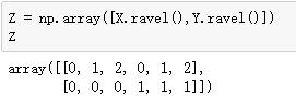
In [14]: x=np.array([[1,2],[3,4]])

# ravel函数在降维时默认是行序优先
In [17]: x.ravel()
Out[17]: array([1, 2, 3, 4])
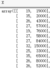
原始数据: Social_Network_Ads.csv (部分)

(1)导入库,加载数据
X = [Age, EstimatedSalary]
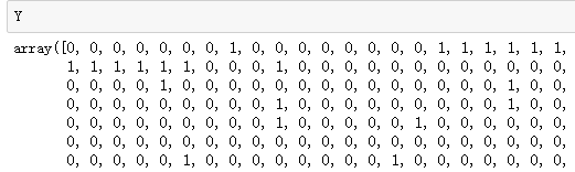
Y = [Purchased]
import numpy as np
import matplotlib.pyplot as plt
import pandas as pd

dataset = pd.read_csv('Social_Network_Ads.csv')
X = dataset.iloc[:,[2,3]].values
Y = dataset.iloc[:,4].values
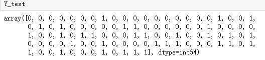
(2)将数据集分成训练集和测试集
from sklearn.model_selection import train_test_split
X_train, X_test, Y_train, Y_test = train_test_split(X, Y, test_size = 0.25, random_state = 0)
(3)特征缩放: 将数据 减去平均值 并 除以方差
from sklearn.preprocessing import StandardScaler
sc = StandardScaler()
X_train = sc.fit_transform(X_train)
X_test = sc.transform(X_test)
(4)将逻辑回归应用于训练集
from sklearn.linear_model import LogisticRegression
classifier = LogisticRegression()
classifier.fit(X_train, Y_train)
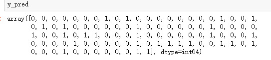
(5)预测测试集结果
y_pred = classifier.predict(X_test)
(6)生成混淆矩阵
from sklearn.metrics import confusion_matrix
cm = confusion_matrix(Y_test, y_pred)
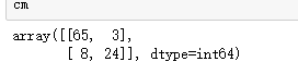
由相关知识点可知,实际为0类的有63个测试样例被正确预测为0,3个被错误预测为1;实际为1类的有24个测试样例被正确预测为1,8个被错误预测为0;
(7)可视化
1: 显示红绿色背景
方法:在网格中采样足够多的点(类似于图片像素点),根据分类器分类的结果,将它们分别用红色和绿色显示出来。
代码:
from matplotlib.colors import ListedColormap
X_set, Y_set = X_train, Y_train
X1,X2 = np.meshgrid(np.arange(start=X_set[:,0].min()-1, stop=X_set[:,0].max()+1, step=0.01),
                   np.arange(start=X_set[:,1].min()-1, stop=X_set[:,1].max()+1, step = 0.01))

plt.contourf(X1,X2,classifier.predict(np.array([X1.ravel(),X2.ravel()]).T).reshape(X1.shape),
                                     alpha = 0.75, cmap = ListedColormap(('red','green')))
plt.xlim(X1.min(),X1.max())
plt.ylim(X2.min(),X2.max())
plt.show()
分析:
以0.01的步伐在X坐标上取点:
np.arange(start=X_set[:,0].min()-1, stop=X_set[:,0].max()+1, step=0.01)
以0.01的步伐在Y坐标上取点:
np.arange(start=X_set[:,1].min()-1, stop=X_set[:,1].max()+1, step = 0.01)
meshgrid 根据所有的X,Y坐标值生成所有对应点的横坐标矩阵X1,总坐标矩阵X2。
将X1,X2展开后进行转置,使得矩阵每一行元素表示一个点(由相关知识点可知),然后预测每个点的类别,将结果大小调整到和坐标数据相同的矩阵大小。
classifier.predict(np.array([X1.ravel(),X2.ravel()]).T).reshape(X1.shape)
最后使用contourf显示。
plt.contourf(X1,X2,classifier.predict(np.array([X1.ravel(),X2.ravel()]).T).reshape(X1.shape),
                                     alpha = 0.75, cmap = ListedColormap(('red','green')))
plt.xlim(X1.min(),X1.max())
plt.ylim(X2.min(),X2.max())
plt.show()

2: 显示数据点
代码:
for i,j in enumerate(np. unique(y_set)):
    plt.scatter(X_set[y_set==j,0],X_set[y_set==j,1],
                c = ListedColormap(('red', 'green'))(i), label=j)
分析:
获取Y_set中的所有类别“标记“ j 及其 索引 i
for i,j in enumerate(np.unique(Y_set)):
    print(i,j)

根据类别标记 j 获取所有类别为j的点的横坐标和纵坐标
X_set[Y_set==j,0],X_set[Y_set==j,1]
根据索引 i 选择不同的颜色,并显示类别标签
c = ListedColormap(('red','green'))(i), label=j)
最后画出对应的散点图

3:最后将1,2结合起来即可得最后的训练集效果图
from matplotlib.colors import ListedColormap
X_set,y_set=X_train,Y_train
X1,X2=np. meshgrid(np. arange(start=X_set[:,0].min()-1, stop=X_set[:, 0].max()+1, step=0.01),
                   np. arange(start=X_set[:,1].min()-1, stop=X_set[:,1].max()+1, step=0.01))
plt.contourf(X1, X2, classifier.predict(np.array([X1.ravel(),X2.ravel()]).T).reshape(X1.shape),
             alpha = 0.75, cmap = ListedColormap(('red', 'green')))
plt.xlim(X1.min(),X1.max())
plt.ylim(X2.min(),X2.max())
for i,j in enumerate(np. unique(y_set)):
    plt.scatter(X_set[y_set==j,0],X_set[y_set==j,1],
                c = ListedColormap(('red', 'green'))(i), label=j)

plt. title(' LOGISTIC(Training set)')
plt. xlabel(' Age')
plt. ylabel(' Estimated Salary')
plt. legend()
plt. show()

同理,可得测试集上的效果图
X_set,y_set=X_test,Y_test
X1,X2=np. meshgrid(np. arange(start=X_set[:,0].min()-1, stop=X_set[:, 0].max()+1, step=0.01),
                   np. arange(start=X_set[:,1].min()-1, stop=X_set[:,1].max()+1, step=0.01))

plt.contourf(X1, X2, classifier.predict(np.array([X1.ravel(),X2.ravel()]).T).reshape(X1.shape),
             alpha = 0.75, cmap = ListedColormap(('red', 'green')))
plt.xlim(X1.min(),X1.max())
plt.ylim(X2.min(),X2.max())
for i,j in enumerate(np. unique(y_set)):
    plt.scatter(X_set[y_set==j,0],X_set[y_set==j,1],
                c = ListedColormap(('red', 'green'))(i), label=j)

plt. title(' LOGISTIC(Test set)')
plt. xlabel(' Age')
plt. ylabel(' Estimated Salary')
plt. legend()
plt. show()

逻辑回归
