
动画效果 柱子会上下跳动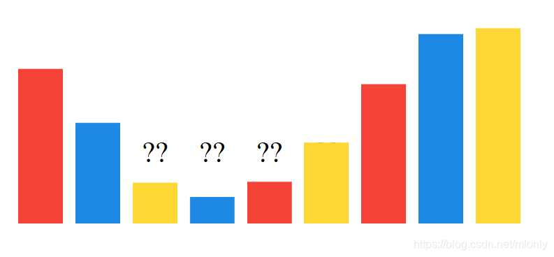
html
<!DOCTYPE html>
<html lang="en" >

<head>
  <meta charset="UTF-8">
  <title>Primary Color Bounce</title>
  <meta name="viewport" content="width=device-width, initial-scale=1">


      <link rel="stylesheet" href="style.css">


</head>

<body>

  <div class="emojis">
  <div>??</div>
  <div>??</div>
  <div>??</div>
  <div>??</div>
  <div>??</div>
  <div>??</div>
  <div>??</div>
  <div>??</div>
  <div>??</div>
</div>

<div class="palette">
  <div></div>
  <div></div>
  <div></div>
  <div></div>
  <div></div>
  <div></div>
  <div></div>
  <div></div>
  <div></div>
</div>


</body>

</html>
css
:root {
  --size: 7vmin;
  --speed: 0.9s;
  --ease-emojis: cubic-bezier(0.125, 0.185, 0.55, 1.775);
  --ease-bars: cubic-bezier(0.105, 0.165, 0.55, 1.575);
  --red: #F44336;
  --blue: #1E88E5;
  --yellow: #FDD835;
}

* {
  box-sizing: border-box;
}

body {
  display: flex;
  flex-direction: column;
  align-items: center;
  justify-content: center;
  padding-top: calc(var(--size) * 4);
  height: 100vh;
}

.palette, .emojis {
  display: flex;
}
.palette div, .emojis div {
  margin: 0 1vmin;
  width: var(--size);
  height: var(--size);
}

.palette {
  position: relative;
}
.palette:after {
  content: '';
  position: absolute;
  top: 100%;
  width: 100%;
  height: var(--size);
  background: white;
  z-index: 2;
}

.emojis div {
  position: relative;
  font-size: calc(var(--size) / 1.5);
  text-align: center;
  animation: jump calc(var(--speed) * 2) var(--ease-emojis) infinite;
}

.palette div {
  transform-origin: 50% 100%;
  animation: stretch var(--speed) var(--ease-bars) infinite;
}
.palette div:nth-child(1n) {
  background: var(--red);
}
.palette div:nth-child(2n) {
  background: var(--blue);
}
.palette div:nth-child(3n) {
  background: var(--yellow);
}

.palette div:nth-child(1), .emojis div:nth-child(1) {
  animation-delay: 0.095s;
}
.palette div:nth-child(2), .emojis div:nth-child(2) {
  animation-delay: 0.19s;
}
.palette div:nth-child(3), .emojis div:nth-child(3) {
  animation-delay: 0.285s;
}
.palette div:nth-child(4), .emojis div:nth-child(4) {
  animation-delay: 0.38s;
}
.palette div:nth-child(5), .emojis div:nth-child(5) {
  animation-delay: 0.475s;
}
.palette div:nth-child(6), .emojis div:nth-child(6) {
  animation-delay: 0.57s;
}
.palette div:nth-child(7), .emojis div:nth-child(7) {
  animation-delay: 0.665s;
}
.palette div:nth-child(8), .emojis div:nth-child(8) {
  animation-delay: 0.76s;
}
.palette div:nth-child(9), .emojis div:nth-child(9) {
  animation-delay: 0.855s;
}

@keyframes stretch {
  50% {
    transform: scaleY(4);
  }
}
@keyframes jump {
  35% {
    transform: translateY(calc(var(--size) * -5)) rotate(15deg);
  }
  50% {
    transform: translateY(0) rotate(0);
  }
  85% {
    transform: translateY(calc(var(--size) * -5)) rotate(-25deg);
  }
}