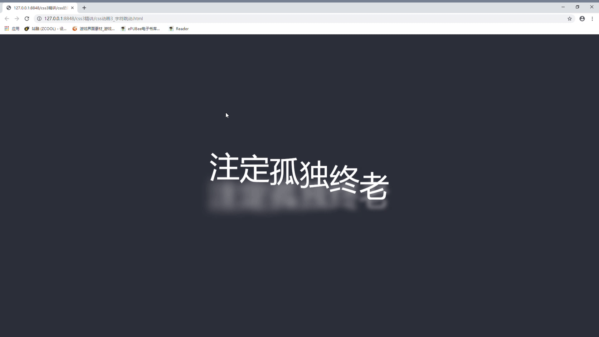
一,成品图
本人自学css3动画特效,今天分享一个简单的字节跳动的特效
 字节跳动
字节跳动
二,实现步骤
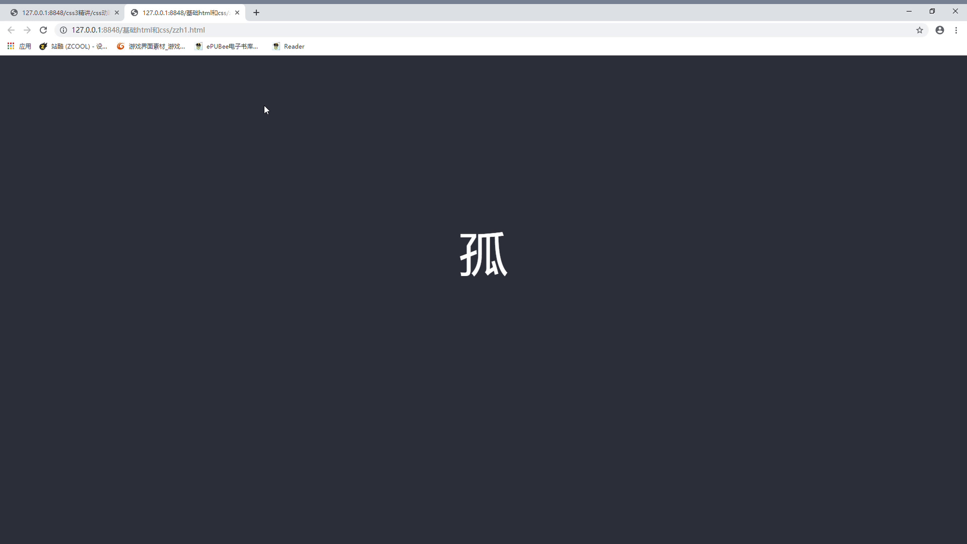
我们先来尝试一个字的跳动,我决定选取孤独的孤字。
1: 第一步,消除浏览器默认样式,并且在网页上写一个孤字。
2: 第二步,设置页面背景色,设置字体样式大小,并且居中。
<!DOCTYPE html>
<html>
	<head>
		<meta charset="utf-8">
		<title></title>
		<style type="text/css">
			*{
				padding: 0;
				margin: 0;
			}
			body{
				background-color: #2d303a;
			}
			div{
				text-align: center;
				margin: 400px auto;
			}
			span{
				font: normal 500 6rem 'Varela Round', sans-serif;
				color: white;
			}

		</style>

	</head>
	<body>
		<div>
			<span>孤</span>
		</div>
	</body>
</html>
效果:

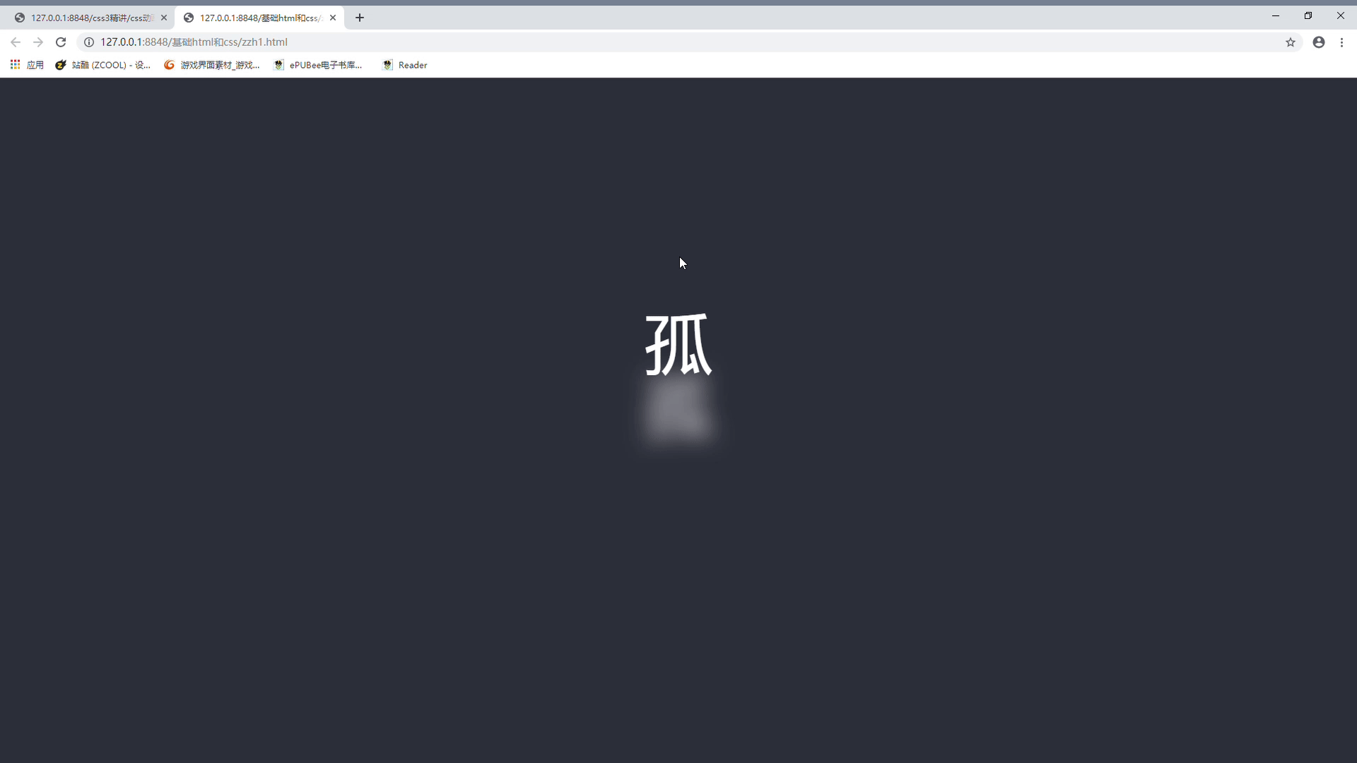
3: 第三步,利用animation属性让字跳起来。下面是style样式代码
		<style type="text/css">
			*{
				padding: 0;
				margin: 0;
			}
			body{
				background-color: #2d303a;
			}
			div{
				text-align: center;
				margin: 400px auto;
			}
			span{
				position: relative;
				font: normal 500 6rem 'Varela Round', sans-serif;
				color: white;
				animation: bounce 0.75s cubic-bezier(0.05, 0, 0.2, 1) infinite alternate;
				top: 0px;

			}

			@keyframes bounce {
			  0% {
			    top: 0;

			  }
			  100% {
			    top: -1em;

			  }
			}
		</style>
4: 第四步,设置字体阴影,让跳动更加立体。
修改bound动画代码块:
@keyframes bounce {
			  0% {
			    top: 0;
			    text-shadow: rgba(255, 255, 255, 0.4) 0 0 0.05em;
			  }
			  100% {
			    top: -1em;
			    text-shadow: rgba(255, 255, 255, 0.9) 0 1em 0.35em;
			  }
			}
5: 多个字一起跳动,设置字体跳动延迟。
span:nth-child(1) {
			  animation-delay: 0s;
			}
			span:nth-child(2) {
			  animation-delay: 0.0833333333s;
			}
			span:nth-child(3) {
			  animation-delay: 0.1666666667s;
			}
			span:nth-child(4) {
			  animation-delay: 0.25s;
			}
			span:nth-child(5) {
			  animation-delay: 0.3333333333s;
			}
			span:nth-child(6) {
			  animation-delay: 0.4166666667s;
			}
			span:nth-child(7) {
			  animation-delay: 0.520s;
			}
完成
代码不够健壮,没有考虑文字过多的情况
完整代码:
<!DOCTYPE html>
<html>
	<head>
		<meta charset="utf-8">
		<title></title>
		<style type="text/css">
			*{
				padding: 0;
				margin: 0;
			}
			body{
				background-color: #2d303a;
			}
			div{
				text-align: center;
				margin: 400px auto;
			}
			span{
				position: relative;
				font: normal 500 6rem 'Varela Round', sans-serif;
				color: white;
				animation: bounce 0.75s cubic-bezier(0.05, 0, 0.2, 1) infinite alternate;
				top: 0px;
			}
			span:nth-child(1) {
			  animation-delay: 0s;
			}
			span:nth-child(2) {
			  animation-delay: 0.0833333333s;
			}
			span:nth-child(3) {
			  animation-delay: 0.1666666667s;
			}
			span:nth-child(4) {
			  animation-delay: 0.25s;
			}
			span:nth-child(5) {
			  animation-delay: 0.3333333333s;
			}
			span:nth-child(6) {
			  animation-delay: 0.4166666667s;
			}
			span:nth-child(7) {
			  animation-delay: 0.520s;
			}
			@keyframes bounce {
			  0% {
			    top: 0;
			    text-shadow: rgba(255, 255, 255, 0.4) 0 0 0.05em;
			  }
			  100% {
			    top: -1em;
			    text-shadow: rgba(255, 255, 255, 0.9) 0 1em 0.35em;
			  }
			}
		</style>

	</head>
	<body>
		<div>
			<span >注</span>
			<span >定</span>
			<span >孤</span>
			<span >独</span>
			<span >终</span>
			<span >老</span>
		</div>
	</body>
</html>
