概述
在CSS中执行动画的属性是CSS3属性中的 animation,该属性可以让元素随着时间的推移,产生“位置”、“形状”、“颜色”、“大小”、“透明度”等属性变化。
它和 transition 的不同之处在于,它可以不需要任何事件的激活(当然也可以通过事件激活),让元素本身就“挂载”一系列的CSS属性变化。他和 transform 的不同之处在于,它并不需要“transition”的过渡特效,让元素可以通过“关键帧 ”的设置达到想要的动画运行的“速度曲线(贝塞尔曲线)。animation 属性和前两者还有一个比较显著的区别,就是它可以单独地存在,即可以不依赖任何选择器,但可以提供给任何与它动画内容匹配并且“显示类型”支持的选择器调用,它和前两者还有一个很显著的区别,就是它能够“无限次”地执行动画效果。
该属性可以和过渡属性“transition”搭配使用,但通常来讲是没有共存的意义的,因为“animation”也可以通过设置“animation-timing-function(动画时间曲线,区别于‘过渡时间曲线’)”来达到动画平滑或无规律的“过渡”效果。但该属性和变形转换属性“transform”配合起来使用,往往都会出现一些让人感到“惊艳”的效果。
该属性的执行需要通过关键帧 “@keyframes+[animation name]” 进行定义,该定义从CSS3技术发展的现状来看,还都需要在前面加上浏览器厂商的“前缀”,如:“@-webkit-keyframes”、“@-moz-keyframes”或“@-ms-keyframes”等,当然,和其它需要加前缀的属性一样,该定义也需要保留一份未加任何前缀的“初始定义”,以供现在或未来的一些支持该属性定义的其它浏览器厂商使用,如:“腾讯浏览器(采用‘X5’内核排版渲染)”。
接下来,我们开始对“animation”属性的各分支属性进行系统化的学习。
动画分支属性
1、animation-name
该属性用于定义动画的名称,以供需要使用该动画的 animation 属性调用,该名称完全是由用户自定义的,但也应该要“语义化”一些,方便调用者能更直观地了解此处定义动画的实际作用,而且切忌出现特殊符号(浏览器解析会存在差异),如一个改变元素颜色动画的名称定义应该是:
定义动画
@keyframes changeColor {
/* 各关键帧执行的css属性 */
}
设置动画
div {
animation-name: changeColor;
}
提示:定义动画的“关键帧”有两种方式,一种为“英文单词”定义模式,一种为“百分数”定义模式。
英文单词模式
该模式只包含两个关键帧,即开始帧“from”,表示动画开始时执行的CSS属性,和结束帧“to”,表示动画结束时执行的CSS属性。
百分数模式
该模式相对“英文单词”定义关键帧的模式更为详细,能够支持理论上从“0%”到“100%”之间的所有帧的定义,“0%”相当于“from”,表示动画开始帧,“100%”相当于“to”,表示动画结束帧。该模式由于控制的精细度高,书写修改容易,甚至可以通过“定义百分比的跳跃”或“CSS属性值的跳跃”来实现动画的“匀速”、“加速”、“减速”,“变速”等动画速率的变化,非常地灵活,所以这种写法也是现今最主流的定义动画关键帧的方式。
@keyframes changeColor {
from {color: #000;}
to {color: #ccc;}
}
@keyframes changeColor {
0% {color: red;}
50% {color: green;}
100% {color: blue;}
}
2、animation-duration
该属性用于定义动画执行的时间,即一段动画从开始到动画结束所经历的时间,单位为秒“s”或毫秒“ms”,默认值为“0”,即不执行任何动画,所以在定义设置一个动画的时候始终都要设置该属性,并给定一个大于“0”的时间。
3、animation-timing-function
该属性定义元素随着时间的推进执行动画的速率变化(线性规律)。主要有以下值:
ease:默认值,逐渐变慢;
linear:匀速
ease-in:加速
ease-out:减速
ease-in-out:先加速,再减速
cubic-bezier([参数]):可以定义一个时间曲线,可以为其配置四个参数,前两个参数为“x1”和“x2”,定义“开始控制点”,后两个参数为“y1”和“y2”,定义“结束控制点”。而“开始点”和“结束点”是通过这两条“转换点控制轴”分别去调整两个点来实现曲线的变化的。
4、animation-delay
该属性定义动画延迟时间,即延时一段时间之后再执行动画,其单位为秒或毫秒;
默认0:立即执行动画
正值:延迟指定时间后,开始执行动画
负值:立即执行,但跳过指定时间后进入动画
5、animation-iteration-count
该属性用于设置动画播放的次数,它可以设置三种类型的值:
1(默认值):表示在执行某事件后只执行1次动画。
[number]:任意正整数,表示在执行某事件后只执行[number]次动画。
infinite:表示在执行某事件后“无限次”执行动画。
6、animation-direction
该属性用于设置元素动画是否能够周期性地逆向播放,逆向动画播放的进行时间和“正向播放”一致,时间速度曲线会按照“100%(to)”到“0%(from)”的方向进行。
normal:默认值;
alternate:逆向执行;
7、animation-play-state
该属性用于设置动画播放状态,其值为:
running:播放动画;
paused:暂停动画;
8、animation-fill-mode
若不将动画的 animation-iteration-count 属性设置为 infinite 值的话,动画在播放完成后会还原到元素没有“挂载”动画播放效果之前的状态,在有的应用场景里这样似乎没有问题,但在有些应用场景下,这样的设定会让人有一种“瞎忙活”或“功败垂成”的感觉。而 animation-fill-mode 属性的出现克服了这个问题,它可以预设值动画播放前的“第一帧”和保留动画播放完成后的“最后一帧”,可以通过以下值进行设置:
backwards:让元素保持动画第一帧定义里所设置的CSS属性,直到动画开始执行。
forwards:让元素保持动画播放结束后最后一帧定义里所设置的CSS属性。
both:让元素保持动画第一帧里定义的CSS属性,直到动画开始,动画播放完成后又保持动画最后一帧的属性。
9、animation
动画组合值写法,其语法形式为:
animation: 动画名称 持续时间 线性规律 延迟时间 播放次数 周期逆向播放 播放/暂停 首帧预设/末帧保留;
提示:动画名称与持续时间为必需属性,其他属性可根据实际需要省略。
动画示例
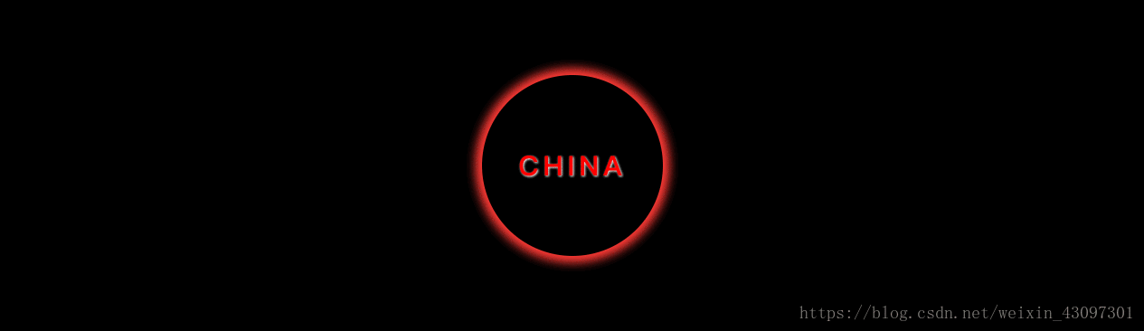
1、光晕效果
<div class="box">
    <span>CHINA</span>
</div>
body {
    background-color: #000;
}

/*定义动画*/
@keyframes shine {
    0%    { box-shadow: 0px 0px 5px  0px  #fff; }
    70%   { box-shadow: 0px 0px 20px 10px #ff0000; }
    100%  { box-shadow: 0px 0px 5px  0px  #fff; }
}

div.box {
    width:  200px;
    height: 200px;
    border-radius: 50%;

    display: flex;
    justify-content: center;
    align-items: center;

    position: absolute;
    top: 0; right: 0; bottom: 0; left: 0;
    margin: auto;

    animation: shine 1s linear infinite;
}
div.box span {
    color: #ff0000;
    letter-spacing: 5px;
    font-size: 30px;
    font-weight: bold;
    text-shadow: 1px 1px 2px #fff;
}
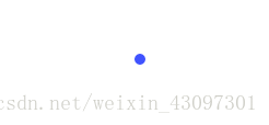
2、气泡效果
<div class="box"></div>
.box {
	width:  40px;
	height: 40px;
	background-color: blue;
	border-radius: 50%;
	margin: 100px auto;
	-webkit-animation: fadeOut 1.0s infinite ease-in-out;
	animation: fadeOut 1.0s infinite ease-in-out;
}
@-webkit-keyframes fadeOut {
	from { -webkit-transform: scale(0.0); }
	to   { -webkit-transform: scale(1.0); opacity: 0; }
}
@keyframes fadeOut {
	from { transform: scale(0.0); }
	to   { transform: scale(1.0); opacity: 0; }
}
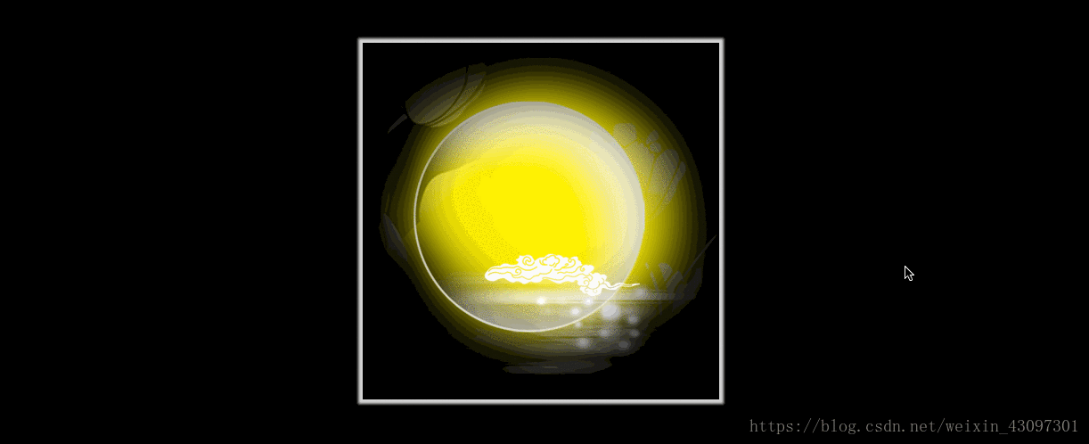
3、嫦娥奔月
<div class="translateBox">
    <div class="img"></div>
</div>
body {
    background: #000;
}
.translateBox {
    width:  400px;
    height: 400px;
    margin: 100px auto;
    background: url("../imgs/bg.png");
    background-size: contain;
    cursor: pointer;

    -webkit-box-shadow: 0 0 3px 5px  #d3d3d3;
    -moz-box-shadow: 0 0 3px 5px  #d3d3d3;
    box-shadow: 0 0 3px 5px  #d3d3d3;

    position: relative;
}

.translateBox .img {
    width:  calc(100% / 2);
    height: calc(100% / 2);
    background: url("../imgs/change.png");
    background-size: contain;
    opacity: 0;


    transition: opacity 1s ease-in-out 0.5s, transform 1s ease-in-out;
    -webkit-transform: scale(.5, .5);
    transform: scale(.5, .5);


    position: absolute;
    top:  -90px;
    left: -90px;
}

.translateBox:hover .img {
    opacity: 1;

    -webkit-transform: translate(170px, 180px);
    transform: translate(170px, 180px);

    transition: opacity 1s ease-in-out, transform 1s ease-in-out .2s;
}
动画技巧
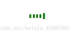
1、延迟调用
<div class="box">
	<div class="line line1"></div>
	<div class="line line2"></div>
	<div class="line line3"></div>
	<div class="line line4"></div>
	<div class="line line5"></div>
</div>
.box {
	width:  60px;
	height: 30px;
	margin: 100px auto;
	text-align: center;
}

.box > .line {
	display: inline-block;
	width: 6px;
	height: 100%;
	background-color: green;

	-webkit-animation: strechDelay 1s linear infinite;
	animation: strechDelay 1s linear infinite;

}
.box > .line2 {
	-webkit-animation-delay: -0.9s;
	animation-delay: -0.9s;
}
.box > .line3 {
	-webkit-animation-delay: -0.8s;
	animation-delay: -0.8s;
}
.box > .line4 {
	-webkit-animation-delay: -0.7s;
	animation-delay: -0.7s;
}
.box > .line5 {
	-webkit-animation-delay: -0.6s;
	animation-delay: -0.6s;
}

@-webkit-keyframes strechDelay {
	0%, 40%, 100% { -webkit-transform: scaleY(.4); }
	20%   { -webkit-transform: scaleY(1.0);}
}
@keyframes strechDelay {
	0%, 40%, 100% { transform: scaleY(.4); }
	20%   { transform: scaleY(1.0);}
}
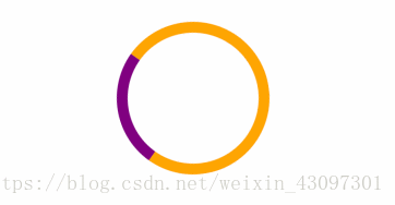
2、进度指示
<div class="box"></div>
.box {
	width:  120px;
	height: 120px;
	margin: 100px auto;

	border: 10px solid orange;
	border-left-color: purple;
	border-radius: 50%;

	animation: loading 1.2s linear infinite;
	-webkit-animation: loading 1.2s linear infinite;
}


@-webkit-keyframes loading {
	from {
		-webkit-transform: rotate(0deg);
	}
	to {
		-webkit-transform: rotate(360deg);
	}
}
@keyframes loading {
	from {
		transform: rotate(0deg);
	}
	to {
		transform: rotate(360deg);
	}
}
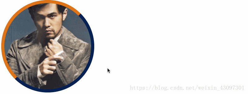
3、hover 特效

```css
<a href="javascript:;" class="wrap">
	<div class="img"></div>
	<div class="mask">
		<div class="info">
			<h3>周杰伦</h3>
			<p>十一月的肖邦</p>
		</div>
	</div>
	<div class="border"></div>
</a>
.wrap, .img, .mask, .border {
	width:  300px;
	height: 300px;
	border-radius: 50%;
}
.wrap {
	position: relative;
	display: block;
}
.img {
	background: url('jay.jpeg') no-repeat 50% 50%;
	background-size: cover;
}
.mask, .border {
	position: absolute;
	left: 0;
	top: 0;
}
.mask {
	text-align: center;
	color: rgba(255, 255, 255, 0);
	transition: all .5s ease-in;
}
.info {
	margin-top: 50%;
	transform: translateY(-50%);
}
.border {
	border: 10px solid #072256;
	border-left-color: #E07514;
	border-top-color: #E07514;
	box-sizing: border-box;
	transition: all .5s ease-in;
}

.wrap:hover .mask {
	background: rgba(0, 0, 0, .5);
	color: rgba(255, 255, 255, 1);
}
.wrap:hover .border {
	transform: rotate(180deg);
}