啦啦啦,好了,今天来分享自己的第一个知识点,难得自己还能想起来过来博客园,写写博客的。
好了,言归正传,今天分享关于html和css的一个简单的知识点,对于大部分从事前端开发的人员来说可能都是很简单的,但是,对于我这种患有严重健忘症的人还有一些初入前端的小伙伴来说,整理一下可能是有百利而无一害的。
今天就简单整理一下前端HTML+CSS实现水平垂直剧中的效果
一 >>> 已知元素宽高
方法1:
position:absolute;
left:0;
right:0;
top:0;
bottom:0;
margin:auto;


 1 <!DOCTYPE html>
 2 <html lang="en">
 3 <head>
 4     <meta charset="UTF-8">
 5     <title>Document</title>
 6     <style>
 7     * {
 8         margin: 0;
 9         padding: 0;
10     }
11     .wrapper {
12         width: 400px;
13         height: 400px;
14         background: rgba(100, 100, 84, .5);
15     }
16     .inner {
17         position: absolute;
18         top: 0;
19         left: 0;
20         bottom: 0;
21         right: 0;
22         margin: auto;
23         width: 100px;
24         height: 100px;
25         background: #90f5;
26     }
27     </style>
28 </head>
29 <body>
30     <div class="wrapper">
31         <div class="inner"></div>
32     </div>
33 </body>
34 </html>
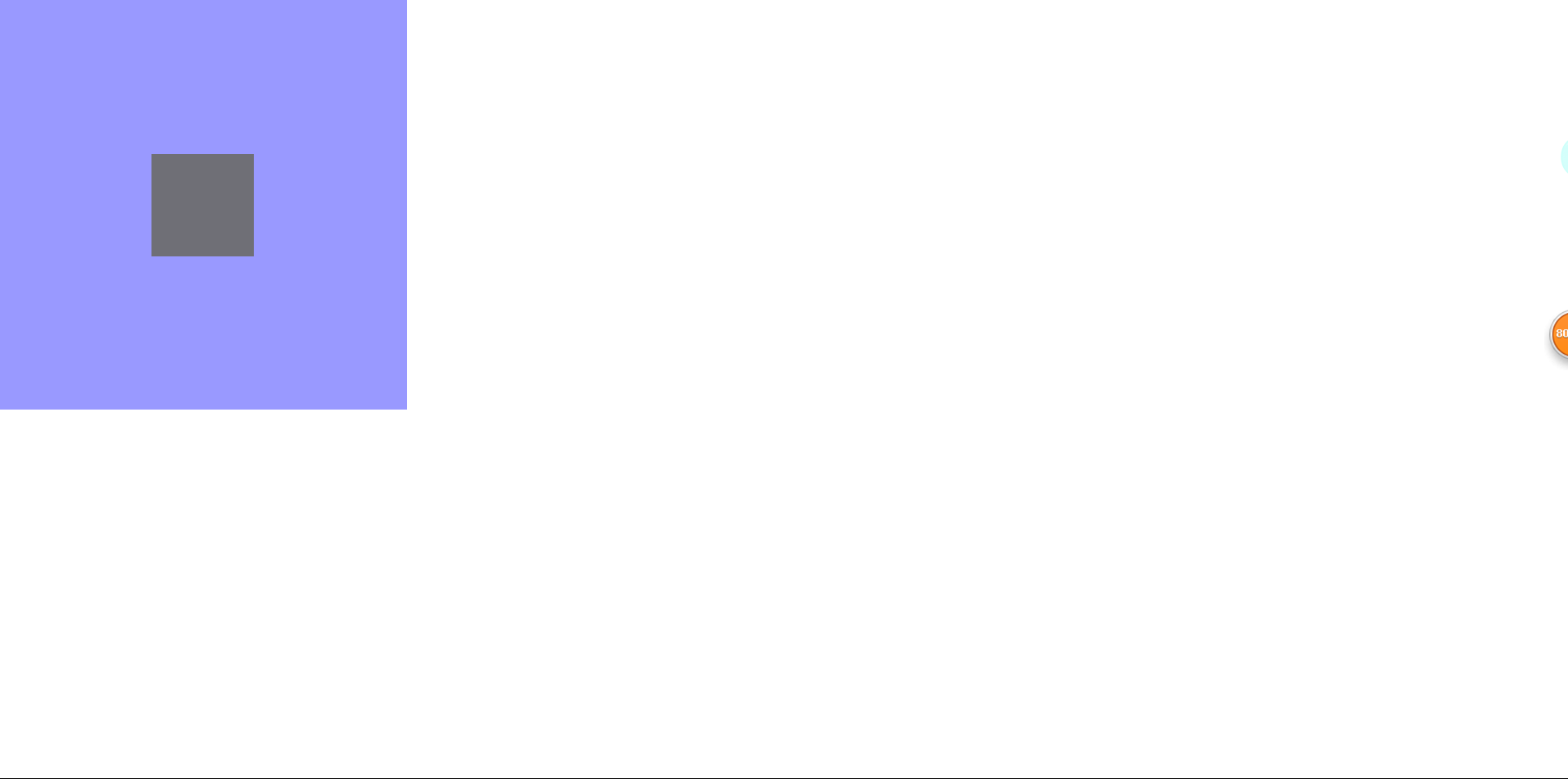
下面是效果图:

ps:测试的时候还有点小翻车呢,不过问题不大,对子元素设置position:absolute后,元素会脱离文档流进行定位,在父元素上加上position:relative就可以了。
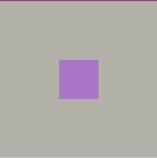
再贴一张图:
方法2:
positionn:absolute;
left , top:50%;
//包含块必须是容器
margin-left,margin-top为负的自身宽高的一半
 1 <!DOCTYPE html>
 2 <html lang="en">
 3 <head>
 4     <meta charset="UTF-8">
 5     <title>Document</title>
 6     <style>
 7     * {
 8         margin: 0;
 9         padding: 0;
10     }
11     .block {
12         position: absolute;
13         top: 50%;
14         left: 50%;
15         margin-left: -200px;
16         margin-top: -200px;
17         width: 400px;
18         height: 400px;
19         background: #0ff;
20     }
21     </style>
22 </head>
23 <body>
24     <div class="block"></div>
25 </body>
26 </html>
贴个效果图:

二 >>> 元素宽高未知
(当然元素宽高已知的居中方法依旧适用于未知宽高的元素,此处不再赘述)
方法1:
position:absolute;
left , top : 50%;
//包含块必须是为容器
transform : translate(-50% , -50%);
 1 <!DOCTYPE html>
 2 <html lang="en">
 3 <head>
 4     <meta charset="UTF-8">
 5     <title>Document</title>
 6     <style>
 7     * {
 8         margin: 0;
 9         padding: 0;
10     }
11     .block {
12         position: absolute;
13         top: 50%;
14         left: 50%;
15         width: 400px; // 没办法,此处必须指定元素的宽高,不过问题不大,假装不知道好了
16         height: 400px;
17         transform: translate(-50%, -50%);
18         background: #0ff;
19     }
20     </style>
21 </head>
22 <body>
23     <div class="block"></div>
24 </body>
25 </html>
运行结果与上图一致,就不再重复贴啦。
此处,需要关注一个问题,translate()移动的百分比是相对于元素本身的宽高
方法2:flex布局
父元素容器display:flex
align-items : center
justify-content : conter
下面是运行效果图:
flex是CSS3中的属性,因此在移动端构建弹性盒模型时,如果想用flex就必须要考虑浏览器兼容性。
三 >>> 单行文本居中
方法1:text-align:center; //水平方向居中 (在父元素中设置)
line-height:$(父元素的高度)//垂直方向居中 (在文本元素中设置)
 1 <!DOCTYPE html>
 2 <html lang="en">
 3 <head>
 4     <meta charset="UTF-8">
 5     <title>Document</title>
 6     <style>
 7     * {
 8         margin: 0;
 9         padding: 0;
10     }
11     .wrapper {
12         width: 400px;
13         height: 400px;
14         background: rgba(100, 100, 84, .5);
15         text-align: center;
16     }
17     .text {
18         line-height: 400px;
19     }
20     </style>
21 </head>
22 <body>
23     <div class="wrapper">
24         <span class="text">hello,2019年加油</span>
25     </div>
26 </body>
27 </html>
贴个图:
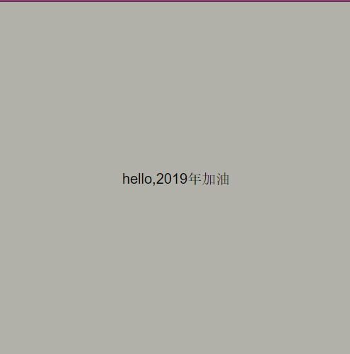
2019年,大家都要加油呀!
四 >>> 图片元素居中
图片元素比较特殊,其display属性值为inline-block,意味着图片元素既有块级元素的特性,例如可以指定宽高等,同时具备行级元素的特性。因此,图片的水平垂直居中的实现可以用未知宽高和已
知宽高元素的居中方式来实现,此处介绍图片元素一种特殊的水平居中方式。
在图片元素的父元素上加text-align:center
 1 <!DOCTYPE html>
 2 <html lang="en">
 3 <head>
 4     <meta charset="UTF-8">
 5     <title>Document</title>
 6     <style>
 7         * {
 8             margin: 0;
 9             padding: 0;
10             text-align: center;
11         }
12         .wrapper {
13             width: 400px;
14             height: 400px;
15             background: rgba(100, 100, 84, .5);
16         }
17         img {
18             width: 300px;
19         }
20     </style>
21 </head>
22 <body>
23     <div class="wrapper">
24         <img src="https://timgsa.baidu.com/timg?image&quality=80&size=b9999_10000&sec=1547137152&di=173ab7466063a1c492761cb613c8172e&imgtype=jpg&er=1&src=http%3A%2F%2Fpic2.ooopic.com%2F12%2F40%2F58%2F18bOOOPIC9c.jpg" alt="">
25     </div>
26 </body>
27 </html>
运行效果贴图:
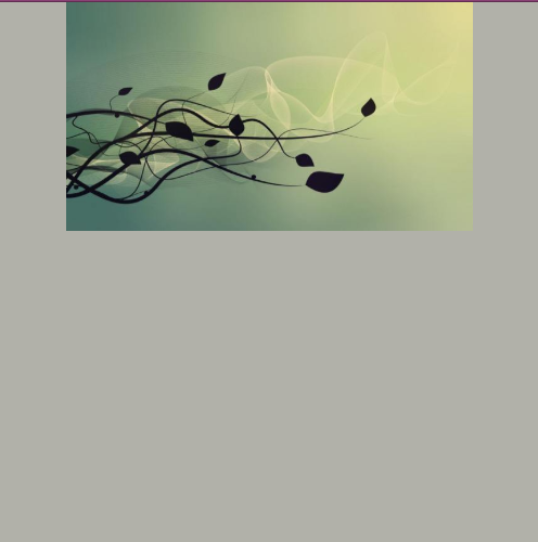
从网上随便拉了张图,不知道会不会构成侵权呢。不管了,用了再说...
/***************************************************************************************************/
/**** 今天一整天都在复习计算机网络,全英文1000页,忽然有点慌了 ***/
/**************************************************************************************************/
至此,停笔。
2019-01-04 00:42:23