flex是对于页面一个非常重要的样式,不会用到px来布局,用rem来代替
rem是根据根文档,也就是html标签上的字体大小来运算的1rem=16px;
手机端的布局也很简单,掌握好flex所有的属性和rem写页面就是一件很轻松的事。
flex的知识过多,咱们只说能应用到的:
HTML
<!DOCTYPE html>
<html lang="zh">
	<head>
		<meta charset="UTF-8" />
		<meta name="viewport" content="width=device-width, initial-scale=1.0" />
		<meta http-equiv="X-UA-Compatible" content="ie=edge" />
		<link rel="stylesheet" type="text/css" href="new_file.css" />
		<title>flexPhone</title>
	</head>

	<body>
		<div class="container">
			<div class="nav">
				<div class="nav-header">Logo</div>
				<!--商标-->
				<ul class="nav-right">
					<li>Demo 1</li>
					<li>Demo 2</li>
					<li>Demo 3</li>
					<li>Demo 4</li>
				</ul>
			</div>
			<!--导航-->
			<div class="Pagebody">
				<div class="banner"></div>
				<!--banner图-->
				<div class="main">

				</div>
				<!--主体内容-->
			</div>
			<!--主体部分-->
			<div class="footer">
				<div class="footer-list">List 1</div>
				<div class="footer-list">List 2</div>
				<div class="footer-list">List 3</div>
				<div class="footer-list">List 4</div>
			</div>
			<!--底部选框-->
		</div>
	</body>

</html>
CSS
* {
	margin: 0;
	padding: 0;
	list-style: none;
}

html,
body,
.container {
	width: 100%;
	height: 100%;
	font-size: 100px;
}

.container {
	font-size: 0.12rem !important;
	display: flex;
	flex-direction: column;
}

.nav {
	top: 0;
	border-bottom: 0.01rem solid lightgray;
}

.nav,
.footer {
	background: linear-gradient(to bottom, #333, #444, #333);
	color: white;
	position: fixed;
	width: 100%;
	height: 0.5rem;
	box-sizing: border-box;
	padding: .16rem 0.16rem;
}

.footer {
	border-top: 0.01rem solid lightgray;
	bottom: 0;
	display: flex;
	align-items: center;
	justify-content: space-around;
}

.nav .nav-header {
	font-weight: bold;
	color: #fff;
	line-height: 100%;
	font-size: 0.18rem;
	float: left;
}

.nav .nav-right {
	float: right;
}

.nav .nav-right li {
	float: left;
	margin-left: 0.12rem;
}

.Pagebody {
	flex:1;
	padding-top: 0.5rem;
}

.banner {
	width: 100%;
	height: 1.5rem;
	background: cornflowerblue;
}

.main{
	box-sizing: border-box;
	height: auto;
	padding:0 0.16rem;
}
效果演示
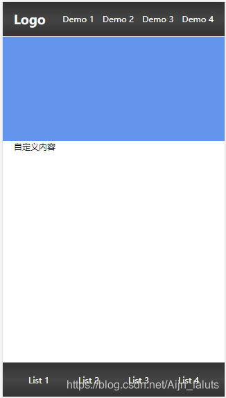
书写时注意↓
- meta标签
<meta name="viewport" content="width=device-width, initial-scale=1.0" />
<meta http-equiv="X-UA-Compatible" content="ie=edge" />
这是在移动端布局时必须有的标签,意思是能让用户缩放屏幕的大小,页面宽度=设备宽度,我在这里用的设备型号是iPhone5的屏幕
-
html和body及自定义一个盒子来包裹页面,即 .container
这里把html的字体设为100px,那么rem就与px成了百倍的关系;即,1rem=100px -
涉及到的flex
display: flex;	/*显示方式设置为flex*/
flex-direction: column;  /*显示方向为 纵向*/
flex:1;			/*分配为1份,加入有两个pagebody每个就占总高的1/2*/
align-items: center;	/*设置轴线上子元素 为 居中*/
justify-content: space-around;	/*排列方式 为 平均分配 且 两端留有空余*/