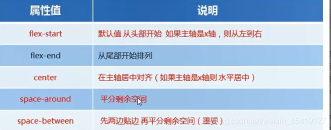
传统布局与flex布局的比较
传统布局
- 兼容性好
- 布局繁琐
- 局限性,不能在移动端很好的布局
flex布局
- 操作方便,布局及其简单
- pc端支持情况较差
pc端如不考虑兼容性 可使用flex布局
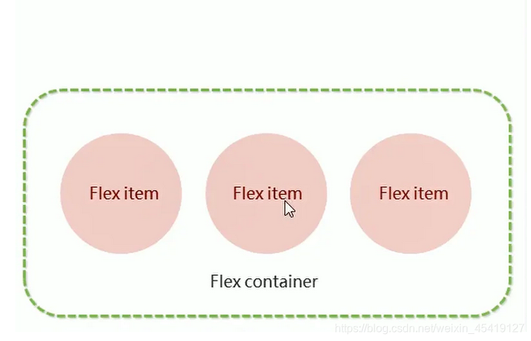
flex布局原理
flex:弹性布局,用来为盒装模型提供最大的灵活性,任何一个容器都可以指定为flex布局
采用flex布局的元素,被称为容器,它的所有子元素会自动成为容器成员,称为flex项目
注意事项
- 当我们的父盒子设为flex布局之后,子元素的float clear 及vertical-align属性将失效
- 伸缩布局 = 弹性布局 = 伸缩盒布局 = 弹性盒布局 = flex布局
原理
通过给父盒子添加flex属性,来控制子盒子的位置和排列方式
<!DOCTYPE html>
<html lang="en">

<head>
    <meta charset="UTF-8">
    <meta name="viewport" content="width=device-width, initial-scale=1.0">
    <title>Document</title>
    <style>
        * {
            margin: 0;
            padding: 0;
        }

        section {
            /* 为父盒子添加弹性盒属性 */
            display: flex;
            width: 600px;
            height: 600px;
            margin: auto;
            border: 5px solid red;
            border-radius: 10px;
            /* justify-content属性定义了项目在主轴上的对齐方式。 */
            justify-content: space-around;
        }

        span {
            width: 100px;
            height: 100px;
            background-color: royalblue;
            border-radius: 50%;
        }
    </style>
</head>

<body>
    <section>
        <span></span>
        <span></span>
        <span></span>

    </section>
</body>

</html>
flex父项属性
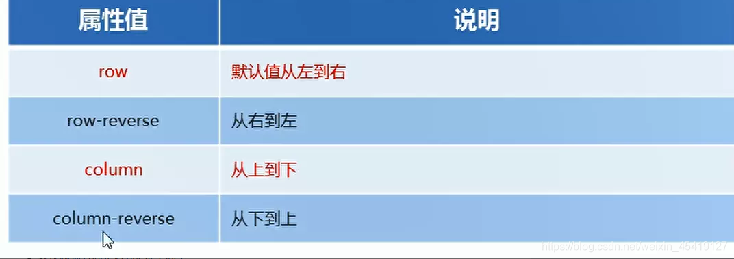
flex-direction:设置主轴的方向
在flex布局中,分为主轴和侧轴
默认的主轴是x方向 水平向右
默认的侧轴是y轴 水平向下
<!DOCTYPE html>
<html lang="en">

<head>

    <meta charset="UTF-8">
    <meta name="viewport" content="width=device-width, initial-scale=1.0">
    <title>Document</title>
    <style>
        * {
            margin: 0;
            padding: 0;
        }

        section {
            /* 为父盒子添加弹性盒属性 */
            display: flex;
            /* 设置主轴方向 */
            flex-direction: row;
            width: 600px;
            height: 600px;
            margin: auto;
            border: 5px solid red;
            border-radius: 10px;
            /* 设置主轴上子元素的排列方式  */
            justify-content: space-around;
        }

        span {
            width: 100px;
            height: 100px;
            text-align: center;
            line-height: 100px;
            font-size: 700;
            background-color: royalblue;
            border-radius: 50%;
        }
    </style>
</head>

<body>
    <section>
        <span>1</span>
        <span>2</span>
        <span>3</span>

    </section>
</body>

</html>
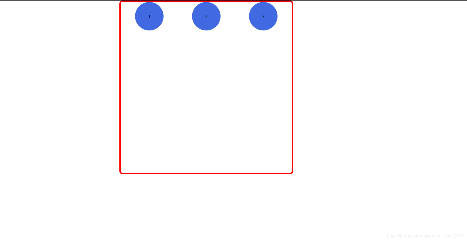
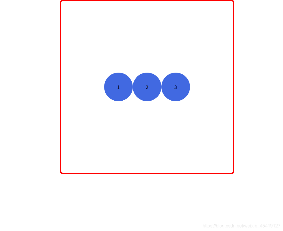
justify-content:设置主轴上子元素的排列方式
<!DOCTYPE html>
<html lang="en">

<head>
    <meta charset="UTF-8">
    <meta name="viewport" content="width=device-width, initial-scale=1.0">
    <title>Document</title>
    <style>
        * {
            margin: 0;
            padding: 0;
        }

        section {
            /* 为父盒子添加弹性盒属性 */
            display: flex;
            /* 设置主轴方向 */
            width: 600px;
            height: 600px;
            margin: auto;
            border: 5px solid red;
            flex-direction: row;
            border-radius: 10px;
            justify-content: center;
        }

        span {
            width: 100px;
            height: 100px;
            text-align: center;
            line-height: 100px;
            font-size: 700;
            background-color: royalblue;
            border-radius: 50%;
        }
    </style>
</head>

<body>
    <section>
        <span>1</span>
        <span>2</span>
        <span>3</span>

    </section>
</body>

</html>
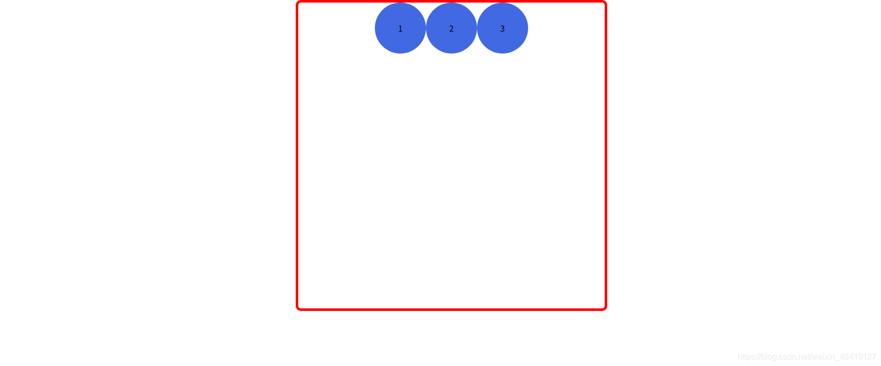
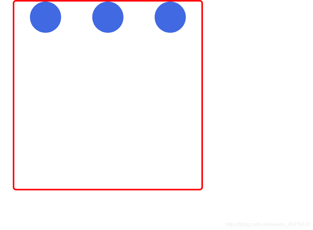
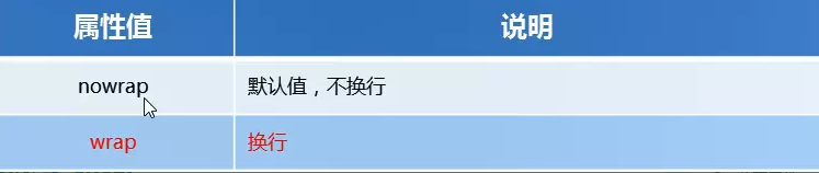
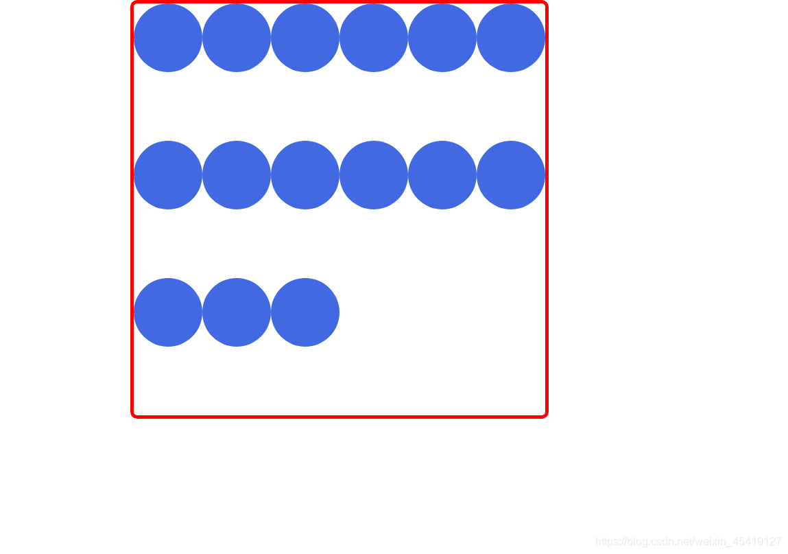
flex-wrap:控制子元素是否换行
在flex布局中,flex项目中的子元素是一直不换行的,会一直在一行显示,宽度会变窄。
<!DOCTYPE html>
<html lang="en">

<head>
    <meta charset="UTF-8">
    <meta name="viewport" content="width=device-width, initial-scale=1.0">
    <title>Document</title>
    <style>
        * {
            margin: 0;
            padding: 0;
        }

        section {
            /* 为父盒子添加弹性盒属性 */
            display: flex;
            width: 600px;
            height: 600px;
            margin: auto;
            border: 5px solid red;
            border-radius: 10px;
            /* 决定子元素是否换行 */
            flex-wrap: wrap;
        }

        span {
            width: 100px;
            height: 100px;
            background-color: royalblue;
            border-radius: 50%;
        }
    </style>
</head>

<body>
    <section>
        <span></span>
        <span></span>
        <span></span>
        <span></span>
        <span></span>
        <span></span>
        <span></span>
        <span></span>
        <span></span>
        <span></span>
        <span></span>
        <span></span>
        <span></span>
        <span></span>
        <span></span>
    </section>
</body>

</html>
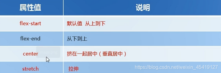
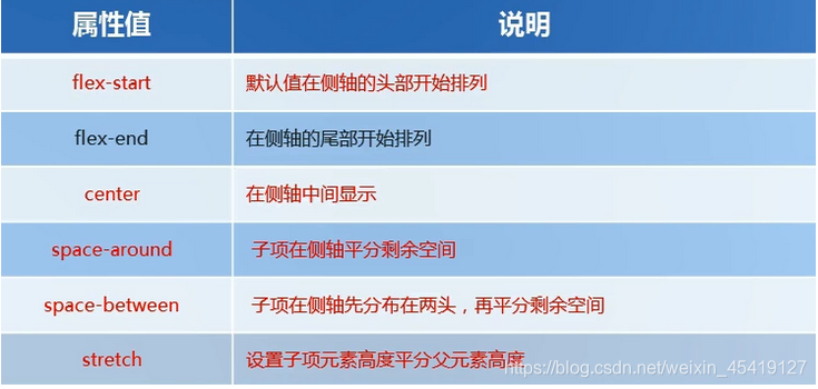
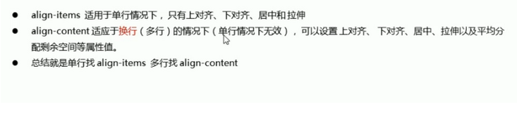
align-items:设置侧轴上子元素的排列方式(适用于单行)
<!DOCTYPE html>
<html lang="en">

<head>
    <meta charset="UTF-8">
    <meta name="viewport" content="width=device-width, initial-scale=1.0">
    <title>Document</title>
    <style>
        * {
            margin: 0;
            padding: 0;
        }

        section {
            /* 为父盒子添加弹性盒属性 */
            display: flex;
            width: 600px;
            height: 600px;
            margin: auto;
            border: 5px solid red;
            border-radius: 10px;
            /* 设置主轴上子元素的排列方式 */
            justify-content: center;
            /* 设置侧轴上的对齐方式 */
            align-items: center;
        }

        span {
            width: 100px;
            height: 100px;
            text-align: center;
            line-height: 100px;
            font-size: 700;
            background-color: royalblue;
            border-radius: 50%;
        }
    </style>
</head>

<body>
    <section>
        <span>1</span>
        <span>2</span>
        <span>3</span>

    </section>
</body>

</html>
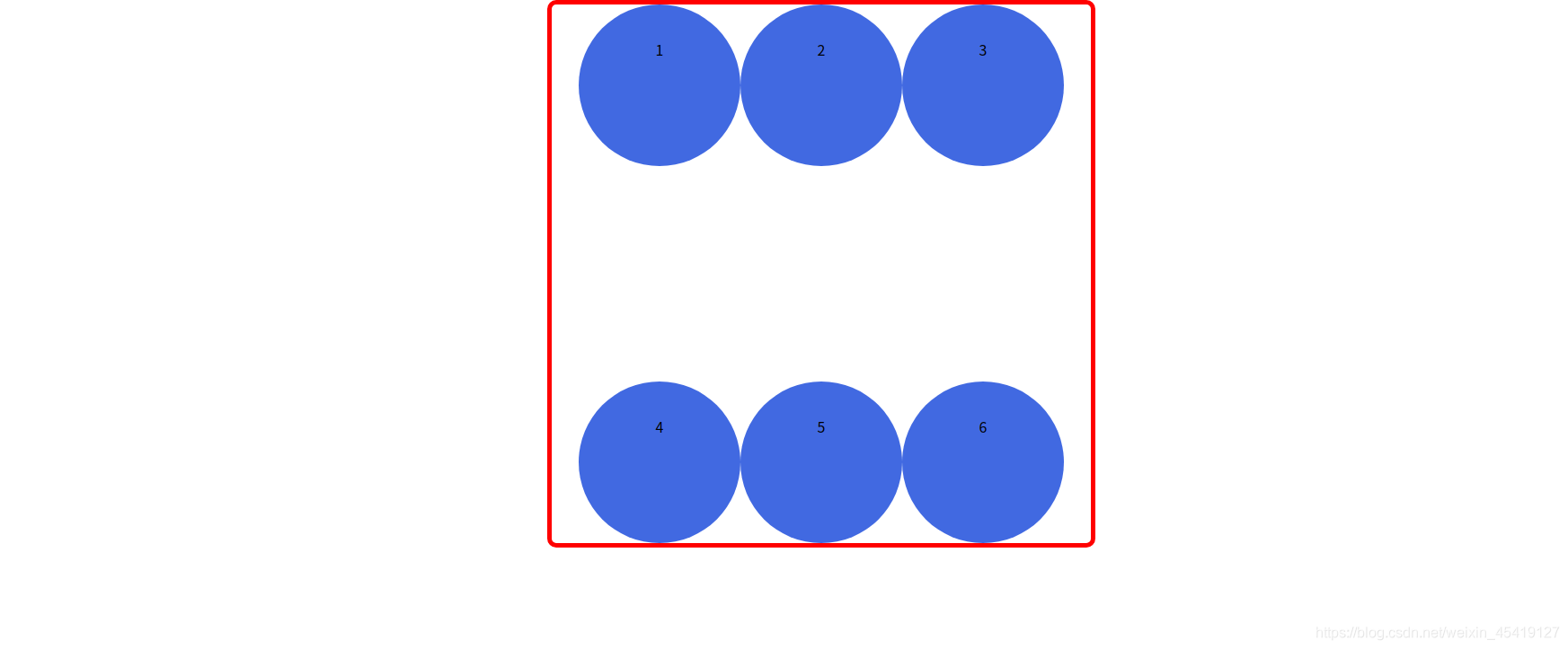
align-content:设置侧轴上子元素的对齐方式(适合于多行)
<!DOCTYPE html>
<html lang="en">

<head>
    <meta charset="UTF-8">
    <meta name="viewport" content="width=device-width, initial-scale=1.0">
    <title>Document</title>
    <style>
        * {
            margin: 0;
            padding: 0;
        }

        section {
            /* 为父盒子添加弹性盒属性 */
            display: flex;
            width: 600px;
            height: 600px;
            margin: auto;
            border: 5px solid red;
            border-radius: 10px;
            /* 设置主轴上子元素的排列方式 */
            justify-content: center;
            /* 决定子元素是否换行 */
            flex-wrap: wrap;
            /* 设置侧轴上的对齐方式 */
            align-content: space-between;
        }

        span {
            width: 180px;
            height: 180px;
            text-align: center;
            line-height: 100px;
            font-size: 700;
            background-color: royalblue;
            border-radius: 50%;
        }
    </style>
</head>

<body>
    <section>
        <span>1</span>
        <span>2</span>
        <span>3</span>
        <span>4</span>
        <span>5</span>
        <span>6</span>

    </section>
</body>

</html>
align-items与align-content的区别
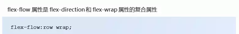
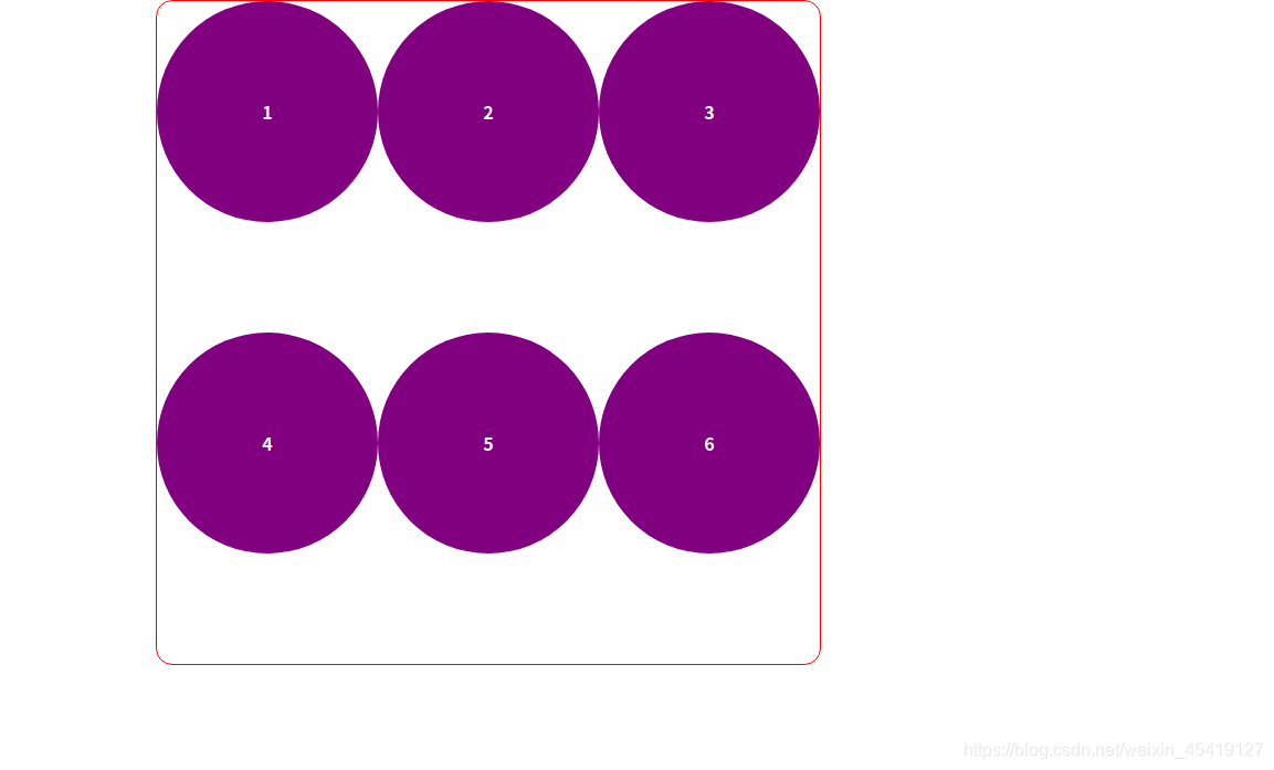
flex-flow
flex-flow是flex-direction与flex-wrap的复合属性
<!DOCTYPE html>
<html lang="en">

<head>
    <meta charset="UTF-8">
    <meta name="viewport" content="width=device-width, initial-scale=1.0">
    <title>Document</title>
    <style>
        * {
            margin: 0;
            padding: 0;
        }

        section {
            display: flex;
            /* flex-flow是flex-direction属性及flex-wrap属性的复合属性 */
            flex-flow: row wrap;
            width: 600px;
            height: 600px;
            margin: auto;
            border: 1px solid red;
            border-radius: 15px;
        }

        span {
            float: left;
            width: 200px;
            height: 200px;
            border-radius: 50%;
            text-align: center;
            line-height: 200px;
            font-weight: 700;
            color: white;
            background-color: purple;
        }
    </style>
</head>

<body>
    <section>
        <span>1</span>
        <span>2</span>
        <span>3</span>
        <span>4</span>
        <span>5</span>
        <span>6</span>
    </section>
</body>

</html>
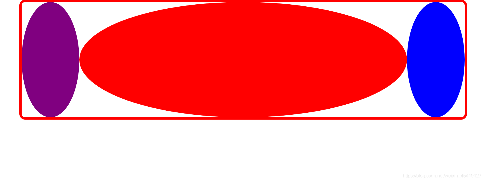
flex子项属性
flex属性定义子项目分配剩余空间,用flex表示占多少份数。
<!DOCTYPE html>
<html lang="en">

<head>
    <meta charset="UTF-8">
    <meta name="viewport" content="width=device-width, initial-scale=1.0">
    <title>Document</title>
    <style>
        * {
            margin: 0;
            padding: 0;
        }

        section {
            display: flex;
            width: 80%;
            height: 400px;
            border: 8px solid red;
            border-radius: 20px;
            margin: auto;
        }

        section span:nth-of-type(1) {
            width: 200px;
            height: 400px;
            border-radius: 50%;
            background-color: purple;
        }

        section span:nth-of-type(2) {
            /* flex属性定义子项目分配的剩余空间,用flex表示占多少份数 */
            flex: 1;
            height: 400px;
            border-radius: 50%;
            background-color: red;
        }

        section span:nth-of-type(3) {
            width: 200px;
            height: 400px;
            border-radius: 50%;
            background-color: blue;
        }
    </style>
</head>

<body>
    <section>
        <span></span>
        <span></span>
        <span></span>
    </section>
</body>

</html>
align-self:控制子项在侧轴上的排列方式

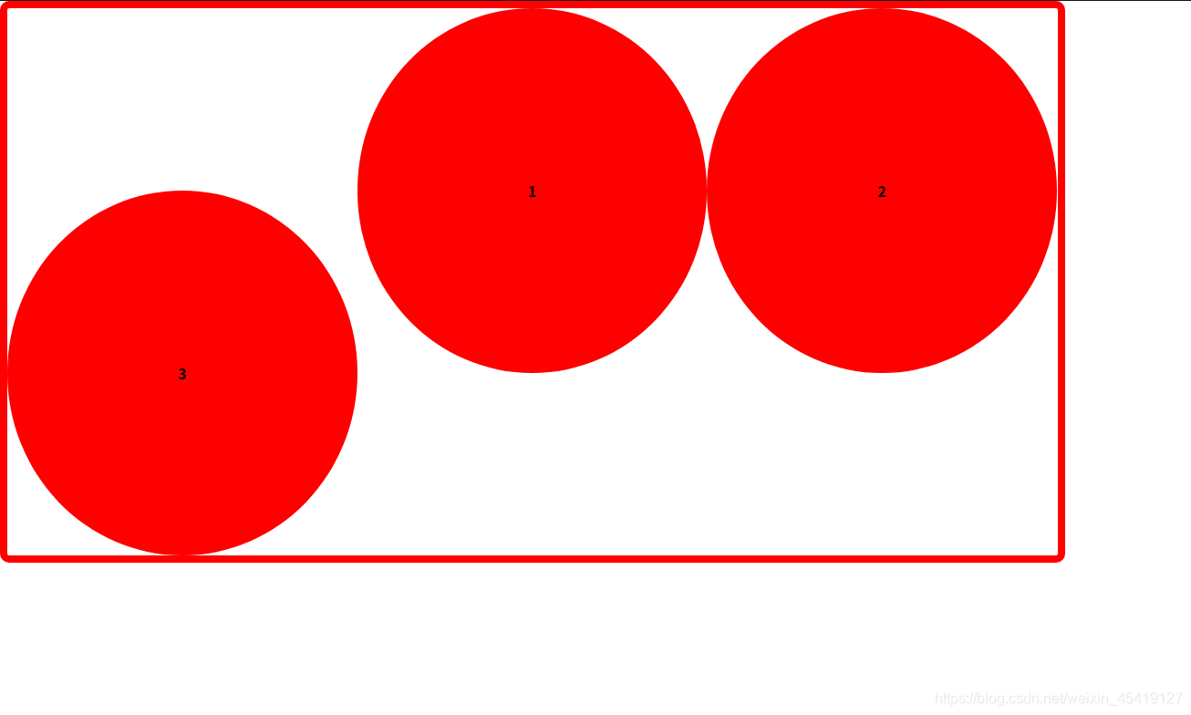
order属性定义子项目的排列顺序
数值越小,排名越靠前,默认为0
<!DOCTYPE html>
<html lang="en">

<head>
    <meta charset="UTF-8">
    <meta name="viewport" content="width=device-width, initial-scale=1.0">
    <title>Document</title>
    <style>
        * {
            margin: 0;
            padding: 0;
        }

        section {
            display: flex;
            width: 60%;
            height: 600px;
            border: 8px solid red;
            border-radius: 10px;
        }

        section span {
            width: 33.3%;
            height: 400px;
            border-radius: 50%;
            background-color: red;
            font-weight: 700;
            line-height: 400px;
            text-align: center;
            color: black
        }

        section span:nth-of-type(3) {
            /* 定义子项目的排列顺序 */
            order: -1;
            /* 定义子项在侧轴上的排列方式 */
            align-self: flex-end;
        }
    </style>
</head>

<body>
    <section>
        <span>1</span>
        <span>2</span>
        <span>3</span>
    </section>
</body>

</html>