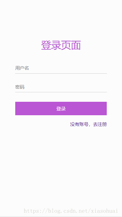
登录页面案例代码:
html代码:
<!DOCTYPE html>
<html>
<head>
<title>登录</title>
<meta charset="utf-8">
<meta name="viewport" content="width=device-width, initial-scale=1, user-scalable=no">
</head>
<link rel="stylesheet" href="./css/login.css" type="text/css"/>
<body>
<div class="login">
<div class="loginheader">
<h2>登录页面</h2>
</div>
<div class="logincontent">
<input type="text" value="" placeholder="用户名">
<input type="password" value="" placeholder="密码">
<button>登录</button>
</div>
<div class="registerjump">
<a href="">没有账号,去注册</a>
</div>
</div>
</body>
</html>
<script type="text/javascript" src="./js/common.js"></script>
css代码:
*{
font-family: "微软雅黑";
}
body,html{
margin:0;
padding:0;
background: #fcfcfc;
}
.login{
display: flex;/*flex布局*/
flex-direction:column;/*主轴方向垂直方向,从上到下*/
}
.loginheader{
height: 1.2rem;
margin-top:1.6rem;
}
.loginheader h2{
font-size: 0.52rem;
color: #fff;
font-weight: 500;
color: #BA55D3;
text-align: center;
}
.logincontent{
margin-top:0.3rem;
display: flex;
flex-direction:column;
}
.logincontent input{
width: 75%;
height: 0.5rem;
margin: 0.2rem auto;
background: #fcfcfc;
border-top: 1px #fcfcfc solid;
border-left: 1px #fcfcfc solid;
border-right: 1px #fcfcfc solid;
border-bottom: 1px #ccc solid;
outline: none;/*去除输入框点击时的外边框*/
box-shadow: none;/*去除输入框点击时的外边框*/
font-size: 0.24rem;
}
.logincontent button{
height: 0.7rem;
width: 75%;
margin: 0.3rem auto;
border: 0;
background: #BA55D3;
color: #fff;
outline: none;
box-shadow: none;
font-size: 0.24rem;
}
.registerjump{
display: flex;
width: 75%;
margin: 0 auto;
justify-content: flex-end;/*水平右对齐*/
}
.registerjump a{
font-size: 0.24rem;
text-decoration: none;
}
js代码:
// 手机端的适配代码
(function (doc, win) {
var docEl = doc.documentElement,
resizeEvt = 'orientationchange' in window ? 'orientationchange' : 'resize',
recalc = function () {
var clientWidth = docEl.clientWidth;
if (!clientWidth) return;
if(clientWidth>=640){
docEl.style.fontSize = '100px';
}else{
docEl.style.fontSize = 100 * (clientWidth / 640) + 'px';
}
};
if (!doc.addEventListener) return;
win.addEventListener(resizeEvt, recalc, false);
doc.addEventListener('DOMContentLoaded', recalc, false);
})(document, window);
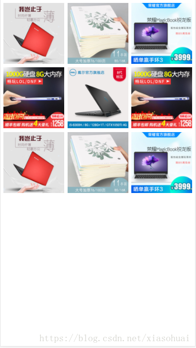
九宫格案例代码:
<!DOCTYPE html>
<html>
<head>
<title>商品首页</title>
<meta charset="utf-8">
<meta name="viewport" content="width=device-width, initial-scale=1, user-scalable=no">
<style type="text/css">
*{
font-family: "微软雅黑";
}
body,html{
margin:0;
padding:0;
}
.goodsindex .goodsgrid{
display: flex;
flex-wrap:wrap;
flex-direction: column;
padding: 0.05rem
}
.goodsindex .goodsgrid .row{
display: flex;
}
.goodsindex .goodsgrid .row .item1{
flex:1;
font-size: 0.24rem;
padding:0.05rem 0.05rem 0 0.05rem;
}
.goodsindex .goodsgrid .row .item2{
flex:1;
font-size: 0.24rem;
padding:0.05rem 0.05rem 0 0.05rem;
}
.goodsindex .goodsgrid .row .item3{
flex:1;
font-size: 0.24rem;
padding:0.05rem 0.05rem 0 0.05rem;
}
.goodsindex .goodsgrid .row .item1 img,.goodsindex .goodsgrid .row .item2 img,.goodsindex .goodsgrid .row .item3 img{
width: 100%;
}
</style>
</head>
<body>
<div class="goodsindex">
<div class="goodsgrid">
<div class="row">
<div class="item1"><img src="./image/1.jpg"></div>
<div class="item2"><img src="./image/2.jpg"></div>
<div class="item3"><img src="./image/3.jpg"></div>
</div>
<div class="row">
<div class="item1"><img src="./image/4.jpg"></div>
<div class="item2"><img src="./image/5.jpg"></div>
<div class="item3"><img src="./image/4.jpg"></div>
</div>
<div class="row">
<div class="item1"><img src="./image/1.jpg"></div>
<div class="item2"><img src="./image/2.jpg"></div>
<div class="item3"><img src="./image/3.jpg"></div>
</div>
</div>
</div>
</body>
</html>
<script type="text/javascript" src="./js/common.js"></script>