CSS全面实现内容水平居中,垂直居中
概述
本文介绍了各种情况下实现水平居中,垂直居中的方式。
参考链接
水平居中(内容)
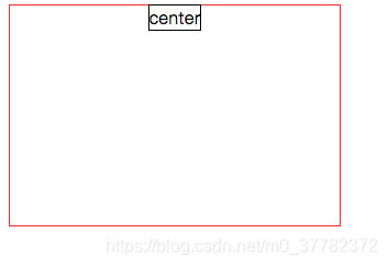
行级元素inline/inline-block
.center {
	text-align: center;
}
示例代码
.wrap {
            width: 300px;
            height: 200px;
            border: 1px solid red;
            text-align: center
        }
        .children {
            border: 1px solid black;
            /* display: inline-block; */
        }
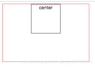
块级元素(block)
.chlldren {
	margin: 0 auto;
}
示例代码
.wrap {
           width: 300px;
           height: 200px;
           border: 1px solid red;
       }
       .children {
          margin: 0 auto;
           width: 100px;
           height: 100px;
           border: 1px solid black;
           /* display: inline-block; */
       }
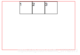
一行多个块级元素
使用flex布局
.wrap {
	display: flex;
	justify-content: center;
}
.wrap {
display: flex;
justify-content: center;
width: 300px;
height: 200px;
border: 1px solid red;
}
.wrap div{
width: 50px;
height: 50px;
border: 1px solid black;
}
垂直居中(内容)
行级元素(inline)/inline-block
- 单行
- 设置相同的padding
.wrap { padding: 30px 0; }- 设置相同的line-height和height
.wrap { height: 50px; line-height: 50px; } - 多行
- flex布局
.wrap {
	display: flex;
	align-items: center;
}