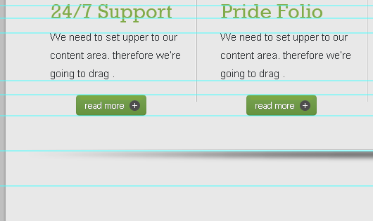
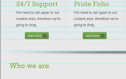
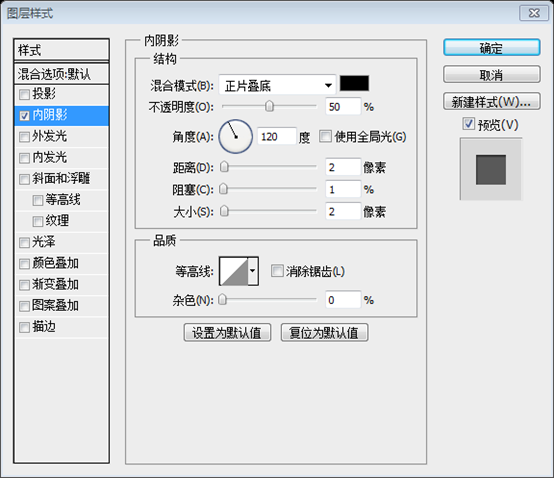
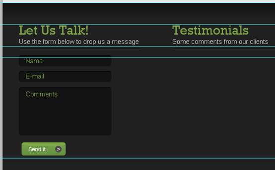
Step 21
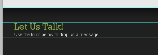
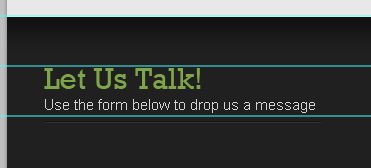
We’ll start working on our lower content area, by dragging a new guide after 50px.
步骤21
现在要创建低位的内容区域,在之前参考线的下方50px处拖动一条新的水平参考线
Add a title with these character settings:
- Font Family: Rockwell
- Font size: 30px
- Font weight: Regular
- Anti-aliasing setting: Smooth
- Color: #81aa48
按照下面的设置添加标题:
- 字体: Rockwell
- 字体大小: 30px
- 字体样式: Regular
- 消除锯齿样式:平滑
- 颜色: #81aa48
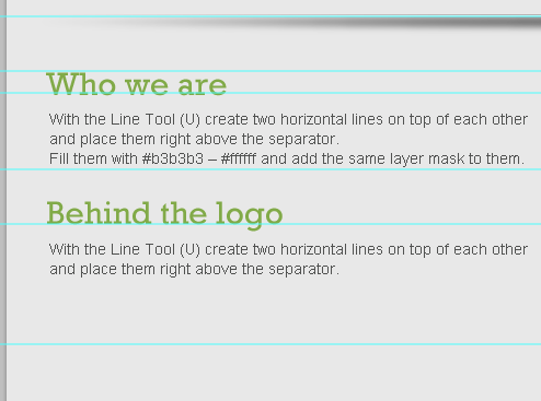
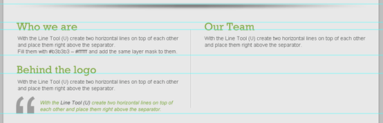
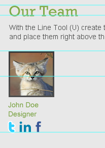
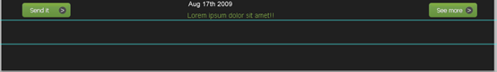
Drag two new horizontal guides according to the following image.
按照下图新建两条水平参考线(一条下方20px处,另一条再下方70px处)
Write some text with these character settings:
- Font Family: Arial
- Font size: 14px
- Font weight: Regular
- Anti-aliasing setting: None
- Color: #505150
按照下面的设置添加文字:
- 字体: Arial
- 字体大小: 14px
- 字体样式: Regular
- 消除锯齿样式:无
- 颜色: #505150
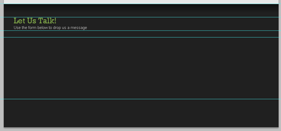
Drag a new guide after 160px as a lower border for the content area.
在之前下方的160px处新建一条水平参考线作为内容区域的底边

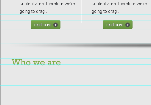
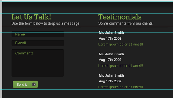
Step 22
Write another title and text using the same character settings we’ve used in the previous step.
步骤22
用和前一步骤相同的恶设置添加另一个标题和文本。(如下图,先要在倒数第二根水平参考线的下方50px处新建一条水平参考线)
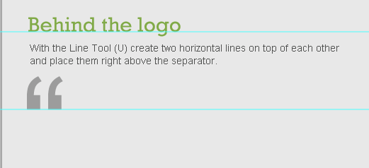
Type a quotation mark on your keyboard, with these character settings:
- Font Family: Arial
- Font size: 200px
- Font weight: Regular
- Anti-aliasing setting: Smooth
- Color: #505150
And reduce its layer’s Opacity to 50%
按键盘上的引号输入一个双引号,按照下面的设置:
- 字体: Arial
- 字体大小: 200px
- 字体样式: Regular
- 消除锯齿样式:平滑
- 颜色: #505150
调整该图层的不透明度为50%
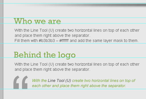
Write a word of wise or quote of yours with these character settings:
- Font Family: Arial
- Font size: 14px
- Font weight: Italic
- Anti-aliasing setting: Smooth
- Color: #81aa48
输入一些心得或名言引用,按照下面的设置:
- 字体: Arial
- 字体大小: 14px
- 字体样式: Italic
- 消除锯齿样式:平滑
- 颜色: #81aa48
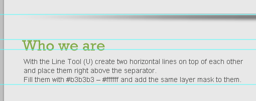
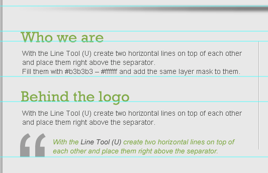
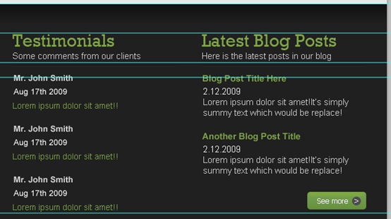
Step 23
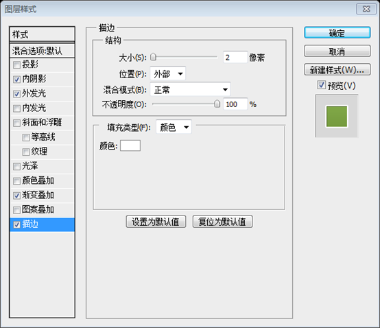
In order to create a vertical separating line, create two vertical lines next to each other, and fill them with these values: #ffffff – #b3b3b3.
步骤23
创建竖直的分隔符,创建两条紧挨着的竖直的直线((509,940,1,215)和(510,940,1,215)),颜色分别是#ffffff和#b3b3b3(#b3b3b3在#ffffff的左侧)
Make sure to keep your layer organized, Here’s how I organized them.
确保你的图层组织分明,这是我的图层分组
Step 24
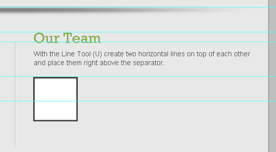
Write yet another title like the ones on the left (Try writing something that represents the team, for example I’ve written “Our Team”).
步骤24
在右侧书写和左侧一样的标题和文字(试着书写点什么代表团队,举例来说,这儿写Our Team)
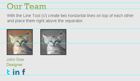
Using the Rectangle Tool (U) create a 90x90px rectangle, and fill it with any color. call this layer “photo1_holder”
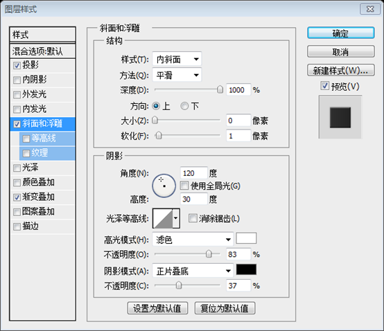
This will work as a holder for a photo of a team member. Now give it a Stroke. Use the image below for reference.
用矩形工具创建一个90px*90px的矩形(546,1011),颜色任意。命名此图层为photo1_holder
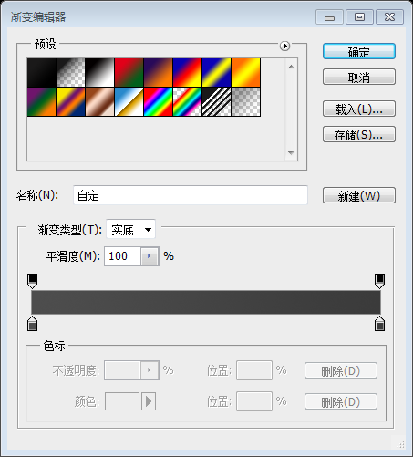
这将是团队成员照片的图片块。现在按照下图给它添加描边图层样式
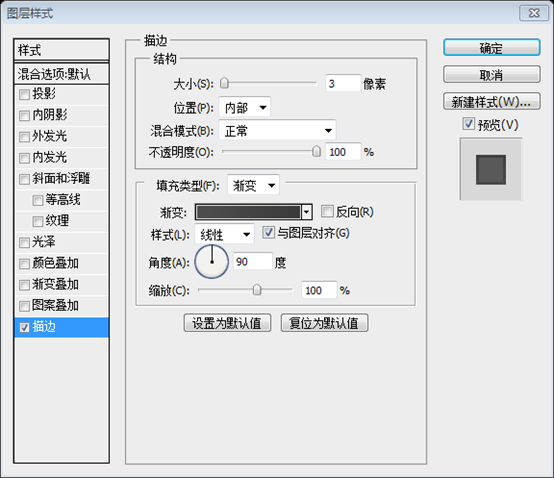
渐变编辑器的颜色: #4d4d4d,#3b3b3b
Place a photo of a member and call its layer “photo1″. Make sure that the layer “photo1″ is right above “photo1_holder” layer. then right-click on “photo1″ layer and choose Create clipping mask. You should come up with something like below!
置入一张成员的照片,命名此图层为photo1。确保photo1图层在photo1_holder图层的正上方。在photo1图层上右键选择创建剪贴蒙版。你的作品就应该如下所示
Step 25
步骤25
Write some text about the member, using these character settings:
- Font Family: Arial
- Font size: 14px
- Font weight: Regular
- Anti-aliasing setting: Smooth
- Color: #7ba344
输入成员的信息文字,按照下面的设置:
- 字体: Arial
- 字体大小: 14px
- 字体样式: Regular
- 消除锯齿样式:平滑
- 颜色: #7ba344
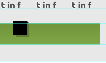
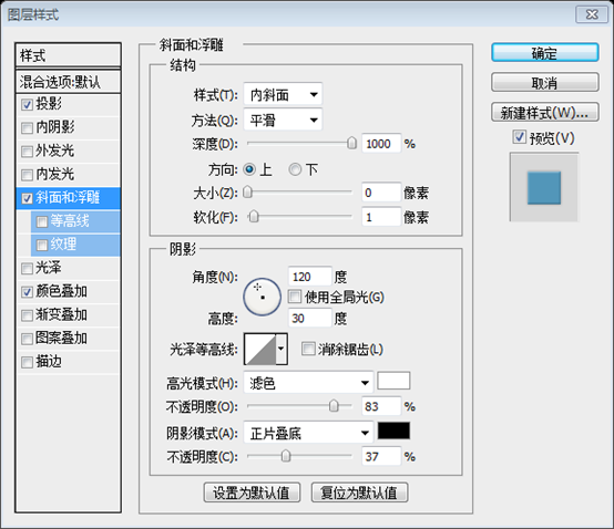
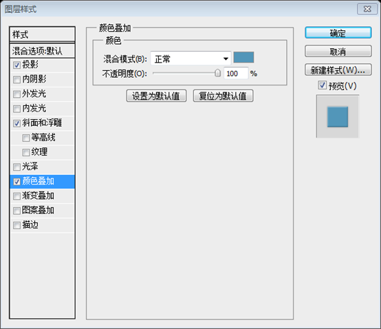
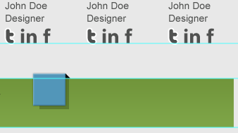
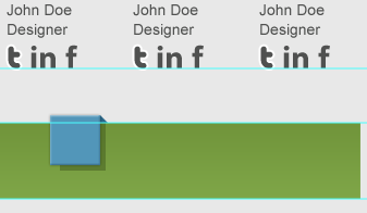
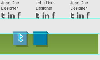
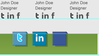
We’ll create the social media icons ourselves! let’s start with Twitter, Type “t” letter with these character settings:
- Font Family: Pico-Black (get it from here)
- Font size: 30px
- Font weight: Regular
- Anti-aliasing setting: Smooth
- Color: #2fcfff
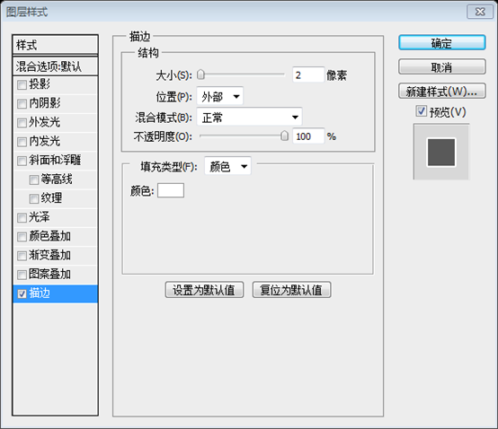
Then Give it a Stroke according to the following image.
我们自己创建一些社会媒体图标!从Twitter开始,按照下面的设置输入t字母:
- 字体: Pico-Black (从这获得)
- 字体大小: 30px
- 字体样式: Regular
- 消除锯齿样式:平滑
- 颜色: #2fcfff
然后按照下图给它添加描边

Let’s create the LinkedIn one! Type “in” word with these character settings:
- Font Family: Myriad Pro (get it from here)
- Font size: 30px
- Font weight: Bold
- Anti-aliasing setting: Smooth
- Color: #0081ac
我们创建LinkedIn!按照下面的设置输入in字母:
- 字体: Myriad Pro (从这获得)
- 字体大小: 30px
- 字体样式: Bold
- 消除锯齿样式:平滑
- 颜色: #0081ac
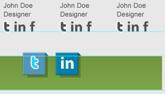
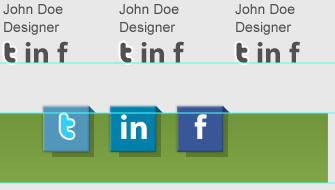
Facebook!? Type “f” letter with these character settings:
- Font Family: Klavika (get it from here)
- Font size: 30px
- Font weight: Bold
- Anti-aliasing setting: Smooth
- Color: #395796
Facebook!?按照下面的设置输入f字母:
- 字体: Klavika (从这获得)
- 字体大小: 30px
- 字体样式: Bold
- 消除锯齿样式:平滑
- 颜色: #395796
Step 26
Create another copy of the member photo. while selecting the photo layer, go to Layer > New Adjustment Layer > Black & White.
Make sure to check “Use Previous Layer to Create Clipping Mask”
步骤26
创建另一个成员照片的副本。当该副本的photo图层选中的时候,点击:图层 > 新建调整图层 > 黑白。
确保勾选使用前一图层创建剪贴蒙版
Type the same text, social media letters we’ve written before using the same character settings, but give them all this color value: #505150.
输入相同的文字,用之前的设置配置社会媒体图标的文字设置,只是给他们相同的颜色: #505150

So obviously the member will look gray when it’s not hovered!
Make two copies and align them this way
很明显的,当鼠标没有移到成员上方时灰色的
用同样的方法创建另两个副本
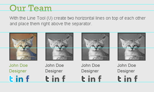
To make sure they’re well-aligned, make four separate groups each one of them contains a member’s content, and click on Distribute left edges in the control bar while having the four groups selected.
若要确保他们是定向的,使用四个单独的组,每一个组都包含成员的内容,单击图层组的左边的控制按钮选定的每个组。
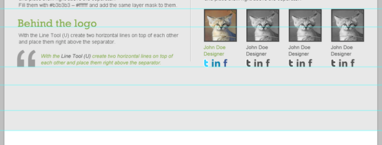
I’ve organized my layers, you?
我是这样组织图层的,你呢?
Step 27
Before we start working on the social media links area, we need to set some borders, that’s why we’ll drag two new guides according to the following image!
步骤27
在开始制作社会媒体区域前,我们需要设定一些边界,所以我们按照下新建动两条水平参考线(一条往下50px,一条再往下70px),再在内容区域的底部新建一条水平参考线
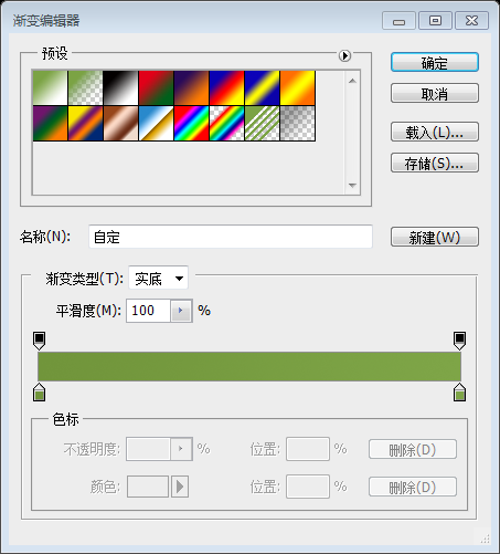
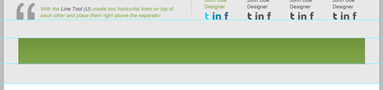
Create a selection of about 940x70px and align it like the image below.
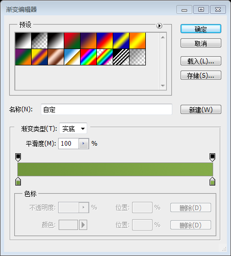
Fill it with any color, and then give it a Gradient Overlay. use the image below for reference.
按照下图创建一个矩形选区,尺寸:940px*70px
用任意色填充,并按照下图添加一个渐变叠加
建议:用矩形工具创建一个矩形(46,1220,940,70),按下图添加渐变叠加
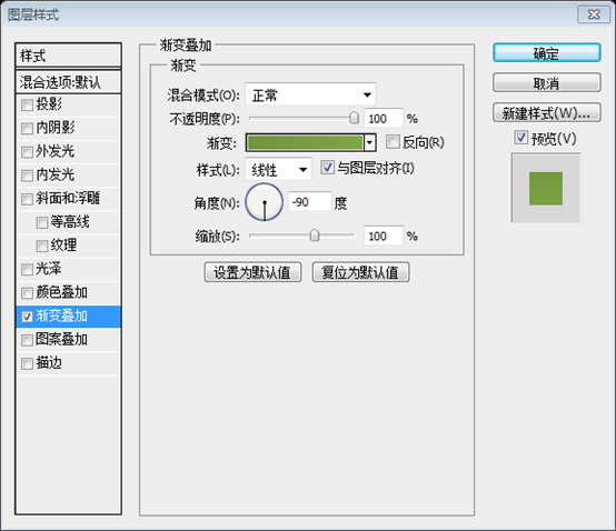
渐变编辑器的颜色: #71953b,#7ea547
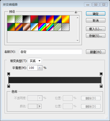
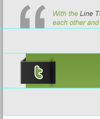
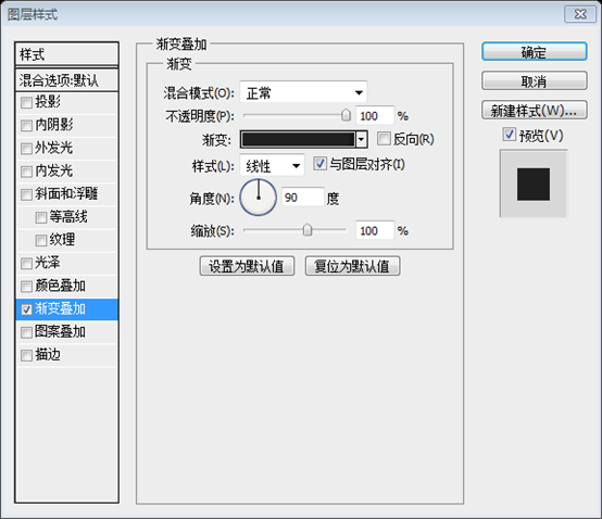
Create a rectangle of 70x45px. use the image below to align it and to give it some layer styles. call this layer “tw_bg”
新建一个矩形(36,1236),尺寸:70px*45px。按照下图摆放,并按照下图添加图层样式。命名此图层为tw_bg
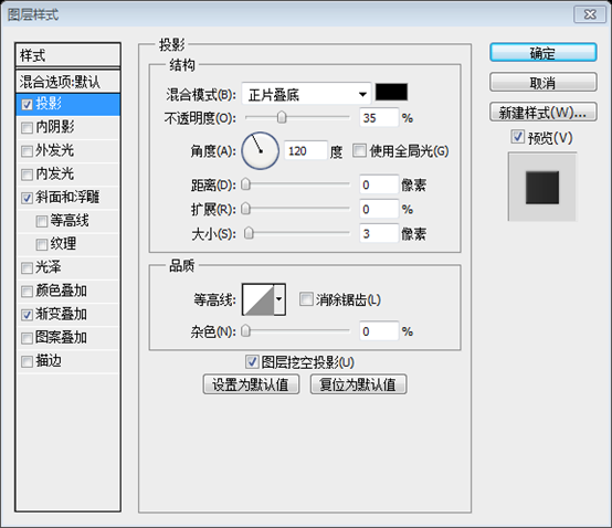

渐变编辑器颜色: #202020,#323232

Hide the layer “tw_bg” to work freely.
Create another rectangle of 10x43px, and go to Edit > Transform Path > Skew. adjust these options in the control bar:
- X: 40px
- Y: 1253px
- V: -39
Call this layer “effect” and make “tw_bg” layer visible again.
隐藏tw_bg图层以便更自由的工作
创建另一个矩形,尺寸:10x43px,然后点击:编辑 > 变换路径 > 斜切。按照下面的数字调整工具栏上的参数:
- X: 40px
- Y: 1253px
- V: -39
命名此图层effect并使tw_bg再次可见
Copy layer style from “tw_bg” layer and paste it into the layer “effect”.
复制图层tw_bg的图层样式到图层effect
Write “t” letter with these character settings:
- Font Family: Pico-Black (get it from here)
- Font size: 35px
- Font weight: Regular
- Anti-aliasing setting: Smooth
- Color: Won’t matter cause we’re gonna add a Gradient Overlay
Also give it some layer styles according to the following image.
按照下面的设置输入t字母:
- 字体: Pico-Black (从这获得)
- 字体大小: 35px
- 字体样式: Regular
- 消除锯齿样式:平滑
- 颜色: 不必关心,因为我们要添加渐变叠加
然后按照下图设置图层样式。
外发光的颜色: #83ab48
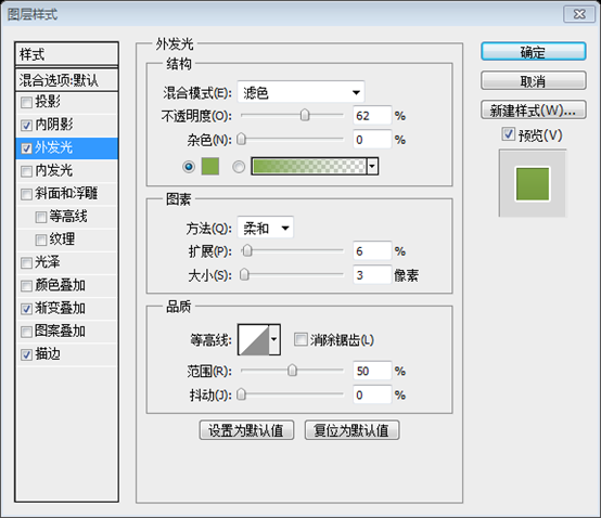

渐变编辑器的颜色: #71963c,#84ac49
Step 28
Repeat step 20 to create another separator or even copy it. then place it this way:
步骤28
重复步骤20创建另一个分隔符甚至复制一份。然后移到下图位置:
这里重复一下步骤,用椭圆工具新建一个椭圆,并添加高斯模糊,半径为3px,调整合适的位置和大小
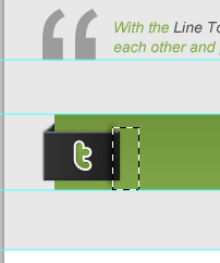
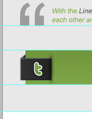
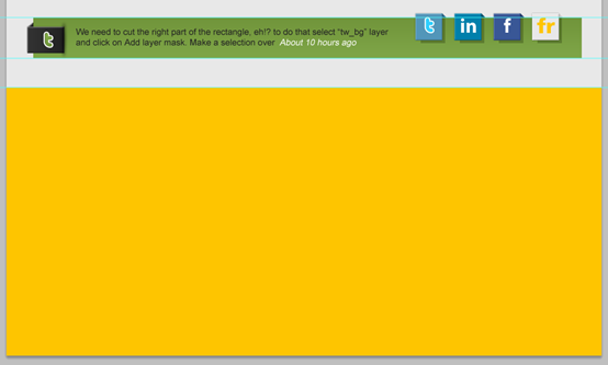
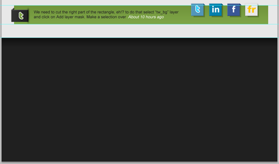
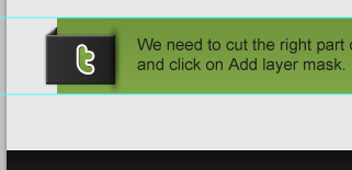
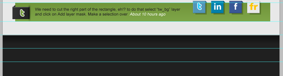
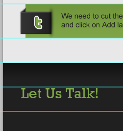
We need to cut the right part of the rectangle, eh!? to do that select “tw_bg” layer and click on Add layer mask.
Make a selection over the right part (that we need to cut) of the rectangle, set your foreground color to black (#000000) then click Shift+Backspace to fill it.
我们需要切除矩形的右半部分,嗯!?为此选择tw_bg图层并点击添加图层蒙版
新建一个选区在矩形的右侧(我们要切除的部分),设置你的前景色为黑色(#000000),然后按Shift+Backspace去填充它
Step 29
步骤29
Write some text – which is actually should be a Tweet – with these character settings:
- Font Family: Arial
- Font size: 15px
- Font weight: Regular
- Anti-aliasing setting: Smooth
- Color: #222222
按照下面的设置输入一些文字——看起来就像是Tweet:
- 字体: Arial
- 字体大小: 15px
- 字体样式: Regular
- 消除锯齿样式:平滑
- 颜色: #222222
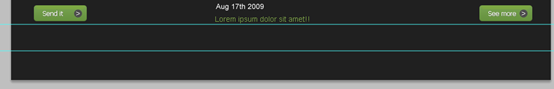
To align the text well, while having the text layer and the green bar layer selected, click on Align vertical centers.
为了完美的对齐文字,当文字图层和绿色条图层选中的时候,点击垂直居中对齐(点击:图层 > 对齐 > 垂直居中)
Step 30
Repeat step 27 to create something like in the image below. Also create a rectangle, fill it with #334814 and reduce its layer Opacity to 40%.
步骤30
重复步骤27创建如下的图形。并创建一个矩形,颜色:#334814,并设置不透明度为40%
先用矩形工具新建一个矩形(701,1213,46,46),然后建立右侧的三角阴影(方法有很多,这里就不列举了),再新建一个矩形(710,1220,42,44),颜色: #334814,不透明度改为40%,合理的调整图层顺序,效果如下
Give the big rectangle some layer styles according to the following image
给大的矩形按照下图添加图层样式

颜色叠加的颜色: #5296b9
Now fill the skewed rectangle with a darker color of this value: #2a6788
给斜切的矩形(三角形阴影)一个深色的颜色: #2a6788
Write “t” letter with these character settings:
- Font Family: Pico-Black
- Font size: 35px
- Font weight: Regular
- Anti-aliasing setting: Smooth
- Color: #2fcfff
And give it a Stroke. use the image below for reference.
按照下面的设置输入t字母:
- 字体: Pico-Black
- 字体大小: 35px
- 字体样式: Regular
- 消除锯齿样式:平滑
- 颜色: #2fcfff
然后按照下图给它添加描边

Step 31
Make another copy of the Twitter icon, change the Color Overlay (for the big rectangle) to: #0080ab, and fill the skewed rectangle with this color value: #00526d.
步骤31
创建另一个Twitter图标的副本,更改颜色叠加的颜色(大矩形)为: #0080ab,填充斜切矩形(三角形阴影)的颜色为: #00526d
Write the word “in” with these character settings:
- Font Family: Myriad Pro
- Font size: 35px
- Font weight: Bold
- Anti-aliasing setting: Smooth
- Color: #ffffff
按照下面的设置输入in字母:
- 字体: Myriad Pro
- 字体大小: 35px
- 字体样式: Bold
- 消除锯齿样式:平滑
- 颜色: #ffffff
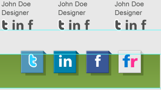
Create a third copy of the Twitter or LinkedIn icon, change the Color Overlay (for the big rectangle) to: #395796, and fill the skewed rectangle with this color value: #263e6f.
创建第三个Twitter或LinkedIn 图标,更改颜色叠加的颜色(大矩形)为: #395796,填充斜切矩形(三角形阴影)的颜色为: #263e6f
Write “f” letter with these character settings:
- Font Family: Klavika
- Font size: 35px
- Font weight: Bold
- Anti-aliasing setting: Smooth
- Color: #ffffff
按照下面的设置输入f字母:
- 字体: Klavika
- 字体大小: 35px
- 字体样式: Bold
- 消除锯齿样式:平滑
- 颜色: #ffffff
Make a last copy, change the Color Overlay (for the big rectangle) to: #e8e8e8, and fill the skewed rectangle with this color value: #cdcdcd.
做最后一个副本,更改颜色叠加的颜色(大矩形)为: #e8e8e8,填充斜切矩形(三角形阴影)的颜色为: #cdcdcd

Write the word “fr” with these character settings:
- Font Family:Frutiger Black
- Font size: 35px
- Font weight: Bold
- Anti-aliasing setting: Smooth
- Color: f: #0079d2 – r: #ff3093
按照下面的设置输入fr字母:
- 字体: Frutiger Black
- 字体大小: 35px
- 字体样式: Bold
- 消除锯齿样式:平滑
- 颜色: f的颜色: #0079d2 和 r的颜色: #ff3093
Put each of the icons in a separate group, and while selection the four of them click on Distribute left edges
把每一个图标都归于一个个分开的组,并且选择他们只要点击左侧的控制按钮就行了
Step 32
Keep it goin’! only the footer left. Create a selection of 1020x460px and fill it with any color for now.
步骤32
继续!只剩下页脚部分了。创建一个矩形选区,尺寸:1020px*460px,并用任意色填充
建议:用矩形工具创建一个矩形(0,1340,1020,460),用任意色填充
Apply a Gradient Overlay to it. use the image below for reference.
给它按照下图添加渐变叠加
渐变编辑器的颜色:#202020,#202020,#111111

You should have a nice shadow!
你将获得一个漂亮的投影
with the Single Row Marquee Tool (M) create a 1px selection and fill it with white (#ffffff).
用单行选择工具创建1px的选区,然后用白色填充
建议:用直线工具创建一条白色水平直线(0,1340,1020,1)
Step 33
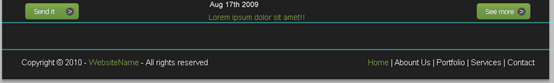
Drag two new horizontal guides according to the following image.
步骤33
按照下图拖动两条新的水平参考线(一条在之前的参考线往下50px,另一条再往下50px)
Write a title with these character settings:
- Font Family: Rockwell
- Font size: 30px
- Font weight: Regular
- Anti-aliasing setting: Sharp
- Color: #7ea547
按照下面的设置添加标题:
- 字体: Rockwell
- 字体大小: 30px
- 字体样式: Regular
- 消除锯齿样式:锐利
- 颜色: #7ea547
Write a sub-title with these character settings:
- Font Family: Arial
- Font size: 15px
- Font weight: Regular
- Anti-aliasing setting: None
- Color: #d3d3d3
按照下面的设置添加子标题文字:
- 字体: Arial
- 字体大小: 15px
- 字体样式: Regular
- 消除锯齿样式:无
- 颜色: #d3d3d3
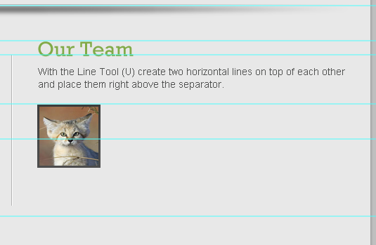
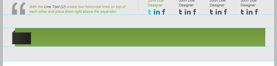
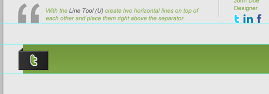
Using the Line Tool (U) create two horizontal lines on top of each other, and fill them with these color values: #151515 – #2f2f2f.
用直线工具在创建两条彼此挨着的水平直线,分别用颜色: #151515(上)和#2f2f2f(下)
Step 34
Drag two new horizontal guides according to the following image.
步骤34
按照下图拖动两条新的水平参考线(一条在之前的参考线往下25px,另一条再往下230px)
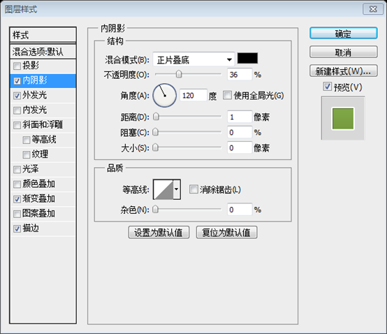
With the Rounded Rectangle Tool (U) create two rectangles of 210x25px – 5px radius, fill them with: #141313 and give them an Inner Shadow.
用圆角矩形工具创建两个圆角矩形(分别是(37,1460)和(37,1496)),尺寸:210px*25px,半径为5px,颜色: #141313,并按照下图添加内投影的样式
Write some text inside the two rectangles with these character settings:
- Font Family: Arial
- Font size: 15px
- Font weight: Regular
- Anti-aliasing setting: None
- Color: #7ea547
按照下面的设置添加两个圆角矩形内的文字:
- 字体: Arial
- 字体大小: 15px
- 字体样式: Regular
- 消除锯齿样式:无
- 颜色: #7ea547
Create another rectangle like the ones above, but this time its height will be: 110px. Also write some text inside it with the same character settings above.
Make a copy of the button we’ve created in step 17. and align it like the following image
创建和上面一样的另一个圆角矩形(37,1533),高度为:110px。并且用同样的文字设置在里面添加文本
复制步骤17中创建的按钮。按照下图摆放到合适的位置
Step 35
Write another title like the one on the left.
步骤35
添加另一个标题,就像左边一样
Write some text. use the image below for reference.
按照下图添加一些文字
Step 36
Fill the right part with a third title and some text.
步骤36
填充右边的第三部分的标题和文字
Step 37
We’re almost there! drag a new horizontal guide after 50px.
步骤37
我们仍在那!拖动一条新的水平参考线,往下50px
Create two horizontal lines on top of each other, and fill them with these color values: #181818 – #2f2f2f.
创建两条彼此挨着的水平线,并使用这些颜色值:#181818(上)–#2f2f2f(下)。
Write some copyright text with these character settings:
- Font Family: Arial
- Font size: 15px
- Font weight: Regular
- Anti-aliasing setting: None
- Color: (#ffffff) – #82aa48
按照下面的设置添加版权信息文字:
- 字体: Arial
- 字体大小: 15px
- 字体样式: Regular
- 消除锯齿样式:无
- 颜色: (#ffffff) – #82aa48
Conclusion
There we have it! we’ve created a professional-looking web 2.0 layout. As you can see the techniques used here are simple. but they get nice results.
结论
我们拥有它! 我们创建具有专业外观的web 2.0布局。 你可以看到这里使用的是简单的的技术。 但是他们得到好的结果。
后记:
这是我翻译的最详细的一篇教程了,详细到每一个小步骤,本教程非常适合初学者临摹学习。
本教程的亮点有两个
1、特色区域的图片滑动块的制作,有种清新透彻的感觉
2、社会媒体图标的制作,纯手工制作,绝无导入图片的过程