Step 11
To create our shadow, we’ll start by duplicating the two layers “pic” and “pic_holder”.
While having the two duplicated layers selected, go to Edit > Free Transform, and adjust the height to: -100.0%
步骤11
创建图片阴影,我们首先复制pic和pic_holder两个图层
当复制好的两个图层选中的时候,点击:编辑 > 自由变换,调整高度为-100%

While we’re still selecting the two duplicated layers right-click on them and choose Convert to Smart Object; call this layer “shadow”. and make sure to place it at the bottom.
在复制的两个图层上右键选择转换为智能对象,命名为shadow。然后移动图层到原图片的下方
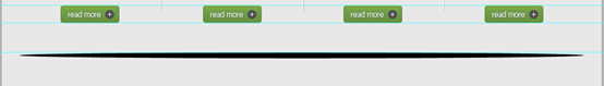
Select “shadow” layer then click on Add layer mask (at the bottom of the layers panel)
选择shadow图层然后点击添加图层蒙版(在图层面板的底部)
Choose the Gradient Tool (G) and with a black, white linear gradient drag from down to top.
选择渐变工具,选择黑-白线性渐变,从下往上拖动(下图中红线所示,从下往上拖动)

You should have something like this!
效果如下:

Step 12
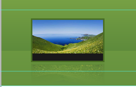
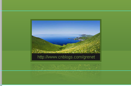
We need to add a description to our image. so we’ll create a selection of 240x25px, and fill it with this color value: #1a1919, This will work as the description background.
步骤12
需要给图片添加一个说明文字。所以我们要创建一个选区,尺寸:240px*25px,用颜色: #1a1919填充,这作为说明文字的背景。
用矩形工具新建一个矩形(105,419)替代本步骤,颜色: #1a1919
Write some description with these character settings:
- Font Family: Arial
- Font size: 15px
- Font weight: Regular
- Anti-aliasing setting: None
- Color: #82aa48
按照下面的设置添加说明文字:
- 字体: Arial
- 字体大小: 15px
- 字体样式: Regular
- 消除锯齿样式:无
- 颜色: #82aa48
Make sure to keep your document tidy!
请务必保持您的文档整洁 !
Step 13
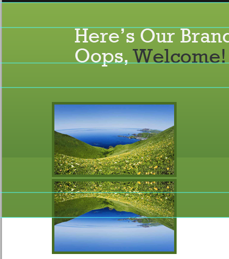
Make another copy of the featured design image and align it to the right.
步骤13
在特色区域的右侧重复的添加另一张图片
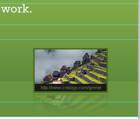
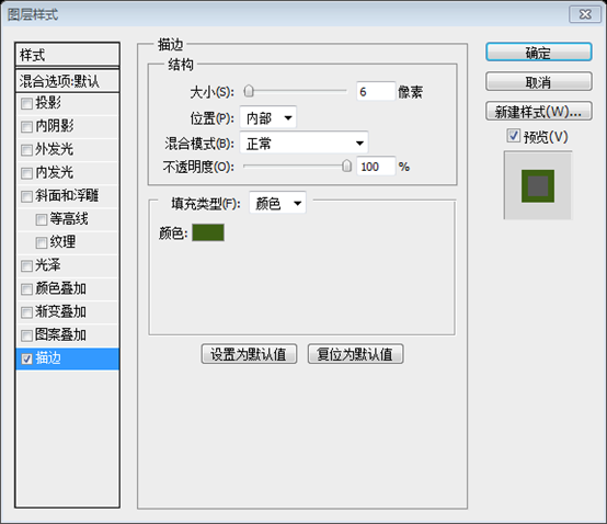
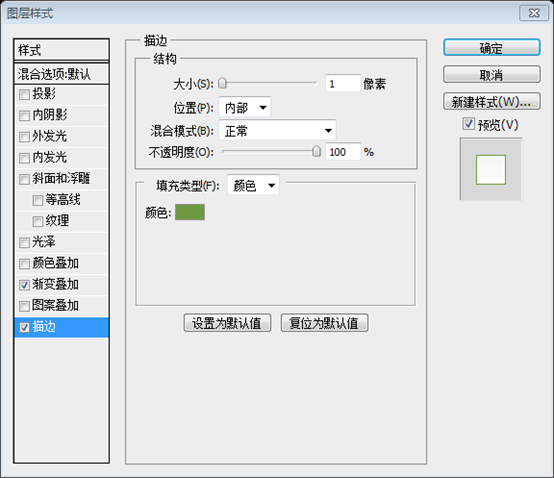
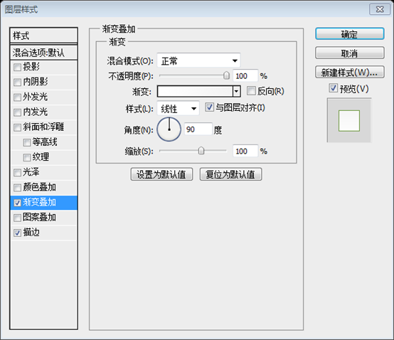
We’ll make the center image a bit bigger, so make a selection of 340x200px, align it like the following, and fill it with any color.
We’ll also give it a Stroke. use the following image for reference
我们在中间添加一个大的图片,创建一个大的选区,尺寸:340px*200px,按照下图摆放,用任意颜色填充
给它按照下图添加一个描边。
用矩形工具创建一个矩形(340,270),颜色任意。并按照下图添加描边样式,替代本步骤
描边的颜色: #3d6013

给当中的图片块添加图片和阴影
And here’s what we’ve got!
这是目前的效果
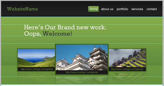
Make sure to organize your layers and to group them. I personally have created three separate groups. here’s how they look
组织你的图层,并合理的归并为组。我把三张图片的各个图层分别归并为3个组
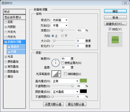
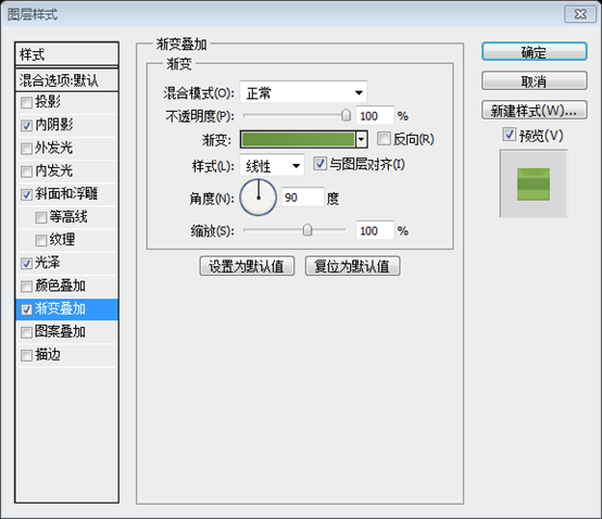
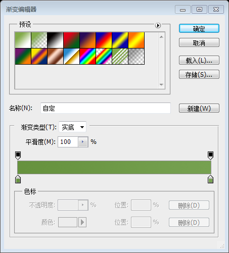
Step 14
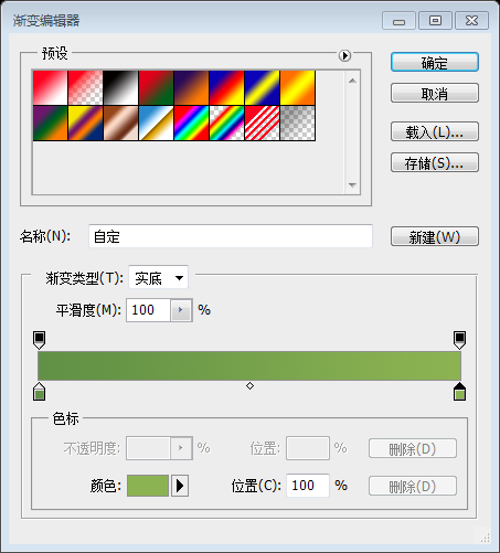
Let’s create our sliding button! we’ll start by creating an Ellipse of 50x50px using the Elliptical Marquee Tool (M), and filling it with any color.
Now give it some layer styles according to the following image
步骤14
要创建滑动按钮!用椭圆选择工具创建一个椭圆选区,尺寸:50px*50px,用任意色填充
直接用椭圆工具创建一个椭圆(28,220),尺寸:50px*50px,颜色任意。
按照下图给该图层添加图层样式
描边的颜色: #6f9941
渐变编辑器的颜色: #ffffff,#f3f3f3
With the Custom Shape Tool (U) create an arrow and give it the following layer styles
用自定义形状工具创建一个箭头,并按照下图添加图层样式
内阴影的颜色: #3c3c3c
渐变编辑器颜色: #619145,#8cb352
Make another copy of the arrow and align it to the right
在右边复制一个箭头
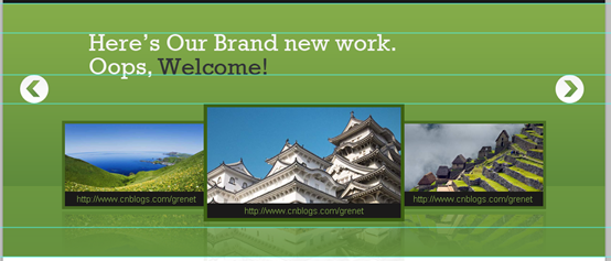
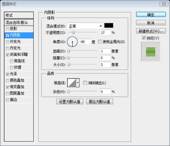
Step 15
Let’s work on the content area. start by creating a selection of 1020x815px
Click Shift+Backspace to fill your selection with this color: #e8e8e8
步骤15
接下来要创建内容区域。首先创建一个选区,尺寸:1020*815
按Click+Backspace用颜色#e8e8e8填充选区
经后面的步骤测算,此处应该是1020*810
建议:直接用矩形工具创建一个矩形(0,530,1020,810),颜色: #e8e8e8
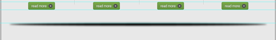
With the Single Row Marquee Tool (M) create a 1px selection, place it like the following image, and fill it with white (#ffffff).
Now you’re having perfect pixel details!
用单行选择工具创建一个1px的选区,按照下图摆放,用白色填充
现在你获得完美的单像素元件
建议:用直线工具画一条水平直线(0,530,1020,1)比较简单,颜色: #ffffff
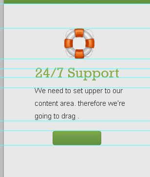
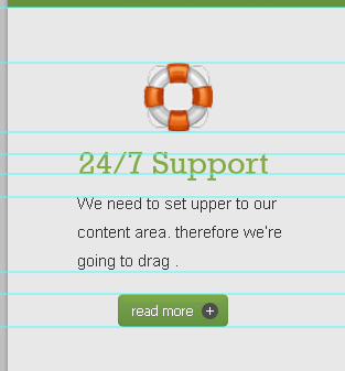
Step 16
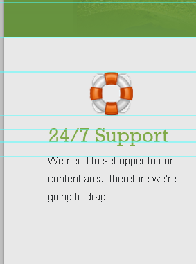
We need to set upper borders to our content area. therefore we’re going to drag a new horizontal guide after 50px.
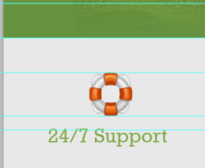
Download this Icon set: Basic Set – Pixel Mixer and place of them like the following.
步骤16
我们需要设置内容区域的边界。我们要在之前的水平参考线之下50px拖动一个新的水平参考线
下载图标:Basic Set – Pixel Mixer,并按下图摆放
Drag a new horizontal guide at the bottom of the icon, leave 20px then drag a new one.
在图标的底部拖动一条水平的参考线,往下20px再拖动一条水平参考线
Now Write some heading with these settings:
- Font Family: Rockwell
- Font size: 29px
- Font weight: Regular
- Anti-aliasing setting: Sharp
- Color: #81aa48
按照下面的设置添加头部文字:
- 字体: Rockwell
- 字体大小: 29px
- 字体样式: Regular
- 消除锯齿样式:锐利
- 颜色: #81aa48
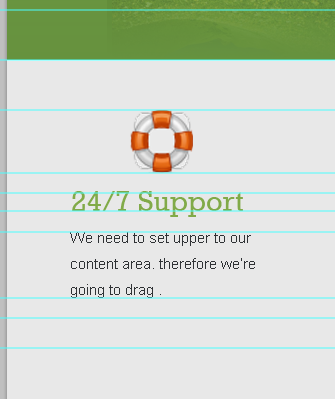
Drag yet another two guides according to the following image
按照下图拖动另两条新的水平参考线(一条在文字的底部,一条再往下20px)
Write some text with these settings:
- Font Family: Arial
- Font size: 15px
- Font weight: Regular
- Anti-aliasing setting: None
- Color: #2f3235
按照下面的设置添加文字:
- 字体: Arial
- 字体大小: 15px
- 字体样式: Regular
- 消除锯齿样式:无
- 颜色: #2f3235
Drag more three guides according to the following image
按照下图拖动3条水平参考线(一条在文字的底部,一条往下20px,一条再往下30px)
Step 17
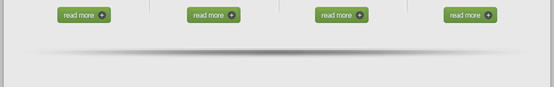
It’s time to create our “read more” button. With the Rounded Rectangle Tool (U) create a rectangle of 100x30px and 5px radius. and fill it with any color just for now.
步骤17
该是创建read more按钮的时候了。用圆角矩形工具创建一个圆角矩形(100,790),尺寸:100px*30px,半径为5px,用任意颜色填充
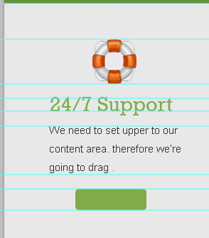
Give this rectangle some layer styles. use the image below for reference.
按照下图给这个圆角矩形添加图层样式
斜面和浮雕中的高光模式的颜色: #7da841

渐变编辑器的颜色: #66923e,#76a150
With the Ellipse Tool (U) create an ellipse of 15x15px and fill it with this color value: #4d4d4d.
To align it correctly select its layer and the rectangle’s layer then click Align vertical centers while having both layers selected.
用椭圆工具创建一个椭圆,尺寸:15px*15px,颜色: #4d4d4d
为了精确的对齐,选择该图层和圆角矩形的图层,然后点击垂直居中对齐(点击:图层 > 对齐 > 垂直居中)
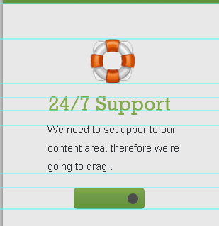
Type “+”, fill it with white (#ffffff) and place it like this
输入+,用白色颜色填充,按下图摆放
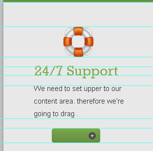
Write the word “read more” with the following character settings:
- Font Family: Tahoma
- Font size: 12px
- Font weight: Regular
- Anti-aliasing setting: None
- Color: #ffffff
按照下面的设置添加文字read more:
- 字体: Tahoma
- 字体大小: 12px
- 字体样式: Regular
- 消除锯齿样式:无
- 颜色: #ffffff
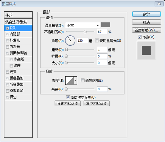
Give it a drop shadow. use the image below for reference
给文字添加投影。按照下图设置投影,投影的颜色: #7c7c7c
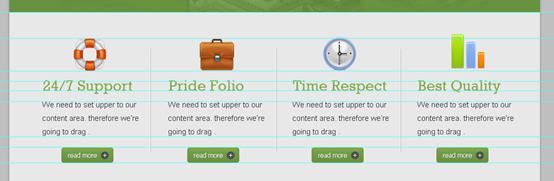
Step 18
To create a vertical separating line, With the Line Tool (U) create two vertical lines next to each. and fill them with these values: #ffffff – #b3b3b3.
步骤18
创建竖直分割线,用直线工具创建两条紧挨着的竖直直线((270,600,1,200)和(271,600,1,200))。颜色分别是:#ffffff和#b3b3b3
Align your line like the following image
按下图排列你的直线
Don’t forget to organize your layers. take a look at mine!
别忘组织你的图层。就像我一样。
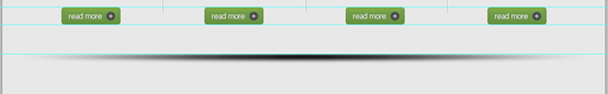
Step 19
Make three copies of what we’ve created in the previous two steps. and have something like this!
步骤19
复制上面两个步骤的3次。完成如下图
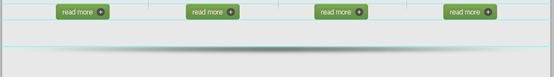
Step 20
Let’s create our separator.
Drag a new horizontal guide after 50px
步骤20
创建水平分隔符
在之前的水平参考线下方50px处新建一条水平参考线
With the Elliptical Marquee Tool (M) create a selection like the one below.
Set your foreground color to black (#000000) then click Shift+Backspace to fill your selection. call this layer “separator_bg”.
如下图,用椭圆选择工具创建一个椭圆选区
设置你的前景色为黑色(#000000),然后按Shift+Backspace填充你的选区。命名此图层为separator_bg
建议:用椭圆工具创建一个椭圆(30,870,960,10),颜色: #000000
To make it looks blurry, go to Filter > Blur > Gaussian Blur – radius: 3px.
要看起来模糊一点,点击:滤镜 > 模糊 > 高斯模糊,半径:3px

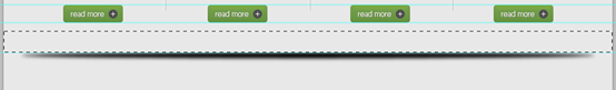
While selecting “separator_bg” layer selected, create a selection like the one below then hit delete.
当separator_bg层被选中的时候,按下图创建一个选区,并按delete。按Ctrl+D取消选区
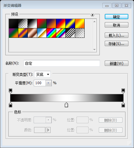
Click on Add layer mask icon. and set your gradient editor to black, white, black.
点击添加图层蒙板图标。并设置你的渐变编辑器为:黑-白-黑
With the Gradient Tool (G) drag with a linear gradient according to the following image.
按照下图用渐变工具拖动一个线性渐变(从右向左水平拖动,拖动的时候按Shift)
Reduce the layer Opacity to 50%
调整该图层的不透明度为50%
With the Line Tool (U) create two horizontal lines on top of each other and place them right above the separator.
Fill them with #b3b3b3 – #ffffff and add the same layer mask to them.
用直线工具创建两条水平直线((30,868,960,1)和(30,869,960,1)),在刚才的那个分隔符的正上方
填充他们的颜色分别是#b3b3b3和#ffffff,并添加和分隔符同样的图层蒙版