我们经常会看到CSS3能制作出很炫酷的动画效果,但是自己却只能做一些简单的。原因是对CSS3动画只知其一,不知其二。最近正好有做动画的项目,于是花时间将css3动画做了一个探究之旅,记录在册。
动画是使元素从一种样式逐渐变化为另外一种效果,CSS3动画的生成,主要依赖@keyframes定义动画,animation执行动画。
@keyframes
通过 @keyframes 规则创建动画。
@keyframes keyframes-name {keyframes-selector {css-styles;}}
keyframes-name帧列表的名称。 名称必须符合 CSS 语法中对标识符的定义。
keyframes-selector动画时长的百分比。合法值:
0-100%
from 等效于 0%
to 等效于 100%
css-styles需要改变的css样式,支持多属性
animation
animation 是一个简写的属性,用于设置6个动画属性:
animation-name:这个就是使用@keyframes定义的动画名称;animation-duration:动画执行的时间,以秒为单位animation-delay:规定动画开始之前的延迟animation-iteration-count:规定动画应该播放的次数,n(次数) | infinite(无限次)animation-direction:规定是否应该轮流反向播放动画animation-timing-function:规定动画的速度曲线
动态效果查看:心跳

@keyframes changeSize {
    0% {
        transform: scale(0.8);
    }
    50% {
        transform: scale(1.2);
    }
    100% {
        transform: scale(0.8);
    }
}

.demo {
    animation-name: changeSize;
    animation-duration: 2s;
    animation-iteration-count:infinite;
}
animation-timing-function
这里说下复杂属性,第一个是animation-timing-function:规定动画速度的曲线
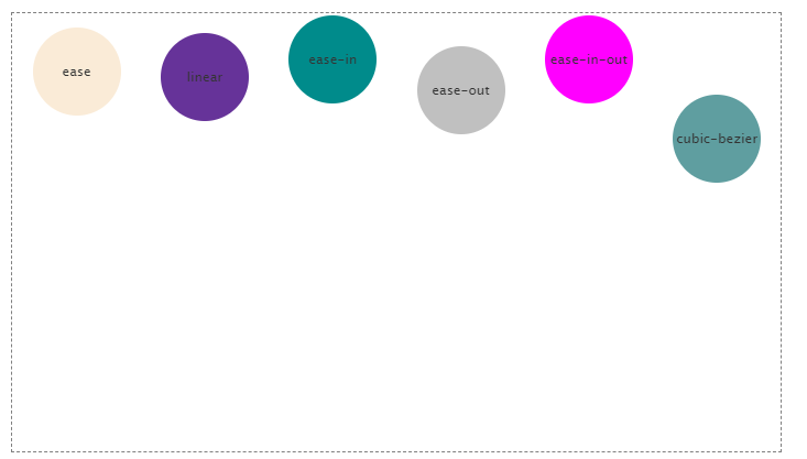
| 值 | 说明 |
|---|---|
| ease | 默认,低速开始,然后加快,结束前变慢 |
| linear | 从头到尾速度相同 |
| ease-in | 以低速度开始,先慢后快 |
| ease-out | 以低速结束,先快后慢 |
| ease-in-out | 以低速开始和结束 |
| cubic-bezier(x1,y1,x2,y2) | 在 cubic-bezier 函数中自己的值。可能的值是从 0 到 1 的数值。 |
cubic-bezier:三次赛贝尔曲线函数,前面的几个预设函数都可以通过它来实现。 通过控制曲线上的四个点(起始点(0,0)、终止点(1,1)以及两个相互分离的中间点)来绘制一条曲线并以曲线的状态来反映动画过程中速度的变化。可以访问 cubic-bezier.com 来设置对应的值。
ease 的效果等同于 cubic-bezier(.25,.01,.25,1)
linear 的效果等同于 cubic-bezier(0,0,1,1)
ease-in 的效果等同于 cubic-bezier(.42,0,1,1)
ease-out 的效果等同于 cubic-bezier(0,0,.58,1)
ease-in-out 的效果等同于 cubic-bezier(.42,0,.58,1)
动态效果查看:球体降落
@keyframes dropdown {
    0% {
        top: 0px;
    }
    100% {
        top: 420px;
    }
}

ul li{
    &:first-child{
        animation: dropdown 6s ease infinite;
    }
    &:nth-child(2){
        animation: dropdown 6s linear infinite;
    }
    &:nth-child(3){
        animation: dropdown 6s ease-in infinite;
    }
    &:nth-child(4){
        animation: dropdown 6s ease-out infinite;
    }
    &:nth-child(5){
        animation: dropdown 6s ease-in-out infinite;
    }
    &:last-child{
        animation: dropdown 6s cubic-bezier(.08,.6,.67,1.03) infinite;
    }
}
animation-direction
animation-direction 定义是否应该轮流反向播放动画,如果动画次数设置为一次,则无效。
| 值 | 说明 |
|---|---|
| normal | 默认,正常播放 |
| reverse | 动画反向播放 |
| alternate | 交替播放, 动画会在奇数次数(1、3、5 等等)正常播放,而在偶数次数(2、4、6 等等)反向播放。 |
| alternate-reverse | 交替播放, 动画会在奇数次数(1、3、5 等等)反向播放,而在偶数次数(2、4、6 等等)正常播放。 |
我们可以把上面的案例每个都加上alternate的参数,再看下效果,是不是更赞了?
动态效果查看:球体升降
ul li{
    &:first-child{
        animation: dropdown 6s ease infinite alternate;
    }
    &:nth-child(2){
        animation: dropdown 6s linear infinite alternate;
    }
    &:nth-child(3){
        animation: dropdown 6s ease-in infinite alternate;
    }
    &:nth-child(4){
        animation: dropdown 6s ease-out infinite alternate;
    }
    &:nth-child(5){
        animation: dropdown 6s ease-in-out infinite alternate;
    }
    &:last-child{
        animation: dropdown 6s cubic-bezier(.08,.6,.67,1.03) infinite alternate;
    }
}