一、首页布局简单思路
回顾上一篇博文,首页的内容主要有轮播图,横向滑动菜单以及菜单对应的view,横向滑动菜单有签到、课堂测试、模拟测试、课堂提问、答问记录五个选项,当点击选项时更新显示view。由于素材和时间有限,所以布局做得相对简单,主要是侧重思路及代码逻辑。
二、轮播图
查看文档,发现轮播图使用的是swiper组件,swiper有以下属性:
| 属性名 | 类型 | 默认值 | 说明 | 最低版本 |
|---|---|---|---|---|
| indicator-dots | Boolean | false | 是否显示面板指示点 | |
| indicator-color | Color | rgba(0, 0, 0, .3) | 指示点颜色 | 1.1.0 |
| indicator-active-color | Color | #000000 | 当前选中的指示点颜色 | 1.1.0 |
| autoplay | Boolean | false | 是否自动切换 | |
| current | Number | 0 | 当前所在页面的 index | |
| interval | Number | 5000 | 自动切换时间间隔 | |
| duration | Number | 500 | 滑动动画时长 | |
| circular | Boolean | false | 是否采用衔接滑动 | |
| vertical | Boolean | false | 滑动方向是否为纵向 | |
| bindchange | EventHandle | current 改变时会触发 change 事件,event.detail = {current: current, source: source} |
那就可以定义一个swiper,样式指定高,宽铺满,swiper里的image组件图片100%显示就能铺满屏幕。还有一点,轮播图是从服务器请求的,那应当用一个block去循环请求到的url列表来设置swiper-item里头的image组件,然后遍历在前台显示。前台的代码如下:
| <view class='section'> <swiper indicator-dots="true" autoplay="true" interval="3000" duration="1000" class='swiper'> <block wx:for="{{vedioImgUrls}}" wx:key="*this"> <swiper-item id="{{index}}" catchtap="swiperItemClick" > <image src="{{item.thumbnail.url}}" /> </swiper-item> </block> </swiper> </view> |
样式代码:
| /* 轮播样式 */ .swiper{ width: 100%; height: 240px; } /* 轮播图片样式 */ .swiper swiper-item image{ width: 100%; } |
当然,现在是空的数据,显示不了啥,因为并没有从服务器获取数据,先指定一个本地图片上海交大计算机网络课程的缩略图,效果如下:

三、横向滑动菜单
查看文档,滑动组件就是scroll-view,scroll-view有比较多的属性,常用属性就是scroll-x和scroll-y:
| 属性名 | 类型 | 默认值 | 说明 |
|---|---|---|---|
| scroll-x | Boolean | false | 允许横向滚动 |
| scroll-y | Boolean | false | 允许纵向滚动 |
| upper-threshold | Number | 50 | 距顶部/左边多远时(单位px),触发 scrolltoupper 事件 |
| lower-threshold | Number | 50 | 距底部/右边多远时(单位px),触发 scrolltolower 事件 |
| scroll-top | Number | 设置竖向滚动条位置 | |
| scroll-left | Number | 设置横向滚动条位置 | |
| scroll-into-view | String | 值应为某子元素id(id不能以数字开头)。设置哪个方向可滚动,则在哪个方向滚动到该元素 | |
| scroll-with-animation | Boolean | false | 在设置滚动条位置时使用动画过渡 |
| enable-back-to-top | Boolean | false | iOS点击顶部状态栏、安卓双击标题栏时,滚动条返回顶部,只支持竖向 |
| bindscrolltoupper | EventHandle | 滚动到顶部/左边,会触发 scrolltoupper 事件 | |
| bindscrolltolower | EventHandle | 滚动到底部/右边,会触发 scrolltolower 事件 | |
| bindscroll | EventHandle | 滚动时触发,event.detail = {scrollLeft, scrollTop, scrollHeight, scrollWidth, deltaX, deltaY} |
于是思路就是给一个scroll-view设置scroll-x属性为true,然后scroll-view里头有五个菜单label,这里说下label是可以把几个组件合并的,在点击事件的使用有意想不到的效果,于是得到前台代码如下:
| <view class='section'> <scroll-view class="categories" scroll-x="true"> <block wx:for="{{selectedScrollItems}}" wx:key="*this"> <label class="category" id="{{index}}" bindtap='scrollMenuClick'> <view wx:if="{{menuIndex==index}}" style='color:green; font-size: 18px;'>{{item}}</view> <view wx:else style='color:royalblue;'>{{item}}</view> </label> </block> </scroll-view> </view> |
样式代码:
| /* 滑动菜单样式 */ .categories { height: 40px; line-height: 40px; border: 1px solid #eee; white-space: nowrap; display: flex; } /* 滑动菜单item样式 */ .categories .category { width: 80px; height: 40px; text-align: center; display: inline-block; border-right: 1px solid #eee; color: royalblue; font-size: 15px; } |
效果如下:
四、子菜单对应view
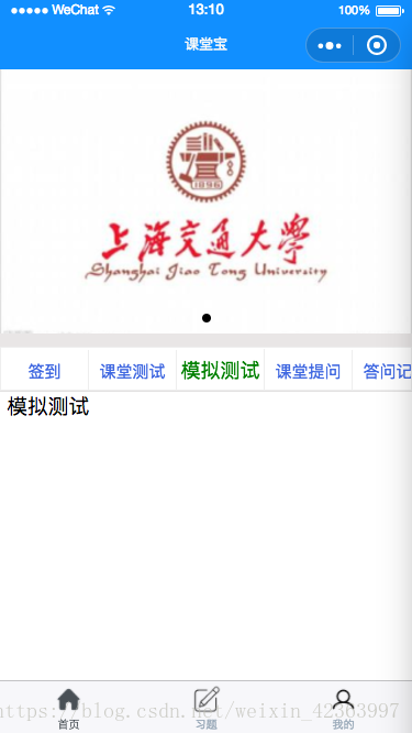
首先,需求是点击选项显示不同的界面,那么思路就可以这样:设计5个view,点到谁谁显示其他隐藏就好。那么逻辑就是在前台写五个view,后台写五个view对应的标记,当选中时该对应标记为true,前台根据这个标记去判定是否渲染,于是得到前台代码如下:
| <view class='section' hidden='{{selectedScrollItemsHiddenSign[0]}}'> 签到 </view> <view class='section' hidden='{{selectedScrollItemsHiddenSign[1]}}'> 课堂测试 </view> <view class='section' hidden='{{selectedScrollItemsHiddenSign[2]}}'> 模拟测试 </view> <view class='section' hidden='{{selectedScrollItemsHiddenSign[3]}}'> 课堂提问 </view> <view class='section' hidden='{{selectedScrollItemsHiddenSign[4]}}'> 答问记录 </view> |
后台代码:
| data{ // 菜单选项 selectedScrollItems: ['签到', '课堂测试', '模拟测试', '课堂提问', '答问记录'], // 菜单选项隐藏和显示标志 selectedScrollItemsHiddenSign: [false, true, true, true, true] } |
在scroll-view绑定的scrollMenuClick事件里头代码如下:
| scrollMenuClick:function(e){ // 隐藏其他页面并显示当前点击的菜单页面 for (var i = 0; i < this.data.selectedScrollItemsHiddenSign.length;i++){ if (i == e.currentTarget.id) this.data.selectedScrollItemsHiddenSign[i] = false; else this.data.selectedScrollItemsHiddenSign[i] = true; } this.setData({ menuIndex: e.currentTarget.id, selectedScrollItemsHiddenSign: this.data.selectedScrollItemsHiddenSign}); // 显示加载logo wx.showToast({ title: '加载中', icon: 'loading', duration:10000 }); // 选中第一个菜单 if (e.currentTarget.id == 0){ setTimeout(function () { wx.hideToast() }, 3000); }// 选中第二个菜单,加载课堂测试题 else if (e.currentTarget.id == 1){ setTimeout(function () { wx.hideToast() }, 3000); } // 选中第三个菜单 else if (e.currentTarget.id == 2) { setTimeout(function () { wx.hideToast() }, 3000); } // 选中第四个菜单 else if (e.currentTarget.id == 3) { setTimeout(function () { wx.hideToast() }, 3000); } // 选中最后一个菜单 else { setTimeout(function () { wx.hideToast() }, 3000); } } |
效果:

五、设置tabBar
如果我们的小程序是一个多 tab 应用(客户端窗口的底部有tab栏可以切换页面),那么我们可以通过 tabBar 配置项指定 tab 栏的表现,以及 tab 切换时显示的对应页面。
Tip:
1. 当设置 position 为 top 时,将不会显示 icon
2. tabBar 是一个数组,只能配置最少2个、最多5个 tab,tab 按数组的顺序排序。
具体属性如下:
| 属性 | 类型 | 必填 | 默认值 | 描述 |
|---|---|---|---|---|
| color | HexColor | 是 | tab 上的文字默认颜色 | |
| selectedColor | HexColor | 是 | tab 上的文字选中时的颜色 | |
| backgroundColor | HexColor | 是 | tab 的背景色 | |
| borderStyle | String | 否 | black | tabbar上边框的颜色, 仅支持 black/white |
| list | Array | 是 | tab 的列表,详见 list 属性说明,最少2个、最多5个 tab | |
| position | String | 否 | bottom | 可选值 bottom、top |
其中 list 接受一个数组,数组中的每个项都是一个对象,其属性值如下:
| 属性 | 类型 | 必填 | 说明 |
|---|---|---|---|
| pagePath | String | 是 | 页面路径,必须在 pages 中先定义 |
| text | String | 是 | tab 上按钮文字 |
| iconPath | String | 否 | 图片路径,icon 大小限制为40kb,建议尺寸为 81px * 81px,当 postion 为 top 时,此参数无效 |
| selectedIconPath | String | 否 | 选中时的图片路径,icon 大小限制为40kb,建议尺寸为 81px * 81px ,当 postion 为 top 时,此参数无效 |
于是,结合我们上一篇的需求,制作tabBar需要三个页面即三个page,因此app.json配置如下:
| { "pages": [ "pages/main/main", "pages/post/post", "pages/mine/mine", "pages/vedioPlayer/vedioPlayer", "pages/start/start" ], "window": { "navigationBarTextStyle": "white", "navigationBarBackgroundColor": "#118fff", "navigationBarTitleText": "课堂宝", "backgroundColor": "#fff" }, "tabBar": { "color": "#9BABBA", "selectedColor": "#495056", "borderStyle": "black", "backgroundColor": "dark", "list": [ { "pagePath": "pages/main/main", "text": "首页", "iconPath": "static/images/tar-home.png", "selectedIconPath": "static/images/tar-home-on.png" }, { "pagePath": "pages/post/post", "text": "习题", "iconPath": "static/sources/发帖32x32.png", "selectedIconPath": "static/sources/发帖32x32hl.png" }, { "pagePath": "pages/mine/mine", "text": "我的", "iconPath": "static/sources/我的32x32.png", "selectedIconPath": "static/sources/我的32x32hl.png" } ] }, "networkTimeout": { "request": 10000, "downloadFile": 10000 } } |
于是就得到界面效果如下:
下一篇将会写到签到子页面的布局及连接服务器获得视频信息并加载播放等。