版权声明:本文为博主原创文章,未经博主允许不得转载。 https://blog.csdn.net/JEYMING/article/details/81283303
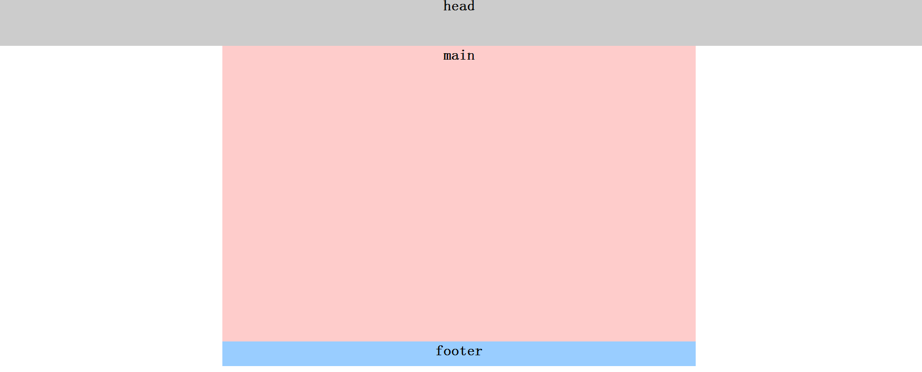
一列布局
<!DOCTYPE html PUBLIC "-//W3C//DTD XHTML 1.0 Transitional//EN" "http://www.w3.org/TR/xhtml1/DTD/xhtml1-transitional.dtd">
<html xmlns="http://www.w3.org/1999/xhtml">
<head>
<meta http-equiv="Content-Type" content="text/html; charset=utf-8" />
<title>一列布局</title>
<style type="text/css">
body{ margin:0; padding:0; font-size:30px}
div{ text-align:center; font-weight:bold}
.main,.footer{ width:960px; margin:0 auto;}
.head{ width:100%; height:100px; background:#ccc}
.main{ height:600px; background:#FCC}
.footer{ height:50px; background:#9CF}
</style>
</head>

<body>
<div class="head">head</div>
<div class="main">main</div>
<div class="footer">footer</div>
</body>
</html>
两列布局

<!DOCTYPE html PUBLIC "-//W3C//DTD XHTML 1.0 Transitional//EN" "http://www.w3.org/TR/xhtml1/DTD/xhtml1-transitional.dtd">
<html xmlns="http://www.w3.org/1999/xhtml">
<head>
<meta http-equiv="Content-Type" content="text/html; charset=utf-8" />
<title>二列布局</title>
<style type="text/css">
    body{ margin:0; padding:0; font-size:30px; font-weight:bold}
    div{ text-align:center; line-height:50px}
    .main{ width:960px; height:600px; margin:0 auto}
    .left{ width:300px; height:600px; background:#ccc; float:left;}/*左浮动样式*/
    .right{ width:660px; height:600px; background:#FCC; float:right;}/*右浮动样式*/
</style>
</head>

<body>
<div class="main">
    <div class="left">left</div>
    <div class="right">right</div>
</div>
</body>
</html>
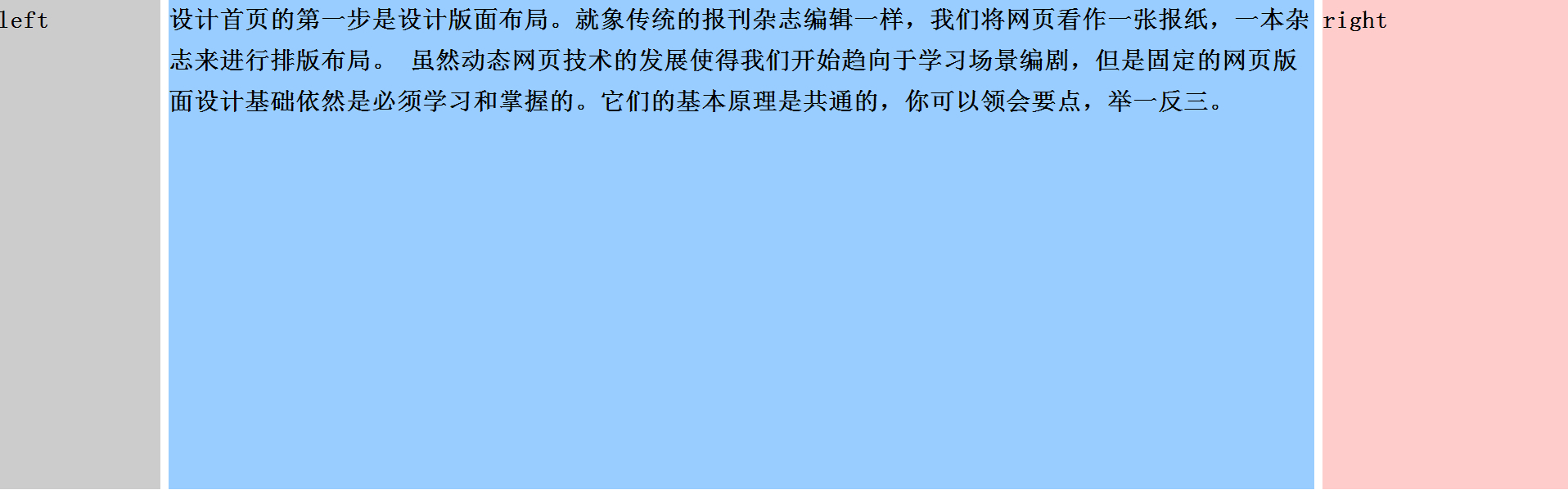
三列布局
<!DOCTYPE html PUBLIC "-//W3C//DTD XHTML 1.0 Transitional//EN" "http://www.w3.org/TR/xhtml1/DTD/xhtml1-transitional.dtd">
<html xmlns="http://www.w3.org/1999/xhtml">
<head>
<meta http-equiv="Content-Type" content="text/html; charset=utf-8" />
<title>三列布局</title>
<style type="text/css">
body{ margin:0; padding:0; font-size:30px; font-weight:bold}
div{ line-height:50px}
.left{ width:200px; height:600px; background:#ccc; position:absolute; left:0; top:0}
.main{ height:600px; margin:0 300px 0 200px; background:#9CF}
.right{ height:600px; width:300px; position:absolute; top:0; position:absolute; right:0; background:#FCC;}
</style>
</head>

<body>

    <div class="left">left</div>
    <div class="main">设计首页的第一步是设计版面布局。就象传统的报刊杂志编辑一样,我们将网页看作一张报纸,一本杂志来进行排版布局。 虽然动态网页技术的发展使得我们开始趋向于学习场景编剧,但是固定的网页版面设计基础依然是必须学习和掌握的。它们的基本原理是共通的,你可以领会要点,举一反三。</div>
    <div class="right">right</div>
</body>
</html>
混合布局

<!DOCTYPE html PUBLIC "-//W3C//DTD XHTML 1.0 Transitional//EN" "http://www.w3.org/TR/xhtml1/DTD/xhtml1-transitional.dtd">
<html xmlns="http://www.w3.org/1999/xhtml">
<head>
<meta http-equiv="Content-Type" content="text/html; charset=utf-8" />
<title>混合布局</title>
<style>
body{ margin:0; padding:0; font-size:30px; font-weight:bold}
div{ text-align:center; line-height:50px}
.top{ height:100px;background:#9CF}
.head,.main{ width:960px; margin:0 auto;}
.head{ height:100px; background:#F90}
.left{ width:220px; height:600px; background:#ccc; float:left;}
.right{ width:740px; height:600px;background:#FCC; float:right}
.r_sub_left{ width:540px; height:600px; background:#9C3; float:left}
.r_sub_right{ width:200px; height:600px; background:#9FC; float:right;}
.footer{ height:50px; background:#9F9; clear:both;}
</style>
</head>

<body>
<div class="top">
    <div class="head">head</div>
</div>
<div class="main">
    <div class="left">left</div>
    <div class="right">
        <div class="r_sub_left">sub_left
        </div>
        <div class=" r_sub_right">sub_right
        </div>
    </div>
</div>
<div class="footer">footer</div>
</body>
</html>