左侧固定,右侧自适应:
index.html:
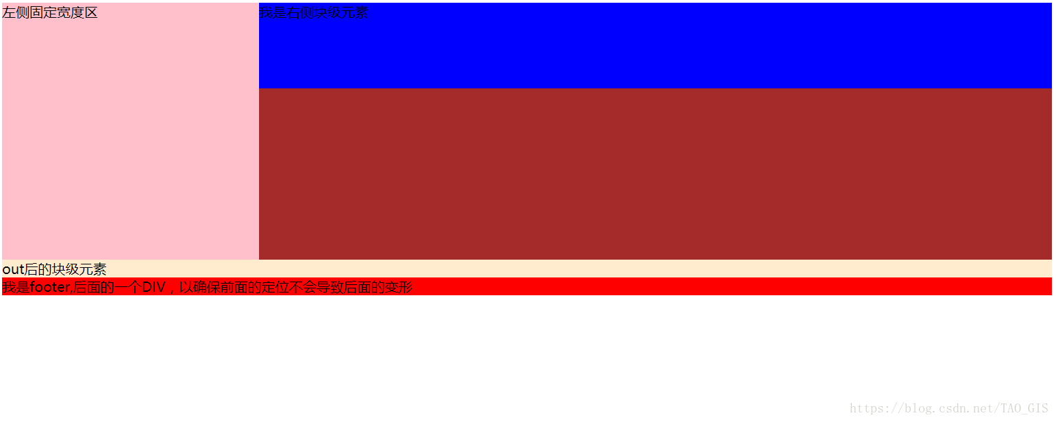
        <div id="outer">
            <div id="sidebar" >左侧固定宽度区</div>
            <div id="content" >我是右侧块级元素</div>
        </div>
        <!-- <div id="footer">我是footer,后面的一个DIV,以确保前面的定位不会导致后面的变形</div> -->
最后一行为footer,可选择添加。
index.css:
            #sidebar {
                width: 300px;
                height: 300px;
                background-color: pink;
                float: left;
            }

            #content {
                margin-left: 300px;
                height: 100px;
                background-color: blue;
            }

            #footer {
                background-color: red;
            }

            #outer:after {
                display: block;
                content: '';//不写内容
                clear: both;//清除浮动,使该元素位于sidebar下方,使他之后的footer位于下方
                background-color: blanchedalmond;
                visibility: hidden;
            }

            #outer {
                zoom: 1;//用于放大缩小查看样式,可以不写
                background-color: brown;
            }
总结:将侧边栏设置 float:left , width:300px(300px只是举个例子,可以任意设置),右半部份设置margin-left:300px,不设置宽高,使其宽高自适应(此时宽度为100%-300px,高度为100%)。如果需要footer则设置outer:after清除浮动。
效果图如下: