这次,让我们使用一个非常有名且十分有趣的玩意儿来完成今天的任务,没错它就是jupyter。
一、安装jupyter
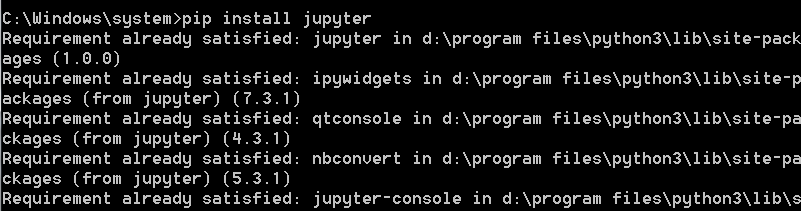
matplotlib入门之前,先安装好jupyter。这里只提供最为方便快捷的安装方式:pip install jupyter。
我这里已经装过了
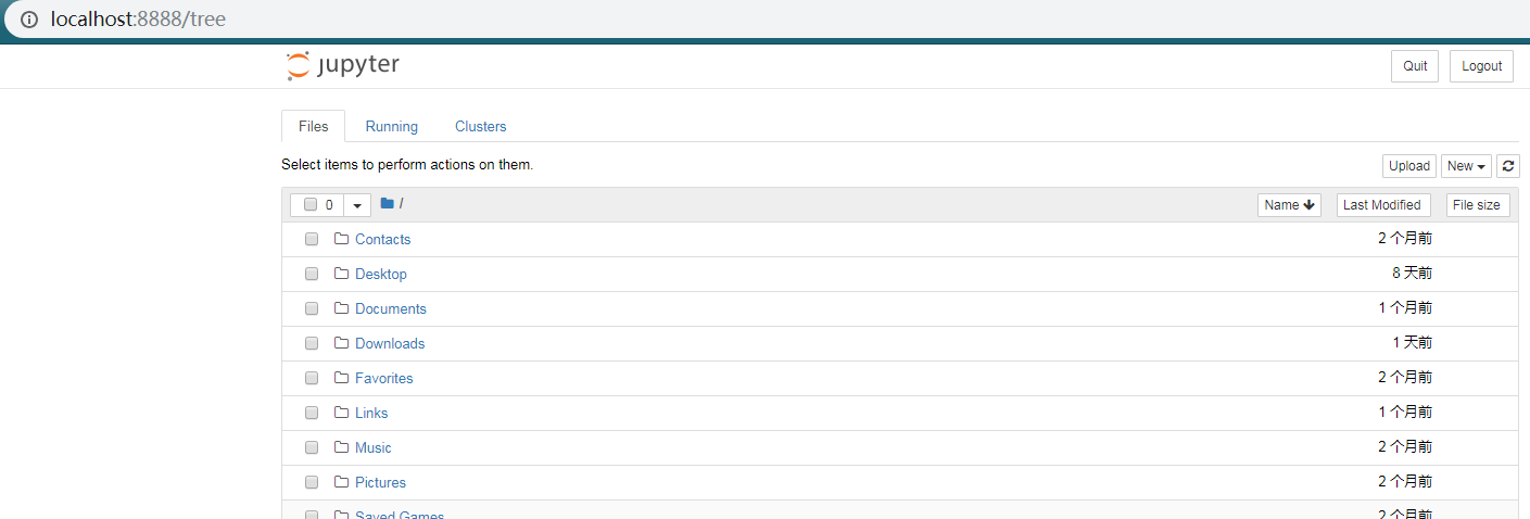
启动jupyter也十分简单:jupyter notebook

执行命令后,自动启动服务,并自动打开浏览器,jupyter就长这样
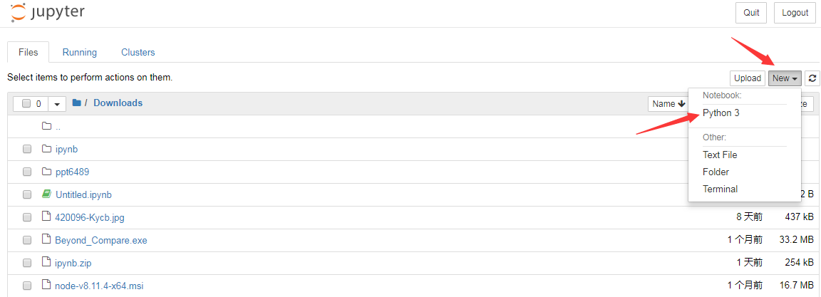
找到你想要的目录,右上角new-->python3新建一个可以执行python3代码的jupyter文件
新文件长这样。虽说每个cell独立,但是下一个cell还是可以引用上一个cell的变量

补充:jupyter下一些常用的快捷命令
ctrl+enter 执行当前cell
shift+enter 执行当前cell并跳到下一个cell
dd 删除当前cell
a 向上建一个cell
b 向下建一个cell
esc+m/m 将当前cell切换为markdown模式
esc+y/y 将当前cell切换为code模式
esc+l/l 显示/隐藏当前cell的行号
o 收起或打开当前cell的output
shift 选中多个cell
shift+m 合并多个cell
二、matplotlib入门
什么是matplotlib?
官方给出的解释是:Matplotlib is a Python 2D plotting library which produces publication quality figures in a variety of hardcopy formats and interactive environments across platforms.You can generate plots, histograms, power spectra, bar charts, errorcharts, scatterplots, etc., with just a few lines of code.
Matplotlib是一个Python的2D绘图库它以各种硬拷贝格式和跨平台的交互式环境生成出版质量级别的图形。只需要几行代码,你就可以生成绘图,直方图,功率谱,条形图,错误图,散点图等。
0.安装依赖库:matplotlib、numpy(pip install *)
numpy是python的一种开源的数值计算扩展库。这种工具可用来进行大型矩阵数据类型处理、矢量处理,以及精密运算。
(小声说一句,这俩货是机器学习三剑客中的两个)
牛刀小试:
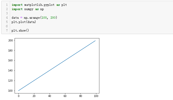
可以看到,代码虽然只有3行,但却非常直观的绘制出了一条线形图。
data = np.arange(100, 200) :生成100-200之间的整数数组,它的值是[100,101...200]
plt.plot(data):将上述数组绘制出来,对应图中y轴,而matplotlib本身默认给我们设置了[0,100]的x轴,使其一一对应
plt.show():将图片展示出来
1.绘制线形图
import matplotlib.pyplot as plt

plt.plot([100, 200, 300], [300, 600, 900], '-r')
plt.plot([100, 200, 300], [200, 400, 900], ':g')
plt.plot([200, 300, 400], [800, 100, 600], '-y')

plt.show()
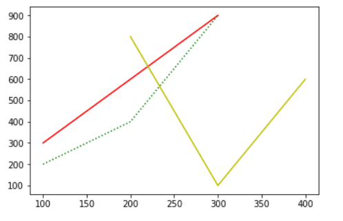
plot接受的三个参数,第一个参数是数组,作为x轴的值;第二个参数也是数组,作为y轴的值;第三个参数则表明线形图是属性,图的构成和颜色,如上一依次是:红色直线、绿色点线、黄色直线。
2.绘制散点图
import matplotlib.pyplot as plt
import numpy as np

N = 20

plt.scatter(np.random.rand(N) * 100,
           np.random.rand(N) *100,
           c='r', s=100, alpha=0.5)

plt.scatter(np.random.rand(N) * 100,
           np.random.rand(N) *100,
           c='y', s=200, alpha=0.8)

plt.scatter(np.random.rand(N) * 100,
           np.random.rand(N) *100,
           c='b', s=300, alpha=0.5)

plt.show()
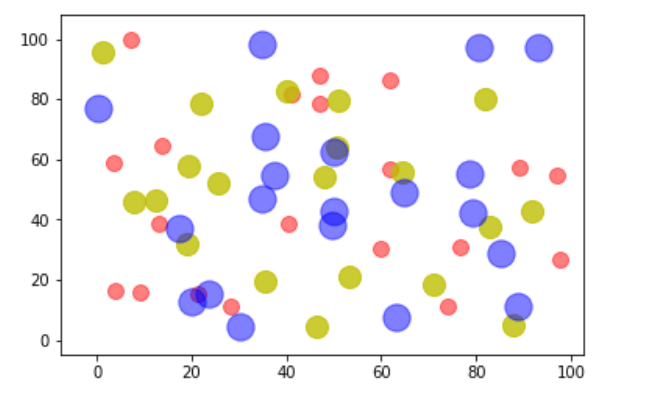
这幅图包含了三组数据,每组数据都包含了20个随机坐标的位置。参数c表示点的颜色,s是点的大小,alpha是透明度
scatter绘制散点图详细文档,参考:https://matplotlib.org/api/_as_gen/matplotlib.pyplot.scatter.html#matplotlib.pyplot.scatter
3.饼状图
import matplotlib.pyplot as plt
import numpy as np

labels = ['suger', 'popo', 'python', 'java', 'ruby', 'c#']
data = np.random.rand(6) * 100

plt.pie(data, labels=labels, autopct='%1.1f%%')
plt.axis('equal')
plt.legend()

plt.show()

data是一组包含6个数据的随机数值;图中的标签通过labels来指定;autopct指定了数值的精度格式;plt.axis('equal')设置了坐标轴大小一致;plt.legend()指明要绘制图。
pie绘制饼状图详细参考:https://matplotlib.org/api/_as_gen/matplotlib.pyplot.pie.html?highlight=pie#matplotlib.pyplot.pie
4.条形图
import matplotlib.pyplot as plt
import numpy as np

N = 7
x = np.arange(N)

data = np.random.randint(low=0, high=100, size=N)
colors = np.random.rand(N * 3).reshape(N, -1)
labels = ['Mon', 'Tue', 'Wed', 'Thu', 'Fri', 'Sat', 'Sun']

plt.title('Weekday Data')
plt.bar(x, data, alpha=0.8, color=colors, tick_label=labels)
plt.show()

# 此图展示了一组包含7个随机数值的结果,每个数值是[0, 100]的随机数
# 它们的颜色也是通过随机数生成的。np.random.rand(N * 3).reshape(N, -1)表示先生成21(N x 3)个随机数,然后将它们组装成7行,那么每行就是三个数,这对应了颜色的三个组成部分
# title指定了图形的标题,labels指定了标签,alpha是透明度
bar绘制条形图官方文档:https://matplotlib.org/api/_as_gen/matplotlib.pyplot.bar.html?highlight=bar#matplotlib.pyplot.bar
5.直方图
import matplotlib.pyplot as plt
import numpy as np

data = [np.random.randint(0, n, n) for n in [3000, 4000, 5000]]
labels = ['3k', '4k', '5k']
bins = [0, 100, 500, 1000, 2000, 3000, 4000, 5000]

plt.hist(data, bins=bins, label=labels)
plt.legend()

plt.show()
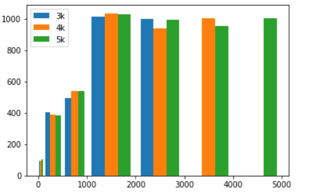
# [np.random.randint(0, n, n) for n in [3000, 4000, 5000]]生成了包含3个数组的数组:第一个数组包含了3000个随机数,这些随机数的范围是 [0, 3000);第二个数组包含了4000个随机数,这些随机数的范围是 [0, 4000);第三个数组包含了5000个随机数,这些随机数的范围是 [0, 5000)
# bins设置直方图的边界。[0, 100, 500, 1000, 2000, 3000, 4000, 5000]一共设置了7个边界,如:第一个边界是[0,100),则有一个据点,符合边界范围的图片将会在其中绘制
# 三组数据都有3000以下的数据,图中3000以下的据点也都有数据,[3000,4000)据点没有了3k的数据,而[4000,5000)据点则只剩下5k的数据了
hist绘制直方图的更多用法:https://matplotlib.org/api/_as_gen/matplotlib.pyplot.hist.html?highlight=hist#matplotlib.pyplot.hist
以上,目前我们已经学会了绘制简单的线形图、散点图、饼状图、条形图和直方图,显然这只是皮毛,真正让人叹为观止的图,尽在matplotlib gallery。
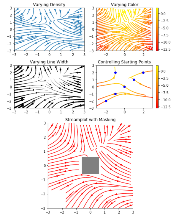
这里摘取一个示例:
import numpy as np
import matplotlib.pyplot as plt
import matplotlib.gridspec as gridspec

w = 3
Y, X = np.mgrid[-w:w:100j, -w:w:100j]
U = -1 - X**2 + Y
V = 1 + X - Y**2
speed = np.sqrt(U*U + V*V)

fig = plt.figure(figsize=(7, 9))
gs = gridspec.GridSpec(nrows=3, ncols=2, height_ratios=[1, 1, 2])

#  Varying density along a streamline
ax0 = fig.add_subplot(gs[0, 0])
ax0.streamplot(X, Y, U, V, density=[0.5, 1])
ax0.set_title('Varying Density')

# Varying color along a streamline
ax1 = fig.add_subplot(gs[0, 1])
strm = ax1.streamplot(X, Y, U, V, color=U, linewidth=2, cmap='autumn')
fig.colorbar(strm.lines)
ax1.set_title('Varying Color')

#  Varying line width along a streamline
ax2 = fig.add_subplot(gs[1, 0])
lw = 5*speed / speed.max()
ax2.streamplot(X, Y, U, V, density=0.6, color='k', linewidth=lw)
ax2.set_title('Varying Line Width')

# Controlling the starting points of the streamlines
seed_points = np.array([[-2, -1, 0, 1, 2, -1], [-2, -1,  0, 1, 2, 2]])

ax3 = fig.add_subplot(gs[1, 1])
strm = ax3.streamplot(X, Y, U, V, color=U, linewidth=2,
                     cmap='autumn', start_points=seed_points.T)
fig.colorbar(strm.lines)
ax3.set_title('Controlling Starting Points')

# Displaying the starting points with blue symbols.
ax3.plot(seed_points[0], seed_points[1], 'bo')
ax3.axis((-w, w, -w, w))

# Create a mask
mask = np.zeros(U.shape, dtype=bool)
mask[40:60, 40:60] = True
U[:20, :20] = np.nan
U = np.ma.array(U, mask=mask)

ax4 = fig.add_subplot(gs[2:, :])
ax4.streamplot(X, Y, U, V, color='r')
ax4.set_title('Streamplot with Masking')

ax4.imshow(~mask, extent=(-w, w, -w, w), alpha=0.5,
          interpolation='nearest', cmap='gray', aspect='auto')
ax4.set_aspect('equal')

plt.tight_layout()
plt.show()