Matplotlib
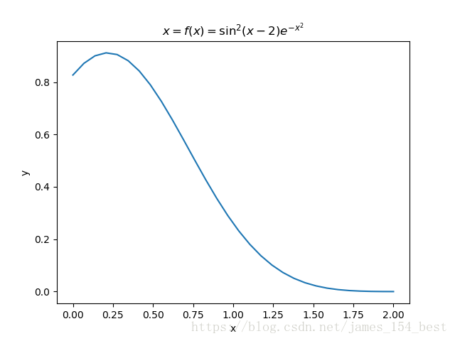
Exercise 11.1: Plotting a function
Plot the function
代码
import numpy as np
import matplotlib.pyplot as plt

x = np.linspace(0,2,30)
y = (np.sin(x-2)**2)*np.exp(-(x**2))
plt.xlabel('x')
plt.ylabel('y')
plt.title('$x=f(x)=\sin^2(x-2)e^{-x^2}$')
plt.plot(x,y)
plt.show()
结果
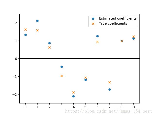
Exercise 11.2: Data
Create a data matrix
with 20 observations of 10 variables. Generate a vector
with parameters Then
generate the response vector
where
is a vector with standard normally distributed variables.
Now (by only using
and
), find an estimator for
, by solving
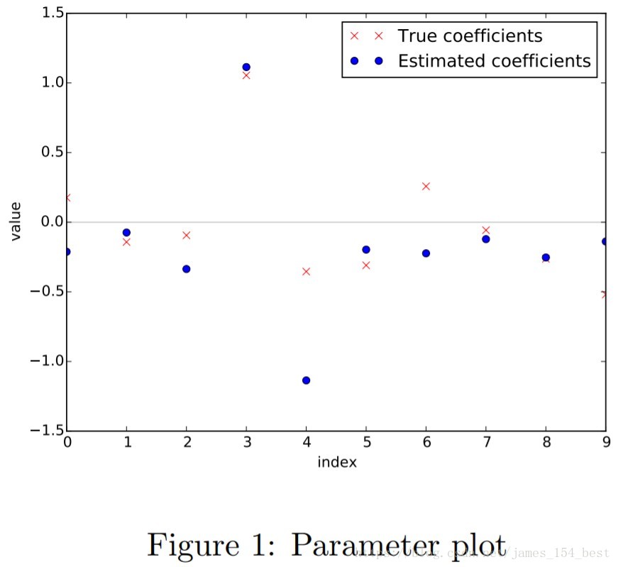
题目分析
- 有一个式子
我们不知道 ,但是我们可以通过20组观察值(observations) 来推测 ,且依题意,需要我们使用最小二乘法。
- 但是这道题的意思是,让我们自己先准备一组
,然后再自己编20组
,然后再创建一组符合高斯分布的
,通过计算
我们就得到了一组
- 现在我们忘记了 和 是多少,但是20组 和 一组 还在,我们想通过它们找回 ,即使不能完全一样,差距也不要太大。其实我们可以通过20组 和 一组 用最小二乘法(题目要求)得到一组 ,且 和 的误差比较小
- 画出 和 ,看看差距有多大
解题步骤
- 创建 的矩阵 ,代表20组观察值
- 创建列表 ,里面的数可以任意取值,这里我们使用随机整数
- 创建高斯随机数列表
- 计算
- 利用
scipy的最小二乘函数leastsq计算最小二乘解 - 对 和 画散点图比较
代码
import numpy as np
import matplotlib.pyplot as plt

X = (np.random.random([20,10])-0.5)*2   #生成(20,10)的随机数矩阵,范围在(-1,1)
b = (np.random.random([10])-0.5)*4  #生成(10,)的随机数向量,矩阵相乘会自动变为纵向量
z = np.random.randn(20) #生成(20,)的服从标准正态分布的向量
y = np.dot(X,b)+z   #计算得到(20,)的向量

res = np.linalg.lstsq(X,y)[0]   #计算线性方程组的最小二乘解的基本方法,X和y组成观察值,返回系数向量b

x = range(0,10)
plt.ylim(-2.5,2.5)
plt.xlim(-0.5,9.5)
plt.scatter(x,res,label='Estimated coefficients')
plt.scatter(x,b,marker='x',label=('True coefficients'))
plt.legend()
plt.hlines(0,-0.5,9.5)  #水平分割线
plt.xticks(range(0,10))
plt.plot()
结果
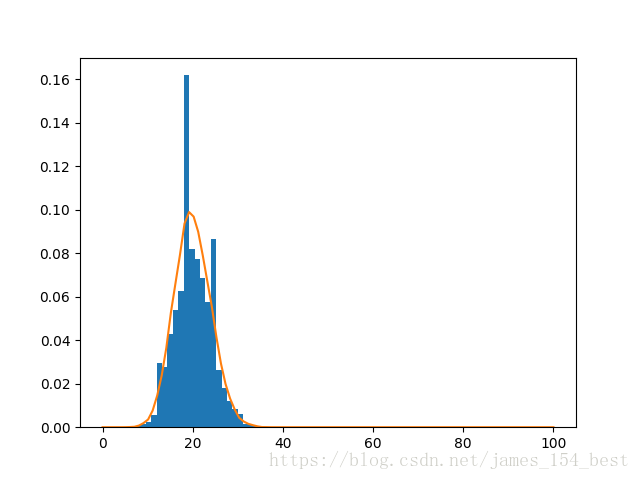
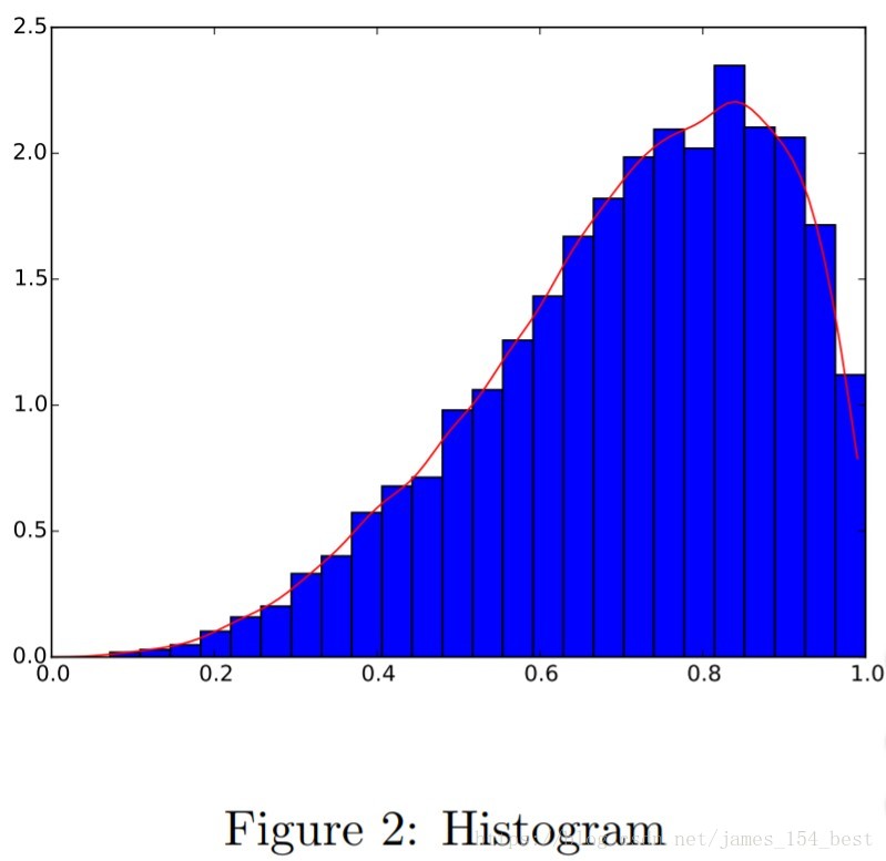
Exercise 11.3: Histogram and density estimation
Generate a vector
of 10000 observations from your favorite exotic distribution. Then make a plot that
shows a histogram of
(with 25 bins), along with an estimate for the density, using a Gaussian kernel
density estimator (see scipy.stats). See Figure 2 for an example plot.
代码
import numpy as np
import matplotlib.pyplot as plt
from scipy import stats

data = np.random.binomial(100,0.2,10000)
x = np.linspace(0,100,100)

kernel = stats.gaussian_kde(data)
kde = kernel.evaluate(x)

plt.hist(kernel.dataset[0],normed='True',bins=25)
plt.plot(x,kde)
plt.show()