版权声明:本文为博主原创文章,未经博主允许不得转载。 https://blog.csdn.net/haha_zhan/article/details/82228487
主要记录自极客学院微信小程序学习视频
文章目录
- 一、样式的基本使用
- 二、样式的属性
- 三、样式选择器
- 3.1 基本选择器
- 3.1.1 类选择器 `(.name{}) `
- 3.1.2 ID选择器 `(#name{}) `
- 3.1.3 元素选择器 `(name{}) `
- 3.1.4 通配符选择器 `(*{}) `
- 3.1.5 包含选择器 `(p c{})`
- 3.1.6 子元素选择器 `(p > c{})`
- 3.1.7 邻近兄弟元素选择器 `(c + c{})`
- 3.1.8 通用兄弟元素选择器 `(c ~ c{})`
- 3.2 属性选择器
- 3.2.1 `E[attr]`
- 3.2.2 `E[attr="value"]`
- 3.2.3 `E[attr~="value"]`
- 3.2.4 `E[attr|="value"]`
- 3.2.5 `E[attr^="value"]`
- 3.2.6 `E[attr$="value"]`
- 3.2.7 `E[attr*="value"]`
- 3.3 伪类选择器
- 3.3.1 动态伪类选择器 (:link, : visited, :hover , :active , :focus)
- 3.3.2 状态伪类选择器 (:enabled , : disabled , :checked)
- 3.3.3 选择伪类选择器 (:first-child, : last-child , :nth-child() , :nth-last-child() , : nth-of-type(), :nth-last-of-type(), :first-of-type , :last-of-type , :only-child , :only-of-type)
- 3.3.4 空内容伪类选择器 (:empty)
- 3.3.5 否定伪类选择器 (:not)
- 3.3.6 伪元素 (::first-line , ::first-letter , ::before , ::after , ::selection)
一、样式的基本使用
<view class="text">
	jekexueyuan ....
</view>
.text {
	font-size: 20px;
}
二、样式的属性
2.1 尺寸
width : 228rpx;
height : 228rpx;

/**
min-width:
max-width:
min-height:
max-height:
**/
2.2 背景
background-color:  //背景颜色
background-image: //背景图片
background-position:
...
2.3 边框
border-radius: 20%; //边框圆角
border-width:10px;
border-color: #ddd;
border-style: solid;
border: 10px solid #ddd;
2.4 边距
margin: 20rpx;
margin-top: 20rpx;
margin-right: 20rpx;
padding: 20rpx;
margin: 20rpx 20rpx 20rpx 20rpx; //上 右 下 左
...
2.5 文本
color: red;//颜色
font-size: 30px;
font-weight: 10;
...
2.6 其他(列表、内容、表格…)
查看文档学习
三、样式选择器
3.1 基本选择器
3.1.1 类选择器 (.name{})
class 与 .
//.wxml
<text class="nickname"> </text>
//.wxss
.nickname{
	width:228rpx;
	height:228rpx;
}
3.1.2 ID选择器 (#name{})
id 与 #
//.wxml
<text id="nickname"> </text>
//.wxss
#nickname{
	width:228rpx;
	height:228rpx;
}
3.1.3 元素选择器 (name{})
name 为元素名称
//.wxss
//表示对所有的image元素都显示以下样式
image{
	width:228rpx;
	height:228rpx;
}
3.1.4 通配符选择器 (*{})
//.wxss
//表示对所有元素都显示以下样式
*{
	background-color: red;
}
3.1.5 包含选择器 (p c{})
//.wxml
<view>
	<view class="userinfo">
		<text id="nickname"> </text>
	</view>
	<view class="usermotto">
		<text id="name"> </text>
	</view>
</view>
//.wxss
<!-- 仅 userinfo 下的text元素有效,usermotto下的text元素无效 -->
.userinfo text{
	color:red;
}
3.1.6 子元素选择器 (p > c{})
//.wxml
<view class="usermotto">
	<view>
		<text id="nickname"> </text>
	</view>
	<text id="name"> </text>
</view>
//.wxss
<!-- 能影响到nickname 和 name 两个text 元素 -->
.usermotto text{
	color:red;
}

/**
只能影响到 name text元素,不能影响到 nickname 元素;
也即是只能影响到p(父view)下一层级的c(子view),
而不能影响到子View 的 子View
**/
.usermotto>text{
	color:red;
}
3.1.7 邻近兄弟元素选择器 (c + c{})
//.wxml
<view>
	<view class="userinfo">
		<text id="nickname"> </text>
	</view>

	//以下为 userinfo 临近的 view
	<view>
		<text id="name"> </text>
	</view>
</view>
//.wxss
<!-- 让临近的元素具有以下属性 -->
.userinfo + view{
	color:red;
}
3.1.8 通用兄弟元素选择器 (c ~ c{})
3.2 属性选择器
3.2.1 E[attr]
只要某类元素 E 有该属性 attr ,不管该属性的值是什么,都会使用该样式
//.wxml
<view>
	<!-- 以下view 具有 bindtap 属性,该属性的值为 bindViewTap -->
	<view bindtap="bindViewTap" class="userinfo">
		<text id="nickname"> </text>
	</view>
</view>
//.wxss
view[bindtap]{
	color:red;
}

//多个属性可以继续往后面加
view[bindtap][bindtap]{
	background-color:red;
}
3.2.2 E[attr="value"]
只要某类元素 E 有该属性 attr ,且该属性的值等于 value ,都会使用该样式
3.2.3 E[attr~="value"]
某类元素 E 有该属性 attr ,只要该属性的值中有一个值等于 value ,都会使用该样式
//.wxml
<view>
	<!-- 以下view 具有 class 属性,该属性的值有两个 userinfo   和 item -->
	<view bindtap="bindViewTap" class="userinfo   item">
		<text id="nickname"> </text>
	</view>
</view>
//.wxss
view[class~="userinfo"]{
	background-color: red;
}
3.2.4 E[attr|="value"]
某类元素 E 有该属性 attr ,只要该属性的值以 value- 开头 ,都会使用该样式
//.wxml
<view>
	<!-- 以下view 具有 class 属性,该属性的值为 userinfo-item ,以 userinfo-  开头   -->
	<view bindtap="bindViewTap" class="userinfo-item">
		<text id="nickname"> </text>
	</view>
</view>
//.wxss
view[class|="userinfo"]{
	background-color: red;
}
3.2.5 E[attr^="value"]
某类元素 E 有该属性 attr ,该属性的值必须以 value 开头 ,才会使用该样式
3.2.6 E[attr$="value"]
某类元素 E 有该属性 attr ,该属性的值必须以 value 结束 ,才会使用该样式
3.2.7 E[attr*="value"]
某类元素 E 有该属性 attr ,该属性的值包含 value ,都会使用该样式
3.3 伪类选择器
3.3.1 动态伪类选择器 (:link, : visited, :hover , :active , :focus)
:focus 表示元素获得焦点的时候触发
:active 表示元素被激活的时候触发,如被点击
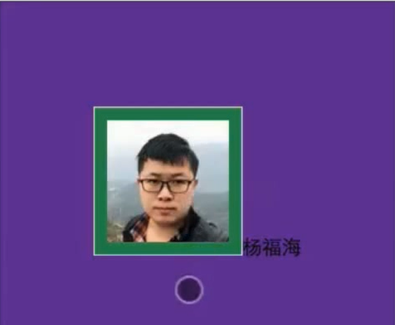
//图片头像应用了以下 ID 选择器
#userinfo-avatar{
width: 228rpx;
height: 228rpx;
background-color: seagreen;
border: 1px solid #ddd
padding:10px;
}
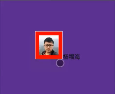
//加了 :active ,表示图像被点击的时候会显示的样式
#userinfo-avatar:active{
width: 128rpx;
height: 128rpx;
background-color: red;
border: 1px solid #ddd
padding:10px;
}
以下是未激活状态显示样式:绿色背景色
点击激活后显示如下:图片变小且背景色变为红色
3.3.2 状态伪类选择器 (:enabled , : disabled , :checked)
描述控件的状态,
:enabled : 启用状态
:disabled : 禁用状态
:checked : 选中状态
3.3.3 选择伪类选择器 (:first-child, : last-child , :nth-child() , :nth-last-child() , : nth-of-type(), :nth-last-of-type(), :first-of-type , :last-of-type , :only-child , :only-of-type)
//.wxml
//有三张图片
<view>
	<image class="userinfo-avatar ">
	<image class="userinfo-avatar ">
	<image class="userinfo-avatar ">
</view>
//.wxss
.userinfo-avatar{
	width: 228rpx;
	height: 228rpx;
	background-color: seagreen;
	border: 1px solid #ddd
	padding:10px;
}

//:first-child 表示仅第一张图片应用以下属性,其余图片应用上面的属性
.userinfo-avatar:first-child{
	width: 128rpx;
	height: 128rpx;
	background-color: red;
	border: 1px solid #ddd
	padding:10px;
}
3.3.4 空内容伪类选择器 (:empty)
3.3.5 否定伪类选择器 (:not)
3.3.6 伪元素 (::first-line , ::first-letter , ::before , ::after , ::selection)
::first-letter :第一个字母显示样式
//.wxml
<view class="usermotto">
	<text class="text1">Hello World</text>
</view>
//.wxss
.usermotto::first-letter{
	color: red;
	font-size:30px;
}