版权声明:本文为博主原创文章,未经博主允许不得转载。 https://blog.csdn.net/czh500/article/details/82010756
ECharts插件的下载地址http://echarts.baidu.com/download.html
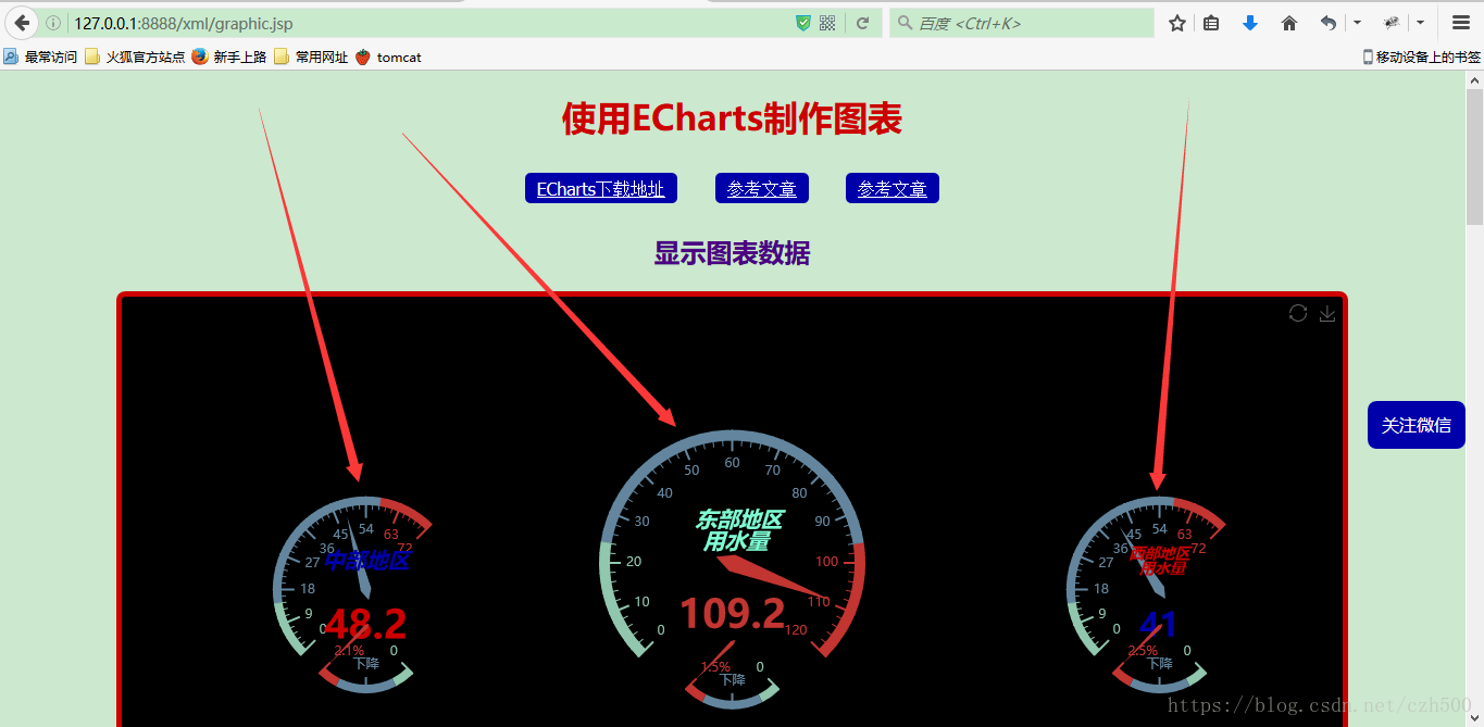
先来看看我们要达到的效果!后面直接上代码,如下图:
下面直接贴上代码
我们这里写的都是些死的数据,真正做的时候,肯定是从数据库中读取数据,根据数据库中读取出来的数据动态生成图表。(这里我就懒得去连接数据库了,大家可以自己去连接数据库,然后再动态生成图表就可以了,具体的代码,你们自己去写)
graphic.jsp页面
<%@ page language="java" contentType="text/html; charset=utf-8"
pageEncoding="utf-8"%>
<!DOCTYPE html PUBLIC "-//W3C//DTD HTML 4.01 Transitional//EN" "http://www.w3.org/TR/html4/loose.dtd">
<html>
<head>
<meta http-equiv="Content-Type" content="text/html; charset=utf-8">
<title>使用ECharts制作图表</title>
<link rel="stylesheet" type="text/css" href="${pageContext.request.contextPath}/css/body.css">
<link rel="stylesheet" type="text/css" href="${pageContext.request.contextPath}/css/mark.css">
<link rel="stylesheet" type="text/css" href="${pageContext.request.contextPath}/css/console.css">
<script type="text/javascript" src="${pageContext.request.contextPath}/js/console.js"></script>
<script type="text/javascript" src="${pageContext.request.contextPath}/js/toTop.js"></script>
<script type="text/javascript" src="${pageContext.request.contextPath}/js/weChatQRCode.js"></script>
<!-- 引入ECharts文件 -->
<script type="text/javascript" src="${pageContext.request.contextPath}/js/echarts.js" ></script>
<style type="text/css">
* {
-webkit-box-sizing: border-box;
-moz-box-sizing: border-box;
box-sizing: border-box;
}
</style>
<script type="text/javascript">
var myTextStyle = {
color: "#0000AA",//文字颜色
fontStyle: "normal",//italic斜体 oblique倾斜
fontWeight: "normal",//文字粗细bold bolder lighter 100 | 200 | 300 | 400...
fontFamily: "sans-serif",//字体系列
fontSize: 18 //字体大小
};
</script>
</head>
<body>
<center>
<h1>使用ECharts制作图表</h1>
<a href="http://echarts.baidu.com/download.html" target="_blank" title="ECharts下载地址">
ECharts下载地址
</a>
<a href="https://blog.csdn.net/m0_37626813/article/details/79008861" target="_blank">
参考文章
</a>
<a href="https://www.cnblogs.com/pengfei25/p/6644953.html" target="_blank">
参考文章
</a>
<h2>显示图表数据</h2>
<div id="showGraphic5" style="width: 85%;height:500px;border: solid 5px #CD0000; margin: 2px; background-color: black;"></div>
<div id="showGraphic" style="width: 100%;height:600px;border: solid 5px #0000AA; margin: 2px; background-color: #EEEED1;"></div>
<div id="showGraphic2" style="width: 50%;height:300px;border: solid 5px #008B45; margin: 2px; background-color: #C4C4C4;"></div>
<div id="showGraphic3" style="width: 80%;height:400px;border: solid 5px black; margin: 2px; background-color: #EEE8AA;"></div>
<div id="showGraphic4" style="width: 90%;height:500px;border: solid 5px #CD0000; margin: 2px; background-color: #DBDBDB;"></div>
<script type="text/javascript">
// 基于准备好的dom,初始化echarts实例
var myChart = echarts.init(document.getElementById('showGraphic'));
// 指定图表的配置项和数据
option = {
title : {
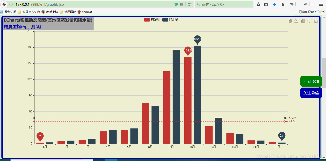
text: 'ECharts实现动态图表(某地区蒸发量和降水量)',
subtext: '纯属虚构(练手测试)',
backgroundColor: '#ABABAB', //标题的背景颜色
// textStyle: myTextStyle,//标题样式
subtextStyle: myTextStyle //小标题样式
},
tooltip : {
trigger: 'axis'
},
legend: {
data:['蒸发量','降水量']
},
toolbox: {
show : true,
feature : {
dataView : {show: true, readOnly: false},
magicType : {show: true, type: ['line', 'bar']},
restore : {show: true},
saveAsImage : {show: true}
}
},
calculable : true,
xAxis : [
{
type : 'category',
data : ['1月','2月','3月','4月','5月','6月','7月','8月','9月','10月','11月','12月']
}
],
yAxis : [
{
type : 'value'
}
],
series : [
{
name:'蒸发量',
type:'bar',
data:[2.0, 4.9, 7.0, 23.2, 25.6, 76.7, 135.6, 162.2, 32.6, 20.0, 6.4, 3.3],
markPoint : {
data : [
{type : 'max', name: '最大值'},
{type : 'min', name: '最小值'}
]
},
markLine : {
data : [
{type : 'average', name: '平均值'}
]
}
},
{
name:'降水量',
type:'bar',
data:[2.6, 5.9, 9.0, 26.4, 28.7, 70.7, 175.6, 182.2, 48.7, 18.8, 6.0, 2.3],
markPoint : {
data : [
{name : '年最高', value : 182.2, xAxis: 7, yAxis: 183},
{name : '年最低', value : 2.3, xAxis: 11, yAxis: 3}
]
},
markLine : {
data : [
{type : 'average', name : '平均值'}
]
}
}
]
};
// 使用刚指定的配置项和数据显示图表。
myChart.setOption(option);
</script>
<script type="text/javascript">
// 基于准备好的dom,初始化echarts实例
var myChart2 = echarts.init(document.getElementById('showGraphic2'));
// 指定图表的配置项和数据
var option2 = {
title: {
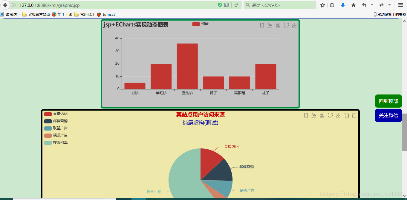
text: 'jsp+ECharts实现动态图表'
},
tooltip: {},
legend: {
data:['销量']
},
toolbox: {
show : true,
feature : {
dataView : {show: true, readOnly: false},
magicType : {show: true, type: ['line', 'bar']},
restore : {show: true},
saveAsImage : {show: true}
}
},
xAxis: {
data: ["衬衫","羊毛衫","雪纺衫","裤子","高跟鞋","袜子"]
},
yAxis: {},
series: [{
name: '销量',
type: 'bar',
data: [5, 20, 36, 10, 10, 20]
}]
};
// 使用刚指定的配置项和数据显示图表。
myChart2.setOption(option2);
</script>
<script type="text/javascript">
// 基于准备好的dom,初始化echarts实例
var myChart3 = echarts.init(document.getElementById('showGraphic3'));
option3 = {
title : {
text: '某站点用户访问来源',
subtext: '纯属虚构(测试)',
textStyle: {
color: '#CD0000'
},
subtextStyle: myTextStyle, //小标题样式
x:'center'
},
tooltip : {
trigger: 'item',
formatter: "{a} <br/>{b} : {c} ({d}%)"
},
legend: {
orient: 'vertical',
left: 'left',
data: ['直接访问','邮件营销','联盟广告','视频广告','搜索引擎']
},
toolbox: {
show : true,
feature : {
dataView : {show: true, readOnly: false},
magicType : {show: true, type: ['line', 'bar']},
restore : {show: true},
saveAsImage : {show: true},
dataZoom: {//数据缩放视图
show: true},
mark: {show: false}
}
},
series : [
{
name: '访问来源',
type: 'pie',
radius : '55%',
center: ['50%', '60%'],
data:[
{value:335, name:'直接访问'},
{value:310, name:'邮件营销'},
{value:234, name:'联盟广告'},
{value:135, name:'视频广告'},
{value:1548, name:'搜索引擎'}
],
itemStyle: {
emphasis: {
shadowBlur: 10,
shadowOffsetX: 0,
shadowColor: 'rgba(0, 0, 0, 0.5)'
}
}
}
]
};
// 使用刚指定的配置项和数据显示图表。
myChart3.setOption(option3);
</script>
<script type="text/javascript">
// 基于准备好的dom,初始化echarts实例
var myChart4 = echarts.init(document.getElementById('showGraphic4'));
option4 = {
title : {
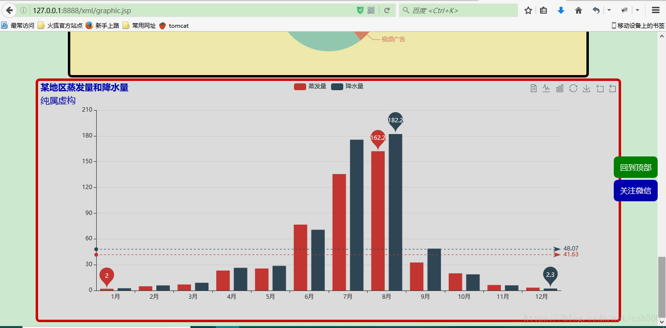
text: '某地区蒸发量和降水量',
color: '#0000AA',
subtext: '纯属虚构',
textStyle: {
color: '#0000AA'
},
subtextStyle: myTextStyle //小标题样式
},
tooltip : {
trigger: 'axis'
},
legend: {
data:['蒸发量','降水量']
},
toolbox: {
show : true,
feature : {
dataView : {show: true, readOnly: false},
magicType : {show: true, type: ['line', 'bar']},
restore : {show: true},
saveAsImage : {show: true},
dataZoom: {//数据缩放视图
show: true},
mark: {show: false}
}
},
calculable : true,
xAxis : [
{
type : 'category',
data : ['1月','2月','3月','4月','5月','6月','7月','8月','9月','10月','11月','12月']
}
],
yAxis : [
{
type : 'value'
}
],
series : [
{
name:'蒸发量',
type:'bar',
data:[2.0, 4.9, 7.0, 23.2, 25.6, 76.7, 135.6, 162.2, 32.6, 20.0, 6.4, 3.3],
markPoint : {
data : [
{type : 'max', name: '最大值'},
{type : 'min', name: '最小值'}
]
},
markLine : {
data : [
{type : 'average', name: '平均值'}
]
}
},
{
name:'降水量',
type:'bar',
data:[2.6, 5.9, 9.0, 26.4, 28.7, 70.7, 175.6, 182.2, 48.7, 18.8, 6.0, 2.3],
markPoint : {
data : [
{name : '年最高', value : 182.2, xAxis: 7, yAxis: 183},
{name : '年最低', value : 2.3, xAxis: 11, yAxis: 3}
]
},
markLine : {
data : [
{type : 'average', name : '平均值'}
]
}
}
]
};
// 使用刚指定的配置项和数据显示图表。
myChart4.setOption(option4);
</script>
<script type="text/javascript">
// 基于准备好的dom,初始化echarts实例
var myChart5 = echarts.init(document.getElementById('showGraphic5'));
option5 = {
tooltip : {
formatter: "{a} <br/>{c}{b}"
},
toolbox: {
show: true,
feature: {
restore: {show: true},
saveAsImage: {show: true}
}
},
series : [
{
name: '东部地区',
type: 'gauge',
z: 3,
min: 0,
max: 120,
splitNumber: 12,
radius: '50%',
axisLine: { // 坐标轴线
lineStyle: { // 属性lineStyle控制线条样式
width: 10
}
},
axisTick: { // 坐标轴小标记
length: 15, // 属性length控制线长
lineStyle: { // 属性lineStyle控制线条样式
color: 'auto'
}
},
splitLine: { // 分隔线
length: 20, // 属性length控制线长
lineStyle: { // 属性lineStyle(详见lineStyle)控制线条样式
color: 'auto'
}
},
title : {
textStyle: { // 其余属性默认使用全局文本样式,详见TEXTSTYLE
fontWeight: 'bolder',
fontSize: 20,
fontStyle: 'italic',
color:"#7FFFD4"
}
},
detail : {
textStyle: { // 其余属性默认使用全局文本样式,详见TEXTSTYLE
fontWeight: 'bolder',
fontSize: 36
}
},
data:[{value: 109.2, name: '\n\n 东部地区\n 用水量'}]
},
{
name: '下降',
type: 'gauge',
center : ['50%', '65%'], // 默认全局居中
radius : '25%',
min: 0,
max: 2,
startAngle: 315,
endAngle: 225,
splitNumber: 2,
axisLine: { // 坐标轴线
lineStyle: { // 属性lineStyle控制线条样式
width: 8
}
},
axisTick: { // 坐标轴小标记
show: false
},
axisLabel: {
formatter:function(v){
switch (v + '') {
case '0' : return '0';
case '1' : return '下降';
case '2' : return '1.5%';
}
}
},
splitLine: { // 分隔线
length: 15, // 属性length控制线长
lineStyle: { // 属性lineStyle(详见lineStyle)控制线条样式
color: 'auto'
}
},
pointer: {
width:2
},
title: {
show: false
},
detail: {
show: false
},
data:[{value: 2, name: '下降'}]
},
{
name: '中部地区',
type: 'gauge',
center: ['20%', '55%'], // 默认全局居中
radius: '35%',
min:0,
max:72,
endAngle:45,
splitNumber:8,
axisLine: { // 坐标轴线
lineStyle: { // 属性lineStyle控制线条样式
width: 8
}
},
axisTick: { // 坐标轴小标记
length:12, // 属性length控制线长
lineStyle: { // 属性lineStyle控制线条样式
color: 'auto'
}
},
splitLine: { // 分隔线
length:20, // 属性length控制线长
lineStyle: { // 属性lineStyle(详见lineStyle)控制线条样式
color: 'auto'
}
},
pointer: {
width:5
},
title: {
offsetCenter: [0, '-30%'], // x, y,单位px
textStyle: {
fontWeight: 'bolder',
fontSize: 20,
fontStyle: 'italic',
color:"#0000AA"
}
},
detail: {
textStyle: { // 其余属性默认使用全局文本样式,详见TEXTSTYLE
fontWeight: 'bolder',
fontSize: 36,
color:'#CD0000'
}
},
data:[{value: 48.2, name: '中部地区' }]
},
{
name: '下降',
type: 'gauge',
center : ['20%', '62%'], // 默认全局居中
radius : '25%',
min: 0,
max: 2,
startAngle: 315,
endAngle: 225,
splitNumber: 2,
axisLine: { // 坐标轴线
lineStyle: { // 属性lineStyle控制线条样式
width: 8
}
},
axisTick: { // 坐标轴小标记
show: false
},
axisLabel: {
formatter:function(v){
switch (v + '') {
case '0' : return '0';
case '1' : return '下降';
case '2' : return '2.1%';
}
}
},
splitLine: { // 分隔线
length: 15, // 属性length控制线长
lineStyle: { // 属性lineStyle(详见lineStyle)控制线条样式
color: 'auto'
}
},
pointer: {
width:2
},
title: {
show: false
},
detail: {
show: false
},
data:[{value: 2, name: '下降'}]
},
{
name: '西部地区',
type: 'gauge',
center: ['85%', '55%'], // 默认全局居中
radius: '35%',
min:0,
max:72,
endAngle:45,
splitNumber:8,
axisLine: { // 坐标轴线
lineStyle: { // 属性lineStyle控制线条样式
width: 8
}
},
axisTick: { // 坐标轴小标记
length:12, // 属性length控制线长
lineStyle: { // 属性lineStyle控制线条样式
color: 'auto'
}
},
splitLine: { // 分隔线
length:20, // 属性length控制线长
lineStyle: { // 属性lineStyle(详见lineStyle)控制线条样式
color: 'auto'
}
},
pointer: {
width:5
},
title: {
offsetCenter: [0, '-30%'], // x, y,单位px
textStyle: {
fontWeight: 'bolder',
fontSize: 14,
fontStyle: 'italic',
color:"#CD0000"
}
},
detail: {
textStyle: { // 其余属性默认使用全局文本样式,详见TEXTSTYLE
fontWeight: 'bolder',
color:"#0000AA"
}
},
data:[{value: 41, name: '西部地区\n 用水量'}]
},
{
name: '下降',
type: 'gauge',
center : ['85%', '62%'], // 默认全局居中
radius : '25%',
min: 0,
max: 2,
startAngle: 315,
endAngle: 225,
splitNumber: 2,
axisLine: { // 坐标轴线
lineStyle: { // 属性lineStyle控制线条样式
width: 8
}
},
axisTick: { // 坐标轴小标记
show: false
},
axisLabel: {
formatter:function(v){
switch (v + '') {
case '0' : return '0';
case '1' : return '下降';
case '2' : return '2.5%';
}
}
},
splitLine: { // 分隔线
length: 15, // 属性length控制线长
lineStyle: { // 属性lineStyle(详见lineStyle)控制线条样式
color: 'auto'
}
},
pointer: {
width:2
},
title: {
show: false
},
detail: {
show: false
},
data:[{value: 2, name: '下降'}]
}
]
};
/*
app.timeTicket = setInterval(function (){
myChart.setOption(option,true);
},2000);
*/
myChart5.setOption(option5);
</script>
</center>
</body>
</html>