简略Spark输出
Spark(和PySpark)的执行可以特别详细,很多INFO日志消息都会打印到屏幕。开发过程中,这些非常恼人,因为可能丢失Python栈跟踪或者print的输出。为了减少Spark输出 – 你可以设置$SPARK_HOME/conf下的log4j。首先,拷贝一份文件,去掉.template扩展名
cp $SPARK_HOME/conf/log4j.properties.template $SPARK_HOME/conf/log4j.properties
编辑新文件,用WARN替换代码中出现的INFO
Ipython notebook
IPython Notebook 是一种新兴的交互式数据分析与记录工具,它定义了一种全新的计算文件格式,其中包含了代码,代码说明以及每一步的计算输出(数值或图片等),也就是说这一个文件完整记录了计算过程中的所有相关信息。此外,该文件还可以嵌入网络视频,图片,(LaTeX) 公式等众多副文本格式,实为交互计算,记录思维,传播思想的好帮手
3.1matplotlib介绍
matplotlib 是python最著名的绘图库,它提供了一整套和matlab相似的命令API,十分适合交互式地行制图。而且也可以方便地将它作为绘图控件,嵌入GUI应用程序中。 matplotlib实际上是一套面向对象的绘图库,它所绘制的图表中的每个绘图元素,例如线条Line2D、文字Text、刻度等在内存中都有一个对象与之对应。 为了方便快速绘图matplotlib通过pyplot模块提供了一套和MATLAB类似的绘图API,将众多绘图对象所构成的复杂结构隐藏在这套API内部。我们只需要调用pyplot模块所提供的函数就可以实现快速绘图以及设置图表的各种细节。pyplot模块虽然用法简单,但不适合在较大的应用程序中使用。
使用环境
我们将matplotlib、numpy、pandas等库安装在虚拟环境bigdata中,所以需要
workon bigdata
此时,输入命令
ipython --matplotlib=qt
启动一个一qt模式打开的matplotlib环境,在ipython notebook中如果导入pyspark,显示没有py4j模块,需要通过命令安装
pip install py4j
API入门
Figure与subplot 一般我们将pyplot设置为缩写plt
from matplotlib import pyplot as plt
matplotlib的图像都位于Figure对象中,你可以使用plt.figure创建一个新的Figure
plt.figure()
在x轴指定随机的50个点,cumsum()函数的作用是将50个随机数变成一个列表,其中k代表黑色,--代表是虚线的意思
from numpy.random import randn
plt.plot(randn(50).cumsum(),'k--')
创建多个subplot
fig,axes = plt.subplots(2,3)
这样生成一个figure中包含了6块区域,可以通过axes[i,j]的方式去对每一个表格进行个性显示
subplot参数:
nrows 行数
ncols 列数
sharex 所有的subplot都应该具有相同的x刻度
sharey 所有的subplot都应该具有相同的y刻度
刻度、标签、图列
比如xlim,xticks和xticklabels的方法, 设置(x)绘图范围,刻度位置,设置刻度的标签
fig,ax= plt.subplots(1,1)
ax.plot(randn(1000).cumsum())
ax.set_xticks([0,250,500,750,1000])
ax.set_xticklabels(['1','2','3','4','5'])
还可以为x轴设置一个名称,并用set_title设置一个标题
ax.set_title('python')
ax.set_xlabel('num')

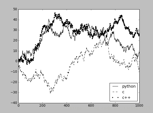
添加图例
使用legend()函数
fig,ax= plt.subplots(1,1)
ax.plot(randn(1000).cumsum(),'k',label='python')
ax.plot(randn(1000).cumsum(),'k--',label='c')
ax.plot(randn(1000).cumsum(),'k.',label='c++')
ax.legend(loc='best')
在subplot上注释
使用annotate()函数
ax.annotate(label,xy=(x,y),arrowprops=dict(facecolor='black',shrink=0.05))
label指定要加的内容,第二个参数指定指向的位置,第三个参数指定标志颜色和斜率
import numpy as np
import matplotlib.pyplot as plt

fig = plt.figure()
ax = fig.add_subplot(111)

t = np.arange(0.0, 5.0, 0.01)
s = np.cos(2*np.pi*t)
line, = ax.plot(t, s, lw=2)

ax.annotate('hello itcast', xy=(2, 1), xytext=(3, 1.5),
            arrowprops=dict(facecolor='black', shrink=0.05),
            )

ax.set_ylim(-2,2)
plt.show()
将图表保存到文件
利用plt.savefig可以将当前图表保存到文件
plt.savefig('pythonshow.png')
3.2ipython notebook
本地运行
此种情形下,数据和计算资源均在本地机器上,需要首先在本地安装好 IPython,之后运行服务端:
ipython notebook
如果想将 Matplotlib 生成的图片潜入网页内显示,则使用:
ipython notebook --pylab inline
我们将使用一下配置去启动一个ipython notebook
export PYSPARK_DRIVER_PYTHON=/usr/bin/ipython
export PYSPARK_DRIVER_PYTHON_OPTS="notebook --matplotlib=qt"
4.1主程序
首先要进入虚拟环境中
workon bigdata
然后启动pyspark,创建一个新的notebook,在notebook上面运行程序
import csv
import matplotlib.pyplot as plt

from StringIO import StringIO
from datetime import datetime
from collections import namedtuple
from operator import add, itemgetter
from pyspark import SparkConf, SparkContext

APP_NAME = "航班信息"
DATE_FMT = "%Y-%m-%d"
TIME_FMT = "%H%M"

fields   = ('date', 'airline', 'flightnum', 'source', 'dest', 'dep',
            'dep_delay', 'arv', 'arv_delay', 'airtime', 'distance')
Flight   = namedtuple('Flight', fields)

def show(delays):
    """
    显示分析结果
    """
    #取得前十个航班的名字和时间
    airlines = [d[0] for d in delays]
    minutes  = [d[1] for d in delays]
    #创建subplot图
    index    = list(xrange(len(airlines)))
    fig, axe = plt.subplots()
    bars = axe.barh(index, minutes)

    #分别处理延误时间大于0和小于0的情况
    for idx, air, min in zip(index, airlines, minutes):
        if min > 0:
            bars[idx].set_color('#FFFF00')
            #设置注解
            axe.annotate(" %0.0f" % min, xy=(min+1, idx+0.5), va='center')
        else:
            bars[idx].set_color('#0000FF')
            #设置注解
            axe.annotate(" %0.0f" % min, xy=(10, idx+0.5), va='center')
    #绘制y坐标的大小和标签
    ticks = plt.yticks([idx+ 0.5 for idx in index], airlines)
    xt = plt.xticks()[0]
    plt.xticks(xt, [' '] * len(xt))

    plt.grid(axis = 'x', color ='white', linestyle='-')
    plt.title('2016 feiji delay')
    plt.show()


def split(line):
    reader = csv.reader(StringIO(line))
    return reader.next()

def parse(row):
    """
    返回一个前十名的命名元组,按要求打印的float单精度
    """
    row[0]  = datetime.strptime(row[0], DATE_FMT).date()
    row[5]  = datetime.strptime(row[5], TIME_FMT).time()
    row[6]  = float(row[6])
    row[7]  = datetime.strptime(row[7], TIME_FMT).time()
    row[8]  = float(row[8])
    row[9]  = float(row[9])
    row[10] = float(row[10])
    return Flight(*row[:11])

def dowork(sc):
    """
    读取hdfs文件,并进行计算
    """
    #读取航空公司信息,返回字典
    airlines = dict(sc.textFile("/tmp/hive/itcast/feiji/airlines.csv").map(split).collect())
    airline_lookup = sc.broadcast(airlines)
    #读取每次飞行信息,并处理数据类型
    flights = sc.textFile("/tmp/hive/itcast/feiji/flights.csv").map(split).map(parse)
    #求出延误时间总和
    delays  = flights.map(lambda f: (airline_lookup.value[f.airline],add(f.dep_delay, f.arv_delay)))
    #将RDD结果转换成数组
    delays  = delays.reduceByKey(add).collect()
    #按照第1列的关键字进行排序
    delays  = sorted(delays, key=itemgetter(1))
    for d in delays:
        print "%0.0f min delayed\t%s" % (d[1], d[0])
    show(delays)

if __name__ == "__main__":
    conf = SparkConf().setMaster("local[*]")
    conf = conf.setAppName(APP_NAME)
    sc   = SparkContext(conf=conf)
    dowork(sc)