本文参考以下文章,感谢原作者:
https://blog.csdn.net/u010228448/article/details/56831202
https://www.cnblogs.com/dreamGong/p/6182235.html
http://mobile.51cto.com/aprogram-380358.htm
https://blog.csdn.net/brokge/article/details/9713041
一、圆角边框实现
在drawable中新建一个xml文件
<?xml version="1.0" encoding="utf-8"?>
<shape xmlns:android="http://schemas.android.com/apk/res/android">
<!--角度-->
<corners
android:radius="5dp"
/>
<!--填充色-->
<solid
android:color="#FF3030"
/>
<!--边框色-->
<stroke
android:color="#000000"
android:width="1dp"
/>
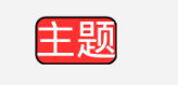
</shape>在布局文件中引用这个资源文件(作为Background)
<TextView

android:layout_width="wrap_content"

android:layout_height="wrap_content"

android:layout_margin="20dp"

android:textColor="#FFFFFF"

android:background="@drawable/style_textview_normal"

android:text="主题"/>
效果如图:
为什么这样定义?
这个实际是给TextView定义了一个背景,Android 控件(TextView、Button等)的背景background可以接受许多种资源类型,color、drawable
二、样式的复用
在style.xml中定义一个样式
<style name="style_text_array">

<item name="android:textSize">21dp</item>

<item name="android:textColor">#FFFFFF</item>

<item name="android:background">@drawable/style_textview_normal</item>

</style>
在布局文件中引用
<TextView

android:layout_width="wrap_content"

android:layout_height="wrap_content"

style="@style/style_text_array"

android:text="主题"/>
样式复用相当于统一的定义了一个样式组,可以在许多的控件里引用,从而减少重复代码
三、selector标签的介绍
selector标签,可以添加一个或多个item子标签,而相应的状态是在item标签中定义的。定义的xml文件可以作为两种资源使用:drawable和color。作为drawable资源使用时,一般和shape一样放于drawable目录下,item必须指定android:drawable属性;作为color资源使用时,则放于color目录下,item必须指定android:color属性。
那么,看看都有哪些状态可以设置呢:
- android:state_enabled: 设置触摸或点击事件是否可用状态,一般只在false时设置该属性,表示不可用状态
- android:state_pressed: 设置是否按压状态,一般在true时设置该属性,表示已按压状态,默认为false
- android:state_selected: 设置是否选中状态,true表示已选中,false表示未选中
- android:state_checked: 设置是否勾选状态,主要用于CheckBox和RadioButton,true表示已被勾选,false表示未被勾选
- android:state_checkable: 设置勾选是否可用状态,类似state_enabled,只是state_enabled会影响触摸或点击事件,而state_checkable影响勾选事件
- android:state_focused: 设置是否获得焦点状态,true表示获得焦点,默认为false,表示未获得焦点
- android:state_window_focused: 设置当前窗口是否获得焦点状态,true表示获得焦点,false表示未获得焦点,例如拉下通知栏或弹出对话框时,当前界面就会失去焦点;另外,ListView的ListItem获得焦点时也会触发true状态,可以理解为当前窗口就是ListItem本身
- android:state_activated: 设置是否被激活状态,true表示被激活,false表示未激活,API Level 11及以上才支持,可通过代码调用控件的setActivated(boolean)方法设置是否激活该控件
- android:state_hovered: 设置是否鼠标在上面滑动的状态,true表示鼠标在上面滑动,默认为false,API Level 14及以上才支持
下面我们就通过例子来看一下常用的场景。
<?xml version="1.0" encoding="utf-8"?>
<selector xmlns:android="http://schemas.android.com/apk/res/android">

    <!--按钮按下状态样式-->
    <item android:state_pressed="true" android:drawable="@drawable/btn_pressed_style" />
    <!--控件不可用时
        设置View.setEnabled方法
    -->
    <item android:state_enabled="false" android:drawable="@drawable/btn_enabled_style" />

    <!--获得焦点时-->
    <item android:state_focused="true" android:drawable="@drawable/btn_focus_style" />
    <!--失去焦点时
        如果定义android:state_focused="true"
        没有定义android:state_focused="false"
        那么EditText失去焦点,就使用默认样式
    -->
    <item android:state_focused="false" android:drawable="@drawable/btn_unfocus_style" />

    <!--默认状态下样式-->
    <item android:drawable="@drawable/btn_normal_style" />
</selector>
我们看到通过select标签,我们可以省去一些Java逻辑代码的编写(针对样式改变的)。这里有一个注意点:默认样式下item必须定义在最后一个,如果你定义在最前面或者中间会导致默认item以下定义的其他item无效。这也算是一个小坑把。
在对控件进行操作时,如果想对控件的文字(例如:Button、TextView的文字)进行改变时,也可以使用selector来改变。这里给大家看一下代码示例:
<?xml version="1.0" encoding="utf-8"?>
<selector xmlns:android="http://schemas.android.com/apk/res/android">
    <!-- 当前窗口失去焦点时 -->
    <item android:color="@android:color/black" android:state_window_focused="false" />
    <!-- 不可用时 -->
    <item android:color="@android:color/background_light" android:state_enabled="false" />
    <!-- 按压时 -->
    <item android:color="@android:color/holo_blue_light" android:state_pressed="true" />
    <!-- 被选中时 -->
    <item android:color="@android:color/holo_green_dark" android:state_selected="true" />
    <!-- 被激活时 -->
    <item android:color="@android:color/holo_green_light" android:state_activated="true" />
    <!-- 默认时 -->
    <item android:color="@android:color/white" />
</selector>
最后我们在使用时只要这样即可:
<Button
        android:layout_width="match_parent"
        android:layout_height="50dp"
        android:text="点击按钮"
        android:textSize="16sp"
        android:textColor="@color/text_btn_selector"
        android:id="@+id/main"
        android:background="@drawable/button_bg_style"/>
最后的注意点
- selector作为drawable资源时,item指定android:drawable属性,并放于drawable目录下;
- selector作为color资源时,item指定android:color属性,并放于color目录下;
- color资源也可以放于drawable目录,引用时则用@drawable来引用,但不推荐这么做,drawable资源和color资源最好还是分开;
- android:drawable属性除了引用@drawable资源,也可以引用@color颜色值;但android:color只能引用@color;
- item是从上往下匹配的,如果匹配到一个item那它就将采用这个item,而不是采用最佳匹配的规则;所以设置默认的状态,一定要写在最后,如果写在前面,则后面所有的item都不会起作用了。
另外,selector标签下有两个比较有用的属性要说一下,添加了下面两个属性之后,则会在状态改变时出现淡入淡出效果,但必须在API Level 11及以上才支持:
- android:enterFadeDuration 状态改变时,新状态展示时的淡入时间,以毫秒为单位
- android:exitFadeDuration 状态改变时,旧状态消失时的淡出时间,以毫秒为单位
最后,关于ListView的ListItem样式,有两种设置方式,一种是在ListView标签里设置android:listSelector属性,另一种是在ListItem的布局layout里设置android:background。但是,这两种设置的结果却有着不同。同时,使用ListView时也有些其他需要注意的地方,总结如下:
1、android:listSelector设置的ListItem默认背景是透明的,不管你在selector里怎么设置都无法改变它的背景。所以,如果想改ListItem的默认背景,只能通过第二种方式,在ListItem的布局layout里设置android:background。
2、当触摸点击ListItem时,第一种设置方式下,state_pressed、state_focused和state_window_focused设为true时都会触发,而第二种设置方式下,只有state_pressed会触发。
3、当ListItem里有Button或CheckBox之类的控件时,会抢占ListItem本身的焦点,导致ListItem本身的触摸点击事件会无效。那么,要解决此问题,有三种解决方案:
- 将Button或CheckBox换成TextView或ImageView之类的控件
- 设置Button或CheckBox之类的控件设置focusable属性为false
- 设置ListItem的根布局属性android:descendantFocusability="blocksDescendants"
第三种是最方便,也是推荐的方式,它会将ListItem根布局下的所有子控件都设置为不能获取焦点。android:descendantFocusability属性的值有三种,其中,ViewGroup是指设置该属性的View,本例中就是ListItem的根布局:
- beforeDescendants:ViewGroup会优先其子类控件而获取到焦点
- afterDescendants:ViewGroup只有当其子类控件不需要获取焦点时才获取焦点
- blocksDescendants:ViewGroup会覆盖子类控件而直接获得焦点
四、使用strings.xml
为什么需要把应用中出现的文字单独存放在string.xml文中呢?
一是为了国际化,Android建议将在屏幕上显示的文字定义在strings.xml中,如果今后需要进行国际化,比如我们开发的应用本来是面向国内用户的,当然在屏幕上使用中文,而如今我们要让应用走向世界,打入日本市场,当然需要在手机屏幕上显示日语,如果没有把文字信息定义在string.xml中,就需要修改程序的内容了。但当我们把所有屏幕上出现的文字信息都集中存放在string.xml文件之后,只需要再提供一个string.xml文件,把里面的汉子信息都修改为日语,再运行程序时,android操作系统会根据用户手机的语言环境和国家来自动选择相应的string.xml文件,这时手机界面就会显示出日语。这样做国际化非常的方便。
二是为了减少应用的体积,降低数据的冗余。假设在应用中要使用"我们一直在努力"这段文字1000次,如果我们不将"我们一直在努力"定义在string.xml文件中,而是在每次使用时直接写上这几个字,这样下来程序中将有70000个字,这70000个字占136KB的空间。而由于手机的资源有限,其CPU的处理能力及内存是非常有限的,136KB对手机内存来说是个不小的空间,我们在做手机应用是一定要记住“能省内存就省内存”。而如果将这几个字定义在string.xml中,在每次使用到的地方通过Resources类来引用该文字,只占用到了14B,因此对降低应用体积效果是非常有效地.当然我们可能在开发时可能并不会用到这么多的文字信息,但是“不以善小而不为,不以恶小而为之”,作为手机应用开发人员,我们一定要养成良好的编程习惯。
1.在程序中获取string.xml中字符串和数值
<?xml version="1.0" encoding="utf-8"?>

<resources>

    <string name="hello">Hello World, MainActivity!</string>

    <string name="app_name">TestExample01</string>

</resources>
在Activity中使用:
String appName=(String) this.getResources().getText(R.string.app_name);

Log.i("test", "appName="+appName);
或者:
String appName=(String) this.getResources().getString(R.string.app_name);

Log.i("test", "appName="+appName);
2.定义string数组(arrays.xml)
<?xml version="1.0" encoding="utf-8"?>

<resources>

    <string-array name="sports">

 <item>足球</item>

 <item>篮球</item>

 <item>太极</item>

 <item>冰球</item>

    </string-array>

</resources>
getResources().getStringArray(R.string.sports); 3.定义颜色(colors.xml)
<?xml version="1.0" encoding="utf-8"?>

<resources>

    <color name="black">#FFFFFF</color>

</resources>
getResources().getDrawable(R.string.black);
getResources().getColor(R.string.black); 4.定义尺寸(dimens.xml)
<?xml version="1.0" encoding="utf-8"?>

<resources>

   <dimen name="height">80dip</dimen>

</resources>
getResource().getDimension(R.string.height); 5.定义样式(styles.xml)
<?xml version="1.0" encoding="utf-8"?>

<resources>

    <style name="sharpText">

 <item name="android:textSize">18sp</item>

 <item name="android:textColor">#000000</item>

    </style>

</resources>