用纯CSS创建一个三角形
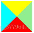
当一个盒容器的两条边框在边角处相交时,浏览器就会在交点处按某个角度绘制接合线。
如果将这个盒容器的width和height设置为0,并为每条边框设置一个较粗的width值和彼此不同的颜色,最终会得到四个被拼接到一起的三角形,它们分别指向不同的方向:
<div id="demo"></div>
#demo {
  width: 0;
  height: 0;
  border-width: 50px;
  border-style: solid;
  border-color: yellow green red blue;
}
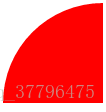
如果将三个方向的边框颜色设置为透明,那么就得到了一个三角形:
#demo {
  width: 0;
  height: 0;
  border-width: 50px;
  border-style: solid;
  border-color: transparent transparent red transparent;
}
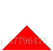
综上所述,实现一个纯CSS三角形的要素是:
- 将一个元素的width和heigth都设置为0
- 设置较粗的边框
- 将其中三个边框的颜色设置为透明
还可以为相邻边框设置不同的边框宽度来改变三角形的角度。
CSS画圆形
圆形
<div class="circle"></div>
.circle{
  width:100px;
  height:100px;
  border-radius:50px;
  background-color:red;
}
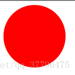
要点:
- 使border-radius半径为宽度的一半
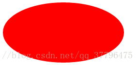
椭圆
也可以画出椭圆:
.circle{
  width:200px;
  height:100px;
  border-radius:100px /50px;
  background-color:red;
}
分别使圆角的半径为宽度和高度的一半。
半圆
.circle{
  width:100px;
  height:50px;
  border-radius:50px 50px 0 0;
  background-color:red;
}

四分之一圆
.circle{
  width:100px;
  height:100px;
  border-radius:100px 0 0 0;
  background-color:red;
}
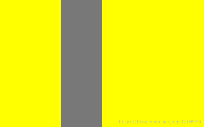
多列等高布局
- 利用padding-bottom|margin-bottom正负值相抵;padding-bottom设为很大的正值;margin-bottom设为相等的负值。
- 设置父容器设置超出隐藏(overflow:hidden),这样父容器的高度就还是最高的列的高度。(padding-bottom和margin-bottom抵消)
- 当它里面的任 一列高度增加了,则父容器的高度被撑到里面最高那列的高度
- 其他比这列矮的列会用它们的padding-bottom补偿这部分高度差。
<div id="container">
  <div class="element">
  </div>
  <div class="element">
  </div>
</div>
#container{
  width:800px;
  background-color:#777;

  overflow:hidden;

}
.element{
  background-color:yellow;
  float:left;

  padding-bottom:2000px;
  margin-bottom:-2000px;
}
.element:first-child{
  height:200px;
  width:30%;
}
.element:last-child{
  height:500px;
  width:50%;
  float:right;
}
元素竖向百分比
当按百分比设定一个元素的宽度时,它是相对于父容器的宽度计算的。
但是,对于一些表示竖向距离的属性,例如padding-top,padding-bottom,margin-top,margin-bottom等,当按百分比设定它们时,依据的也是父容器的宽度,而不是高度。
多边框
可以利用box-shadow属性实现多边框。
- box-shadow支持多阴影,以逗号分隔。最先声明的阴影在最上面。
- 将偏移和模糊半径都设置为0,才会形成边缘清晰的元素四周的边框。
- 将各个阴影的扩展半径设置为不同的长度。
#demo {
  margin-top:90px;
  margin-left:90px;
  width: 200px;
  height: 50px;
  background-color:#eee;

  box-shadow: 0 0 0 10px gold,0 0 0 20px green,0 0 0 30px red;
}

其实还可以用box-sizing来实现双边框。
纯CSS实现手风琴效果
利用:target伪类可以用纯css实现手风琴效果。
<div>
  <a href="#panel1">panel1</a>
  <div id="panel1" class="element">
    <p>this is panel 1</p>
   </div>
   <a href="#panel2">panel2</a>
  <div id="panel2" class="element">
    <p>this is panel 2</p>
   </div>
   <a href="#panel3">panel3</a>
  <div id="panel3" class="element">
    <p>this is panel 3</p>
   </div>
 </div>
.element{
  width:200px;
  border:1px solid #777;
  border-top:none;
  height:0px; /*初始情况所有选项卡都不显示*/
  overflow:hidden;
  transition:height 0.3s;
}
a{
  height:20px;
  width:200px;
  display:block;
  border-left:1px solid #777;
  border-right:1px solid #777;
  background-color:orange;
  text-decoration:none;
}
a:first-child{
  border-top:1px solid #777;
}

.element:target{
  height:100px; /*目标元素高度设为100,即显示出来*/
}
原理就是通过一个a元素链接目标元素,当点击对应标题时更改相应目标元素的样式将其显示出来。
demo地址
纯CSS实现简单视差滚动效果
通过使用background-attachment:fixed实现简单视差滚动效果。
background-attachment属性用于设置背景图片决定背景是在视口中固定的还是随包含它的区块滚动的。
而fixed属性值就是表示背景图片不随容器一起滚动,而是相对于视口固定。这样的话在我们向下滑动页面时,容器及其内容是向上滚动的,但其背景图片却是固定的,造成一种视差滚动的效果。
上代码:
  <section>
      You don't have to be great to start, but you have to start to be great.
  </section>

  <section>
    what is your main focus today?
  </section>

  <section>
     i'm chengigi
  </section>
section{
/*用于控制每一个section的大小占据整个视口*/
  width:100vw;
  height:100vh;

  color:#fff;
  font-size:40px;
  text-align:center;
/*背景图片相关属性设置*/
  background-repeat:no-repeat;
  background-size:cover;
  background-attachment:fixed;
}
section:nth-child(1){
  background-image:url(http://newfront.free4inno.com/dev/img/pic1.jpg);
}
section:nth-child(2){
  background-image:url(http://newfront.free4inno.com/dev/img/pic2.jpg);
}
section:nth-child(3){
  background-image:url(http://newfront.free4inno.com/dev/img/pic3.jpg);
}
Demo地址