本文主要介绍R语言中基本图形的绘制,包含以下几种图形:1.条形图 2.饼图 3.直方图 4.核密度图 5.箱线图 6.点图
1.直方图的绘制
#直方图绘制
barplot(height)
#height是一个向量或者矩阵
a<-c(1,2,3,4,5,6)
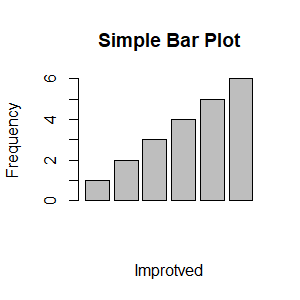
#垂直直方图
barplot(a,main="Simple Bar Plot",xlab="Improtved",ylab="Frequency")
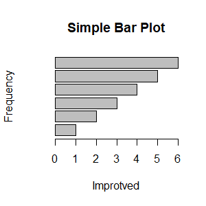
#水平直方图
barplot(a,main="Simple Bar Plot",xlab="Improtved",ylab="Frequency",horiz=TRUE)
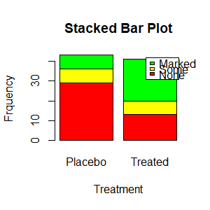
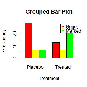
#barplot(height)
#height为矩阵时,绘制的是堆砌条形图或分组条形图
library(vcd)
counts<-table(Arthritis$Improved,Arthritis$Treatment)
#绘制堆叠图
barplot(counts,main="Stacked Bar Plot",xlab="Treatment",ylab="Frquency",col=c("red","yellow","green"),legend=rownames(counts))
#绘制分组图
barplot(counts,main="Grouped Bar Plot",xlab="Treatment",ylab="Grequency",col=c("red","yellow","green"),legend=rownames(counts),beside=TRUE)
#下面为counts的值
Placebo Treated
None 29 13
Some 7 7
Marked 7 21
#直方图的微调
#增加Y边界的大小
par(mar=c(5,8,4,2))
#旋转条形的标签
par(las=2)
counts<-table(Arthritis$Improved)
barplot(counts,main="Treatment Outcome",horiz=TRUE,cex.names=0.8,names.arg=c("No improved","some Improved","Marked Improved"))

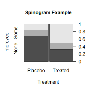
#简单的棘状图
library(vcd)
attach(Arthritis)
counts<-table(Treatment,Improved)
spine(counts,main="Spinogram Example")
detach(Arthritis)
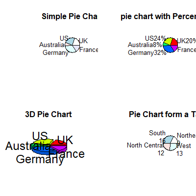
2.饼图的绘制
#饼图的绘制
pie(x,labels)
#x为一个非负值向量,表示每个扇形的面积,labels为各个扇形标签的字符型向量
par(mfrow=c(2,2))
slices<-c(10,12,4,16,8)
#基本的饼图
lbls<-c("UK","US","Australia","Germany","France")
pie(slices,labels=lbls,main="Simple Pie Chart")
#为饼形图添加比例数值
pct<-round(slices/sum(slices)*100)
lbls2<-paste(lbls,"",pct,"%",sep="")
pie(slices,labels=lbls2,col=rainbow(length(lbls2)),main="pie chart with Percentages")
#3D饼形图
library(plotrix)
pie3D(slices,labels=lbls,explode=0.1,main="3D Pie Chart")
#从表格创建饼图
mytable<-table(state.region)
lbls3<-paste(names(mytable),"\n",mytable,sep="")
pie(mytable,labels=lbls3,main="Pie Chart form a Table")
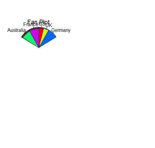
#绘制容易看出大小的饼图
library(plotrix)
slices<-c(10,12,4,16,8)
lbls<-c("US","UK","Australia","Germany","France")
fan.plot(slices,labels=lbls,main="Fan Plot")
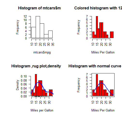
3.绘制直方图
直方图:通过在X轴上将值域分割为一定数量的组,在Y轴上显示相应的频数,展示连续变量的分析
#绘制直方图
par(mfrow=c(2,2))
#简单的直方图
hist(mtcars$mpg)
#设置直方图的颜色,添加坐标轴标签
hist(mtcars$mpg,breaks=12,col="red",xlab="Miles Per Gallon",
     main="Colored histogram with 12 bins")
#添加轴须图
hist(mtcars$mpg,freq=FALSE,breaks=12,col="red",xlab="Miles per Gallon",main="Histogram ,rug plot,density curve")
rug(jitter(mtcars$mpg))
lines(density(mtcars$mpg),col="blue",lwd=2)
#添加正态分布密度曲线和外框
x<-mtcars$mpg
h<-hist(x,breaks=12,col="red",xlab="Miles Per Gallon",main="Histogram with normal curve and box")
xfit<-seq(min(x),max(x),length=40)
yfit<-dnorm(xfit,mean=mean(x),sd=sd(x))
yfit<-yfit*diff(h$mids[1:2]*length(x))
lines(xfit,yfit,col="blue",lwd=2)
box()
#上述图形比较复杂,后续结合具体实例深入研究
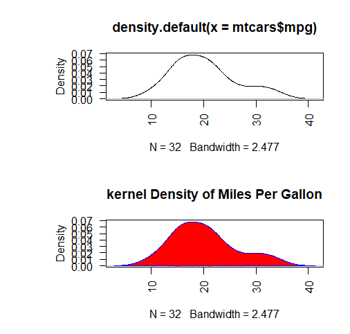
4.绘制核密度图
核密度:核密度估计师用于估计随机变量概率密度函数的一种非参数方法
#绘制核密度图
par(mfrow=c(2,1))
d<-density(mtcars$mpg)
plot(d)
d<-density(mtcars$mpg)
plot(d,main="kernel Density of Miles Per Gallon")
polygon(d,col="red",border="blue")
rug(mtcars$mpg,col="brown")
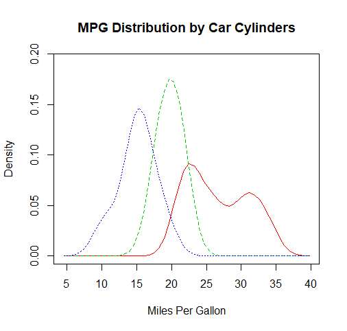
#一个图形中绘制多个核密度图
library(sm)
attach(mtcars)
cyl.f<-factor(cyl,levels=c(4,6,8),labels=c("4 cylinder","6 cylinder","8 cylinder"))
sm.density.compare(mpg,cyl,xlab="Miles Per Gallon")
title(main="MPG Distribution by Car Cylinders")
detach(mtcars)
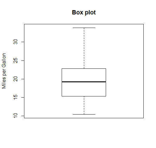
5.箱形图
箱形图:通过绘制连续性变量的五数总括,即最小值、下四分位、中位数、上四分位数、最大值
boxplot(mtcars$mpg,main="Box plot",ylab="Miles per Gallon")
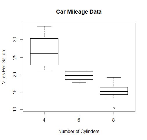
#一个图中绘制多个箱形图
boxplot(formula,data=data.frame)
boxplot(mpg~cyl,data=mtcars,main="Car Mileage Data",xlab="Number of Cylinders",ylab="Miles Per Gallon")
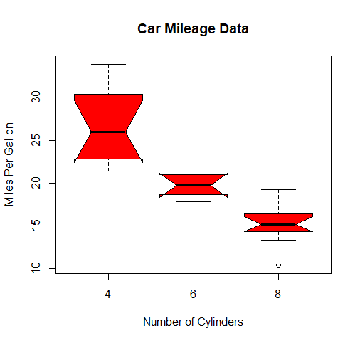
#凹槽型箱形图
boxplot(mpg~cyl,data=mtcars,notch=TRUE,col="red",main="Car Mileage Data",xlab="Number of Cylinders",ylab="Miles Per Gallon")
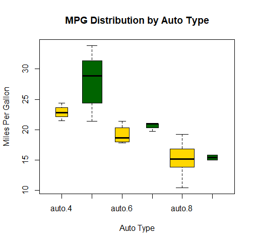
#绘制交叉因子箱形图
mtcars$cyl.f<-factor(mtcars$cyl,levels=c(4,6,8),labels=c("4","6","8"))
mtcars$am.f<-factor(mtcars$am,levels=c(0,1),labels=c("auto","standard"))
boxplot(mpg~am.f *cyl.f,
        data=mtcars,
        varwidth=TRUE,
        col=c("gold","darkgreen"),
        main="MPG Distribution by Auto Type",
        xlab="Auto Type",
        ylab="Miles Per Gallon")
#小提琴箱形图
library(vioplot)
x1<-mtcars$mpg[mtcars$cyl==4]
x2<-mtcars$mpg[mtcars$cyl==6]
x3<-mtcars$mpg[mtcars$cyl==8]
vioplot(x1,x2,x3,names=c("4 cyl","6 cyl","8 cyl"),col="gold")

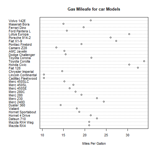
6.点图
#水平刻度上绘制大量有标签值的方法
dotchart(x,labels)
dotchart(mtcars$mpg,labels=row.names(mtcars),cex=0.7,main="Gas Mileafe for car Models",xlab="Miles Per Gallon")
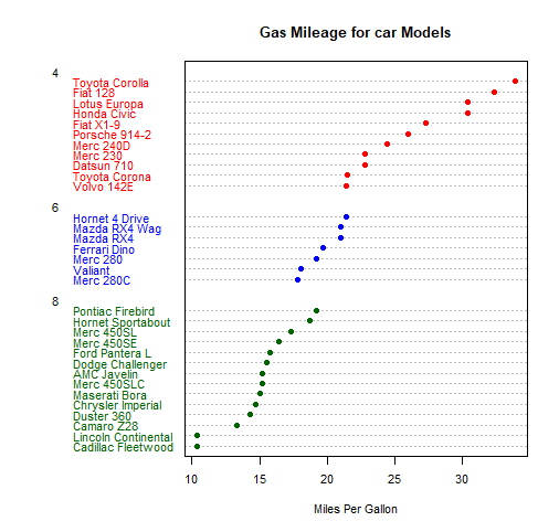
#进行调整的点图
x<-mtcars[order(mtcars$mpg),]
x$cyl<-factor(x$cyl)
x$color[x$cyl==4]<-"red"
x$color[x$cyl==6]<-"blue"
x$color[x$cyl==8]<-"darkgreen"
dotchart(x$mpg,labels=row.names(x),cex=0.7,groups=x$cyl,gcolor="black",color=x$color,pch=19,main="Gas Mileage for car Models",xlab="Miles Per Gallon")
以上简单探索了R语言中的集中常用图形,后续要根据具体业务需要灵活运用。