转自:https://www.cnblogs.com/starof/p/4459991.html
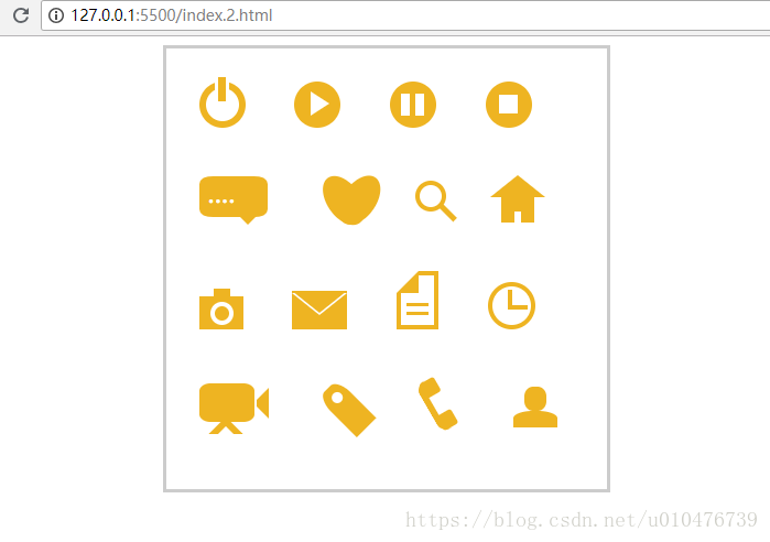
首先看效果图:
代码如下:
<!doctype html>
<html>

<head>
  <title>伪类标签使用</title>
</head>
<style type="text/css">
  #wraper {
    padding: 10px;
    width: 380px;
    height: 380px;
    border: 3px solid #ccc;
    margin: auto;
  }

  #power {
    width: 30px;
    height: 30px;
    margin: 20px;
    border: 6px solid #EEB422;
    border-radius: 50%;
    position: relative;
    display: inline-block;
  }

  #power:before {
    width: 7px;
    height: 22px;
    background: #EEB422;
    position: absolute;
    left: 8px;
    top: -13px;
    content: "";
    border: 3px solid #fff;
  }

  #play {
    width: 30px;
    height: 30px;
    margin: 20px;
    border: 6px solid #EEB422;
    border-radius: 50%;
    position: relative;
    display: inline-block;
    background: #EEB422;
  }

  #play:before {
    border: 11px solid transparent;
    border-left: 17px solid #fff;
    content: "";
    position: absolute;
    left: 9px;
    top: 3px;
  }

  #pause {
    width: 30px;
    height: 30px;
    margin: 20px;
    border: 6px solid #EEB422;
    border-radius: 50%;
    position: relative;
    display: inline-block;
    background: #EEB422;
  }

  #pause:before {
    height: 20px;
    width: 5px;
    border: 0px solid transparent;
    border-left: 8px solid #fff;
    border-right: 8px solid #fff;
    content: "";
    position: absolute;
    left: 4px;
    top: 5px;
  }

  #stop {
    width: 30px;
    height: 30px;
    margin: 20px;
    border: 6px solid #EEB422;
    border-radius: 50%;
    position: relative;
    display: inline-block;
    background: #EEB422;
  }

  #stop:before {
    height: 17px;
    width: 17px;
    background: #fff;
    content: "";
    position: absolute;
    left: 6px;
    top: 6px;
  }

  #comment {
    width: 50px;
    height: 25px;
    margin: 20px;
    border: 6px solid #EEB422;
    border-radius: 20%;
    position: relative;
    display: inline-block;
    background: #EEB422;
  }

  #comment:before {
    border: 10px solid transparent;
    border-top: 10px solid #EEB422;
    content: "";
    position: absolute;
    left: 28px;
    top: 28px;
  }

  #comment:after {
    content: "....";
    position: absolute;
    color: #fff;
    font-size: 26px;
    top: -10px;
    left: 2px;
  }

  #like {
    width: 50px;
    height: 30px;
    margin: 20px;
    border-radius: 55%;
    transform: rotate(55deg);
    -webkit-transform: rotate(55deg);
    position: relative;
    display: inline-block;
    background: #EEB422;
  }

  #like:before {
    width: 50px;
    height: 30px;
    border-radius: 55%;
    transform: rotate(-110deg);
    -webkit-transform: rotate(-110deg);
    background: #EEB422;
    content: "";
    position: absolute;
    left: 8px;
    top: -12px;
  }

  #search {
    width: 20px;
    height: 20px;
    border: 4px solid #EEB422;
    border-radius: 50%;
    margin: 20px;
    position: relative;
    display: inline-block;
    top: -5px;
    left: -5px;
  }

  #search:before {
    width: 20px;
    height: 5px;
    background: #EEB422;
    transform: rotate(45deg);
    -webkit-transform: rotate(45deg);
    content: "";
    position: absolute;
    left: 15px;
    top: 22px;
  }

  #home {
    width: 30px;
    height: 30px;
    background: #EEB422;
    margin: 20px;
    position: relative;
    display: inline-block;
    top: 5px;
  }

  #home:before {
    width: 6px;
    height: 12px;
    background: #fff;
    content: "";
    position: absolute;
    left: 12px;
    top: 20px;
  }

  #home:after {
    border: 25px solid transparent;
    border-bottom: 20px solid #EEB422;
    content: "";
    position: absolute;
    top: -38px;
    left: -10px;
  }

  #photo {
    width: 40px;
    height: 30px;
    background: #EEB422;
    margin: 20px;
    position: relative;
    display: inline-block;
    top: 5px;
  }

  #photo:before {
    width: 13px;
    height: 13px;
    border: 4px solid #fff;
    border-radius: 50%;
    background: #EEB422;
    content: "";
    position: absolute;
    left: 10px;
    top: 5px;
  }

  #photo:after {
    width: 15px;
    height: 10px;
    background: #EEB422;
    content: "";
    position: absolute;
    top: -7px;
    left: 13px;
  }

  #photo {
    width: 40px;
    height: 30px;
    background: #EEB422;
    margin: 20px;
    position: relative;
    display: inline-block;
    top: 5px;
  }

  #email {
    width: 50px;
    height: 35px;
    background: #EEB422;
    margin: 20px;
    position: relative;
    display: inline-block;
    top: 5px;
  }

  #email:before {
    border: 25px solid transparent;
    border-top: 20px solid #fff;
    content: "";
    position: absolute;
    left: 0px;
    top: 2px;
  }

  #email:after {
    border: 25px solid transparent;
    border-top: 20px solid #EEB422;
    content: "";
    position: absolute;
    top: 0px;
  }

  #file {
    width: 30px;
    height: 45px;
    border: 4px solid #EEB422;
    margin: 20px;
    position: relative;
    display: inline-block;
    top: 5px;
  }

  #file:before {
    border: 10px solid #fff;
    border-right: 10px solid #EEB422;
    border-bottom: 10px solid #EEB422;
    content: "";
    position: absolute;
    left: -4px;
    top: -4px;
  }

  #file:after {
    width: 20px;
    height: 5px;
    border-top: 3px solid #EEB422;
    border-bottom: 3px solid #EEB422;
    content: "";
    position: absolute;
    left: 5px;
    top: 25px;
  }

  #history {
    width: 35px;
    height: 35px;
    border: 4px solid #EEB422;
    border-radius: 50%;
    margin: 20px;
    position: relative;
    display: inline-block;
    top: 5px;
  }

  #history:before {
    width: 14px;
    height: 14px;
    border-bottom: 4px solid #EEB422;
    border-left: 4px solid #EEB422;
    content: "";
    position: absolute;
    left: 14px;
    top: 3px;
  }

  #video {
    width: 50px;
    height: 35px;
    background: #EEB422;
    border-radius: 20%;
    margin: 20px;
    position: relative;
    display: inline-block;
    top: -5px;
  }

  #video:before {
    width: 6px;
    height: 6px;
    border: 11px solid transparent;
    border-right: 11px solid #EEB422;
    content: "";
    position: absolute;
    left: 35px;
    top: 4px;
  }

  #video:after {
    width: 10px;
    height: 10px;
    border: 6px solid transparent;
    border-top: 6px solid #EEB422;
    border-left: 6px solid #EEB422;
    transform: rotate(45deg);
    -webkit-transform: rotate(45deg);
    content: "";
    position: absolute;
    left: 13px;
    top: 35px;
  }

  #tags {
    width: 50px;
    height: 25px;
    background: #EEB422;
    border-radius: 35% 0% 0% 35%;
    transform: rotate(45deg);
    -webkit-transform: rotate(45deg);
    margin: 20px;
    margin-left: 35px;
    position: relative;
    display: inline-block;
    top: -5px;
  }

  #tags:before {
    width: 10px;
    height: 10px;
    border-radius: 50%;
    background: #fff;
    content: "";
    position: absolute;
    left: 7px;
    top: 7px;
  }

  #phone {
    width: 50px;
    height: 50px;
    border-left: 6px solid #EEB422;
    border-radius: 20%;
    transform: rotate(-30deg);
    -webkit-transform: rotate(-30deg);
    margin: 20px;
    margin-right: 0px;
    position: relative;
    display: inline-block;
    top: -5px;
  }

  #phone:before {
    width: 15px;
    height: 15px;
    background: #EEB422;
    border-radius: 20%;
    content: "";
    position: absolute;
    left: -2px;
    top: 1px;
  }

  #phone:after {
    width: 15px;
    height: 15px;
    background: #EEB422;
    border-radius: 20%;
    content: "";
    position: absolute;
    left: -3px;
    top: 34px;
  }

  #profile {
    width: 40px;
    height: 15px;
    background: #EEB422;
    border-radius: 45% 45% 0 0;
    margin: 20px;
    position: relative;
    display: inline-block;
    top: 0px;
  }

  #profile:before {
    width: 20px;
    height: 22px;
    background: #EEB422;
    border-radius: 40%;
    content: "";
    position: absolute;
    left: 10px;
    top: -22px;
  }
</style>

<body>
  <div id="wraper">
    <div id="power"></div>
    <div id="play"></div>
    <div id="pause"></div>
    <div id="stop"></div>
    <div id="comment"></div>
    <div id="like"></div>
    <div id="search"></div>
    <div id="home"></div>
    <div id="photo"></div>
    <div id="email"></div>
    <div id="file"></div>
    <div id="history"></div>
    <div id="video"></div>
    <div id="tags"></div>
    <div id="phone"></div>
    <div id="profile"></div>
  </div>
</body>

</html>