效果图:

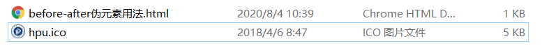
hpu.ico
同一目录下:
源码:
<!DOCTYPE html>
<html lang="en">
<head>
	<meta charset="UTF-8">
	<title>before-after</title>
	<style>
	div{

     margin:50px;}
	div::before{


		content:url(hpu.ico);
		position:relative;
		bottom:-10px;
		left:-10px;
	}
	div::after{


		content:"";
		width: 0px;
		height: 0px;
		display: inline-block;
		border:10px solid transparent;
		border-bottom:20px solid red;
		position: relative;
		bottom:-8px;
		left:10px;

	}
	p{

     margin:50px;
		  width:200px;
		  height:50px;
		  background:green;
		  border-radius: 5px;

      }
      p::after{


      	content:"";
      	width: 0px;
      	height: 0px;
      	display:inline-block;
      	border:12px solid transparent;
      	border-top:12px solid green;
      	position:relative;
      	bottom:-50px;
      	left:85px;

      }

	</style>
</head>
<body>
	<div>河南理工大学计算机学院</div>
	<p></p>
</body>
</html>
可以通过border、border-bottom、border-radius、border-top等控制图标的形状。