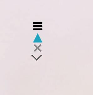
代码包含图标:menu菜单按钮,三角形,关闭按钮,下拉按钮,希望对大家有所帮助!
<html>
<head>
<meta charset="utf-8">
<meta name="viewport" content="width=device-width,initial-scale=1.0,maximum-scale=1.0,user-scalable=no"/>
<style type="text/css">
*{margin:0;padding:0;}
body{font-family:Viacultura-SemiBold,MicroSoft YaHei,Arial;}
ul,ol,li{list-style:none;}
img{border:none;vertical-align: middle;}
img[src=""],img:not([src]){opacity:0;}
a{text-decoration:none;}
input,button,select,textarea,a{outline:none;}
@font-face{
font-family: 'MinionPro-Regular';
src : url('https://cdn.shopify.com/s/files/1/0012/3391/1873/t/1/assets/MinionPro-Regular.otf');
}
@font-face{
font-family: 'Viacultura-SemiBold';
src : url('https://cdn.shopify.com/s/files/1/0012/3391/1873/t/1/assets/Viacultura-SemiBold.otf');
}
.bg{width:100%;position:fixed;top:0;left:0;z-index:-1;}
.left{width:14px;background:#fff;position:fixed;bottom:0;top:0;left:0;z-index:99;}
.right{width:14px;background:#fff;position:fixed;bottom:0;top:0;right:0;z-index:99;}
.box { margin: 200px; }
/*menu菜单效果*/
.menu{width:40px;height:44px;margin:200px 0 0 200px;float:left;}
.menu span{ width: 40px; height: 4px; position: relative;left:0;top:10px;display:inline-block;background: #fff;-webkit-transition: all 0.3s ease-in-out; transition: all 0.3s ease-in-out;}
.menu span:before{content: ""; display: block; width: 40px; height: 4px; background: #fff; border-radius: 5px; position: absolute; left: 0;top:13px; -webkit-transition: all 0.3s ease-in-out; transition: all 0.3s ease-in-out;}
.menu span:after{content: ""; display: block; width: 40px; height: 4px; background: #fff; border-radius: 5px; position: absolute; left: 0; -webkit-transition: all 0.3s ease-in-out; transition: all 0.3s ease-in-out;bottom:13px;}
.menu .active{background:transparent;}
.menu .active:before {top:0; -webkit-transform: rotate(-45deg); transform: rotate(-45deg);}
.menu .active:after {bottom:0; -webkit-transform: rotate(45deg); transform: rotate(45deg); }
/*menu菜单按钮*/
/*.menu{ width: 30px; height:5px; border-top: 5px solid #DD575C; border-bottom: 5px solid #DD575C; background-color: #DD575C; padding: 5px 0; background-clip:content-box; position: relative; margin:0 0 100px 0;}*/
/*三角形*/
.tranigle{width: 0;height: 0;border-bottom: 30px solid #20a3bf;border-left: 15px solid transparent;border-right: 15px solid transparent;transition:all 0.6s;}
.tranigle:hover{transform:rotate(180deg);transition:all 0.6s;}
/*关闭按钮*/
.close { width: 30px;height: 30px; position: relative;cursor:pointer;}
.close:before, .close:after { content: ''; position: absolute; top: 50%; width: 30px; height: 5px; background-color: #888; -webkit-transform: rotate(45deg); transform: rotate(45deg); }
.close:after { -webkit-transform: rotate(-45deg); transform: rotate(-45deg); }
/*下拉按钮*/
.down-arrow:after { content: ''; display: block; width: 20px; height: 20px; border-right: 3px solid #444; border-top: 3px solid #444; -webkit-transform: rotate(135deg); transform: rotate(135deg); cursor:pointer;}
@media screen and (min-width:1024px) and (max-width:1400px){
.bg{width:auto;}
}
@media screen and (min-width:667px) and (max-width:1024px){
.bg{width:auto;}
.left,.right{display:none;}
}
@media screen and (min-width:300px) and (max-width:667px){
.bg{width:auto;}
.left,.right{display:none;}
}
</style>
</head>
<body>
<div class="box">
<div class="menu"><span></span></div>
<div class="tranigle"></div>
<div class="close"></div>
<div class="down-arrow"></div>
</div>
<div class="left"></div>
<div class="right"></div>
<img class="bg" src="http://cdn.hauschka.com/images/system/background/white-flower.jpg">
<script type="text/javascript" src='http://code.jquery.com/jquery-1.8.0.min.js'></script>
<script type="text/javascript">
$(".menu").click(function(){
if($(this).find("span").hasClass("active")){
$(this).find("span").removeClass("active")
}else{
$(this).find("span").addClass("active")
}
})
</script>
</body>
</html>
效果如下: