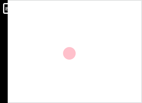
CSS3,我们可以创建动画,它可以取代许多网页动画图像,例如下面这个小球动画
使用css3关键帧动画可以轻松实现
请看下面代码
<!DOCTYPE html>
<html lang="en">
<head>
    <meta charset="UTF-8">
    <title>关键帧动画</title>
</head>
<style type="text/css">

@keyframes move {
    10%{
        transform: translate(50px,50px)
    }
    30%{
        transform: translate(150px,150px) scale(1.5);
    }
    50%{
        transform: translate(250px,150px) scale(1);
    }
    70%{
        transform: translate(350px,250px) scale(2);
    }
    100%{
        transform: translate(0px,0px) scale(1);
    }
}

@-webkit-keyframes move {
    10%{
        -webkit-transform: translate(50px,50px)
    }
    30%{
        -webkit-transform: translate(150px,150px) scale(1.5)
    }
    50%{
        -webkit-transform: translate(250px,150px) scale(1)
    }
    70%{
        -webkit-transform: translate(350px,250px) scale(2)
    }
    100%{
        -webkit-transform: translate(0px,0px) scale(1)
    }
}


.box{
    width: 30px;
    height: 30px;
    background-color: pink;
    border-radius: 50%;

    /* 规定 @keyframes 动画的名称 */
    animation-name:move;
    -webkit-animation-name:move;
    -o-animation-name:move;
    -ms-animation-name:move;
    -moz-animation-name:move;
    /* 规定动画完成一个周期所花费的秒 默认是 0 */
    animation-duration:1s;
    -webkit-animation-duration:1s;
    -o-animation-duration:1s;
    -ms-animation-duration:1s;
    -moz-animation-duration:1s;
    /* 规定动画的速度曲线。默认是 "ease" */
    animation-timing-function: linear;
    -webkit-animation-timing-function: linear;
    -o-animation-timing-function: linear;
    -ms-animation-timing-function: linear;
    -moz-animation-timing-function: linear;
    /* 规定动画何时开始。默认是 0 */
    animation-delay: 0;
    -webkit-animation-delay: 0;
    -o-animation-delay: 0;
    -ms-animation-delay: 0;
    -moz-animation-delay: 0;
    /* 规定动画被播放的次数。默认是 1 */
    animation-iteration-count: infinite;
    -webkit-animation-iteration-count: infinite;
    -o-animation-iteration-count: infinite;
    -ms-animation-iteration-count: infinite;
    -moz-animation-iteration-count: infinite;
}


</style>
<body>
    <div class="box"></div>
</body>
</html>
动画类型不仅仅局限于 translate(平移) 还可以是 scale(缩放)rotate(旋转)等