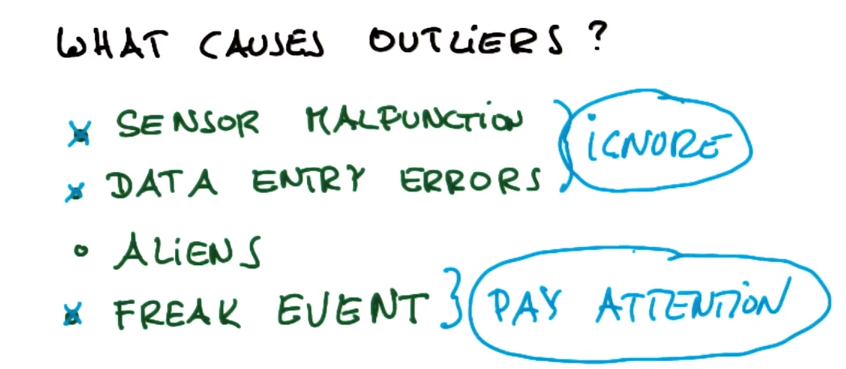
什么可能导致异常值:根据具体事件选择忽略还是重视(欺诈侦测)
传感器故障、(忽略)
数据输入错误、(忽略)
外部数据×
反常事件(通常需要重视)
选择异常值

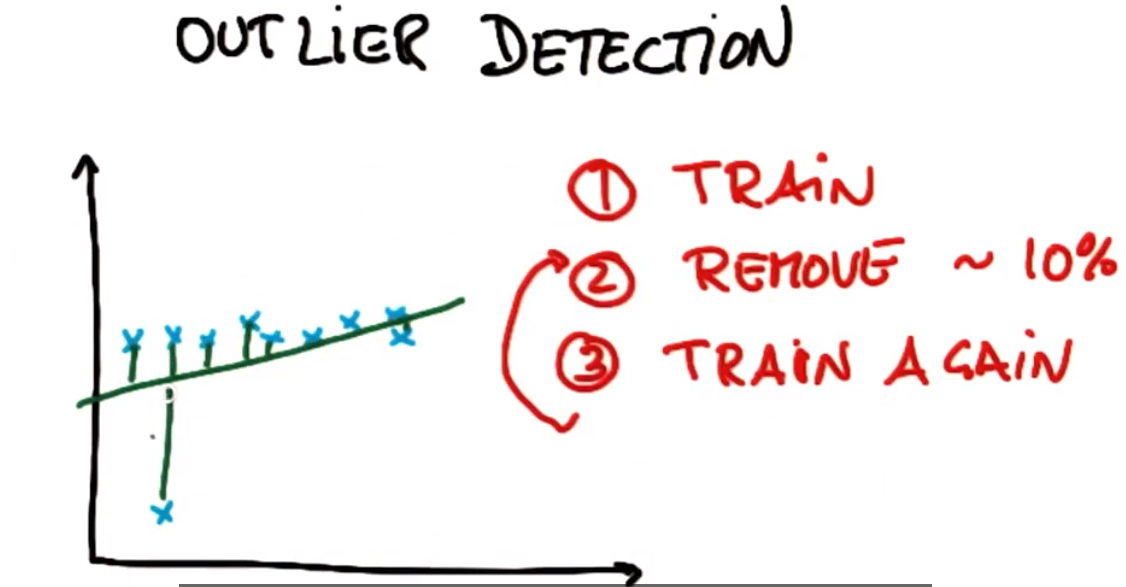
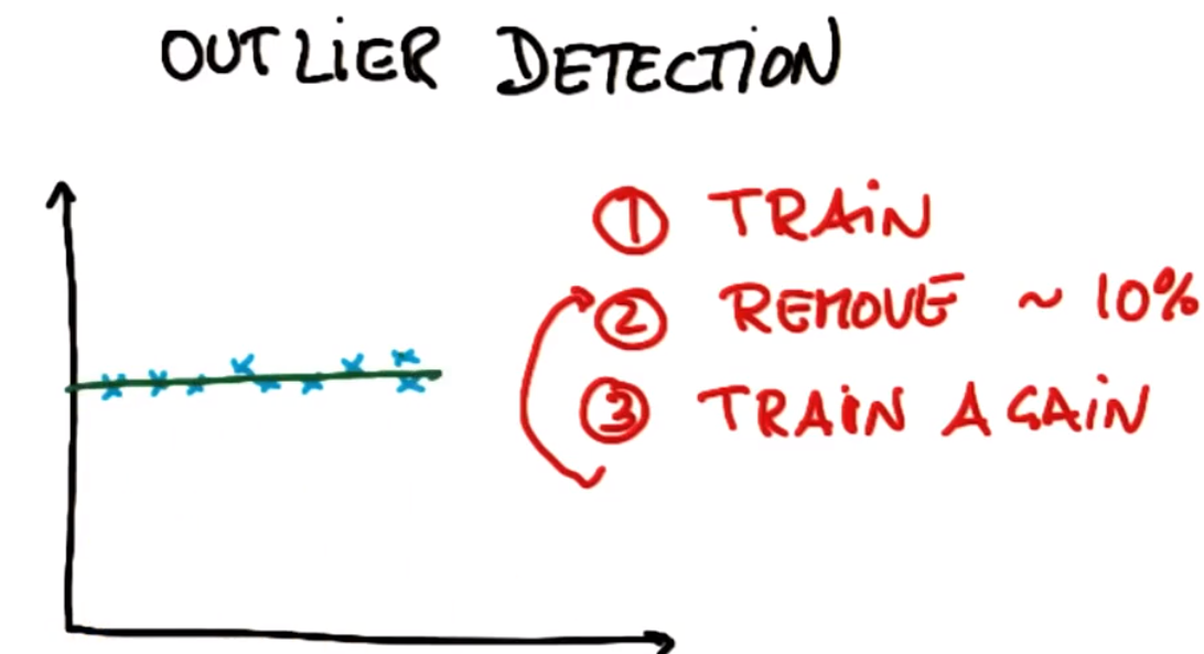
异常值检测-删除算法
训练
异常值检测——找出训练集中访问最多的点,去除这些点(一般约10%的异常数据)
再训练
(可能需要重复2、3步骤多次)
删除前:
删除后
异常值删除策略小结:这里要注意有的地方是要保留异常值,去除正常的数据的(异常检测、欺诈检测)。
1训练
2去掉最大误差的点(一般称为残差)
3重新训练
异常值迷你项目:
此项目有两部分。在第一部分中将运行回归,然后识别并删除具有最大残差的 10% 的点。然后,根据 Sebastian 在课程视频中所建议的,从数据集中删除那些异常值并重新拟合回归。
第一部分
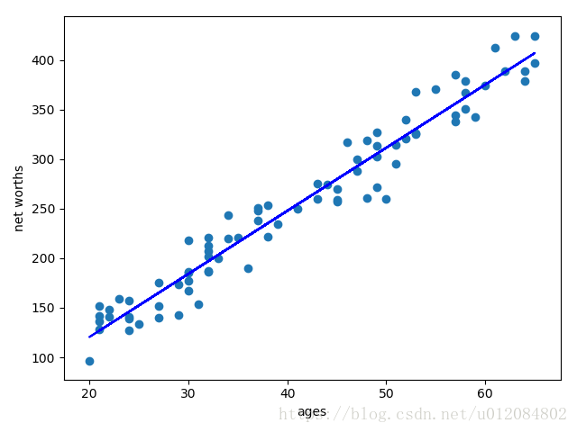
1.先开始运行初始代码 (outliers/outlier_removal_regression.py) 和可视化点。一些异常值应该会跳出来。部署一个线性回归,其中的净值是目标,而用来进行预测的特征是人的年龄(记得在训练数据上进行训练!)。
数据点主体的正确斜率是 6.25(我们之所以知道,是因为我们使用该值来生成数据);你的回归的斜率是 5.07793064
2.当使用回归在测试数据上进行预测时,你获得的分数是0.878262470366
3.你将在 outliers/outlier_cleaner.py 中找到 outlierCleaner() 函数的骨架并向其填充清理算法。用到的三个参数是:predictions 是一个列表,包含回归的预测目标;ages 也是一个列表,包含训练集内的年龄;net_worths 是训练集内净值的实际值。每个列表中应有 90 个元素(因为训练集内有 90 个点)。你的工作是返回一个名叫cleaned_data 的列表,该列表中只有 81 个元素,也即预测值和实际值 (net_worths) 具有最小误差的 81 个训练点 (90 * 0.9 = 81)。cleaned_data 的格式应为一个元组列表,其中每个元组的形式均为 (age, net_worth, error)。
一旦此清理函数运行起来,你应该能看到回归结果发生了变化。新斜率6.36859481
4.当使用回归在测试集上进行预测时,新的分数0.983189455396
outlier_removal_regression.py
#!/usr/bin/python

import random
import numpy
import matplotlib.pyplot as plt
import pickle

from outlier_cleaner import outlierCleaner


### load up some practice data with outliers in it
ages = pickle.load( open("practice_outliers_ages.pkl", "r") )
net_worths = pickle.load( open("practice_outliers_net_worths.pkl", "r") )


### ages and net_worths need to be reshaped into 2D numpy arrays
### second argument of reshape command is a tuple of integers: (n_rows, n_columns)
### by convention, n_rows is the number of data points
### and n_columns is the number of features
ages       = numpy.reshape( numpy.array(ages), (len(ages), 1))
net_worths = numpy.reshape( numpy.array(net_worths), (len(net_worths), 1))
from sklearn.cross_validation import train_test_split
ages_train, ages_test, net_worths_train, net_worths_test = train_test_split(ages, net_worths, test_size=0.1, random_state=42)

### fill in a regression here!  Name the regression object reg so that
### the plotting code below works, and you can see what your regression looks like
#=========answer======================
from sklearn import linear_model
reg = linear_model.LinearRegression()
reg.fit(ages_train,net_worths_train)
print 'slope', reg.coef_
print 'r-square', reg.score(ages_test,net_worths_test)


try:
    plt.plot(ages, reg.predict(ages), color="blue")
except NameError:
    pass
plt.scatter(ages, net_worths)
plt.show()


### identify and remove the most outlier-y points
cleaned_data = []
try:
    predictions = reg.predict(ages_train)
    cleaned_data = outlierCleaner( predictions, ages_train, net_worths_train )
except NameError:
    print "your regression object doesn't exist, or isn't name reg"
    print "can't make predictions to use in identifying outliers"


### only run this code if cleaned_data is returning data
if len(cleaned_data) > 0:
    ages, net_worths, errors = zip(*cleaned_data)
    ages       = numpy.reshape( numpy.array(ages), (len(ages), 1))
    net_worths = numpy.reshape( numpy.array(net_worths), (len(net_worths), 1))

    ### refit your cleaned data!
    try:
        reg.fit(ages, net_worths)
        plt.plot(ages, reg.predict(ages), color="blue")
    except NameError:
        print "you don't seem to have regression imported/created,"
        print "   or else your regression object isn't named reg"
        print "   either way, only draw the scatter plot of the cleaned data"
    plt.scatter(ages, net_worths)
    plt.xlabel("ages")
    plt.ylabel("net worths")
    plt.show()
========answer2========================
    print 'slope', reg.coef_
    print 'r-square', reg.score(ages_test, net_worths_test)

else:
    print "outlierCleaner() is returning an empty list, no refitting to be done"
outlier_cleaner.py
#!/usr/bin/python
# -*- coding: utf-8 -*-
import numpy as np
import math

def outlierCleaner(predictions, ages, net_worths):
    """
        Clean away the 10% of points that have the largest
        residual errors (difference between the prediction
        and the actual net worth).

        Return a list of tuples named cleaned_data where
        each tuple is of the form (age, net_worth, error).
    """

    cleaned_data = []

    ### your code goes here

    ages = ages.reshape((1,len(ages)))[0]
    net_worths = net_worths.reshape((1,len(ages)))[0]
    predictions = predictions.reshape((1,len(ages)))[0]
    # zip() 函数用于将可迭代的对象作为参数,将对象中对应的元素打包成一个个元组,然后返回由这些元组组成的列表。
    cleaned_data = zip(ages,net_worths,abs(net_worths-predictions))
    #按照error大小排序
    cleaned_data = sorted(cleaned_data , key=lambda x: (x[2]))
    #ceil() 函数返回数字的上入整数,计算要删除的元素个数
    cleaned_num = int(-1 * math.ceil(len(cleaned_data)* 0.1))
    #切片
    cleaned_data = cleaned_data[:cleaned_num]
    return cleaned_data
第二部分
在第二部分中,你将熟悉安然财务数据中的一些异常值,并且了解是否/如何删除它们。
1.在 outliers/enron_outliers.py 中找到初始代码,该代码读入数据(以字典形式)并将之转换为适合 sklearn 的 numpy 数组。由于从字典中提取出了两个特征(“工资”和“奖金”),得出的 numpy 数组维度将是 N x 2,其中 N 是数据点数,2 是特征数。对散点图而言,这是非常完美的输入;我们将使用 matplotlib.pyplot 模块来绘制图形。(在本课程中,我们对所有可视化均使用 pyplot。)将这些行添加至脚本底部,用以绘制散点图:
for point in data:
    salary = point[0]
    bonus = point[1]
    matplotlib.pyplot.scatter( salary, bonus )

matplotlib.pyplot.xlabel("salary")
matplotlib.pyplot.ylabel("bonus")
matplotlib.pyplot.show()
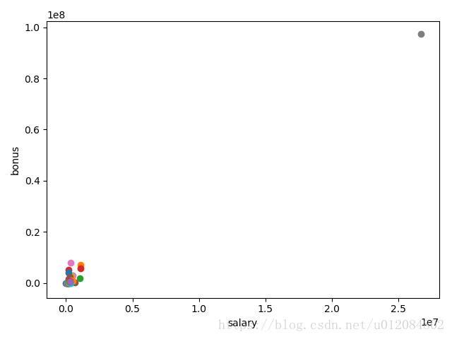
2.有一个异常值应该会立即跳出来。现在的问题是识别来源。我们发现原始数据源对于识别工作非常有帮助;你可以在 final_project/enron61702insiderpay.pdf 中找到该 PDF。
该数据点的字典键名称是什么?(例如:如果是 Ken Lay,那么答案就是“LAY KENNETH L”)。
TOTAL
#-----搜索异常点--------------
solve = data.reshape( ( 1, len(data) * len(data[0]) ) )[0]
max_value = sorted(solve,reverse=True)[0]
print max_value

import pprint
pp = pprint.PrettyPrinter(indent=4)

for item in data_dict:
	if data_dict[item]['bonus'] == max_value:
		print item # the answer is crazy
3.你认为这个异常值应该并清除,还是留下来作为一个数据点?
- 清除掉,它是一个电子表格 bug
4.从字典中快速删除键值对的一种方法如以下行所示:
#去除TOTAL异常值
data_dict.pop("TOTAL",0)
写下这样的一行代码并在调用 featureFormat() 之前删除异常值。然后重新运行代码,你的散点图就不会再有这个异常值了。
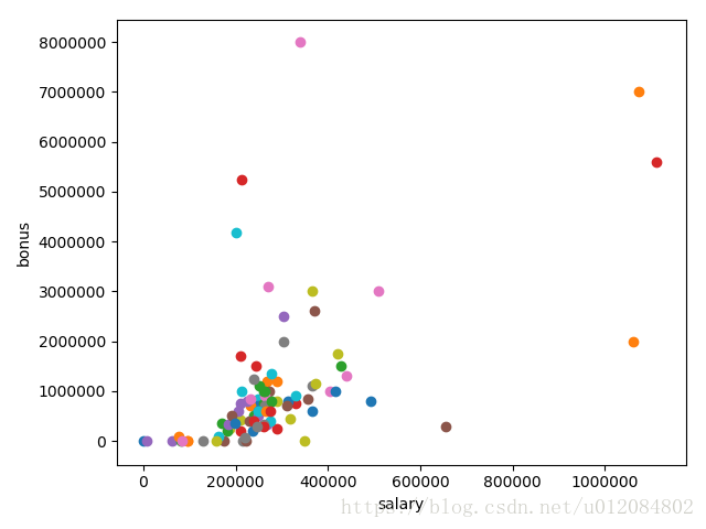
但是Enron 数据中还有其他异常值 ——可能还有四个
5.与当前 Enron 异常值相关联的名称有哪些?(给出字典 key 值中所写的名称 – 如:Phillip Allen 将是 ALLEN PHILLIP K)
这几个是boss
LAVORATO JOHN J 粉点
LAY KENNETH L 上橙点
SKILLING JEFFREY K 红点
FREVERT MARK A 下橙点
#识别   两人获得了至少 5 百万美元的奖金,以及超过 1 百万美元的工资  的异常点

for item in data_dict:
    if data_dict[item]['bonus'] != 'NaN' and data_dict[item]['salary'] != 'NaN':
        if data_dict[item]['bonus'] > 5e6 and data_dict[item]['salary'] > 1e6:
            print item
enron_outliers.py
#!/usr/bin/python

import pickle
import sys
import matplotlib.pyplot
sys.path.append("../tools/")
from feature_format import featureFormat, targetFeatureSplit


### read in data dictionary, convert to numpy array
data_dict = pickle.load( open("../final_project/final_project_dataset.pkl", "r") )

# answer
data_dict.pop( 'TOTAL', 0 )

features = ["salary", "bonus"]
data = featureFormat(data_dict, features)

### your code below
# answer
# solve = data.reshape( ( 1, len(data) * len(data[0]) ) )[0]
# max_value = sorted(solve,reverse=True)[0]
# print max_value

# import pprint
# pp = pprint.PrettyPrinter(indent=4)

# for item in data_dict:
#     if data_dict[item]['bonus'] == max_value:
#         print item # the answer is crazy

# answer
for item in data_dict:
    if data_dict[item]['bonus'] != 'NaN' and data_dict[item]['salary'] != 'NaN':
        if data_dict[item]['bonus'] > 5e6 and data_dict[item]['salary'] > 1e6:
            print item

for point in data:
    salary = point[0]
    bonus = point[1]
    matplotlib.pyplot.scatter( salary, bonus )

matplotlib.pyplot.xlabel("salary")
matplotlib.pyplot.ylabel("bonus")
matplotlib.pyplot.show()