图表简介
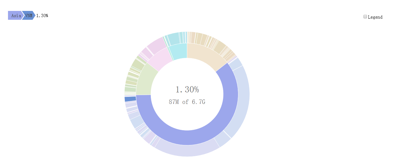
旭日图(Sunburst Chart)是一种现代饼图,它超越传统的饼图和环图,能表达清晰的层级和归属关系,以父子层次结构来显示数据构成情况。旭日图中,离远点越近表示级别越高,相邻两层中,是内层包含外层的关系。
图表用法
旭日图可以更细分溯源分析数据,真正了解数据的具体构成。
可视化
devtools::install_github("timelyportfolio/sunburstR")如果安装不了直接
install.packages("sunburstR")开始
 library(treemap)
 library(sunburstR)
 library(d3r)

  # use example from ?treemap::treemap
  data(GNI2014)
  tm <- treemap(GNI2014,
          index=c("continent", "iso3"),
          vSize="population",
          vColor="continent",
          type="index")

  tm_nest <- d3_nest(
    tm$tm[,c("continent", "iso3", "vSize", "color")],
    value_cols = c("vSize", "color")
  )

  sunburst(
    data = tm_nest,
    valueField = "vSize",
    count = TRUE,
    # to avoid double counting with pre-summed trees
    # use sumNodes = FALSE
    sumNodes = FALSE,
    colors = htmlwidgets::JS("function(d){return d3.select(this).datum().data.color;}"),
    withD3 = TRUE
  )
ok!