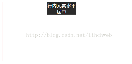
1.行内元素水平居中
a.将行内元素包裹在块级元素中,然后设置:text-align:center
.box1 {
			background: #2b2b2b;
			margin: 0 auto;
			width: 100px;
			color: white;
			text-align: center;
		}
2.块级元素水平居中
块级元素的宽度一定,这就是我们平常所用的:margin: 0 auto。
但是当块级元素的宽度不定的时候,我们可以这样:让他display为inline类型,然后给父级标签设置text-align:center实现。当然了还有另外一种有趣的方法:给父级设置float属性,position:relative,left:50%;同时给子元素设置position:relative left:-50%.但是相对定位设置left后会在原地‘留坑’,酌情使用。
.box {
			float: left;
			position: relative;
			left: 50%;
		}
		.box1 {
			background:blue;
			font-size: 40px;
			color: white;
			position: relative;
			left: -50%;
		}
<div class="box">
<div class="box1">1</div>
</div>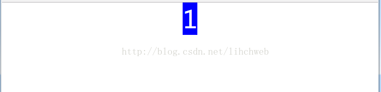
3.水平排列的多个块级元素的水平居中
a.给子元素设置:display:inline-block,再给父级设置text-align:center即可。
.box {
			width: 400px;
			height: 200px;
			margin: 100px auto;
			border: 1px solid red;
			text-align: center;

		}
		.box1 {
			background:blue;
			width: 100px;
			height: 100px;
			line-height: 100px;
			font-size: 40px;
			color: white;
			display: inline-block;;
		}
<div class="box">
<div class="box1">1</div>
<div class="box1">2</div>
<div class="box1">3</div>
</div>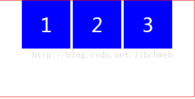
b.用弹性盒子实现flexbox .给元素父级设置:display:flex;justify-content:center 给子元素设置display:inline-flex;
.box {
			width: 400px;
			height: 200px;
			margin: 100px auto;
			border: 1px solid red;
			display: flex;
			justify-content: center;


		}
		.box1 {
			background:blue;
			display: inline-flex;
			width: 100px;
			height: 100px;
			line-height: 100px;
			font-size: 40px;
			color: white;
		}
<div class="box">
<div class="box1">1</div>
<div class="box1">2</div>
<div class="box1">3</div>
</div>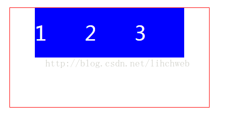
4.子元素的父元素高度不确定的垂直居中
这个时候只要给父元素设置相同的上下padding即可实现。
.box {
			width: 300px;
			border: 1px solid black;
			padding-top: 30px;
			padding-bottom: 30px;
			margin: 0 auto;
		}
		.box1 {
			background:orange;
			font-size: 40px;
			color: white;
			width: 100px;
			line-height: 100px;
			text-align: center;
		}
<div class="box">
<div class="box1">1</div>
</div>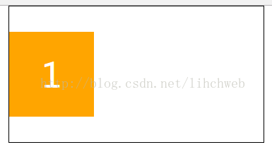
5.子元素的父元素高度确定的垂直居中
a.如果是单行文本,设置line-height等于父元素高度即可。
b.如果是多行文本,图片,块级等元素的时候,高度又不确定,我们可以利用vertical-align:middle这个属性实现居中。但是这个vertical-align这个属性默认为父元素是td或者th等表单类的时候才生效。这个时候我们就要把父元素进行转化:display:table-cell(ie6、7不支持此属性)。大家可以试着居中一下图片。
.box {
			width: 300px;
			height: 300px;
			margin-left: 400px;
			border: 1px solid red;
			display: table-cell;
			vertical-align: middle;
		}
		.box1 {
			background:orange;
			font-size: 40px;
			color: white;
			width: 100px;
			text-align: center;
			margin: 0 auto;
		}
<div class="box">
<div class="box1">1</div>
</div>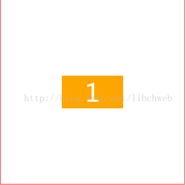
6.已知宽高元素的水平垂直居中
a.父元素设置相对定位。子元素设置绝对定位。令子元素的top,left值都为50%,利用负的margin-left和负的margin-top值为其宽高的一半实现水平垂直居中。
.box {
			width: 300px;
			height: 300px;
			margin: 100px auto;
			border: 1px solid red;
			position: relative;
		}
		.box1 {
			background:purple;
			font-size: 40px;
			color: white;
			text-align: center;
			line-height: 80px;
			width: 100px;
			height: 80px;
			position: absolute;
			left: 50%;
			top: 50%;
			margin-left: -50px;
			margin-top: -40px;
		}
<div class="box">
<div class="box1">1</div>
</div>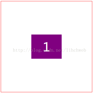
b.设置父元素相对定位,设置子元素的margin为auto,并令其left.top,bottom.right值都为0.仍然可以实现上述效果。
.box {
			width: 300px;
			height: 300px;
			margin: 100px auto;
			border: 1px solid red;
			position: relative;
		}
		.box1 {
			background:#2b2b2b;
			font-size: 40px;
			color: white;
			text-align: center;
			line-height: 80px;
			width: 100px;
			height: 80px;
			margin: auto;
			position: absolute;
			left: 0;
			top: 0;
			right: 0;
			bottom: 0;
		}
<div class="box">
<div class="box1">1</div>
</div>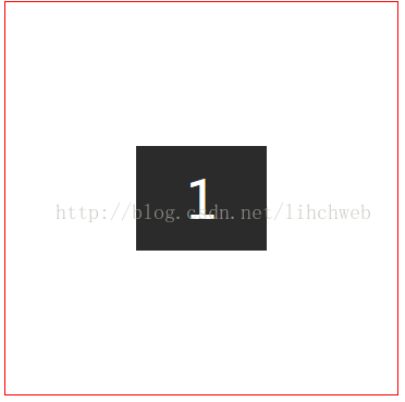
总结:如果还有更好的方法,本人会继续补充说明。