CSS3/CSS之居中解析(水平+垂直居中、水平居中,垂直居中)
今天,博主带来的是CSS3/CSS中的居中解析,相信小伙伴们有时候也会被各种居中搞的一脸懵逼把!
居中总体来说可以分为水平居中还有垂直居中,正中央,顾名思义,定义这里就不解释了!
首先,我们来看下垂直居中:
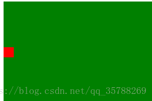
(1)、如果是单行文本,则可以设置的line-height的数值,让其等于父级元素的高度!
<!DOCTYPE html
>
<
html
lang=
"en"
>
<
head
>
<
meta
charset=
"UTF-8"
>
<
meta
name=
"viewport"
content=
"width=device-width, initial-scale=1.0"
>
<
meta
http-equiv=
"X-UA-Compatible"
content=
"ie=edge"
>
<
title
>Document
</
title
>
<
style
>
.box{
background:
green;
height:
200px;
}
a {
height:
100%;
line-height:
200px;
color:
red;
}
<
/
style
>
</
head
>
<
body
>
<
div
class=
"box"
>
<
a
href=
""
>ggg
</
a
>
</
div
>
</
body
>
</
html
>
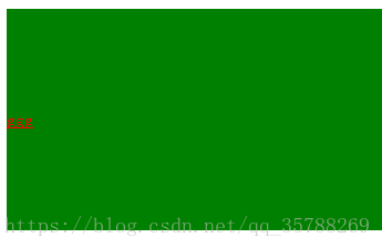
(2)、如果元素是行内块级元素,一般会使用diaplay:inline-block,vertical-align:middle,还有一个伪元素让元素内容处于容器中央!给父元素添加伪元素!
<!DOCTYPE html
>
<
html
lang=
"en"
>
<
head
>
<
meta
charset=
"UTF-8"
>
<
meta
name=
"viewport"
content=
"width=device-width, initial-scale=1.0"
>
<
meta
http-equiv=
"X-UA-Compatible"
content=
"ie=edge"
>
<
title
>Document
</
title
>
<
style
>
.box {
background:
green;
height:
200px;
}
.box::after, .box2{
display:
inline-block;
vertical-align:
middle;
}
.box::after{
content:
'';
height:
100%;
}
.box2{
background-color:
red;
width:
20px;
height:
20px;}
<
/
style
>
</
head
>
<
body
>
<
div
class=
"box"
>
<
div
class=
"box2"
></
div
>
</
div
>
</
body
>
</
html
>
(3)、通过display:flex来实现垂直居中;
父级:display:flex;
子元素:align-self:center;
扫描二维码关注公众号,回复:
1828987 查看本文章

<!DOCTYPE html
>
<
html
lang=
"en"
>
<
head
>
<
meta
charset=
"UTF-8"
>
<
meta
name=
"viewport"
content=
"width=device-width, initial-scale=1.0"
>
<
meta
http-equiv=
"X-UA-Compatible"
content=
"ie=edge"
>
<
title
>Document
</
title
>
<
style
>
.box {
background:
green;
height:
300px;
width:
600px;
display:
flex;
}
.box2{
background:
red;
width:
30%;
height:
30%;
align-self:
center;
}
<
/
style
>
</
head
>
<
body
>
<
div
class=
"box"
>
<
div
class=
"box2"
></
div
>
</
div
>
</
body
>
</
html
>
(4)、使用display:table进行垂直居中!
给父元素设置display:table;子元素设置为display:table-cell;
<!DOCTYPE html
>
<
html
lang=
"en"
>
<
head
>
<
meta
charset=
"UTF-8"
>
<
meta
name=
"viewport"
content=
"width=device-width, initial-scale=1.0"
>
<
meta
http-equiv=
"X-UA-Compatible"
content=
"ie=edge"
>
<
title
>Document
</
title
>
<
style
>
.box {
background-color:
green;
height:
300px;
width:
600px;
display:
table;
}
.box .box2{
color:
red;
display:
table-cell;
vertical-align:
middle;
}
<
/
style
>
</
head
>
<
body
>
<
div
class=
"box"
>
<
div
class=
"box2"
>ddddd
</
div
>
</
div
>
</
body
>
</
html
>
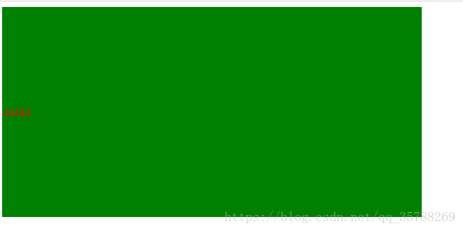
(5),已经知道父元素的高度,给子元素相对定位,在通过translaY()得到垂直居中
<!DOCTYPE html
>
<
html
lang=
"en"
>
<
head
>
<
meta
charset=
"UTF-8"
>
<
meta
name=
"viewport"
content=
"width=device-width, initial-scale=1.0"
>
<
meta
http-equiv=
"X-UA-Compatible"
content=
"ie=edge"
>
<
title
>Document
</
title
>
<
style
>
.box {
background-color:
green;
height:
300px;
width:
600px;
}
.box .box2{
background-color:
red;
width:
50%;
height:
50%;
position:
relative;
top:
50%;
transform:
translateY(
-50%);
}
<
/
style
>
</
head
>
<
body
>
<
div
class=
"box"
>
<
div
class=
"box2"
></
div
>
</
div
>
</
body
>
</
html
>

(6)、父元素高度不知道,同过transform实现,先给父元素相对定位,在给子元素绝对定位,
<!DOCTYPE html
>
<
html
lang=
"en"
>
<
head
>
<
meta
charset=
"UTF-8"
>
<
meta
name=
"viewport"
content=
"width=device-width, initial-scale=1.0"
>
<
meta
http-equiv=
"X-UA-Compatible"
content=
"ie=edge"
>
<
title
>Document
</
title
>
<
style
>
.box {
background-color:
green;
height:
300px;
width:
600px;
position:
relative;
}
.box .box2{
background-color:
red;
width:
50%;
height:
50%;
position:
absolute;
top:
50%;
transform:
translateY(
-50%);
}
<
/
style
>
</
head
>
<
body
>
<
div
class=
"box"
>
<
div
class=
"box2"
></
div
>
</
div
>
</
body
>
</
html
>
二、水平居中:
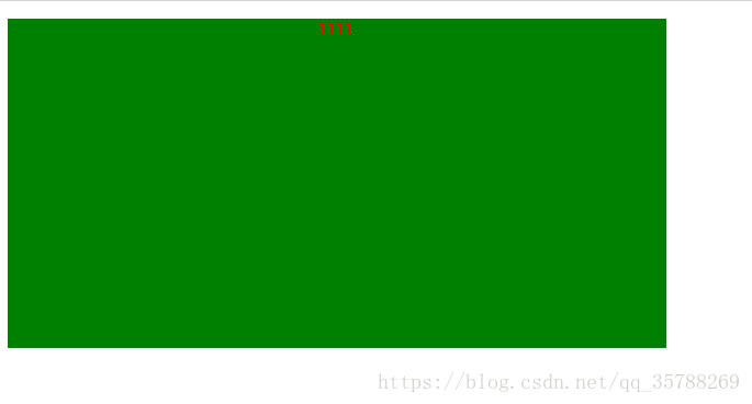
(1)、行内元素方案,只要把行内元素包裹 在一个盒子中,并且在他父级元素添加如下属性:text-align:center;
<!DOCTYPE html
>
<
html
lang=
"en"
>
<
head
>
<
meta
charset=
"UTF-8"
>
<
meta
name=
"viewport"
content=
"width=device-width, initial-scale=1.0"
>
<
meta
http-equiv=
"X-UA-Compatible"
content=
"ie=edge"
>
<
title
>Document
</
title
>
<
style
>
.box {
background-color:
green;
height:
300px;
width:
600px;
text-align:
center;
}
P{
color:
red;}
<
/
style
>
</
head
>
<
body
>
<
div
class=
"box"
>
<
p
>1111
</
p
>
</
div
>
</
body
>
</
html
>
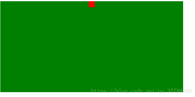
(2)、单个块状元素解决方案:
<!DOCTYPE html
>
<
html
lang=
"en"
>
<
head
>
<
meta
charset=
"UTF-8"
>
<
meta
name=
"viewport"
content=
"width=device-width, initial-scale=1.0"
>
<
meta
http-equiv=
"X-UA-Compatible"
content=
"ie=edge"
>
<
title
>Document
</
title
>
<
style
>
.box {
background-color:
green;
height:
300px;
width:
600px;
text-align:
center;
}
.box2{
background-color:
red;
width:
20px;
height:
20px;
margin:
0
auto;
}
<
/
style
>
</
head
>
<
body
>
<
div
class=
"box"
>
<
div
class=
"box2"
></
div
>
</
div
>
</
body
>
</
html
>
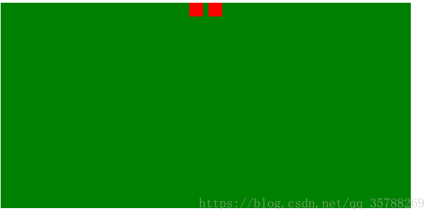
(3)、多个块状元素解决方案:父元素设置为text-align:center;子元素设置为:display:inline-block;
<!DOCTYPE html
>
<
html
lang=
"en"
>
<
head
>
<
meta
charset=
"UTF-8"
>
<
meta
name=
"viewport"
content=
"width=device-width, initial-scale=1.0"
>
<
meta
http-equiv=
"X-UA-Compatible"
content=
"ie=edge"
>
<
title
>Document
</
title
>
<
style
>
.box {
background-color:
green;
height:
300px;
width:
600px;
text-align:
center;
}
.box2, .box3{
background-color:
red;
width:
20px;
height:
20px;
display:
inline-block;
}
<
/
style
>
</
head
>
<
body
>
<
div
class=
"box"
>
<
div
class=
"box2"
></
div
>
<
div
class=
"box3"
></
div
>
</
div
>
</
body
>
</
html
>
也可以使用flexbox来实现:
<!DOCTYPE html
>
<
html
lang=
"en"
>
<
head
>
<
meta
charset=
"UTF-8"
>
<
meta
name=
"viewport"
content=
"width=device-width, initial-scale=1.0"
>
<
meta
http-equiv=
"X-UA-Compatible"
content=
"ie=edge"
>
<
title
>Document
</
title
>
<
style
>
.box {
background-color:
green;
height:
300px;
width:
600px;
display:
flex;
justify-content:
center;
}
.box2, .box3, .box4{
background-color:
red;
width:
20px;
height:
20px;
}
<
/
style
>
</
head
>
<
body
>
<
div
class=
"box"
>
<
div
class=
"box2"
></
div
>
<
div
class=
"box3"
></
div
>
<
div
class=
"box4"
></
div
>
</
div
>
</
body
>
</
html
>
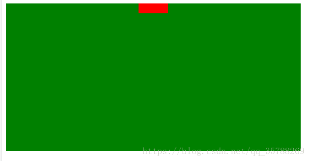
(4)、不定宽度块元素水平居中:
<!DOCTYPE html
>
<
html
lang=
"en"
>
<
head
>
<
meta
charset=
"UTF-8"
>
<
meta
name=
"viewport"
content=
"width=device-width, initial-scale=1.0"
>
<
meta
http-equiv=
"X-UA-Compatible"
content=
"ie=edge"
>
<
title
>Document
</
title
>
<
style
>
.box {
float:
left;
position:
relative;
left:
50%;
}
.box ul{
position:
relative;
left:
-50%;
}
<
/
style
>
</
head
>
<
body
>
<
div
class=
"box"
>
<
ul
>
<
li
>1111
</
li
>
<
li
>111
</
li
>
<
li
>111
</
li
>
</
ul
>
</
div
>
</
body
>
</
html
>
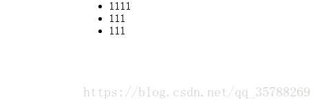
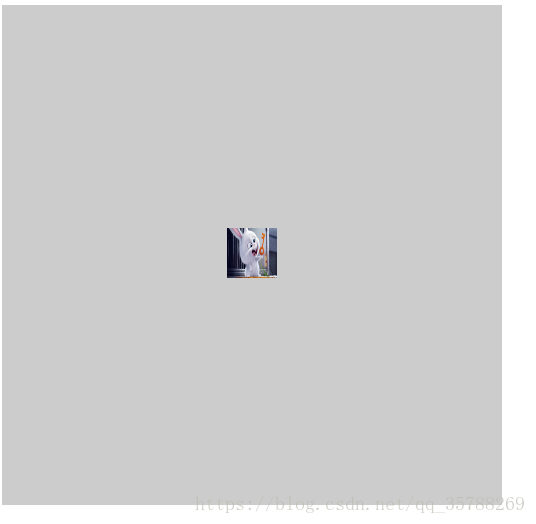
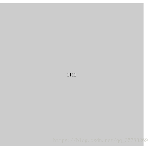
三:实现水平+垂直居中,也就是在中央:(1)单行行内元素:父元素设置:text-align:center,display:table-cell;vertical-align:middle,在这里,图片,文字,都是一样的操作
<!DOCTYPE html
>
<
html
lang=
"en"
>
<
head
>
<
meta
charset=
"UTF-8"
>
<
meta
name=
"viewport"
content=
"width=device-width, initial-scale=1.0"
>
<
meta
http-equiv=
"X-UA-Compatible"
content=
"ie=edge"
>
<
title
>Document
</
title
>
<
style
>
.box {
background-color:
#ccc;
width:
500px;
height:
500px;
display:
table-cell;
text-align:
center;
vertical-align:
middle;
}
img{
width:
50px;
height:
50px;}
<
/
style
>
</
head
>
<
body
>
<
div
class=
"box"
>
<
img
src=
"5.jpg"
alt=
""
>
</
div
>
</
body
>
</
html
>
文字在中央,还可以父级设置为text-align:center;line-height设置为父元素的height
<!DOCTYPE html
>
<
html
lang=
"en"
>
<
head
>
<
meta
charset=
"UTF-8"
>
<
meta
name=
"viewport"
content=
"width=device-width, initial-scale=1.0"
>
<
meta
http-equiv=
"X-UA-Compatible"
content=
"ie=edge"
>
<
title
>Document
</
title
>
<
style
>
.box {
background-color:
#ccc;
width:
500px;
height:
500px;
text-align:
center;
}
p{
line-height:
500px;}
<
/
style
>
</
head
>
<
body
>
<
div
class=
"box"
>
<
p
>1111
</
p
>
</
div
>
</
body
>
</
html
>
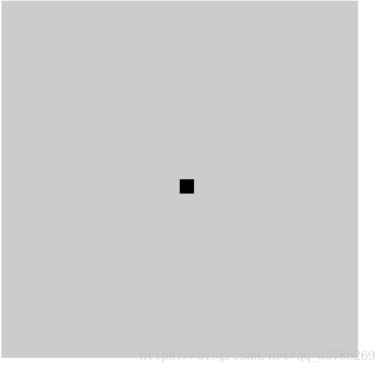
(2)对于单个块级元素,父元素设置为相对定位,子元素设置为绝对定位高度,宽度为50%
<!DOCTYPE html
>
<
html
lang=
"en"
>
<
head
>
<
meta
charset=
"UTF-8"
>
<
meta
name=
"viewport"
content=
"width=device-width, initial-scale=1.0"
>
<
meta
http-equiv=
"X-UA-Compatible"
content=
"ie=edge"
>
<
title
>Document
</
title
>
<
style
>
.box {
background-color:
#ccc;
width:
500px;
height:
500px;
position:
relative;
}
.box2{
position:
absolute;
top:
50%;
left:
50%;
background-color:
black;
width:
20px;
height:
20px;}
<
/
style
>
</
head
>
<
body
>
<
div
class=
"box"
>
<
div
class=
"box2"
></
div
>
</
div
>
</
body
>
</
html
>
(3)、flex实现不定宽度水平+垂直居中
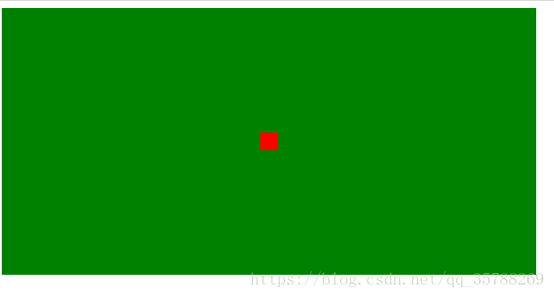
<!DOCTYPE html
>
<
html
lang=
"en"
>
<
head
>
<
meta
charset=
"UTF-8"
>
<
meta
name=
"viewport"
content=
"width=device-width, initial-scale=1.0"
>
<
meta
http-equiv=
"X-UA-Compatible"
content=
"ie=edge"
>
<
title
>Document
</
title
>
<
style
>
.box {
background-color:
green;
height:
300px;
width:
600px;
display:
flex;
justify-content:
center;
align-items:
center;
}
.box2, .box3, .box4{
background-color:
red;
width:
20px;
height:
20px;
}
<
/
style
>
</
head
>
<
body
>
<
div
class=
"box"
>
<
div
class=
"box2"
></
div
>
</
div
>
</
body
>
</
html
>
好了这次的分享就到这里了!喜欢的点波关注哦