水平垂直居中
1、grid布局实现
<style>
   html,body{


      margin: 0;
      padding: 0;
      width: 100%;
      height: 100%;
      display: grid;
      place-content: center;
  }
 </style>
 <body>
    <div class="container" style="width: 100px; height: 100px; background: rgb(206, 100, 100)">块状元素</div>
</body>
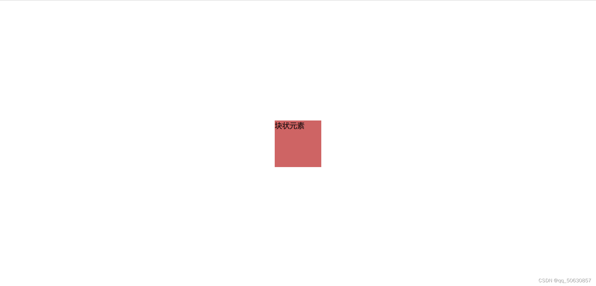
实现效果
2、flex布局实现 flex+margin
<style>
   html,body{


       margin: 0;
       padding: 0;
       width: 100%;
       height: 100%;
       display: flex;
   }
   .container{


       margin: auto;
   }
</style>
<body>
    <div class="container" style="width: 100px; height: 100px; background: rgb(206, 100, 100)">块状元素</div>
</body>
实现效果如上
3、定位布局
<style>
//子绝父相
   html,body{


      margin: 0;
      padding: 0;
      width: 100%;
      height: 100%;
      position: relative;  //相对定位
   }
   .container{


      position: absolute;   //绝对定位,相对于祖先元素位置移动,如果没有祖先元素则以浏览器为基准定位
      top: 50%;
      left: 50%;
      transform: translate(-50%, -50%); //将元素向左移动50%的宽度,向上移动50%的宽度
   }
</style>
<body>
    <div class="container" style="width: 400px; height: 400px; background: rgb(93, 185, 210)">块状元素</div>
    <div class="container" style="color: red;">不定宽高的块状元素</div>
    <span class="container" style="color: green;">行内元素</span>
</body>
块级元素水平居中
定宽:
给需要居中的块级元素加margin:0 auto;(块状元素的宽度一定要有)
块级元素垂直对齐
父元素设置display:flex和align-items:center;
要求:父元素必须显示设置height值
三、块级元素水平垂直居中
1、父元素(定高)设置
display:flex;
align-items:center;
块级元素(定宽)设置 margin:0 auto;
2、实现不定宽高水平垂直居中:(测试中块级元素和父元素都分别需要设置宽高)
父元素设置
display:flex;
justify-content:center; //子元素水平居中
align-items:center; //子元素垂直居中