进度条用多了,有没有想过环形的呢,说实在的,虽然css3提供了很强大的动画功能,包括各种旋转,直线运动,然而,并没有曲线运动,那么只好综合运用已有的功能进行实现,这里用到的比较多的就是旋转,先看下面的这几段代码,这是网上一个哥们写的,先用来理解一下实现的原理,虽然有一堆的兼容性问题,只能在pc版的chome上面使用,但是用来学习已经足够了,后面再奉上修改后的源码。
html:
<div class="wrapper" data-anim="base wrapper">
  <div class="circle" data-anim="base left"></div>
  <div class="circle" data-anim="base right"></div>
</div>
css:
.wrapper {
  width: 100px; /* Set the size of the progress bar */
  height: 100px;
  position: absolute; /* Enable clipping */
  clip: rect(0px, 100px, 100px, 50px); /* Hide half of the progress bar */
}
/* Set the sizes of the elements that make up the progress bar */
.circle {
  width: 80px;
  height: 80px;
  border: 10px solid green;
  border-radius: 50px;
  position: absolute;
  clip: rect(0px, 50px, 100px, 0px);
}
div[data-anim~=base] {
  -webkit-animation-iteration-count: 1;
  -webkit-animation-fill-mode: forwards;
  -webkit-animation-timing-function:linear;
}

.wrapper[data-anim~=wrapper] {
  -webkit-animation-duration: 0.01s;
  -webkit-animation-delay: 3s;
  -webkit-animation-name: close-wrapper;
}

.circle[data-anim~=left] {
  -webkit-animation-duration: 6s;
  -webkit-animation-name: left-spin;
}

.circle[data-anim~=right] {
  -webkit-animation-duration: 3s;
  -webkit-animation-name: right-spin;
}
@-webkit-keyframes right-spin {
  from {
    -webkit-transform: rotate(0deg);
  }
  to {
    -webkit-transform: rotate(180deg);
  }
}

@-webkit-keyframes left-spin {
  from {
    -webkit-transform: rotate(0deg);
  }
  to {
    -webkit-transform: rotate(360deg);
  }
}

@-webkit-keyframes close-wrapper {
  to {
    clip: rect(auto, auto, auto, auto);
  }
}
上面的这段代码直接copy下来,在chome上面可以看到一个绿色圆环旋转一周的效果,接下来我们说说实现的原理,这里主要用了css3的旋转动画还有clip,先简单介绍一下clip这个属性,clip用于对dom元素进行裁剪,四个参数,按照css的潜规则,上,右,下,左逆时针,分别为第一个和第三个参数为距离元素顶部的距离,第二个和第四个参数为距离元素左侧的距离,以此画出四条线对元素进行裁剪,像这样:
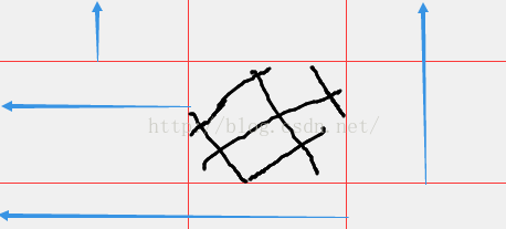
图略丑,中间黑色部分即为裁剪出来的部分,通过clip裁剪功能,加上旋转功能以及遮罩层,我们即可实现一个曲线旋转的效果。
首先我们需要准备三个div,position:absolute,最底部的我们称之为wapper,用clip函数裁剪掉左半部分,留下右半部分,wapper包含的两个div,我们称之为circle1和circle2,裁掉右半部分,只留下左半部分,并将边框设置为圆角,看起来就是两个半圆,但由于wapper裁掉了左半部分,所以目前什么都看不到。于是,circle1开始旋转,周期3秒,旋转180度,,左侧的半圆部分经过了wapper的为裁剪部分之后开始显示出来,与此同时,circle2也同时旋转,周期6秒,旋转360度,当3秒时间到达时,也就是我们看到了一个半圆时,此时wapper解除裁剪,显示所有的内容,,二circle2继续旋转,我们即可看到接下来另一个半圆的旋转完成,继而完成一整个圆环的旋转。
有点绕,慢慢理解一下代码即可,但是上述的代码有点硬伤,即各种兼容性问题,在ie和火狐上面均只能看到一个半环的动画,原因在于用了animation在3秒后修改了wapper的裁剪范围,用clip实现,然而可能ie和火狐对此支持不太完善,最新版的火狐和ie11均无法实现,移动版的chome也是无法支持,于是,改改改。
首先,干掉上面用css实现的改变裁剪的功能,改用js实现,用setTimeout定时3秒之后,动态修改css,试运行,目测可以了,但是这个离实际运用好像还很远,毕竟,我们不需要每次都是百分之百旋转的圆环,我们需要动态改变旋转的百分比,于是,依据上述的原理,做成了一个插件,有兴趣可以看看github上面的代码,这里就不细讲了。最后,放链接
https://github.com/githubxiaominge/CircleProcess