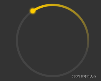
环形进度条:一个圆覆盖在设置了锥形渐变的圆上,然后将锥形进度条进行旋转或者更高锥形进度区域实现
效果图:
代码示例:
//轨道内的区域,meaningless
.g-container {


    position: relative;
    width: 200px;
    height: 200px;
    margin: auto;
    border-radius: 50%;
    box-sizing: border-box;
    border: 6px solid #444;
}
//锥形渐变容器
.g-circle {


    position: absolute;
    top: -6px;
    left: -6px;
    bottom: -6px;
    right: -6px;
    border-radius: 50%;
    background: conic-gradient(#fc0 0%, transparent 40%, transparent);
    animation: rotate 3s ease-in-out infinite;

}

//轨道内的区域
.g-circle::before {


        content: "";
        position: absolute;
        top: 6px;
        left: 6px;
        bottom: 6px;
        right: 6px;
        background: green;
        border-radius: 50%;

    }

//轨道上的球
.g-circle::after {


    content: "";
    position: absolute;
    width: 12px;
    height: 12px;
    top: 0;
    left: 50%;
    transform: translate(-50%, -3px);
    border-radius: 50%;
    background: red;
    box-shadow: 0 0 4px 2px #fc0;
}
@keyframes rotate {


    100% {


        transform: rotate(-360deg);
    }
}


<div class="g-container">
    <div class="g-circle"></div>
</div>