目录
3.使用yardstick包中的conf_mat() 和autoplot() 函数
在评估分类器效果的时候,除了要呈现sensitivity,specificity,F1score等参数外,还需要图示confusion matrix的结果,以更直观地呈现结果。以以下示例文件为例
set.seed(123)
data <- data.frame(Actual = sample(c("True","False"), 100, replace = TRUE),
                   Prediction = sample(c("True","False"), 100, replace = TRUE)
                   )
table(data$Prediction, data$Actual)
输出结果为
       False True
 False    23   31
 True     20   26
此为confusion matrix的表格,如何图示呢?以下提供几种图示方法:
1.自写函数
先用caret包中的confusionMatrix函数构建matrix
library(caret)
result_matrix<-confusionMatrix(data$Prediction,data$Actual)
输出结果为:
Confusion Matrix and Statistics

          Reference
Prediction False True
     False    23   31
     True     20   26

               Accuracy : 0.49
                 95% CI : (0.3886, 0.592)
    No Information Rate : 0.57
    P-Value [Acc > NIR] : 0.9564

                  Kappa : -0.0087

 Mcnemar's Test P-Value : 0.1614

            Sensitivity : 0.5349
            Specificity : 0.4561
         Pos Pred Value : 0.4259
         Neg Pred Value : 0.5652
             Prevalence : 0.4300
         Detection Rate : 0.2300
   Detection Prevalence : 0.5400
      Balanced Accuracy : 0.4955

       'Positive' Class : False
自写函数
draw_confusion_matrix <- function(cm) {

  layout(matrix(c(1,1,2)))
  par(mar=c(2,2,2,2))
  plot(c(100, 345), c(300, 450), type = "n", xlab="", ylab="", xaxt='n', yaxt='n')
  title('CONFUSION MATRIX', cex.main=2)

  # create the matrix
  rect(150, 430, 240, 370, col='#3F97D0')
  text(195, 435, 'Non-COVID-19', cex=1.2)
  rect(250, 430, 340, 370, col='#F7AD50')
  text(295, 435, 'COVID-19', cex=1.2)
  text(125, 370, 'Predicted', cex=1.3, srt=90, font=2)
  text(245, 450, 'Actual', cex=1.3, font=2)
  rect(150, 305, 240, 365, col='#F7AD50')
  rect(250, 305, 340, 365, col='#3F97D0')
  text(140, 400, 'Non-COVID-19', cex=1.2, srt=90)
  text(140, 335, 'COVID-19', cex=1.2, srt=90)

  # add in the cm results
  res <- as.numeric(cm$table)
  text(195, 400, res[1], cex=1.6, font=2, col='white')
  text(195, 335, res[2], cex=1.6, font=2, col='white')
  text(295, 400, res[3], cex=1.6, font=2, col='white')
  text(295, 335, res[4], cex=1.6, font=2, col='white')

  # add in the specifics
  plot(c(100, 0), c(100, 0), type = "n", xlab="", ylab="", main = "DETAILS", xaxt='n', yaxt='n')
  text(10, 85, names(cm$byClass[1]), cex=1.2, font=2)
  text(10, 70, round(as.numeric(cm$byClass[1]), 3), cex=1.2)
  text(30, 85, names(cm$byClass[2]), cex=1.2, font=2)
  text(30, 70, round(as.numeric(cm$byClass[2]), 3), cex=1.2)
  text(50, 85, names(cm$byClass[5]), cex=1.2, font=2)
  text(50, 70, round(as.numeric(cm$byClass[5]), 3), cex=1.2)
  text(70, 85, names(cm$byClass[6]), cex=1.2, font=2)
  text(70, 70, round(as.numeric(cm$byClass[6]), 3), cex=1.2)
  text(90, 85, names(cm$byClass[7]), cex=1.2, font=2)
  text(90, 70, round(as.numeric(cm$byClass[7]), 3), cex=1.2)

  # add in the accuracy information
  text(30, 35, names(cm$overall[1]), cex=1.5, font=2)
  text(30, 20, round(as.numeric(cm$overall[1]), 3), cex=1.4)
  text(70, 35, names(cm$overall[2]), cex=1.5, font=2)
  text(70, 20, round(as.numeric(cm$overall[2]), 3), cex=1.4)
}
使用绘图函数
draw_confusion_matrix(result_matrix)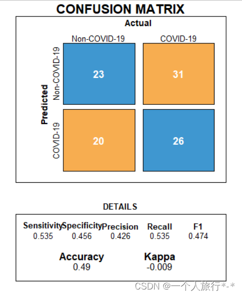
2.使用内置函数fourfoldplot
ctable <- table(data$Actual,data$Prediction)
fourfoldplot(ctable, color = c("#CC6666", "#99CC99"),
conf.level = 0, margin = 1, main = "Confusion Matrix") 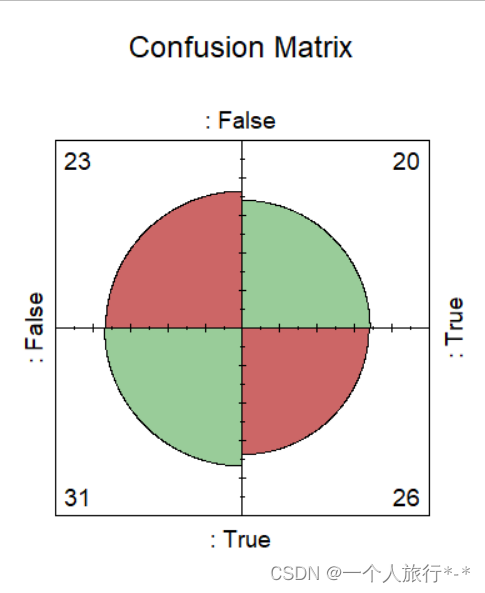
3.使用yardstick包中的conf_mat() 和autoplot() 函数
library(yardstick)
library(ggplot2)


# The confusion matrix from a single assessment set (i.e. fold)
cm <- conf_mat(data, Actual, Prediction)

autoplot(cm, type = "heatmap") +
    scale_fill_gradient(low="#D6EAF8",high = "#2E86C1")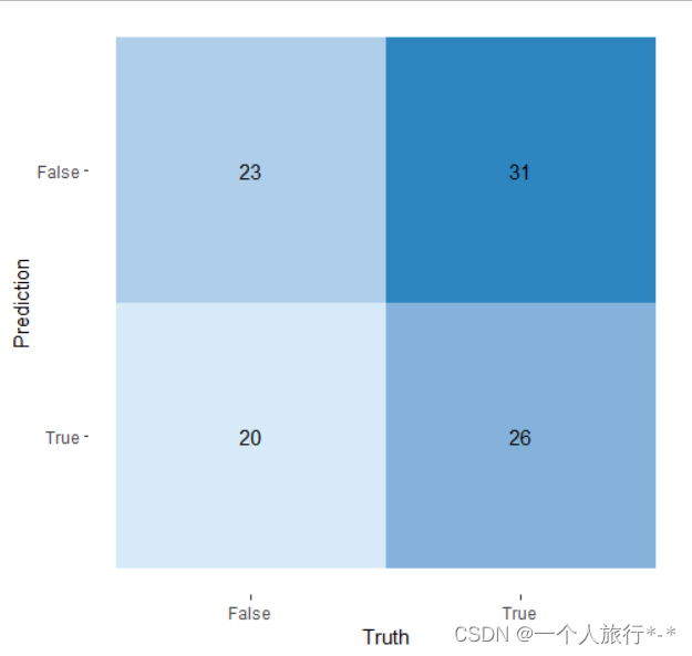
4.多类别confusion matrix
#data
confusionMatrix(iris$Species, sample(iris$Species))
newPrior <- c(.05, .8, .15)
names(newPrior) <- levels(iris$Species)

cm <-confusionMatrix(iris$Species, sample(iris$Species))
# extract the confusion matrix values as data.frame
cm_d <- as.data.frame(cm$table)
# confusion matrix statistics as data.frame
cm_st <-data.frame(cm$overall)
# round the values
cm_st$cm.overall <- round(cm_st$cm.overall,2)
# here we also have the rounded percentage values
cm_p <- as.data.frame(prop.table(cm$table))
cm_d$Perc <- round(cm_p$Freq*100,2)library(ggplot2) # to plot
library(gridExtra) # to put more
library(grid) # plot together
# plotting the matrix
cm_d_p <- ggplot(data = cm_d, aes(x = Prediction , y = Reference, fill = Freq))+
geom_tile() +
geom_text(aes(label = paste("",Freq,",",Perc,"%")), color = 'red', size = 8) +
theme_light() +
guides(fill=FALSE)
# plotting the stats
cm_st_p <- tableGrob(cm_st)
# all together
grid.arrange(cm_d_p, cm_st_p,nrow = 1, ncol = 2,
top=textGrob("Confusion Matrix and Statistics",gp=gpar(fontsize=25,font=1))) 
Reference:
R how to visualize confusion matrix using the caret package - Stack Overflow