前言
在 Compose 中如果我们想要实现文本输入框的话,一般都是使用 Material 包中的 TextField 或者 OutlinedTextField 。
但是因为这两个组件都是属于 Material 包中的,自然是需要符合 Material 设计规范的,这也就会导致使用他们会丧失很多灵活性。
如果我们想自己实现一些不符合 Material 规范但是很酷炫的效果,亦或是其他设计风格,那继续使用 TextField 或者 OutlinedTextField 将会变得非常痛苦,甚至没法实现。
好在,Compose 提供了一个名为 BasicTextField 的组件,这个组件比上面两个级别更低(上面两个位于 androidx.compose.material 包,而它位于 androidx.compose.foundation.text 包),相比于他们有着极大的灵活性。其实上述两个组件都是对 BasicTextField 的封装。
下面,我们就以仿写一个微信的搜索框为例讲解如何实现使用 BasicTextField 。
开始
分析布局
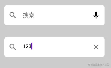
在开始之前我们先分析一下微信的搜索框是什么样子的。
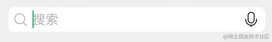
这是没有输入内容时:
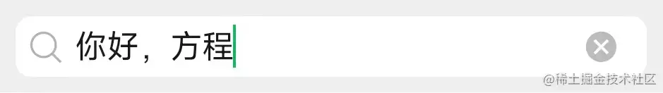
这是输入内容后:
可以看到,在没有输入内容前,输入框有一个前导图标显示搜索,中间输入框中有一个浅色的占位字符,最后有一个后置图标显示语音输入。
而输入内容后,占位字符清除,后置图标更改为清除图标。
这么一分析,好像没啥难度啊,直接用 OutlinedTextField 完全可以实现嘛。
是吗?那我们先尝试直接用 OutlinedTextField 仿写一下试试。
直接使用 OutlinedTextField
根据上面的分析,无非就是一个 OutlinedTextField 加上前导图标还有后置图标,以及占位字符而已嘛,所以我们很容易就能编写出这样的代码:
var inputText by remember { mutableStateOf("") }

OutlinedTextField(
    value = inputText,
    onValueChange = {
        inputText = it
    },
    leadingIcon = {
        Icon(imageVector = Icons.Outlined.Search, contentDescription = null)
    },
    trailingIcon = {
        if (inputText.isNotEmpty()) Icon(imageVector = Icons.Outlined.Close, contentDescription = null)
        else Icon(imageVector = Icons.Outlined.Mic, contentDescription = null)
    },
    placeholder = {
        Text(text = "搜索")
    },
)
其中后置图标通过 inputText.isNotEmpty() 判断输入内容是否为空,如果为空则显示麦克风图标,不为空则显示清除图标,运行效果如下:
咋一看好像没啥问题,仔细一看发现好像不对劲。
对了,是输入框背景颜色不对劲,而且微信的输入框是有圆角的,那就改一下吧。
首先是加上圆角,添加参数:
shape = RoundedCornerShape(8.dp)
然后改一下背景颜色,这里我们通过重新指定一个 colors 颜色配置文件并修改其中的 backgroundColor 字段实现修改背景颜色:
colors = TextFieldDefaults.outlinedTextFieldColors(
   backgroundColor = Color.White
)
修改完成,再次运行:
这下好像对味了?不对!还是不对劲,首先微信的输入框是没有边框的;其次在微信中即使输入框拿到焦点边框也不会变色;另外微信的后置语音图标是黑色的,不是灰色的。
那么我们再改一改。
首先是语音输入图标颜色,这个没什么难度,使用 tint 参数重新着色即可:
Icon(imageVector = Icons.Outlined.Mic, contentDescription = null, tint = Color.Black)
接下来是去掉边框,这个就不好弄了。
我看了一圈文档,发现没有提供设置边框尺寸的地方,又看了一下源码,果然,边框尺寸被直接写死了:
调用 OutlinedTextField 后,会调用到 TextFieldImpl 函数,并在其中通过 TextFieldTransitionScope.Transition 获取到边框宽度。
而 TextFieldTransitionScope.Transition 中对边框宽度的定义如下:
val indicatorWidth by transition.animateDp(
    label = "IndicatorWidth",
    transitionSpec = { tween(durationMillis = AnimationDuration) }
) {
    when (it) {
        InputPhase.Focused -> IndicatorFocusedWidth
        InputPhase.UnfocusedEmpty -> IndicatorUnfocusedWidth
        InputPhase.UnfocusedNotEmpty -> IndicatorUnfocusedWidth
    }
}
可以看到这里是定义的一个动画,但是不要紧,我们只需要关心动画完成后最终的宽度值是多少就行,查看上面两个个常量值:
privateval IndicatorUnfocusedWidth =1.dp
privateval IndicatorFocusedWidth =2.dp
可以看到,在持有焦点时的宽度是 2 dp,没有焦点时是 1 dp。
不过,既然无法自己定义边框宽度,那我们改一下颜色总可以了吧?把边框颜色改成和背景颜色一样,约等于没有边框嘛。
改边框颜色依旧是修改 colors 颜色配置信息,这里需要把聚焦和失焦时的颜色都改成白色:
colors = TextFieldDefaults.outlinedTextFieldColors(
            backgroundColor = Color.White,
            focusedBorderColor = Color.White,
            unfocusedBorderColor = Color.White
        )
最终完整代码:
var inputText by remember { mutableStateOf("") }

OutlinedTextField(
    value = inputText,
    onValueChange = {
        inputText = it
    },
    leadingIcon = {
        Icon(imageVector = Icons.Outlined.Search, contentDescription = null)
    },
    trailingIcon = {
        if (inputText.isNotEmpty()) Icon(imageVector = Icons.Outlined.Close, contentDescription = null)
        else Icon(imageVector = Icons.Outlined.Mic, contentDescription = null, tint = Color.Black)
    },
    placeholder = {
        Text(text = "搜索")
    },
    shape = RoundedCornerShape(8.dp),
    colors = TextFieldDefaults.outlinedTextFieldColors(
        backgroundColor = Color.White,
        focusedBorderColor = Color.White,
        unfocusedBorderColor = Color.White
    )
)
现在再来看看效果:
好像差不多了欸?哈哈,你再仔细看看。
发现问题了吗?
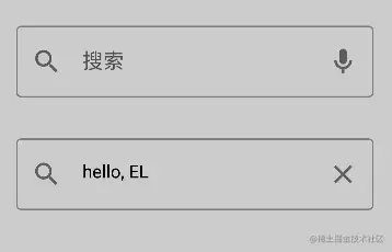
没错,虽然大体上是像了,但是显然文本和图标相对于输入框的边距不对劲啊。
又是翻了一圈文档和源码,并没有发现设置边距的地方,算了,太麻烦了,我们还是使用 BasicTextField 自定义一个吧。
使用 BasicTextField 自定义
BasicTextField 的参数和 OutlinedTextField 大差不差:
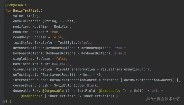
但是它多了一个关键参数 decorationBox ,得益于这个参数,我们可以为所欲为了。
根据文档介绍:
decorationBox - Composable lambda that allows to add decorations around text field, such as icon, placeholder, helper messages or similar, and automatically increase the hit target area of the text field. To allow you to control the placement of the inner text field relative to your decorations, the text field implementation will pass in a framework-controlled composable parameter “innerTextField” to the decorationBox lambda you provide. You must call innerTextField exactly once.
简单来说就是这个参数是一个作用域为 Composable 且带有参数 innerTextField 的匿名函数。
而 innerTextField 也是一个 Composable 的匿名函数,并且它就是输入框的实现函数。
也就是说,我们可以在 decorationBox 中通过自定义 innerTextField 的调用位置等方式实现自定义自己需要的文本框的目的。
需要注意的是,正如上面说的,innerTextField 是输入框的实现,所以我们必须并且也只能调用一次这个函数,不然我们的组件里面就没有输入框了。
依旧是实现上述的微信搜索框,我们可以这样写:
var inputText by remember { mutableStateOf("") }

BasicTextField(
    value = inputText,
    onValueChange = {
        inputText = it
    },
    decorationBox = { innerTextField ->
        Box {
            Surface(
                // border = BorderStroke(1.dp, Color.Gray),
                shape = RoundedCornerShape(8.dp)
            ) {
                Row(
                    modifier = Modifier.padding(8.dp),
                    verticalAlignment = Alignment.CenterVertically
                ) {
                    Icon(imageVector = Icons.Outlined.Search, contentDescription = null, tint = Color(0x88000000))

                    Box(modifier = Modifier.padding(start = 4.dp, end = 4.dp)) {
                        if (inputText.isEmpty()) Text(text = "搜索", color = Color(0x88000000))
                        innerTextField()
                    }

                    if (inputText.isNotEmpty()) Icon(imageVector = Icons.Outlined.Close, contentDescription = null, tint = Color(0x88000000))
                    else Icon(imageVector = Icons.Outlined.Mic, contentDescription = null, tint = Color(0xFF000000))
                }
            }
        }
    }
)
其他地方没什么好说的,我们来重点分析 decorationBox 的内容。
首先,我们的根组件选择了 Surface,这是 Material 中的组件之一,官方称之为 “平面”,简单来说就是可以把它包含的内容以统一的样式配置(例如边框、阴影、圆角等)放到同一个“平面”内。
因为我们需要给输入框加上圆角,所以选择它做根组件,并设置了 8dp 的圆角 shape = RoundedCornerShape(8.dp) 。
因为输入框的三个主要组件:前置图标、输入框(占位字符)、后置图标是水平排列的,所以接下来用了一个 Row ,并设置垂直对齐方式为居中 verticalAlignment = Alignment.CenterVertically 。
然后根据需求设置前置图标,后置图标,以及配置颜色和边距等这里就不过多赘述了,重点需要注意占位文本和输入框(innerTextField())的摆放。
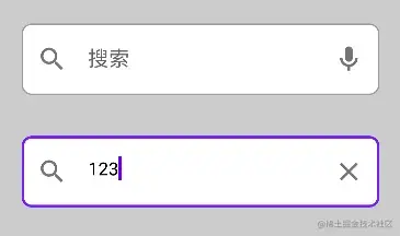
因为占位文本和输入框实际上应该是属于同一个位置的,虽然在输入框有内容后就不会显示占位文本了,但是我们依旧需要把他们放到 Box 中,即堆叠到同一个位置,否则将会变成这样:
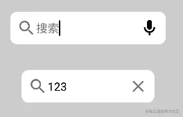
没看出区别?仔细看光标,输入框已经被挤到占位文本之后了。
加上 Box 后效果如下:
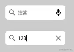
这样看起来是不是对味多了?
总结
我们通过模仿微信搜索框的方式讲解了如何使用 BasicTextField 自定义文本输入框效果。
当然,这里只是抛砖引玉,只是简单的介绍了使用方法,并没有做什么酷炫的组件,但是知道了如何使用 BasicTextField 想要实现什么酷炫的输入框效果那还不是手到擒来?