Uniapp零基础开发学习笔记(5) -组件入门及容器组件使用
按照官网教程学习使用组件,并且重点把容器组件的应用进行了练习。
1.官网关于组件的介绍
组件是视图层的基本组成单元,是一个单独且可复用的功能模块的封装。
开始标签上可以写属性,属性可以有多个,多个属性之间用空格分割。
注意:所有组件与属性名都是小写,单词之间以连字符-连接。
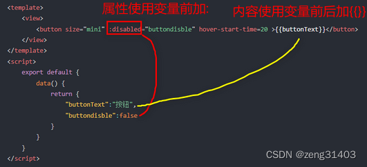
下面的示例是button按钮组件,有size,disabled,hover-start-time等多个属性,标签中是文本
<template>
	<view>
		<button size="mini" :disabled="false" hover-start-time=20 >按钮</button>
	</view>
</template>
所有的组件都具有以下公共属性,但每个组件也都有自己的专有属性。
组件使用前,需要将对应的组件复制到components目录下方。
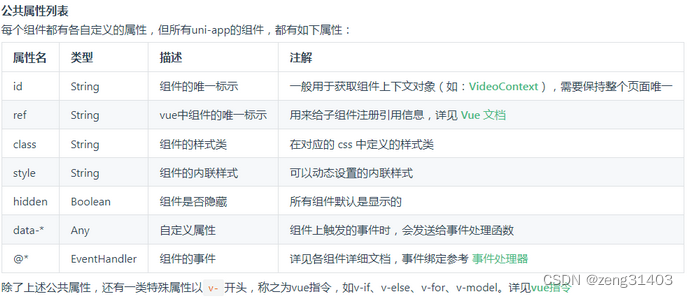
组件中可使用js变量绑定
组件的属性前加@则代表这是一个事件。
事件的属性值,指向一个在script的methods里定义过的js方法,还可以给方法传参数。
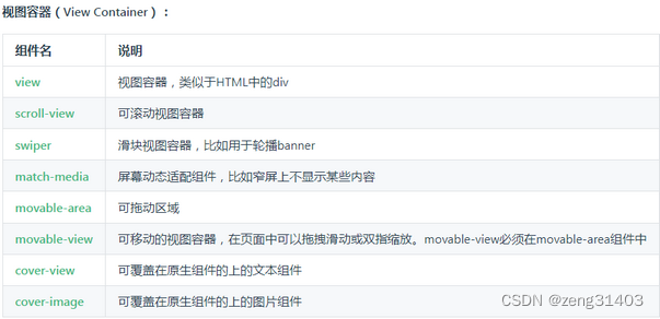
基础组件有很多,大概分为几类。
2.视图容器的简单练习使用
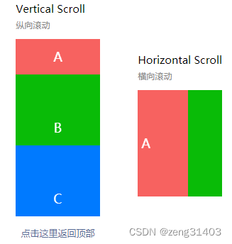
1. scroll-view 滚动条
可以引用为纵向和横向。
纵向引用时,scroll-y=“true”, class=“scroll-Y”, scroll-top引用js变量,注意为了保持滚动条原始位置,
以及上一个位置,用了两个变量。
横向引用时, scroll-x=“true”, class=“scroll-view_H”
事件定义了三个:
@scrolltoupper 滚动到顶部/左边,会触发 scrolltoupper 事件,纵向横向通用
@scrolltolower 滚动到底部/右边,会触发 scrolltolower 事件,纵向横向通用
@scroll 滚动时触发,event.detail = {scrollLeft, scrollTop, scrollHeight, scrollWidth, deltaX, deltaY},纵向横向通用
应用效果
<!-- 引用纵向scroll-view的代码 -->
	<view>
		<view class="uni-title uni-common-mt">
						Vertical Scroll
						<text>\n纵向滚动</text>
		</view>
		<scroll-view :scroll-top="scrollTop" scroll-y="true" class="scroll-Y"
		@scrolltoupper="upper" @scrolltolower="lower" @scroll="scroll"
		enable-back-to-top="true" style="height: 500rpx" >
			<view id="demo1" class="scroll-view-item uni-bg-red">A</view>
			<view id="demo2" class="scroll-view-item uni-bg-green">B</view>
			<view id="demo3" class="scroll-view-item uni-bg-blue">C</view>
		</scroll-view>
	</view>
	<view @tap="goTop" class="uni-link uni-center uni-common-mt">
		<text>点击这里返回顶部</text>
	</view>
	<!-- 引用横向scroll-view的代码 -->
	<view>
		<view class="uni-title uni-common-mt">
						Horizontal Scroll
						<text>\n横向滚动</text>
		</view>
		<scroll-view class="scroll-view_H" scroll-x="true" @scroll="scroll"
		scroll-left="120" >
			<view id="demo1" class="scroll-view-item_H uni-bg-red">A</view>
			<view id="demo2" class="scroll-view-item_H uni-bg-green">B</view>
			<view id="demo3" class="scroll-view-item_H uni-bg-blue">C</view>
		</scroll-view>
	</view>
对应的<script></script>补充JS定义
在下方的view中定义了@tap事件,触发点goTop函数也在其中补充
data() {
			return {
				title: '首页',
				//滚动的初始位置为0,上一次滚动的位置存在old.scrollTop
				scrollTop: 0,
				old: {
					scrollTop: 0}
			}
		},
methods: {
			upper: function(e) {
				console.log(e)
			},
			lower: function(e) {
				console.log(e)
			},
			scroll: function(e) {
				console.log(e)
				//每次滚动以后,把当前的滚动位置存在this.old.scrollTop
				this.old.scrollTop = e.detail.scrollTop
			},
			goTop: function(e) {
				// 解决view层不同步的问题
				this.scrollTop = this.old.scrollTop
				this.$nextTick(function() {
					this.scrollTop = 0
				});
				uni.showToast({
					icon:"none",
					title:"纵向滚动 scrollTop 值已被修改为 0"
				})
			}
		}
在<style></style>补充CSS样式定义
使用竖向滚动时,需要给 <scroll-view> 一个固定高度,通过 css 设置 height;
使用横向滚动时,需要给 <scroll-view> 添加white-space: nowrap;样式,强制文字不换行
.scroll-Y {
	height: 300rpx;
}
.scroll-view_H {
	white-space: nowrap;//强制文字不换行
	width: 100%;
}
.scroll-view-item {
	height: 300rpx;
	line-height: 300rpx;
	text-align: center;
	font-size: 36rpx;
}
.scroll-view-item_H {
	display: inline-block;
	height: 300rpx;
	line-height: 300rpx;
	text-align: center;
	font-size: 36rpx;
}
2. swiper 滑块视图容器
一般用于左右滑动或上下滑动,swiper是单页组件,适合做banner图轮播和简单列表左右滑动。
应用效果
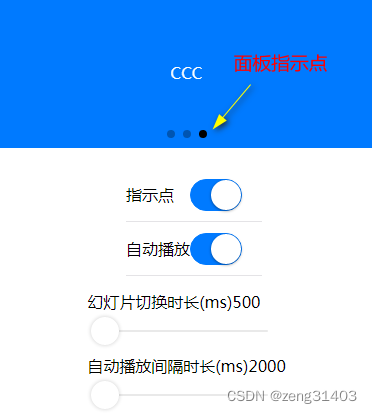
swiper的属性设置中,circular是否采用衔接滑动,默认为false;indicator-dots是否显示面板指示点,
autoplay为是否自动切换,默认为false;interval为自动切换时间间隔,默认5000ms;
duration为滑动动画时长,默认500ms。
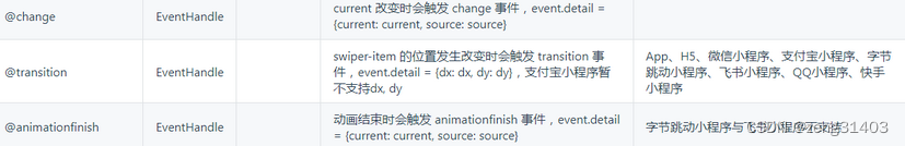
当然这些可以用JS改变,属性current为当前位置,current改变触发@change事件
<!-- swiper应用案例代码 -->
		<!-- swiper轮播图显示区 -->
		<view class="uni-margin-wrap">
			<swiper class="swiper" circular :indicator-dots="indicatorDots" :autoplay="autoplay"
			    :interval="interval" :duration="duration">
				<swiper-item>
					<view class="swiper-item uni-bg-red">AAA</view>
				</swiper-item>
				<swiper-item>
					<view class="swiper-item uni-bg-green">BBB</view>
				</swiper-item>
				<swiper-item>
					<view class="swiper-item uni-bg-blue">CCC</view>
				</swiper-item>
			</swiper>
		</view>
		<!-- swiper轮播播放方式设置 -->
		<view class="swiper-list">
			<view class="uni-list-cell uni-list-cell-pd">
				<view class="uni-list-cell-db">指示点</view>
				<!-- 引用了switch切换组件 -->
				<switch :checked="indicatorDots" @change="changeIndicatorDots" />
			</view>
			<view class="uni-list-cell uni-list-cell-pd">
				<view class="uni-list-cell-db">自动播放</view>
				<!-- 引用了switch切换组件 -->
				<switch :checked="autoplay" @change="changeAutoplay" />
			</view>
		</view>
		<!-- swiper轮播播放参数设置 -->
		<view class="uni-padding-wrap">
			<view class="uni-common-mt">
				<text>幻灯片切换时长(ms)</text>
				<text class="info">{

   {duration}}</text>
			</view>
			<!-- 引用了slider滑动条组件 -->
			<slider @change="durationChange" :value="duration" min="500" max="2000" />
			<view class="uni-common-mt">
				<text>自动播放间隔时长(ms)</text>
				<text class="info">{

   {interval}}</text>
			</view>
			<!-- 引用了slider滑动条组件 -->
			<slider @change="intervalChange" :value="interval" min="2000" max="10000" />
		</view>
对应的<script></script>补充JS定义
data() {
			return {
				indicatorDots: true,
				autoplay: true,
				interval: 2000,
				duration: 500
			}
		},
methods: {
        //设置是否显示面板指示点
		changeIndicatorDots(e) {
            this.indicatorDots = !this.indicatorDots
        },
         //设置是否自动播放
        changeAutoplay(e) {
            this.autoplay = !this.autoplay
        },
         //设置幻灯片切换时长
        intervalChange(e) {
            this.interval = e.target.value
        },
        //自动播放间隔时长
        durationChange(e) {
            this.duration = e.target.value
        }
     }
在<style></style>补充CSS样式定义
.uni-margin-wrap {
		width:690rpx;
		width: 100%;;
}
.swiper {
	height: 300rpx;
}
.swiper-item {
	display: block;
	height: 300rpx;
	line-height: 300rpx;
	text-align: center;
}
.swiper-list {
	margin-top: 40rpx;
	margin-bottom: 0;
}
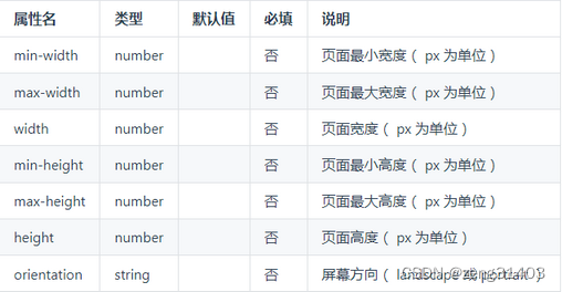
3. match-media 适配屏幕组件
match-media是一个可适配不同屏幕的基本视图组件。可以指定一组 media query 媒体查询规则,满足查询条件时,这个组件才会被展示。例如在match-media组件中放置一个侧边栏,媒体查询规则设置为宽屏才显示,就可以实现在PC宽屏显示该侧边栏,而在手机窄屏中不显示侧边栏的效果。
<template>
    <view>
        <match-media :min-width="375" :max-width="800" >
            <view>当页面最小宽度 375px, 页面宽度最大 800px 时显示</view>
        </match-media>
        <match-media :min-height="400" :orientation="landscape">
            <view>当页面高度不小于 400px 且屏幕方向为横向时展示这里</view>
        </match-media>
    </view>
</template>
4. movable-area可拖动区域和movable-view可移动的视图容器
movable-area指代可拖动的范围,在其中内嵌movable-view组件用于指示可拖动的区域。
即手指/鼠标按住movable-view拖动或双指缩放,但拖不出movable-area规定的范围。
当然也可以不拖动,而使用代码来触发movable-view在movable-area里的移动缩放。
应用效果

示例代码:在<movable-area>中定义movable-view
movable-view 属性x,y为左上角位置,direction可定义移动方向,有all、vertical、horizontal、none
inertia定义movable-view是否带有惯性移动,默认false
out-of-bounds定义超过可移动区域后,movable-view是否还可以移动,默认false
<view class="uni-padding-wrap uni-common-mt">
				<view class="uni-title uni-common-mt">
					<text>\nmovable-view 区域小于 movable-area</text>
				</view>
				<movable-area>
				    <!-- css原始大小movable-view宽高150,movable-area高300px -->
					<movable-view :x="x" :y="y" direction="all" @change="onChange">text</movable-view>
				</movable-area>
				<view @tap="tap" class="uni-link uni-center uni-common-mt">
					点击这里移动至 (30px, 30px)
				</view>
				<view class="uni-title uni-common-mt">
					<text>movable-view区域大于movable-area</text>
				</view>
				<movable-area>
				    <!-- 通过css改大了movable-view,max样式宽高500px,movable-area高300px -->
					<movable-view class="max" direction="all">text</movable-view>
				</movable-area>
		</view>
对应的<script></script>补充JS定义
<script>
export default {


    data() {


        return {


            x: 0,
            y: 0,
            old: {


                x: 0,
                y: 0
            }
        }
    },
    methods: {


        //定义tap移动到30,30位置
        tap: function(e) {


            this.x = this.old.x
            this.y = this.old.y
            this.$nextTick(function() {


                this.x = 30
                this.y = 30
            })
        },
        //定义onChange事件移动滑块位置
        onChange: function(e) {


            this.old.x = e.detail.x
            this.old.y = e.detail.y
        }
    }
}
</script>
在<style></style>补充CSS样式定义
<style>
	movable-view {


		display: flex;
		align-items: center;
		justify-content: center;
		height: 150rpx;
		width: 150rpx;
		background-color: #007AFF;
		color: #fff;
	}
	movable-area {


		height: 300rpx;
		width: 100%;
		background-color: #D8D8D8;
		overflow: hidden;
	}
	.max {


		width:500rpx;
		height: 500rpx;
	}
</style>
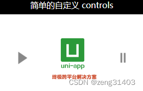
5. cover-view覆盖文本视图和cover-image覆盖图片视图
cover-view是覆盖在原生组件上的文本视图
cover-image是覆盖在原生组件上的图片视图。可覆盖的原生组件同cover-view,支持嵌套在cover-view里。
app-vue上可覆盖的原生组件:<video>、<map>
支持的事件:click
应用效果
先引入cover-view和vedio组件
示例代码:
cover-view 和cover-image放在video或者map标签内部就可以了
<!-- cover-view和cover-image,以及video示例 -->
<video class="video" id="demoVideo" :controls="false" :enable-progress-gesture="false"
	:show-center-play-btn="true"
	src="https://img.cdn.aliyun.dcloud.net.cn/guide/uniapp/%E7%AC%AC1%E8%AE%B2%EF%BC%88uni-app%E4%BA%A7%E5%93%81%E4%BB%8B%E7%BB%8D%EF%BC%89-%20DCloud%E5%AE%98%E6%96%B9%E8%A7%86%E9%A2%91%E6%95%99%E7%A8%[email protected]"
	poster="https://vkceyugu.cdn.bspapp.com/VKCEYUGU-dc-site/b1476d40-4e5f-11eb-b997-9918a5dda011.png">
		<cover-view class="controls-title">简单的自定义 controls</cover-view>
		<cover-image class="controls-play img" @click="play" src="/static/play.png"></cover-image>
		<cover-image class="controls-pause img" @click="pause" src="/static/pause.png"></cover-image>
</video>
对应的<script></script>补充JS定义
页面mounted时this.videoCtx = uni.createVideoContext(‘demoVideo’)加载视频
click触发play ->this.videoCtx.play(); 和pause->this.videoCtx.pause();
不过视频播放还是有点问题。
<script>
	export default {


		data() {


			return {

      }
		},
		//页面加载时创建媒体对象videoCtx
		mounted() {


			this.videoCtx = uni.createVideoContext('demoVideo')
		},
		methods: {


			play(event) {


				this.videoCtx.play();
				uni.showToast({


					title: '开始播放',
					icon: 'none'
				});
			},
			pause(event) {


				this.videoCtx.pause();
				uni.showToast({


					title: '暂停播放',
					icon: 'none'
				});
			}
		}
	}
</script>
在<style></style>补充CSS样式定义
.video {
		position: relative;
	}

cover-view,
cover-image {
	display: inline-block;
}

.img {
	position: absolute;
	width: 100rpx;
	height: 100rpx;
	top: 50%;
	margin-top: -50rpx;
}

.controls-play {
	left: 50rpx;
}

.controls-pause {
	right: 50rpx;
}

.controls-title {
	width: 100%;
	text-align: center;
	color: #FFFFFF;
}