Padding
这个组件最能体现Flutter与其他UI框架的一个不同点,那就是在其他UI框架中padding基本都是作为组件的一个属性,例如在html中常见的布局标签都有padding属性,Android中也是如此,但是在Flutter中组件并没有一个叫padding的属性,相反,提供了一个叫作 Padding 的 Widget 组件。(体现了Flutter中万物皆Widget的理念)
Padding可以给其子节点添加填充(留白),和边距效果类似。
下面是Padding的定义:
Padding({


  ...
  EdgeInsetsGeometry padding,
  Widget child,
})
可以看到它的padding参数需要传递一个EdgeInsetsGeometry类型,这是一个抽象类,开发中,我们一般都使用EdgeInsets类,它是EdgeInsetsGeometry的一个子类,定义了一些设置填充的便捷方法。
下面是EdgeInsets提供的便捷方法:
fromLTRB(left, top, right, bottom):分别指定四个方向的填充。all(value): 所有方向均使用相同数值的填充。only({left, top, right ,bottom }):可以设置具体某个方向的填充(可以同时指定多个方向)。symmetric({ vertical, horizontal }):用于设置对称方向的填充,vertical指top和bottom,horizontal指left和right。
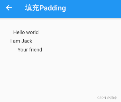
下面的示例展示了EdgeInsets的不同用法:
class PaddingTestRoute extends StatelessWidget {
const PaddingTestRoute({
Key? key}) : super(key: key);
Widget build(BuildContext context) {
return Padding(
//上下左右各添加16像素补白
padding: const EdgeInsets.all(16),
child: Column(
//显式指定对齐方式为左对齐,排除对齐干扰
crossAxisAlignment: CrossAxisAlignment.start,
mainAxisSize: MainAxisSize.min,
children: const <Widget>[
Padding(
//左边添加8像素补白
padding: EdgeInsets.only(left: 8),
child: Text("Hello world"),
),
Padding(
//上下各添加8像素补白
padding: EdgeInsets.symmetric(vertical: 8),
child: Text("I am Jack"),
),
Padding(
// 分别指定四个方向的补白
padding: EdgeInsets.fromLTRB(20, 0, 20, 20),
child: Text("Your friend"),
)
],
),
);
}
}
运行效果:
Container
Container是一个组合类容器,它本身不对应具体的RenderObject,它是DecoratedBox、ConstrainedBox、Transform、Padding、Align等组件组合的一个多功能容器,所以我们只需通过一个Container组件可以实现同时需要装饰、变换、限制的场景。下面是Container的定义:
Container({


  this.alignment,
  this.padding, //容器内补白,属于decoration的装饰范围
  Color color, // 背景色
  Decoration decoration, // 背景装饰
  Decoration foregroundDecoration, //前景装饰
  double width,//容器的宽度
  double height, //容器的高度
  BoxConstraints constraints, //容器大小的限制条件
  this.margin,//容器外补白,不属于decoration的装饰范围
  this.transform, //变换
  this.child,
  ...
})
| 属性 | 说明 |
|---|---|
alignment |
topCenter:顶部居中对齐topLeft:顶部左对齐topRight:顶部右对齐center:水平垂直居中对齐centerLeft:垂直居中水平居左对齐centerRight:垂直居中水平居右对齐bottomCenter:底部居中对齐bottomLeft:底部居左对齐bottomRight:底部居右对齐 |
decoration |
BoxDecoration背景装饰 |
foregroundDecoration |
BoxDecoration前景装饰 |
margin |
表示Container与外部其他组件的距离。 如margin:EdgeInsets.all(20.0), |
padding |
Container的内边距,指Container边缘与Child之间的距离,如padding:EdgeInsets.all(10.0) |
transform |
让Container容易进行一些旋转之类的,如transform: Matrix4.rotationZ(0.2) |
height |
容器高度 |
width |
容器宽度 |
child |
容器子元素 |
color |
背景色 |
constraints |
容器大小的限制条件 |
有两点需要特别注意:
- 容器的大小可以通过
width、height属性来指定,也可以通过constraints来指定;如果它们同时存在时,width、height优先。实际上Container内部会根据width、height来生成一个constraints。 color和decoration是互斥的,如果同时设置它们则会报错!实际上,当指定color时,Container内会自动创建一个decoration。
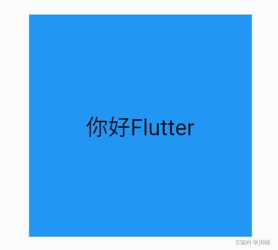
示例代码1:
class MyCard extends StatelessWidget {
const MyCard({
Key? key}) : super(key: key);
Widget build(BuildContext context) {
return Center(
child: Container(
width: 200,
height: 200,
color: Colors.blue,
alignment: Alignment.center,
child: const Text("你好Flutter", style: TextStyle(fontSize: 20)),
),
);
}
}
效果:
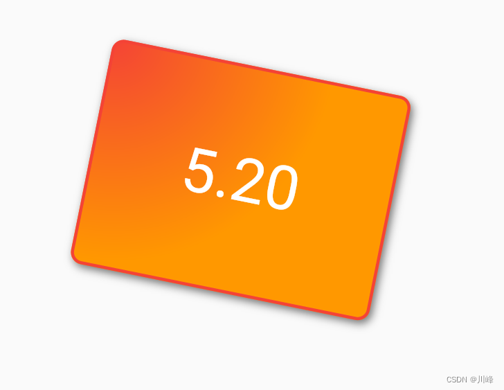
示例代码2:
Container(
    margin: const EdgeInsets.only(top: 50.0, left: 120.0),
    constraints: const BoxConstraints.tightFor(width: 200.0, height: 150.0), // 卡片大小
    decoration: BoxDecoration(  // 背景装饰
      gradient: const RadialGradient( // 背景径向渐变
        colors: [Colors.red, Colors.orange],
        center: Alignment.topLeft,
        radius: .98,
      ),
      // LinearGradient 是背景线性渐变
      // gradient: LinearGradient( colors: [Colors.red, Colors.orange]),
      boxShadow: const [ //卡片阴影
        BoxShadow(
          color: Colors.black54,
          offset: Offset(2.0, 2.0),
          blurRadius: 4.0,
        )
      ],
      border: Border.all(color: Colors.red, width: 2.0),
      borderRadius: BorderRadius.circular(8.0), // 圆角 ,
      color: Colors.blue,
    ),
    transform: Matrix4.rotationZ(.2),//卡片倾斜变换
    alignment: Alignment.center, //卡片内文字居中
    child: const Text("5.20", style: TextStyle(color: Colors.white, fontSize: 40.0),), //卡片文字
),
效果:
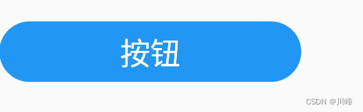
通过Container创建一个按钮:
class MyButton extends StatelessWidget {
const MyButton({
Key? key}) : super(key: key);
Widget build(BuildContext context) {
return Container(
alignment: Alignment.center,
width: 200,
height: 40,
// margin: const EdgeInsets.all(10), //四周margin
margin: const EdgeInsets.fromLTRB(0, 40, 0, 0),
// padding: const EdgeInsets.fromLTRB(40, 0, 0, 0),
decoration: BoxDecoration(
color: Colors.blue,
borderRadius:BorderRadius.circular(20)
),
child: const Text("按钮",style: TextStyle(
color: Colors.white,
fontSize: 20
)),
);
}
}
效果:
可以看到Container具备多种组件的功能,通过查看Container源码,我们会很容易发现它是多种组件组合而成的。在Flutter中,Container组件也正是组合优先于继承的实例。
Padding和Margin
接下来我们来看一下Container组件margin和padding属性的区别:
...
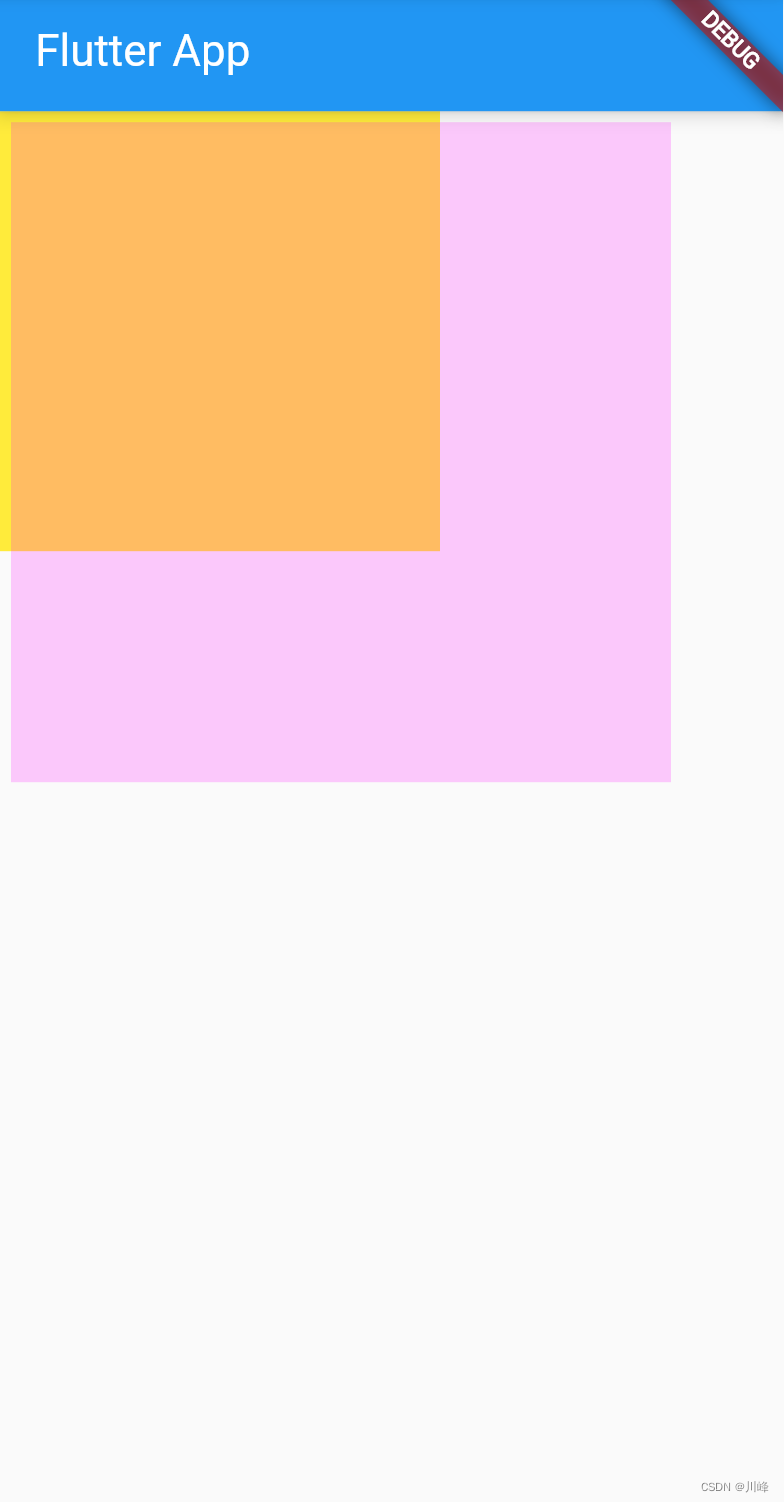
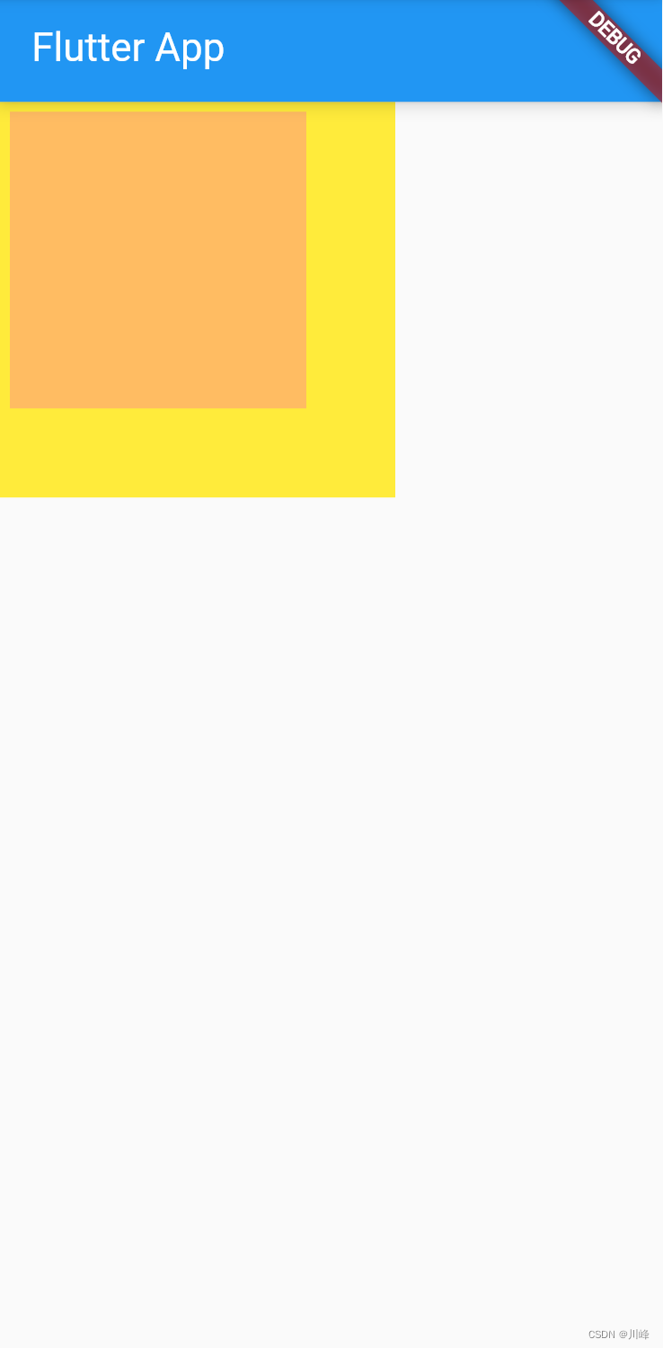
Container(
margin: EdgeInsets.all(20.0), //容器外补白
color: Colors.orange,
child: Text("Hello world!"),
),
Container(
padding: EdgeInsets.all(20.0), //容器内补白
color: Colors.orange,
child: Text("Hello world!"),
),
...
效果:
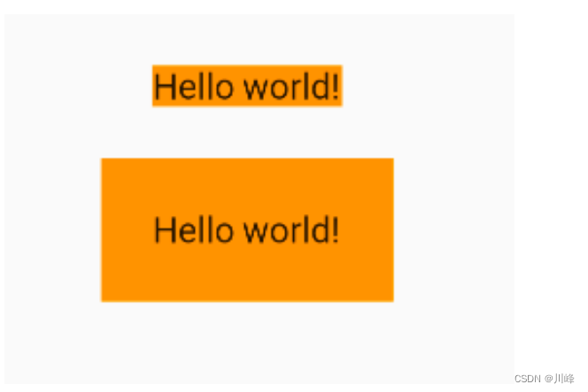
可以发现,直观的感觉就是margin的留白是在容器外部,而padding的留白是在容器内部,需要记住这个差异。事实上,Container内margin和padding都是通过Padding 组件来实现的,上面的示例代码实际上等价于:
...
Padding(
  padding: EdgeInsets.all(20.0),
  child: DecoratedBox(
    decoration: BoxDecoration(color: Colors.orange),
    child: Text("Hello world!"),
  ),
),
DecoratedBox(
  decoration: BoxDecoration(color: Colors.orange),
  child: Padding(
    padding: const EdgeInsets.all(20.0),
    child: Text("Hello world!"),
  ),
),
...
double.infinity 和 double.maxFinite
double.infinity 和double.maxFinite可以让当前元素的width或者height达到父元素的尺寸。
static const double nan = 0.0 / 0.0;
static const double infinity = 1.0 / 0.0;
static const double negativeInfinity = -infinity;
static const double minPositive = 5e-324;
static const double maxFinite = 1.7976931348623157e+308;
如下代码可以让Container铺满整个屏幕:
Widget build(BuildContext context) {


  return Container(
    height: double.infinity,
    width: double.infinity,
    color: Colors.black26,
    child: const Column(
      crossAxisAlignment: CrossAxisAlignment.center,
      mainAxisAlignment: MainAxisAlignment.spaceEvenly,
      children: [
        Icon(Icons.home, color: Colors.red),
        Icon(Icons.search, color: Colors.blue),
        Icon(Icons.send, color: Colors.orange),
      ],
    ),
  );
}
如下代码可以让Container的宽度和高度等于父元素的宽度高度:
class HomePage extends StatelessWidget {
const HomePage({
Key? key}) : super(key: key);
Widget build(BuildContext context) {
return Container(
height: 400,
width: 600,
color: Colors.red,
child: Container(
height: double.maxFinite,
width: double.infinity,
color: Colors.black26,
child: const Column(
crossAxisAlignment: CrossAxisAlignment.center,
mainAxisAlignment: MainAxisAlignment.spaceEvenly,
children: [
Icon(Icons.home, color: Colors.red),
Icon(Icons.search, color: Colors.blue),
Icon(Icons.send, color: Colors.orange),
],
),
),
);
}
}
DecoratedBox
DecoratedBox可以在其子组件绘制前(或后)绘制一些装饰(Decoration),如背景、边框、渐变等。DecoratedBox定义如下:
const DecoratedBox({


  Decoration decoration,
  DecorationPosition position = DecorationPosition.background,
  Widget? child
})
decoration:代表将要绘制的装饰,它的类型为Decoration。Decoration是一个抽象类,它定义了一个接口createBoxPainter(),子类的主要职责是需要通过实现它来创建一个画笔,该画笔用于绘制装饰。position:此属性决定在哪里绘制Decoration,它接收DecorationPosition的枚举类型,该枚举类有两个值:background:在子组件之下绘制,即背景装饰。foreground:在子组件之上绘制,即前景。
BoxDecoration
我们通常会直接使用BoxDecoration类,它是一个Decoration的子类,实现了常用的装饰元素的绘制。
BoxDecoration({


  Color color, //颜色
  DecorationImage image,//图片
  BoxBorder border, //边框
  BorderRadiusGeometry borderRadius, //圆角
  List<BoxShadow> boxShadow, //阴影,可以指定多个
  Gradient gradient, //渐变
  BlendMode backgroundBlendMode, //背景混合模式
  BoxShape shape = BoxShape.rectangle, //形状
})
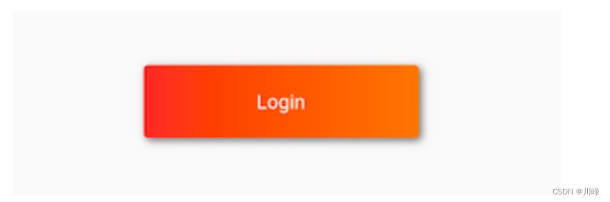
示例:下面代码实现一个带阴影的背景色渐变的按钮
DecoratedBox(
   decoration: BoxDecoration(
     gradient: LinearGradient(colors:[Colors.red,Colors.orange.shade700]), //背景渐变
     borderRadius: BorderRadius.circular(3.0), //3像素圆角
     boxShadow: [ //阴影
       BoxShadow(
         color:Colors.black54,
         offset: Offset(2.0,2.0),
         blurRadius: 4.0
       )
     ]
   ),
  child: Padding(
    padding: EdgeInsets.symmetric(horizontal: 80.0, vertical: 18.0),
    child: Text("Login", style: TextStyle(color: Colors.white),),
  )
)
效果:
上面的例子中使用了LinearGradient类,它用于定义线性渐变的类,Flutter中还提供了其他渐变配置类,如RadialGradient、SweepGradient,若有需要可以自行查看API文档。
Transform
Transform可以在其子组件绘制时对其应用一些矩阵变换来实现一些特效。Matrix4是一个4D矩阵,通过它我们可以实现各种矩阵操作,下面是一个例子:
Container(
  color: Colors.black,
  child: Transform(
    alignment: Alignment.topRight, //相对于坐标系原点的对齐方式
    transform: Matrix4.skewY(0.3), //沿Y轴倾斜0.3弧度
    child: Container(
      padding: const EdgeInsets.all(8.0),
      color: Colors.deepOrange,
      child: const Text('Apartment for rent!'),
    ),
  ),
)
效果:
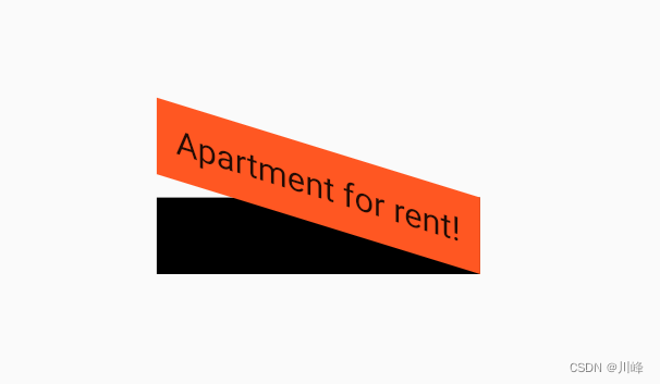
由于矩阵变化时发生在绘制时,而无需重新布局和构建等过程,所以性能很好。
平移
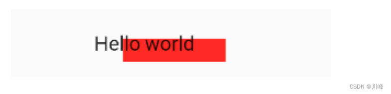
Transform.translate接收一个offset参数,可以在绘制时沿x、y轴对子组件平移指定的距离。
DecoratedBox(
  decoration:BoxDecoration(color: Colors.red),
  child: Transform.translate(
    offset: Offset(-20.0, -5.0), // 默认原点为左上角,左移20像素,向上平移5像素
    child: Text("Hello world"),
  ),
)
效果:
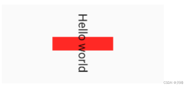
旋转
Transform.rotate可以对子组件进行旋转变换,如:
import 'dart:math' as math;  // 要使用math.pi需先进行导包

DecoratedBox(
  decoration:BoxDecoration(color: Colors.red),
  child: Transform.rotate(
    angle:math.pi / 2 ,  // 旋转90度
    child: Text("Hello world"),
  ),
)
效果:
缩放
Transform.scale可以对子组件进行缩小或放大,如:
DecoratedBox(
  decoration:BoxDecoration(color: Colors.red),
  child: Transform.scale(
    scale: 1.5, //放大到1.5倍
    child: Text("Hello world")
  )
);
效果:
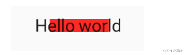
Transform 注意事项
Transform的变换是应用在绘制阶段,而并不是应用在布局(layout)阶段,所以无论对子组件应用何种变化,其占用空间的大小和在屏幕上的位置都是固定不变的,因为这些是在布局阶段就确定的。下面我们具体说明:
Row(
  mainAxisAlignment: MainAxisAlignment.center,
  children: <Widget>[
    DecoratedBox(
      decoration:BoxDecoration(color: Colors.red),
      child: Transform.scale(scale: 1.5,
          child: Text("Hello world")
      )
    ),
    Text("你好", style: TextStyle(color: Colors.green, fontSize: 18.0),)
  ],
)
效果:
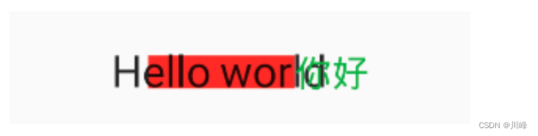
解释:由于第一个Text应用变换(放大)后,其在绘制时会放大,但其占用的空间依然为红色部分,所以第二个Text会紧挨着红色部分,最终就会出现文字重合。
- 由于矩阵变化只会作用在绘制阶段,所以在某些场景下,在UI需要变化时,可以直接通过矩阵变化来达到视觉上的UI改变,而不需要去重新触发build流程,这样会节省layout的开销,所以性能会比较好。如之前介绍的
Flow组件,它内部就是用矩阵变换来更新UI,除此之外,Flutter的动画组件中也大量使用了Transform以提高性能。
RotatedBox
RotatedBox和Transform.rotate功能相似,它们都可以对子组件进行旋转变换,但是有一点不同:RotatedBox的变换是在layout阶段,会影响在子组件的位置和大小。我们将上面介绍Transform.rotate时的示例改一下:
Row(
  mainAxisAlignment: MainAxisAlignment.center,
  children: <Widget>[
    DecoratedBox(
      decoration: BoxDecoration(color: Colors.red),
      // 将 Transform.rotate 换成 RotatedBox
      child: RotatedBox(
        quarterTurns: 1, // 旋转90度(1/4圈)
        child: Text("Hello world"),
      ),
    ),
    Text("你好", style: TextStyle(color: Colors.green, fontSize: 18.0),)
  ],
),
效果:
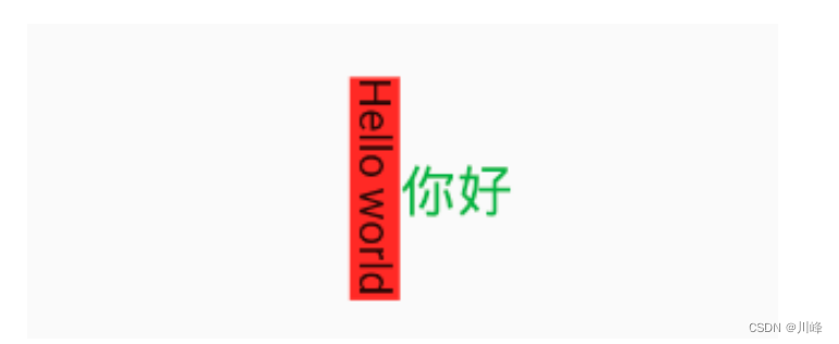
由于RotatedBox是作用于layout阶段,所以子组件会旋转90度(而不只是绘制的内容),decoration会作用到子组件所占用的实际空间上,所以最终就是上图的效果,可以和前面Transform.rotate示例对比理解。
Clip
剪裁类组件
Flutter中提供了一些剪裁组件,用于对组件进行剪裁。
| 剪裁Widget | 默认行为 |
|---|---|
ClipOval |
子组件为正方形时剪裁成内贴圆形;为矩形时,剪裁成内贴椭圆 |
ClipRRect |
将子组件剪裁为圆角矩形 |
ClipRect |
默认剪裁掉子组件布局空间之外的绘制内容(溢出部分剪裁) |
ClipPath |
按照自定义的路径剪裁 |
示例:
import 'package:flutter/material.dart';
class ClipTestRoute extends StatelessWidget {
Widget build(BuildContext context) {
// 头像
Widget avatar = Image.asset("imgs/avatar.png", width: 60.0);
return Center(
child: Column(
children: <Widget>[
avatar, //不剪裁
ClipOval(child: avatar), //剪裁为圆形
ClipRRect( //剪裁为圆角矩形
borderRadius: BorderRadius.circular(5.0),
child: avatar,
),
Row(
mainAxisAlignment: MainAxisAlignment.center,
children: <Widget>[
Align(
alignment: Alignment.topLeft,
widthFactor: .5,//宽度设为原来宽度一半,另一半会溢出
child: avatar,
),
Text("你好世界", style: TextStyle(color: Colors.green),)
],
),
Row(
mainAxisAlignment: MainAxisAlignment.center,
children: <Widget>[
ClipRect(//将溢出部分剪裁
child: Align(
alignment: Alignment.topLeft,
widthFactor: .5,//宽度设为原来宽度一半
child: avatar,
),
),
Text("你好世界",style: TextStyle(color: Colors.green))
],
),
],
),
);
}
}
效果:
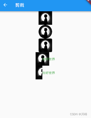
上面示例代码中值得一提的是最后的两个Row,它们通过Align设置widthFactor为0.5后,图片的实际宽度等于60×0.5,即原宽度一半,但此时图片溢出部分依然会显示,所以第一个“你好世界”会和图片的另一部分重合,为了剪裁掉溢出部分,我们在第二个Row中通过ClipRect将溢出部分剪裁掉了。
自定义裁剪
如果我们想剪裁子组件的特定区域,比如,在上面示例的图片中,如果我们只想截取图片中部40×30像素的范围应该怎么做?这时我们可以使用自定义CustomClipper来剪裁区域,实现代码如下:
class MyClipper extends CustomClipper<Rect> {
Rect getClip(Size size) => Rect.fromLTWH(10.0, 15.0, 40.0, 30.0);
bool shouldReclip(CustomClipper<Rect> oldClipper) => false;
}
-
getClip()是用于获取剪裁区域的接口,由于图片大小是60×60,我们返回剪裁区域为Rect.fromLTWH(10.0, 15.0, 40.0, 30.0),即图片中部40×30像素的范围。 -
shouldReclip()接口决定是否重新剪裁。如果在应用中,剪裁区域始终不会发生变化时应该返回false,这样就不会触发重新剪裁,避免不必要的性能开销。如果剪裁区域会发生变化(比如在对剪裁区域执行一个动画),那么变化后应该返回true来重新执行剪裁。
然后,我们通过ClipRect来执行剪裁,为了看清图片实际所占用的位置,我们设置一个红色背景:
DecoratedBox(
  decoration: BoxDecoration(
    color: Colors.red
  ),
  child: ClipRect(
    clipper: MyClipper(), //使用自定义的clipper
    child: avatar
  ),
)
效果:
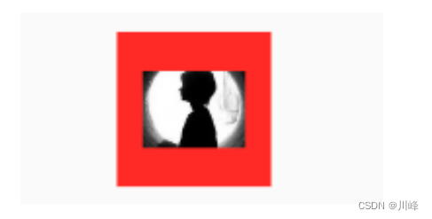
可以看到我们的剪裁成功了,但是图片所占用的空间大小仍然是60×60(红色区域),这是因为组件大小是是在layout阶段确定的,而剪裁是在之后的绘制阶段进行的,所以不会影响组件的大小,这和Transform原理是相似的。
ClipPath 可以按照自定义的路径实现剪裁,它需要自定义一个CustomClipper<Path> 类型的 Clipper,定义方式和 MyClipper 类似,只不过 getClip 需要返回一个 Path,不再赘述。
FittedBox
当子组件大小超出了父组件大小时,如果不经过处理的话 Flutter 中就会显示一个溢出警告并在控制台打印错误日志,比如下面代码会导致溢出:
Padding(
  padding: const EdgeInsets.symmetric(vertical: 30.0),
  child: Row(children: [Text('xx'*30)]), //文本长度超出 Row 的最大宽度会溢出
)
效果:
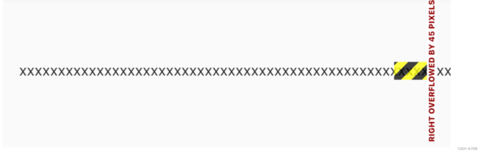
可以看到右边溢出了 45 像素。
上面只是一个例子,理论上我们经常会遇到子元素的大小超过他父容器的大小的情况,比如一张很大图片要在一个较小的空间显示,根据 Flutter 的布局协议,父组件会将自身的最大显示空间作为约束传递给子组件,子组件应该遵守父组件的约束,如果子组件原始大小超过了父组件的约束区域,则需要进行一些缩小、裁剪或其他处理,而不同的组件的处理方式是特定的,比如 Text 组件,如果它的父组件宽度固定,高度不限的话,则默认情况下 Text 会在文本到达父组件宽度的时候换行。那如果我们想让 Text 文本在超过父组件的宽度时不要换行而是字体缩小呢?还有一种情况,比如父组件的宽高固定,而 Text 文本较少,这时候我们想让文本放大以填充整个父组件空间该怎么做呢?
实际上,上面这两个问题的本质就是:子组件如何适配父组件空间。而根据 Flutter 布局协议适配算法应该在容器或布局组件的 layout 中实现,为了方便开发者自定义适配规则,Flutter 提供了一个 FittedBox 组件,定义如下:
const FittedBox({


  Key? key,
  this.fit = BoxFit.contain, // 适配方式
  this.alignment = Alignment.center, //对齐方式
  this.clipBehavior = Clip.none, //是否剪裁
  Widget? child,
})
适配原理
-
FittedBox在布局子组件时会忽略其父组件传递的约束,可以允许子组件无限大,即FittedBox传递给子组件的约束为(0 <= width <= double.infinity, 0 <= height <= double.infinity)。 -
FittedBox对子组件布局结束后就可以获得子组件真实的大小。 -
FittedBox知道子组件的真实大小也知道他父组件的约束,那么FittedBox就可以通过指定的适配方式(BoxFit枚举中指定),让子组件在FittedBox父组件的约束范围内按照指定的方式显示。
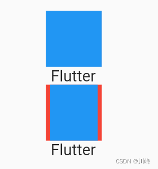
我们通过一个简单的例子说明:
Widget build(BuildContext context) {


  return Center(
    child: Column(
      children: [
        wContainer(BoxFit.none),
        Text('Flutter'),
        wContainer(BoxFit.contain),
        Text('Flutter'),
      ],
    ),
  );
}

Widget wContainer(BoxFit boxFit) {


  return Container(
    width: 50,
    height: 50,
    color: Colors.red,
    child: FittedBox(
      fit: boxFit,
      // 子容器超过父容器大小
      child: Container(width: 60, height: 70, color: Colors.blue),
    ),
  );
}
效果:
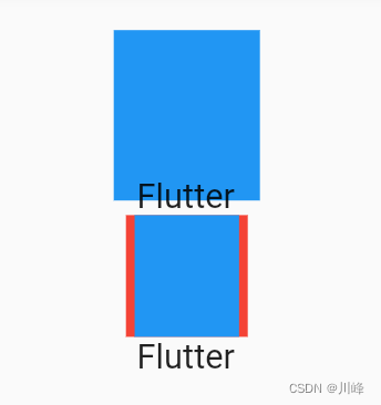
因为父Container要比子Container 小,所以当没有指定任何适配方式时,子组件会按照其真实大小进行绘制,所以第一个蓝色区域会超出父组件的空间,因而看不到红色区域。第二个我们指定了适配方式为 BoxFit.contain,含义是按照子组件的比例缩放,尽可能多的占据父组件空间,因为子组件的长宽并不相同,所以按照比例缩放适配父组件后,父组件能显示一部分。
要注意一点,在未指定适配方式时,虽然 FittedBox 子组件的大小超过了 FittedBox 父 Container 的空间,但 FittedBox 自身还是要遵守其父组件传递的约束,所以最终 FittedBox 的本身的大小是 50×50,这也是为什么蓝色会和下面文本重叠的原因,因为在布局空间内,父Container只占50×50的大小,接下来Text文本会紧挨着Container进行布局,而此时Container 中有子组件的大小超过了自己,所以最终的效果就是绘制范围超出了Container,但布局位置是正常的,所以就重叠了。如果我们不想让蓝色超出父组件布局范围,那么可以使用 ClipRect 对超出的部分剪裁掉即可:
ClipRect( // 将超出子组件布局范围的绘制内容剪裁掉
  child: Container(
    width: 50,
    height: 50,
    color: Colors.red,
    child: FittedBox(
      fit: boxFit,
      child: Container(width: 60, height: 70, color: Colors.blue),
    ),
  ),
);
效果:
关于 BoxFit 的各种适配规则和 Image 的 fix 属性指定是一样的,可以查看我们在介绍 Image 组件时关于各种适配规则对应的效果。
实例:单行缩放布局
比如我们有三个数据指标,需要在一行显示,因为换行的话就会将我们的页面布局打乱,所以换行是不能接受的。因为不同设备的屏幕宽度不同,且不同人的数据也不同,所以就会出现数据太长或屏幕太窄时三个数据无法在一行显示,因此,我们希望当无法在一行显示时能够对组件进行适当的缩放以确保一行能够显示的下,为此我们写了一个测试 demo :
Widget build(BuildContext context) {
return Center(
child: Column(
children: [
wRow(' 90000000000000000 '),
FittedBox(child: wRow(' 90000000000000000 ')),
wRow(' 800 '),
FittedBox(child: wRow(' 800 ')),
].map((e) => Padding(
padding: EdgeInsets.symmetric(vertical: 20),
child: e,
)).toList();,
),
);
}
// 直接使用Row
Widget wRow(String text) {
Widget child = Text(text);
child = Row(
mainAxisAlignment: MainAxisAlignment.spaceEvenly,
children: [child, child, child],
);
return child;
}
效果:
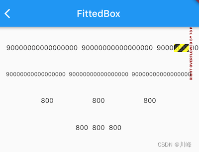
首先,因为我们给Row在主轴的对齐方式指定为MainAxisAlignment.spaceEvenly,这会将水平方向的的剩余显示空间均分成多份穿插在每一个 child之间。
可以看到,当数字为’ 90000000000000000 '时,三个数字的长度加起来已经超出了测试设备的屏幕宽度,所以直接使用 Row 会溢出,当给 Row 添加上如果加上 FittedBox时,就可以按比例缩放至一行显示,实现了我们预期的效果。
但是当数字没有那么大时,比如下面的 ’ 800 ',直接使用 Row 是可以的,但加上 FittedBox 后三个数字虽然也能正常显示,但是它们却挤在了一起,这不符合我们的期望。之所以会这样,原因其实很简单:在指定主轴对齐方式为 spaceEvenly 的情况下,Row 在进行布局时会拿到父组件的约束,如果父约束的 maxWidth 不是无限大,则 Row 会根据子组件的数量和它们的大小在主轴方向来根据 spaceEvenly 填充算法来分割水平方向的长度,最终 Row 的宽度为 maxWidth;但如果父约束的 maxWidth 是无限大时,就无法在进行分割了,所以此时 Row 就会将子组件的宽度之和作为自己的宽度。
回到示例中,当 Row 没有被 FittedBox 包裹时,此时父组件传给 Row 的约束的 maxWidth 为屏幕宽度,此时,Row 的宽度也就是屏幕宽度,而当被 FittedBox 包裹时,FittedBox 传给 Row 的约束的 maxWidth 为无限大(double.infinity),因此 Row 的最终宽度就是子组件的宽度之和。
父组件传递给子组件的约束可以用我们之前封装的 LayoutLogPrint 来打印出来:
LayoutLogPrint(tag: 1, child: wRow(' 800 ')),
FittedBox(child: LayoutLogPrint(tag: 2, child: wRow(' 800 '))),
运行后控制台日志如下:
flutter: 1: BoxConstraints(0.0<=w<=396.0, 0.0<=h<=Infinity)
flutter: 2: BoxConstraints(unconstrained)
问题原因找到了,那解决的思路就很简单了,我们只需要让 FittedBox 子元素接收到的约束的 maxWidth 为屏幕宽度即可,为此我们封装了一个 SingleLineFittedBox 来替换 FittedBox 以达到我们预期的效果,实现如下:
class SingleLineFittedBox extends StatelessWidget {
const SingleLineFittedBox({
Key? key,this.child}) : super(key: key);
final Widget? child;
Widget build(BuildContext context) {
return LayoutBuilder(
builder: (_, constraints) {
return FittedBox(
child: ConstrainedBox(
constraints: constraints.copyWith(
maxWidth: constraints.maxWidth //让 maxWidth 使用屏幕宽度
),
child: child,
),
);
},
);
}
}
测试代码改为:
wRow(' 90000000000000000 '),
SingleLineFittedBox(child: wRow(' 90000000000000000 ')),
wRow(' 800 '),
SingleLineFittedBox(child: wRow(' 800 ')),
运行效果:
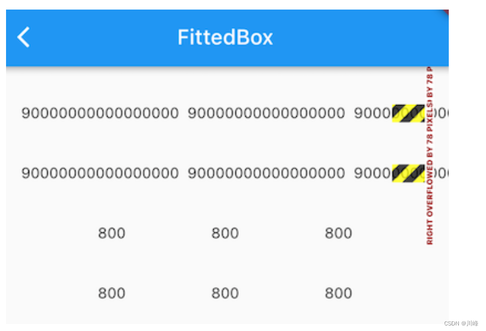
发现 800 的正常显示了,但用SingleLineFittedBox包裹的 ’ 90000000000000000 ’ 的那个 Row 却溢出了!溢出的原因其实也很简单,因为我们在 SingleLineFittedBox 中将传给 Row 的 maxWidth 置为屏幕宽度后,效果和不加SingleLineFittedBox 的效果是一样的,Row 收到父组件约束的 maxWidth 都是屏幕的宽度,所以搞了半天实现了个寂寞。但是,不要放弃,其实离胜利只有一步,只要我们稍加修改,就能实现我们的预期,话不多说,直接上代码:
class SingleLineFittedBox extends StatelessWidget {
const SingleLineFittedBox({
Key? key,this.child}) : super(key: key);
final Widget? child;
Widget build(BuildContext context) {
return LayoutBuilder(
builder: (_, constraints) {
return FittedBox(
child: ConstrainedBox(
constraints: constraints.copyWith(
minWidth: constraints.maxWidth,
maxWidth: double.infinity,
// maxWidth: constraints.maxWidth
),
child: child,
),
);
},
);
}
}
代码很简单,我们将最小宽度(minWidth)约束指定为屏幕宽度,因为Row必须得遵守父组件的约束,所以 Row 的宽度至少等于屏幕宽度,所以就不会出现缩在一起的情况;同时我们将 maxWidth 指定为无限大,则就可以处理数字总长度超出屏幕宽度的情况。
重新运行后效果如图所示:
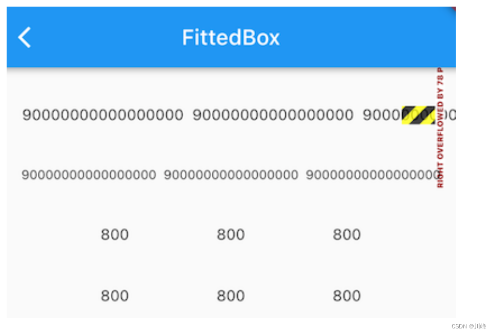
发现无论长数字还是短数字,我们的SingleLineFittedBox 都可以正常工作,大功告成!
OverflowBox
OverflowBox的作用是允许child超出parent的范围显示。
OverflowBox的定义:
OverflowBox({


	Key key, this.alignment = Alignment.center,//对齐方式。
	this.minWidth,//允许 child 的最小宽度。如果 child 宽度小于这个值,则按照最小宽度进行显示。
	this.maxWidth,//允许 child 的最大宽度。如果 child 宽度大于这个值,则按照最大宽度进行展示。
	this.minHeight,//允许 child 的最小高度。如果 child 高度小于这个值,则按照最小高度进行显示。
	this.maxHeight,//允许 child 的最大高度。如果 child 高度大于这个值,则按照最大高度进行展示。
	Widget child,
})
- 当
OverflowBox的最大尺寸大于child的时候,child可以完整显示, - 当
OverflowBox的最大尺寸小于child的时候,则以最大尺寸为基准,当然,这个尺寸都是可以突破父节点的。 - 当最小以及最大宽高度,如果为
null的时候,就取父节点的constraint代替。
示例:
class OverflowBoxWidget extends StatelessWidget {
const OverflowBoxWidget({
Key? key}) : super(key: key);
Widget build(BuildContext context) {
return Container(
color: Colors.yellow,
width: 200.0,
height: 200.0,
padding: const EdgeInsets.all(5.0),
child: OverflowBox(
alignment: Alignment.topLeft,
maxWidth: 300.0,
maxHeight: 300.0,
child: Container(
color: const Color(0x33FF00FF),
width: 400.0,
height: 500.0,
),
),
);
}
}
效果:
可以看到OverflowBox的子元素以300x300的大小溢出父元素200x200的黄色区域显示。
如果代码修改为:
Widget build(BuildContext context) {
return Container(
color: Colors.yellow,
width: 200.0,
height: 200.0,
padding: const EdgeInsets.all(5.0),
child: OverflowBox(
alignment: Alignment.topLeft,
minWidth: 150.0,
maxWidth: 300.0,
minHeight: 150.0,
maxHeight: 300.0,
child: Container(
color: const Color(0x33FF00FF),
width: 100.0,
height: 100.0,
),
),
);
}
效果:
此时可以看到OverflowBox的子元素会以150x150的大小显示在父元素200x200的黄色区域内。
MaterialApp 和 Scaffold
Flutter 提供了一套丰富、强大的基础组件,在基础组件库之上 Flutter 又提供了一套 Material 风格( Android 默认的视觉风格)和一套 Cupertino 风格(iOS视觉风格)的组件库。要使用基础组件库,需要先导入:
import 'package:flutter/widgets.dart';
开发者使用 MaterialApp 和 Scaffold 两个组件来装饰 App。
MaterialApp
MaterialApp 是一个方便的Widget,它封装了应用程序实现Material Design所需要的一些Widget。一般作为顶层widget使用。
MaterialApp常用的属性:
home(主页)title(标题)color(颜色)theme(主题)routes(路由)...
例如,通过 MaterialApp 配置全局主题:
MaterialApp(
    title: 'Flutter Demo',
    theme: ThemeData(
        primarySwatch: Colors.blue,
        appBarTheme: const AppBarTheme(
          centerTitle: true,
        )
    ),
    initialRoute: "/",
    routes: routes,
    debugShowCheckedModeBanner: false,
 );
Scaffold
Scaffold是实现Material Design基本布局结构的一个脚手架。此类提供了用于显示drawer、snackbar和底部sheet的API。
Scaffold 有下面几个主要属性:
appBar- 显示在界面顶部的一个AppBar。body- 当前界面所显示的主要内容Widget。drawer- 抽屉菜单控件。...
以下是使用 Scaffold 实现的一个简单示例:
class ScaffoldRoute extends StatefulWidget {
_ScaffoldRouteState createState() => _ScaffoldRouteState();
}
class _ScaffoldRouteState extends State<ScaffoldRoute> {
int _selectedIndex = 1;
Widget build(BuildContext context) {
return Scaffold(
appBar: AppBar( //导航栏
title: Text("App Name"),
actions: <Widget>[ //导航栏右侧菜单
IconButton(icon: Icon(Icons.share), onPressed: () {
}),
],
),
drawer: MyDrawer(), //抽屉
bottomNavigationBar: BottomNavigationBar( // 底部导航
items: <BottomNavigationBarItem>[
BottomNavigationBarItem(icon: Icon(Icons.home), title: Text('Home')),
BottomNavigationBarItem(icon: Icon(Icons.business), title: Text('Business')),
BottomNavigationBarItem(icon: Icon(Icons.school), title: Text('School')),
],
currentIndex: _selectedIndex,
fixedColor: Colors.blue,
onTap: _onItemTapped,
),
floatingActionButton: FloatingActionButton( //悬浮按钮
child: Icon(Icons.add),
onPressed:_onAdd
),
);
}
void _onItemTapped(int index) {
setState(() {
_selectedIndex = index;
});
}
void _onAdd(){
}
}
运行效果如下:
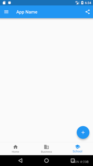
面代码中我们用到了如下组件:
AppBar一个导航栏骨架MyDrawer抽屉菜单BottomNavigationBar底部导航栏FloatingActionButton漂浮按钮
AppBar
AppBar是一个Material风格的导航栏,通过它可以设置导航栏标题、导航栏菜单、导航栏底部的Tab标题等。下面我们看看AppBar的定义:
AppBar({


  Key? key,
  this.leading, //导航栏最左侧Widget,常见为抽屉菜单按钮或返回按钮。
  this.automaticallyImplyLeading = true, //如果leading为null,是否自动实现默认的leading按钮
  this.title,// 页面标题
  this.actions, // 导航栏右侧菜单
  this.bottom, // 导航栏底部菜单,通常为Tab按钮组
  this.elevation = 4.0, // 导航栏阴影
  this.centerTitle, //标题是否居中
  this.backgroundColor,
  ...   //其他属性见源码注释
})
| 属性 | 描述 |
|---|---|
leading |
在标题前面显示的一个控件,在首页通常显示应用的 logo;在其他界面通常显示为返回按钮 |
title |
标题,通常显示为当前界面的标题文字,可以放组件 |
actions |
通常使用 IconButton 来表示,可以放按钮组 |
bottom |
通常放tabBar,标题下面显示一个 Tab 导航栏 |
backgroundColor |
导航背景颜色 |
iconTheme |
图标样式 |
centerTitle |
标题是否居中显示 |
简单示例:
AppBar(
   //导航栏
   title: const Text("App Name"),
   actions: <Widget>[
     //导航栏右侧菜单
     IconButton(
         icon: const Icon(Icons.share), onPressed: () => print("share")),
   ],
   //导航栏最左侧Widget,常见为抽屉菜单按钮或返回按钮。
   leading: Builder(builder: (context) {


     return IconButton(
         icon: const Icon(Icons.dashboard, color: Colors.white), //自定义图标
         onPressed: () => Scaffold.of(context).openDrawer() // 打开抽屉菜单
         );
   }),
   //顶部导航栏下面的Tab菜单 tabbar本身支持横向滚动
   bottom: TabBar(
       controller: _tabController,
       tabs: tabs.map((e) => Tab(text: e)).toList() //Tab可添加图标
       ),
),
如果给Scaffold添加了抽屉菜单,默认情况下Scaffold会自动将AppBar的leading设置为菜单按钮,点击它便可打开抽屉菜单。如果我们想自定义菜单图标,可以手动来设置leading,如:
Scaffold(
  appBar: AppBar(
    title: Text("App Name"),
    leading: Builder(builder: (context) {


      return IconButton(
        icon: Icon(Icons.dashboard, color: Colors.white), //自定义图标
        onPressed: () {


          // 打开抽屉菜单
          Scaffold.of(context).openDrawer();
        },
      );
    }),
    ...
  )
代码运行效果:
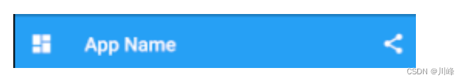
可以看到左侧菜单已经替换成功。
代码中打开抽屉菜单的方法在ScaffoldState中,通过Scaffold.of(context)可以获取父级最近的Scaffold 组件的State对象。
TabBar + TabBarView
AppBar结合TabBar可以实现顶部Tab切换效果。

TabBar 有很多配置参数,通过这些参数我们可以定义 TabBar 的样式,很多属性都是在配置 indicator 和 label,拿上图来举例,Label 是每个Tab 的文本,indicator 指 “历史” 下面的白色下划线。
TabBar常见属性:
| 属性 | 描述 |
|---|---|
| tabs | 显示的标签内容,一般使用Tab对象,也可以是其他的Widget |
| controller | TabController对象 |
| isScrollable | 是否可滚动 |
| indicatorColor | 指示器颜色 |
| indicatorWeight | 指示器高度 |
| indicatorPadding | 底部指示器的Padding |
| indicator | 指示器decoration,例如边框等 |
| indicatorSize | 指示器大小计算方式,TabBarIndicatorSize.label跟文字等宽,TabBarIndicatorSize.tab跟每个tab等宽 |
| labelColor | 选中label颜色 |
| labelStyle | 选中label的Style |
| labelPadding | 每个label的padding值 |
| unselectedLabelColor | 未选中label颜色 |
| unselectedLabelStyle | 未选中label的Style |
TabBarView 是 Material 组件库中提供了 Tab 布局组件,通常和 TabBar 配合使用。TabBarView 内部封装了 PageView,它的构造方法很简单:
 TabBarView({


  Key? key,
  required this.children, // tab 页
  this.controller, // TabController
  this.physics,
  this.dragStartBehavior = DragStartBehavior.start,
})
TabController 用于监听和控制 TabBarView 的页面切换,通常和 TabBar 联动。
TabBar 通常位于 AppBar 的底部(bottom属性),它也可以接收一个 TabController ,如果需要和 TabBarView 联动, TabBar 和 TabBarView 使用同一个 TabController 即可,注意,联动时 TabBar 和 TabBarView 的孩子数量需要一致。如果没有指定 controller,则会在组件树中向上查找并使用最近的一个 DefaultTabController 。
另外我们需要创建需要的 tab 并通过 tabs 传给 TabBar, tab 可以是任何 Widget,不过Material 组件库中已经实现了一个 Tab 组件,我们一般都会直接使用它:
const Tab({


  Key? key,
  this.text, //文本
  this.icon, // 图标
  this.iconMargin = const EdgeInsets.only(bottom: 10.0),
  this.height,
  this.child, // 自定义 widget
})
注意,text 和 child 是互斥的,不能同时指定。
使用AppBar结合 Tabbar + TabBarView实现类似头条顶部导航效果
1、混入SingleTickerProviderStateMixin
class _HomePageState extends State<HomePage> with SingleTickerProviderStateMixin{

    }
由于 TabController 需要一个 TickerProvider (vsync 参数), 所以我们需要混入 SingleTickerProviderStateMixin这个类。
2、定义TabController
  late TabController _tabController;

  void initState() {


    super.initState();
    _tabController = TabController(length: 8, vsync: this);
    _tabController.addListener(() {


      if (_tabController.animation!.value == _tabController.index) {


        print(_tabController.index); //获取点击或滑动页面的索引值
      }
    });
  }
3、配置TabBar和TabBarView
import 'package:flutter/material.dart';
void main() {
runApp(const MyApp());
}
class MyApp extends StatelessWidget {
const MyApp({
Key? key}) : super(key: key);
Widget build(BuildContext context) {
return MaterialApp(
title: 'Flutter Demo',
theme: ThemeData(
primarySwatch: Colors.blue,
),
home: const HomePage(),
);
}
}
class HomePage extends StatefulWidget {
const HomePage({
Key? key}) : super(key: key);
State<HomePage> createState() => _HomePageState();
}
class _HomePageState extends State<HomePage>
with SingleTickerProviderStateMixin {
late TabController _tabController;
void initState() {
super.initState();
_tabController = TabController(length: 3, vsync: this);
}
Widget build(BuildContext context) {
return Scaffold(
appBar: AppBar(
title: const Text("Flutter App"),
bottom: TabBar(
controller: _tabController,
tabs: const [
Tab(child: Text("热门")),
Tab(child: Text("推荐")),
Tab(child: Text("视频"))
],
),
),
body: TabBarView(
controller: _tabController,
children: const [Text("热门"), Text("推荐"), Text("视频")])
);
}
void dispose() {
// 释放资源
_tabController.dispose();
super.dispose();
}
}
注意,TabBar是放在Scaffold的AppBar中的,而TabBarView 是放在Scaffold的body中的。
上面代码中,由于创建 TabController 需要一个vsync 参数所以需要混入一个类,由于 TabController 中会执行动画,持有一些资源,所以我们在页面销毁时必须得释放资源(dispose)。
我们发现创建 TabController 的过程还是比较复杂,实战中,如果需要 TabBar 和 TabBarView 联动,通常会创建一个 DefaultTabController 作为它们共同的父级组件,这样它们在执行时就会从组件树向上查找,都会使用我们指定的这个 DefaultTabController。我们可以这样做:
class HomePage extends StatelessWidget {
const HomePage({
super.key});
Widget build(BuildContext context) {
List tabs = ["新闻", "历史", "图片"];
return DefaultTabController(
length: tabs.length,
child: Scaffold(
appBar: AppBar(
title: const Text("App Name"),
bottom: TabBar(tabs: tabs.map((e) => Tab(text: e)).toList(),),
),
body: TabBarView( //构建
children: tabs.map((e) {
return KeepAliveWrapper(
child: Container(
alignment: Alignment.center,
child: Text(e, textScaleFactor: 5),
),
);
}).toList(),
),
),
);
}
}
这样省力一些。但是这样无法通过Controller拿到tab变化的index。
解决“双下巴”标题
假如我们把上面的HomePage组件嵌入到main.dart中的MyApp组件中,可能出现下图的“双下巴”顶部标题:
//main.dart
class MyApp extends StatelessWidget {
const MyApp({
Key? key}) : super(key: key);
Widget build(BuildContext context) {
return MaterialApp(
title: 'Flutter App',
theme: ThemeData(primarySwatch: Colors.blue,),
home: HomePage(),
);
}
}
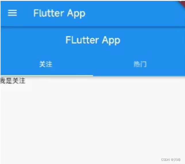
如何去掉这个“双下巴”呢?我们可以将HomePage中原本放在AppBar的bottom属性上的TabBar放到AppBar的title属性上即可,然后去掉bottom属性:
Scaffold(
   appBar: AppBar(
      title: TabBar(
        controller: _tabController,
        tabs: const [...],
      ),
    ),
    body: TabBarView(...),
);
这样就去掉了子组件的标题,只有最外面的标题了。
PreferredSize改变appBar的高度
通过PreferredSize组件可以修改appBar的默认高度:
Scaffold(
  appBar: PreferredSize(
      preferredSize: Size.fromHeight(50),
      child: AppBar(
      ....
      )
  ),
  body: Test(),
)
监听 TabController 的改变事件
void initState() {


  super.initState();
  _tabController = TabController(length: 8, vsync: this);
  //监听_tabController的改变事件
  _tabController.addListener(() {


  	// print(_tabController.index); // 如果直接在这里获取会执行2次
    if (_tabController.animation!.value==_tabController.index){


      print(_tabController.index); //获取点击或滑动页面的索引值
    }
  });
}
注意,上面代码中如果直接在addListener回调中获取_tabController.index会执行2次,所以需要加上判断。而如果你在TarBar的onTap点击回调中获取index,则只能获取到点击触发切换tab时的index,当Tab由于用户滚动改变index时就不能获取到了,所以最佳位置就是放在tabController.addListener中。获取到这个index后,我们就可以在tab切换时去请求数据了,或者做其他业务逻辑。
解决 TabView 的页面缓存问题
由于 TabBarView 内部封装了 PageView,存在页面缓存失效问题,会导致在进行Tab切换时丢失页面状态。比如,假如 TabBarView 的内容是一个ListView列表,当用户在当前Tab页面滑动ListView到某个位置时,切换到了其他Tab页面浏览,然后再次返回当前Tab页,此时会发现列表滚动位置失效,回到初始状态,即当前Tab被销毁重建了。
import 'package:flutter/material.dart';
import '../../tools/KeepAliveWrapper.dart';
class HomePage extends StatefulWidget {
const HomePage({
super.key});
State<HomePage> createState() => _HomePageState();
}
class _HomePageState extends State<HomePage>
with SingleTickerProviderStateMixin {
late TabController _tabController;
void initState() {
super.initState();
_tabController = TabController(length: 8, vsync: this);
//监听_tabController的改变事件
_tabController.addListener(() {
// print(_tabController.index);
if (_tabController.animation!.value == _tabController.index) {
print(_tabController.index); //获取点击或滑动页面的索引值
}
});
}
//组件销毁的时候触发
void dispose() {
// TODO: implement dispose
super.dispose();
//销毁_tabController
_tabController.dispose();
}
Widget build(BuildContext context) {
return Scaffold(
appBar: PreferredSize(
//可以配置appBar的高度
preferredSize: const Size.fromHeight(40),
child: AppBar(
elevation: 0.5,
backgroundColor: Colors.white,
title: SizedBox(
//改TabBar的高度
height: 30,
child: TabBar(
labelStyle: const TextStyle(fontSize: 14),
isScrollable: true,
indicatorColor: Colors.red, //底部指示器的颜色
labelColor: Colors.red,
unselectedLabelColor: Colors.black, //lable未选中的颜色
indicatorSize: TabBarIndicatorSize.label,
controller: _tabController,
// onTap: (index){ //只能监听点击事件 没法监听滑动
// print(index);
// },
tabs: const [
Tab(child: Text("关注"),),
Tab(child: Text("热门"),),
Tab(child: Text("视频"),),
Tab(child: Text("娱乐"),),
Tab(child: Text("篮球"),),
Tab(child: Text("深圳"),),
Tab(child: Text("疫情"),),
Tab(child: Text("其他"),),
],
),
),
),
),
body: TabBarView(controller: _tabController, children: [
//自定义的缓存组件
KeepAliveWrapper(
child: ListView(
children: List.generate(30, (index) => ListTile(title: Text("关注列表$index")))
)
),
KeepAliveWrapper(
child: ListView(
children: List.generate(30, (index) => ListTile(title: Text("热门列表$index")))
)
),
KeepAliveWrapper(
child: ListView(
children: List.generate(30, (index) => ListTile(title: Text("视频列表$index")))
)
),
KeepAliveWrapper(
child: ListView(
children: List.generate(30, (index) => ListTile(title: Text("娱乐列表$index")))
)
),
KeepAliveWrapper(
child: ListView(
children: List.generate(30, (index) => ListTile(title: Text("篮球列表$index")))
)
),
KeepAliveWrapper(
child: ListView(
children: List.generate(30, (index) => ListTile(title: Text("深圳列表$index")))
)
),
KeepAliveWrapper(
child: ListView(
children: List.generate(30, (index) => ListTile(title: Text("疫情列表$index")))
)
),
KeepAliveWrapper(
child: ListView(
children: List.generate(30, (index) => ListTile(title: Text("其他列表$index")))
)
),
]),
);
}
}
其中KeepAliveWrapper是对AutomaticKeepAlive的一个简单封装,具体请参考后文 可滚动组件 部分中如何开启滚动组件的子项缓存。假如不使用KeepAliveWrapper包装TabBarView的children,那么当从当前Tab切换到其他Tab再返回当前Tab页时,会发生列表滚动位置失效问题,即当前Tab被销毁重建了。
BottomNavigationBar
我们通过Material组件库提供的BottomNavigationBar和BottomNavigationBarItem两种组件来实现Material风格的底部导航栏。它可以让我们定义底部Tab切换。可以用过
Scaffold组件的参数bottomNavigationBar来配置BottomNavigationBar。
BottomNavigationBar 常见的属性:
| 属性 | 描述 |
|---|---|
| items | List底部导航条按钮集合 |
| iconSize | icon |
| currentIndex | 默认选中第几个 |
| onTap | 选中变化回调函数 |
| fixedColor | 选中的颜色 |
| type | BottomNavigationBarType.fixed、BottomNavigationBarType.shifting |
简单示例:
import 'package:flutter/material.dart';
void main() {
runApp(const MyApp());
}
class MyApp extends StatelessWidget {
const MyApp({
Key? key}) : super(key: key);
Widget build(BuildContext context) {
return MaterialApp(
title: 'Flutter Demo',
theme: ThemeData(
primarySwatch: Colors.blue,
),
home: Scaffold(
appBar: AppBar(title: const Text("Flutter App")),
body: const Center(
child: Text("我是一个文本"),
),
bottomNavigationBar: BottomNavigationBar(
items: const [
BottomNavigationBarItem(
icon: Icon(Icons.home),
label: "首页"
),
BottomNavigationBarItem(
icon: Icon(Icons.category),
label: "分类"
),
BottomNavigationBarItem(
icon: Icon(Icons.settings),
label: "设置"
) ]
),
),
);
}
}
点击底部Tab的时候实现Tab切换:
import 'package:flutter/material.dart';
void main() {
runApp(const MyApp());
}
class MyApp extends StatelessWidget {
const MyApp({
Key? key}) : super(key: key);
Widget build(BuildContext context) {
return MaterialApp(
title: 'Flutter Demo',
theme: ThemeData(
primarySwatch: Colors.blue,
),
home: const Tabs(),
);
}
}
class Tabs extends StatefulWidget {
const Tabs({
super.key});
State<Tabs> createState() => _TabsState();
}
class _TabsState extends State<Tabs> {
int _currentIndex = 0;
Widget build(BuildContext context) {
return Scaffold(
appBar: AppBar(title: const Text("Flutter App")),
body: const Center(
child: Text("我是一个文本"),
),
bottomNavigationBar: BottomNavigationBar(
currentIndex: _currentIndex,
onTap: (index) => setState(() {
_currentIndex = index;}), // 点击时更新index
items: const [
BottomNavigationBarItem(icon: Icon(Icons.home), label: "首页"),
BottomNavigationBarItem(icon: Icon(Icons.category), label: "分类"),
BottomNavigationBarItem(icon: Icon(Icons.settings), label: "设置"),
]
),
);
}
}
这样我们就可以拿到底部Tab点击切换的index,拿到这个index后,就可以实现根据index变化动态切换Scaffold中的body页面了,比如:
Scaffold(
    body: _pages[_currentIndex], // index状态改变时这里自动切换body
    bottomNavigationBar: BottomNavigationBar(
      currentIndex:_currentIndex,  //第几个菜单选中
      onTap: (index) => setState(() {

    _currentIndex = index;}), // 点击时更新index
      items: ...
    ),
);
完整代码如下:
import 'package:flutter/material.dart';
import './tabs/home.dart';
import './tabs/category.dart';
import './tabs/setting.dart';
import './tabs/user.dart';
class Tabs extends StatefulWidget {
const Tabs({
super.key});
State<Tabs> createState() => _TabsState();
}
class _TabsState extends State<Tabs> {
int _currentIndex=0;
final List<Widget> _pages=const [ // 使用一个List保存不同的页面组件
HomePage(),
CategoryPage(),
SettingPage(),
UserPage()
];
Widget build(BuildContext context) {
return Scaffold(
appBar: AppBar(title: const Text("Flutter App")),
body: _pages[_currentIndex],
bottomNavigationBar: BottomNavigationBar(
fixedColor:Colors.red, //选中的颜色
iconSize:35, //底部菜单大小
currentIndex:_currentIndex, //第几个菜单选中
type:BottomNavigationBarType.fixed, //如果底部有4个或者4个以上的菜单的时候就需要配置这个参数
onTap: (index) => setState(() {
_currentIndex = index;}), // 点击时更新index
items: const [
BottomNavigationBarItem(
icon:Icon(Icons.home),
label: "首页"
),
BottomNavigationBarItem(
icon:Icon(Icons.category),
label: "分类"
),
BottomNavigationBarItem(
icon:Icon(Icons.settings),
label: "设置"
),
BottomNavigationBarItem(
icon:Icon(Icons.people),
label: "用户"
)
]),
);
}
}
上面代码中还有一个点需要特别注意:当底部Tab的数量 ≥ 4 时,BottomNavigationBar的type属性必须设置为BottomNavigationBarType.fixed,否则不会显示。
FloatingActionButton
FloatingActionButton简称FAB , 是Material设计规范中的一种特殊Button,可以实现悬浮按钮,通常用于悬浮在页面的某一个位置作为某种常用动作的快捷入口,也可以实现类似闲鱼app的底部凸起效果。
我们可以通过Scaffold的floatingActionButton属性来设置一个FloatingActionButton,同时通过floatingActionButtonLocation属性来指定其在页面中悬浮的位置。
FloatingActionButton的常用属性:
| 属性 | 描述 |
|---|---|
child |
子视图,一般为Icon,不推荐使用文字 |
tooltip |
FAB被长按时显示,也是无障碍功能 |
backgroundColor |
背景颜色 |
elevation |
未点击的时候的阴影 |
hignlightElevation |
点击时阴影值,默认12.0 |
onPressed |
点击事件回调 |
shape |
可以定义FAB的形状等 |
mini |
是否是mini类型默认false |
实现 App 底部导航栏凸起 Tab 效果
使用BottomNavigationBar实现常规的底部导航栏非常简单,但是如果我们想实现如下图所示的底部突出Tab效果应该怎么做呢?

Material组件库中提供了一个BottomAppBar 组件,它可以和FloatingActionButton配合实现这种“打洞”效果,源码如下:
bottomNavigationBar: BottomAppBar(
  color: Colors.white,
  shape: CircularNotchedRectangle(), // 底部导航栏打一个圆形的洞
  child: Row(
    children: [
      IconButton(icon: Icon(Icons.home)),
      SizedBox(), //中间位置空出
      IconButton(icon: Icon(Icons.business)),
    ],
    mainAxisAlignment: MainAxisAlignment.spaceAround, //均分底部导航栏横向空间
  ),
)
可以看到,上面代码中没有控制打洞位置的属性,实际上,打洞的位置取决于FloatingActionButton的位置,下面代码设置打洞位置在底部导航栏的正中间:
floatingActionButtonLocation: FloatingActionButtonLocation.centerDocked,
BottomAppBar的shape属性决定洞的外形,CircularNotchedRectangle实现了一个圆形的外形,我们也可以自定义外形,比如,Flutter Gallery 示例中就有一个“钻石”形状的示例,读者感兴趣可以自行查看。
Flutter Gallery 是Flutter官方提供的 Flutter Demo, 它是一个很全面的Flutter示例应用,是非常好的参考Demo,该示例应用也是官方为了给初次打算入手Flutter的技术团队提供评估。
也许不一定要打洞,另一种实现方式是直接将FloatingActionButton盖在底部的BottomNavigationBar上面,例如闲鱼App的底部突出tab明显不是打洞:
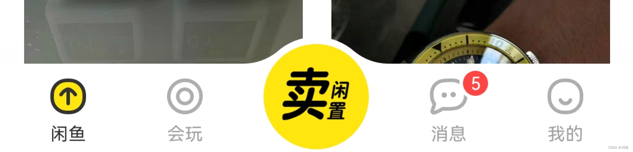
要实现这种效果,还是要将floatingActionButtonLocation设置为centerDocked,不过实现代码稍微麻烦一点:
import 'package:flutter/material.dart';
import './tabs/home.dart';
import './tabs/category.dart';
import './tabs/message.dart';
import './tabs/setting.dart';
import './tabs/user.dart';
class Tabs extends StatefulWidget {
const Tabs({
super.key});
State<Tabs> createState() => _TabsState();
}
class _TabsState extends State<Tabs> {
int _currentIndex = 0;
final List<Widget> _pages = const [
HomePage(),
CategoryPage(),
MessagePage(),
SettingPage(),
UserPage()
];
Widget build(BuildContext context) {
return Scaffold(
appBar: AppBar(title: const Text("Flutter App")),
body: _pages[_currentIndex],
bottomNavigationBar: BottomNavigationBar(
fixedColor: Colors.red, //选中的颜色
// iconSize:35, //底部菜单大小
currentIndex: _currentIndex, //第几个菜单选中
type: BottomNavigationBarType.fixed, //如果底部有4个或者4个以上的菜单的时候就需要配置这个参数
onTap: (index) => setState(() {
_currentIndex = index;}), // 点击时更新index
items: const [
BottomNavigationBarItem(icon: Icon(Icons.home), label: "首页"),
BottomNavigationBarItem(icon: Icon(Icons.category), label: "分类"),
BottomNavigationBarItem(icon: Icon(Icons.message), label: "消息"),
BottomNavigationBarItem(icon: Icon(Icons.settings), label: "设置"),
BottomNavigationBarItem(icon: Icon(Icons.people), label: "用户")
]),
floatingActionButton: Container(
height: 60, //调整FloatingActionButton的大小
width: 60,
padding: const EdgeInsets.all(5),
margin: const EdgeInsets.only(top: 5), //调整FloatingActionButton的位置
decoration: BoxDecoration(
color: Colors.white,
borderRadius: BorderRadius.circular(30),
),
child: FloatingActionButton(
backgroundColor:_currentIndex==2?Colors.red:Colors.blue,
child: const Icon(Icons.add),
onPressed: () {
setState(() {
_currentIndex=2;
});
}
),
),
floatingActionButtonLocation: FloatingActionButtonLocation.centerDocked, //配置浮动按钮的位置
);
}
}
这种实现需要设置奇数个tab,中间专门留出一个tab给FloatingActionButton覆盖。
Drawer
Scaffold组件的drawer和endDrawer属性可以分别接受一个Widget来作为页面的左、右抽屉菜单。如果开发者提供了抽屉菜单,那么当用户手指从屏幕左(或右)侧向里滑动时便可打开抽屉菜单。( 侧边栏默认是隐藏的,我们可以通过手指滑动显示侧边栏,也可以通过点击按钮显示侧边栏)
DefaultTabController(
   Scaffold(
     appBar: AppBar(title: Text("Flutter App"),),
     drawer: Drawer(child: Text('左侧边栏'),),
     endDrawer: Drawer(child: Text('右侧侧边栏'),),
);
使用 DrawerHeader 组件
| 属性 | 描述 |
|---|---|
decoration |
设置顶部背景颜色 |
child |
配置子元素 |
padding |
内边距 |
margin |
外边距 |
示例代码:
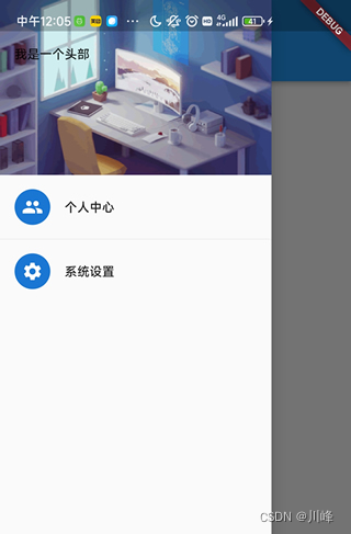
Drawer(
  child: Column(
    children: [
    	Row(children: [Expanded(
              flex: 1,
              child: DrawerHeader(
                decoration: const BoxDecoration(
                    // color: Colors.yellow,
                    image: DecorationImage(
                        image: NetworkImage(
                            "https://www.itying.com/images/flutter/2.png"),
                        fit: BoxFit.cover)),
                child: Column(
                  children: const [
                    ListTile(
                      leading: CircleAvatar(
                        backgroundImage:NetworkImage("https://www.itying.com/images/flutter/3.png")
                      ),
                      title: Text("张三",style: TextStyle(
                        color: Colors.red
                      )),
                    ),
                    ListTile(
                      title: Text("邮箱:[email protected]"),
                    )
                  ],
                ),
              ))
        ],
      ),
      const ListTile(
        leading: CircleAvatar(
          child: Icon(Icons.people),
        ),
        title: Text("个人中心"),
      ),
      const Divider(),
      const ListTile(
        leading: CircleAvatar(
          child: Icon(Icons.settings),
        ),
        title: Text("系统设置"),
      ),
      Divider(),
    ],
  ),
),
效果:
使用 UserAccountsDrawerHeader 组件
| 属性 | 描述 |
|---|---|
decoration |
设置顶部背景颜色 |
accountName |
账户名称 |
accountEmail |
账户邮箱 |
currentAccountPicture |
用户头像 |
otherAccountsPictures |
用来设置当前账户其他账户头像 |
margin |
示例代码:
Drawer(
  child: Column(
    children: [
      Row(children: [Expanded(
              flex: 1,
              child: UserAccountsDrawerHeader(
                accountName: const Text("itying"),
                accountEmail: const Text("[email protected]"),
                otherAccountsPictures:[
                  Image.network("https://www.itying.com/images/flutter/1.png"),
                     Image.network("https://www.itying.com/images/flutter/2.png"),
                     Image.network("https://www.itying.com/images/flutter/3.png"),
                ],
                currentAccountPicture:const CircleAvatar(
                  backgroundImage:NetworkImage("https://www.itying.com/images/flutter/3.png")
                ),
                decoration: const BoxDecoration(
                    image: DecorationImage(
                      fit: BoxFit.cover,
                        image: NetworkImage(
                            "https://www.itying.com/images/flutter/2.png"))),
              ))
        ],
      ),
      const ListTile(
        leading: CircleAvatar(
          child: Icon(Icons.people),
        ),
        title: Text("个人中心"),
      ),
      const Divider(),
      const ListTile(
        leading: CircleAvatar(
          child: Icon(Icons.settings),
        ),
        title: Text("系统设置"),
      ),
      const Divider(),
    ],
  ),
),
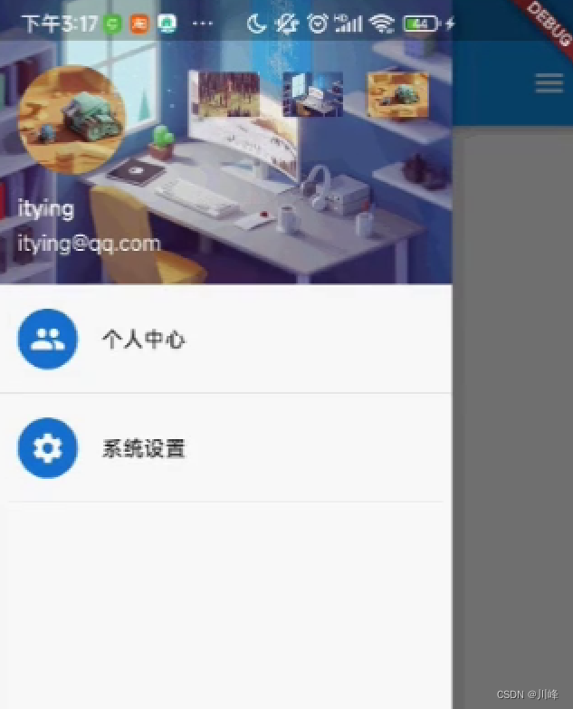
效果:
也可以不使用系统提供的这两个Header组件,完全自己定义Drawer组件的内容,因为其child属性是可以设置任意Widget的,例如:
class MyDrawer extends StatelessWidget {
const MyDrawer({
Key? key,
}) : super(key: key);
Widget build(BuildContext context) {
return Drawer(
child: MediaQuery.removePadding(
context: context,
//移除抽屉菜单顶部默认留白
removeTop: true,
child: Column(
crossAxisAlignment: CrossAxisAlignment.start,
children: <Widget>[
Padding(
padding: const EdgeInsets.only(top: 38.0),
child: Row(
children: <Widget>[
Padding(
padding: const EdgeInsets.symmetric(horizontal: 16.0),
child: ClipOval(
child: Image.asset(
"imgs/avatar.png",
width: 80,
),
),
),
Text(
"Wendux",
style: TextStyle(fontWeight: FontWeight.bold),
)
],
),
),
Expanded(
child: ListView(
children: <Widget>[
ListTile(
leading: const Icon(Icons.add),
title: const Text('Add account'),
),
ListTile(
leading: const Icon(Icons.settings),
title: const Text('Manage accounts'),
),
],
),
),
],
),
),
);
}
}
上面代码中MediaQuery.removePadding可以移除Drawer默认的一些留白(比如Drawer默认顶部会留和手机状态栏等高的留白),可以尝试传递不同的参数来看看实际效果。抽屉菜单页由顶部和底部组成,顶部由用户头像和昵称组成,底部是一个菜单列表,用ListView实现。