Uniapp零基础开发学习笔记(7) -表单组件的练习使用
照着官网的教程,练习各种表单组件的使用,完成一个表单的制作
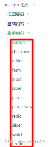
1.表单组件的构成
各种表单组件,可以用来生成登录/注册/提交信息等功能,由于还没有买服务器空间,也没有学uni-cloud,表单先做到submit就行了。
2.使用表单组件搭建一个表单
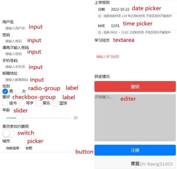
利用上面所有的表单组件设计了一个学员注册信息的表单效果如下:
先建立表单,默认@submit, @reset两个事件
<form @submit="formSubmit" @reset="formReset">
</form>
1. input组件
属性name用来标识变量名称,接收的值为输入的文本,placeholder为提示字符
注意:考虑到提交表单时,需要对输入的格式字符,比如用户名,密码,电话号码,邮箱等进行校验,可以引入hello uni-app的
grace-checker.js
<view class="uni-input-wrapper">
	用户名
	<input class="uni-input" name="username" placeholder="请输入用户名" />
	密码
	<input class="uni-input" name="password1"
	password type="text" placeholder="请输入密码" />
	请再次输入密码
	<input class="uni-input" name="password2"
	password type="text" placeholder="请输入密码" />
	手机号码
	<input class="uni-input" name="cellphone"  placeholder="请输入手机号" />
	邮箱地址
	<input class="uni-input" name="email"  placeholder="请输入邮箱地址" />
</view>
在脚本的submit事件中加入格式校验
在规则rule数组中有多种检查类型:
name:“username”, checkType : “string”, checkRule:“3,10” -》校验username长度3-10
name:“password2”,checkType : “same”, checkRule:“password1” -》校验password2=password1
其它规则checkType有:
“int” 必须为整数
"between"在两者之间; "betweenD"在两个数之间; "betweenF"在两个浮点数之间;
"same"必须相同; "notsame"必须不同;
"phoneno"电话格式; "email"邮件格式; "zipcode"邮编格式;
"reg"按照checkRule的字符串格式检查;
"in"返回值中有checkrule的字符;
"notnull"返回值非空;
import graceChecker from "../../common/graceChecker.js"
formSubmit: function(e) {
	console.log('form发生了submit事件,携带数据为:' + JSON.stringify(e.detail.value))
	//定义表单规则
var rule = [
		{name:"username", checkType : "string", checkRule:"3,10",  errorMsg:"用户名应为3-10个字符"},
		{name:"password1",checkType : "string", checkRule:"6,10",  errorMsg:"密码应为6-10个字符"},
		{name:"password2",checkType : "same", checkRule:e.detail.value["password1"],  errorMsg:"两次输入密码不同!"},
		{name:"cellphone",checkType : "phoneno", errorMsg:"手机号格式不符合要求"},
		{name:"email",checkType : "email", errorMsg:"邮箱格式不符合要求"}
			];
	//进行表单检查
	var formData = e.detail.value;
	var checkRes = graceChecker.check(formData, rule);
	if(checkRes){
		uni.showToast({title:"验证通过!", icon:"none"});
	}else{
		uni.showToast({ title: graceChecker.error, icon: "none" });
	}
},
formReset: function(e) {
	console.log('清空数据')
}
submit返回数据
{“username”:“werew”,“password1”:“123456”,“password2”:“123456”,“cellphone”:“1321321321”,“email”:“[email protected]”,“gender”:“男”,“loves”:[“读书”,“写字”],“age”:20,“switch”:true,“citypicker”:1,“studyhistory”:“xx unser”
2. input组件
属性name="gender"用来接收选择的值,返回的通常是index
<!-- 学习使用radio-group组件 -->
<view class="title">性别</view>
<radio-group name="gender">
	<label>
		<radio value="男" checked/><text>男</text>
	</label>
	<label>
		<radio value="女" /><text>女</text>
	</label>
</radio-group>
<!-- 学习使用radio-group组件完成 -->
3. checkbox-group组件
属性name="loves"用来接收选择的值
<view class="title">爱好</view>
<!-- 学习使用checkbox-group组件 -->
<view class="uni-form-item uni-column">
	<checkbox-group name="loves">
		<label><checkbox value="读书" /><text>读书</text></label>
		<label><checkbox value="写字" /><text>写字</text></label>
		<label><checkbox value="音乐" /><text>音乐</text></label>
		<label><checkbox value="篮球" /><text>篮球</text></label>
	</checkbox-group>
</view>
<!-- 学习使用checkbox-group组件完成 -->
4. slider组件
<!-- 学习使用slider组件 -->
<view class="uni-form-item uni-column">
	<slider value="20" name="age" show-value></slider>
</view>
<!-- 学习使用slider组件完成 -->
5. switch组件
<!-- 学习使用switch组件 -->
<view class="title">是否参加兴趣班</view>
<view class="uni-form-item uni-column">
	<view><switch name="switch" /></view>
</view>
<!-- 学习使用switch组件完成 -->
6. picker普通选择器/日期选择器/事件选择器
<!-- 学习使用picker普通选择器组件 -->
<view class="title">城市</view>
<view class="uni-list">
	<view class="uni-list-cell">
		<view class="uni-list-cell-left">当前选择</view>
		<view class="uni-list-cell-db">
			<picker name="citypicker" @change="bindPickerChange" :value="index"
			:range="city" range-key="name">
				<view class="uni-input">{

   {city[index].name}}</view>
			</picker>
		</view>
	</view>
</view>
<!-- 学习使用picker普通选择器组件完成 -->
<!-- 学习使用picker日期选择器组件 -->
<view class="title">上学报到</view>
<view class="uni-list">
	<view class="uni-list-cell">
		<view class="uni-list-cell-left">日期</view>
		<view class="uni-list-cell-db">
			<picker mode="date" :value="date" :start="startDate" :end="endDate" @change="bindDateChange">
				<view class="uni-input">{

   {date}}</view>
			</picker>
		</view>
	</view>
</view>
<!-- 学习使用picker日期选择器组件完成 -->
<!-- 学习使用picker时间选择器组件 -->
<view class="uni-list">
	<view class="uni-list-cell">
		<view class="uni-list-cell-left">时间</view>
		<view class="uni-list-cell-db">
			<picker mode="time" :value="time" start="09:01" end="21:01" @change="bindTimeChange">
				<view class="uni-input">{

   {time}}</view>
			</picker>
		</view>
	</view>
</view>
<!-- 学习使用picker时间选择器组件完成 -->
城市picker需要定义一个城市数组
日期和时间需要引入date和time变量,并定义函数获取年月日
因此在脚本中增加定义
	function getDate(type) {
		const date = new Date();

		let year = date.getFullYear();
		let month = date.getMonth() + 1;
		let day = date.getDate();

		if (type === 'start') {
			year = year - 10;
		} else if (type === 'end') {
			year = year + 10;
		}
		month = month > 9 ? month : '0' + month;;
		day = day > 9 ? day : '0' + day;

		return `${year}-${month}-${day}`;
	}
	export default {
		data() {
			return {
				city:[{name:'武汉'},{name: '合肥'}, {name:'长沙'}, {name:'南昌'}],
				index: 0,
				date: getDate({
					format: true
				}),
				startDate:getDate('start'),
				endDate:getDate('end'),
				time: '12:01',
				placeholder: '开始输入...'
			}
		},
		onLoad() {
		},
		methods: {
		//城市选择器picker结果改变时,索引也改变
		bindPickerChange: function(e) {
            console.log('picker发送选择改变,携带值为', e.detail.value)
            this.index = e.detail.value
			},
		//date变量获取picker的结果
		bindDateChange: function(e) {
			this.date = e.detail.value
			},
		//time变量获取picker的结果
		bindTimeChange: function(e) {
			this.time = e.detail.value
			}
		}
7. textarea 文本输入区
textarea 是普通文本输入区可输入多行文本
<!-- 学习使用textarea组件 -->
<view class="title">学习经历</view>
<view>
	<view class="uni-textarea"><textarea @blur="bindTextAreaBlur" auto-height />
	</view>
	<view class="uni-textarea">
		<textarea name="studyhistory" placeholder-style="color:#F76260" placeholder="请输入学习经历"/>
	</view>
</view>
<!-- 学习使用textarea组件完成 -->
8. editor 文本编辑区
editor 类似文本输入区,但可以回撤undo
<!-- 学习使用editor组件 -->
<view class="title">获奖情况
	<button  type="warn" @tap="undo">撤销</button>
</view>
<view>
	<editor id="editor" class="ql-container" :placeholder="placeholder" @ready="onEditorReady"></editor>
</view>
<!-- 学习使用editor组件完成 -->
脚本中加入响应事件
	onEditorReady() {
				// #ifdef MP-BAIDU
				this.editorCtx = requireDynamicLib('editorLib').createEditorContext('editor');
				// #endif

				// #ifdef APP-PLUS || H5 ||MP-WEIXIN
				uni.createSelectorQuery().select('#editor').context((res) => {
				  this.editorCtx = res.context
				}).exec()
				// #endif
			},
		undo() {
				this.editorCtx.undo()
			},
9.button 按钮提交和重置
button的属性中
type有"primary" 带蓝色 "default"无颜色 "warn"为红色’
size 有default默认大小 mini小尺寸一行可以放几个
open-type 有效值根据平台类型很多,需要重点查看说明
还有很多其它的属性 button是比较重要的控件用法需要结合文档使用。
<view class="uni-btn-v">
	<button type= "primary" form-type="submit">注册</button>
	<button type="default" form-type="reset">重置</button>
</view>