1、代码
<!DOCTYPE html>
<html>
<head>
<style>
.uu {
position: relative;
width: 400px;
height: 300px;
}
img {
width: 100%;
height: 100%;
z-index: 1;
}
.box_right_top {
background-image: radial-gradient(circle at left bottom, transparent 50px, white 0);
position: absolute;
top: 0;
right: 0;
z-index: 2;
width: 50px;
height: 50px;
}
.box_left_top {
background-image: radial-gradient(circle at right bottom, transparent 50px, white 0);
position: absolute;
top: 0;
left: 0;
z-index: 2;
width: 50px;
height: 50px;
}
.box_right_bottom {
background-image: radial-gradient(circle at left top, transparent 50px, white 0);
position: absolute;
bottom: 0;
right: 0;
z-index: 2;
width: 50px;
height: 50px;
}
.box_left_bottom {
background-image: radial-gradient(circle at right top, transparent 50px, white 0);
position: absolute;
bottom: 0;
left: 0;
z-index: 2;
width: 50px;
height: 50px;
}
</style>
</head>
<body>
<div class="uu">
<img src="https://fuss10.elemecdn.com/e/5d/4a731a90594a4af544c0c25941171jpeg.jpeg" />
<div class="box_right_top"></div>
<div class="box_right_bottom"></div>
<div class="box_left_top"></div>
<div class="box_left_bottom"></div>
</div>
</body>
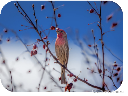
</html>2、原理
使用了radial-gradient属性
3、效果图